Package Exports
- react-native-loading-spinner-overlay-clj
This package does not declare an exports field, so the exports above have been automatically detected and optimized by JSPM instead. If any package subpath is missing, it is recommended to post an issue to the original package (react-native-loading-spinner-overlay-clj) to support the "exports" field. If that is not possible, create a JSPM override to customize the exports field for this package.
Readme
React Native Loading Spinner Overlay

Table of Contents
Install
npm:
npm install react-native-loading-spinner-overlayyarn:
yarn add react-native-loading-spinner-overlayExample
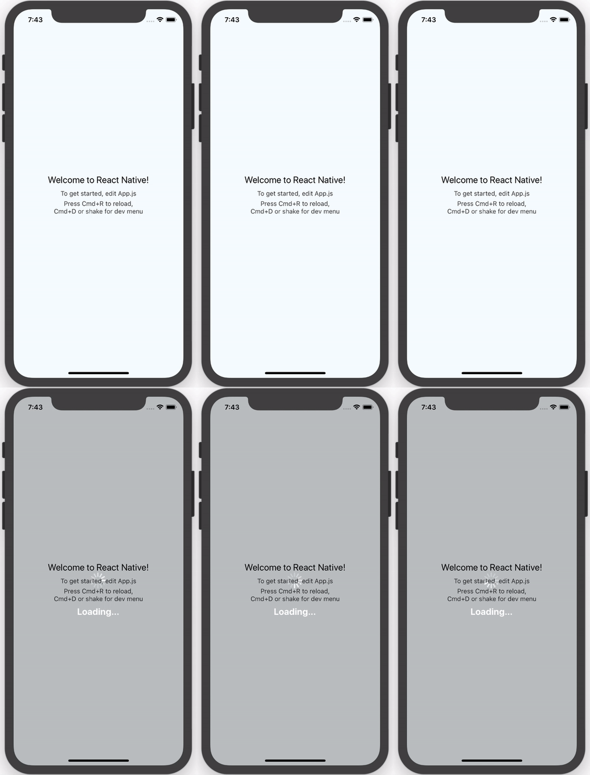
See the example App.js file for an example implementation.
Options
| Property | Type | Default | Description |
|---|---|---|---|
| cancelable | Boolean | false |
Android: If set to false, it will prevent spinner from hiding when pressing the hardware back button. If set to true, it will allow spinner to hide if the hardware back button is pressed. |
| color | String | "white" |
Changes the spinner's color (example values are red, #ff0000, etc). For adjusting the contrast see overlayColor prop below. |
| animation | String (enum) none, slide, fade |
"none" |
Changes animation on show and hide spinner's view. |
| overlayColor | String | rgba(0, 0, 0, 0.25) |
Changes the color of the overlay. |
| size | String (enum) small, normal, large |
"large" |
Sets the spinner's size. No other cross-platform sizes are supported right now. |
| textContent | String | "" |
Optional text field to be shown. |
| textStyle | StyleSheet | - |
The style to be applied to the <Text> that displays the textContent. |
| visible | Boolean | false |
Controls the visibility of the spinner. |
| indicatorStyle | StyleSheet | undefined |
Additional styles for the ActivityIndicator to inherit |
| customIndicator | Element | undefined |
An alternative, custom component to use instead of the default <ActivityIndicator /> |
| children | Element | undefined |
Children element(s) to nest inside the spinner |
Recommended Implementation
We recommend that you follow two rules when implementing this component.
Integrate it inside the parent-most/top-level/root component in your app
Wrap usage of actions after attempting to stop the spinner with
setTimeoutto avoid the non-stop spinner issue:this.setState({ spinner: false }); setTimeout(() => { Alert.alert('Oops!', err.message); }, 100);
Contributors
| Name | Website |
|---|---|
| Nick Baugh | http://niftylettuce.com |
| Spencer Snyder | http://spencersnyder.io |
| Luciano Lima | |
| George Savvidis | |
| Sandro Machado | |
| Ben Sutter | |
| Ivan Kuznetsov | |
| Darren Camp | |
| Rigo B Castro | |
| Raj Kissu | |
| Ivan Pusic | |
| Antonio Grass | |
| Vijay Chouhan | |
| Jacob Lee | |
| Matt Labrum |
License
MIT © Nick Baugh


