
Package Exports
- react-native-masked-loader
This package does not declare an exports field, so the exports above have been automatically detected and optimized by JSPM instead. If any package subpath is missing, it is recommended to post an issue to the original package (react-native-masked-loader) to support the "exports" field. If that is not possible, create a JSPM override to customize the exports field for this package.
Readme
react-native-masked-loader
Creating butter smooth content and skeleton loader in react native.
react-native-skeleton-loader is using react-native-masked-view and react-native-svg. you can simply create your SVG elements with an arbitry color and pass it to the library;
Platforms Supported
✅ iOS
✅ Android
Getting Started
$ yarn add react-native-masked-loader react-native-masked-view react-native-svgor
$ npm install --save react-native-masked-loader react-native-masked-view react-native-svgfor IOS
$ cd ios
pod install| Example 1 | Example 2 |
|---|---|
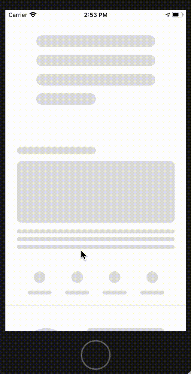 |
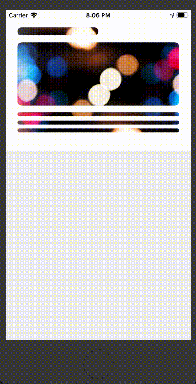 |
Props
| Type | Required | Description |
|---|---|---|
| MaskedElement | Yes | |
| duration | No | animation duration in millisecond the default is 1200 |
| delay | No | delay in millisecond for every round of animation default is zero |
| forColor | No | the animated gradient color default is #CBCBCB |
| forColorOpacity | No | its recommended to use this when you have backgroundImage, the default is 1 |
| backColor | No | the backgound of maked view the default is #E0E0E0 |
| backgroundImage | No | the backgoundImage => backgoundImage={uri:'imageUrl'} |
| dir | No | animation direction the default is "ltr", ltr/rtl/top/bottom |
Usage
import React from 'react';
import { View, StyleSheet } from 'react-native';
import Svg, { Rect } from 'react-native-svg';
import ContentLoader from 'react-native-masked-loader';

const styles = StyleSheet.create({
  container: {
    backgroundColor: '#fff',
    padding: '35px 24px 0 24px',
    height: 285,
  }
});

function getMaskedElement() {
  return (
    <Svg height={250} width="100%" fill={'black'}>
      <Rect x="0" y="0" rx="8" ry="8" width="50%" height="16" />
      <Rect x="0" y="30" rx="9" ry="9" width="100%" height="128" />
      <Rect x="0" y="172" rx="4" ry="4" width="100%" height="8" />
      <Rect x="0" y="188" rx="4" ry="4" width="100%" height="8" />
      <Rect x="0" y="204" rx="4" ry="4" width="100%" height="8" />
    </Svg>
  );
}

export default function BOSLoader() {
  const MaskedElement = getMaskedElement();
  return (
    <View style={styles.container}>
      <ContentLoader MaskedElement={MaskedElement} />
    </View>
  );
}
Advance Usage
import React from 'react';
import { View, StyleSheet, ScrollView } from 'react-native';
import Svg, { Rect, Circle } from 'react-native-svg';
import ContentLoader from 'react-native-masked-loader';

const styles = StyleSheet.create({
  container_1: {
    backgroundColor: '#fff',
    paddingHorizontal: 24,
    paddingVertical: 30,
    height: 285
  },
  container_2: {
    backgroundColor: '#fff',
    height: 145,
  },
  cardLoaderContainer: {
    width: '100%',
    flexDirection: 'row',
    paddingBottom: 20
  },
  cardCircleWrapper:{
    paddingTop: 20,
    paddingLeft: 33,
    width: 147
  },
  cardContextWrapper:{
    flex: 1,
    padding: 20,
    paddingLeft: 22,
    paddingBottom: 0
  }
});


function getMaskedElement_1() {
  return (
    <Svg height={250} width="100%" fill={'black'}>
      <Rect x="0" y="0" rx="8" ry="8" width="50%" height="16" />
      <Rect x="0" y="30" rx="9" ry="9" width="100%" height="128" />
      <Rect x="0" y="172" rx="4" ry="4" width="100%" height="8" />
      <Rect x="0" y="188" rx="4" ry="4" width="100%" height="8" />
      <Rect x="0" y="204" rx="4" ry="4" width="100%" height="8" />
    </Svg>
  );
}


function getMaskedElement_2() {

  return (
    <>
      <View style={styles.cardLoaderContainer}>
        <View style={styles.cardCircleWrapper}>
           <Svg height={105} width="100%" fill={'black'}>
              <Circle cx="52" cy="52" r="52" />
            </Svg>
        </View>
        <View style={styles.cardContextWrapper}>
          <Svg height={105} width="100%" fill={'black'}>
            <Rect x="0" y="0" rx="7" ry="7" width="100%" height="12" />
            <Rect x="0" y="29" rx="7" ry="7" width="100%" height="12" />
            <Rect x="0" y="53" rx="7" ry="7" width="100%" height="12" />
            <Rect x="0" y="77" rx="7" ry="7" width="50%" height="12" />
          </Svg>
        </View>
      </View>
    </>
  );
}

export default function LoaderComponent() {

  const MaskedElement_1 = getMaskedElement_1();
  const MaskedElement_2 = getMaskedElement_2();

  return (
    <ScrollView>

      {/* Basic Example with direction */}
      <View style={styles.container_1}>
        <ContentLoader MaskedElement={MaskedElement_1} dir={'rtl'} duration={2000} forColor="#cfcfcf" backColor="gray"/>
      </View>

      {/* diffrent svg mask item */}
      <View style={styles.container_2}>
        <ContentLoader MaskedElement={MaskedElement_2} />
      </View>

      {/* background image with forcolor opacity */}
      <View style={styles.container_1}>
        <ContentLoader
          MaskedElement={MaskedElement_1}
          forColorOpacity={0.8}
          backgroundImage={{uri:'https://i.pinimg.com/originals/11/f7/75/11f7754f6c4b3994c2656c09283d3c13.jpg'}}
        />
      </View>

    </ScrollView>
  );
}