
Package Exports
- react-native-neomorph-shadows
This package does not declare an exports field, so the exports above have been automatically detected and optimized by JSPM instead. If any package subpath is missing, it is recommended to post an issue to the original package (react-native-neomorph-shadows) to support the "exports" field. If that is not possible, create a JSPM override to customize the exports field for this package.
Readme


react-native-neomorph-shadows
Shadows and neumorphism/neomorphism for iOS & Android (like iOS).
Installation
IMPORTANT:
this library, starting from v1.0.0, no longer supports expo because React Native Art library was recently deprecated from expo.
Step 1
Run the command below to install the plugin.
npm i react-native-neomorph-shadowsStep 2
You need to install React Native Art in your project.
npm install @react-native-community/art --saveWith autolinking (react-native 0.60+)
cd ios && pod install && cd ..Pre 0.60
react-native link @react-native-community/artGreat! Let's start to use it.
Usage
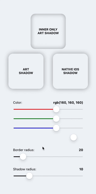
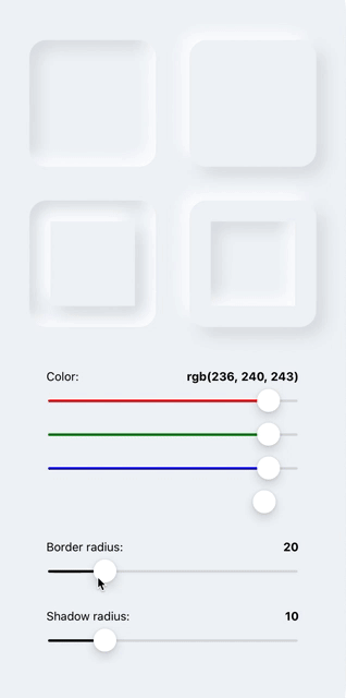
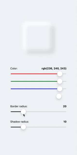
There are three components: Shadow, Neomorph & NeomorphBlur. Prop style supports most of the view/layout styles.
IMPORTANT: Components dont't support Flex.
If you want flex and auto sizing of Shadow or Neomorph components, use ShadowFlex/NeomorphFlex experimental components, but be careful, these components reduce performance by double rerender. If you know exactly what size(width, height props) it should be, use Shadow/Neomorph components.
Shadow / ShadowFlex
import { Shadow } from 'react-native-neomorph-shadows';

...

<Shadow
  inner // <- enable inner shadow
  useArt // <- set this prop to use non-native shadow on ios
  style={{
    shadowOffset: {width: 10, height: 10},
    shadowOpacity: 1,
    shadowColor: "grey",
    shadowRadius: 10,
    borderRadius: 20,
    backgroundColor: 'white',
    width: 100,
    height: 100,
    // ...include most of View/Layout styles
  }}
>
  ...
</Shadow>
Neomorph / NeomorphFlex
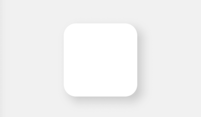
Opacity of two shadows automaticly changing and depends of backgroundColor brightness.


import { Neomorph } from 'react-native-neomorph-shadows';

...

<Neomorph
  inner // <- enable shadow inside of neomorph
  swapShadows // <- change zIndex of each shadow color
  style={{
    shadowRadius: 10,
    borderRadius: 25,
    backgroundColor: '#DDDDDD',
    width: 150,
    height: 150,
  }}
>
  ...
</Neomorph>
Nested Neomorph
<Neomorph
  style={{
    shadowRadius: 3,
    borderRadius: 100,
    backgroundColor: '#DDDDDD',
    width: 200,
    height: 200,
    justifyContent: 'center',
    alignItems: 'center',
  }}
>
  <Neomorph
    inner
    style={{
      shadowRadius: 7,
      borderRadius: 90,
      backgroundColor: '#F19F9F',
      width: 180,
      height: 180,
      justifyContent: 'center',
      alignItems: 'center',
    }}
  >
    <Neomorph
      style={{
        shadowRadius: 7,
        borderRadius: 50,
        backgroundColor: '#DDDDDD',
        width: 100,
        height: 100,
      }}
    />
  </Neomorph>
</Neomorph>
Custom shadow colors of Neomorph
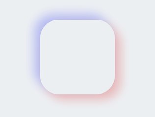
<Neomorph
darkShadowColor="#FF3333" // <- set this
lightShadowColor="#3344FF" // <- this
style={{
shadowOpacity: 0.3, // <- and this or yours opacity
shadowRadius: 15,
borderRadius: 50,
backgroundColor: '#ECF0F3',
width: 200,
height: 200,
}}
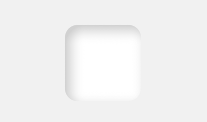
/>Neomorph Blur

import { NeomorphBlur } from 'react-native-neomorph-shadows';

<NeomorphBlur
  style={{
    shadowRadius: 12,
    borderRadius: 70,
    backgroundColor: '#ECF0F3',
    width: 140,
    height: 140,
  }}
/>;
Animation
import { Animated } from 'react-native';
import { Shadow, Neomorph, NeomorphBlur } from 'react-native-neomorph-shadows';

const AnimatedShadow = Animated.createAnimatedComponent(Shadow);
const AnimatedNeomorph = Animated.createAnimatedComponent(Neomorph);
const AnimatedNeomorphBlur = Animated.createAnimatedComponent(Neomorph);

...

<AnimatedShadow />
<AnimatedNeomorph />
<AnimatedNeomorphBlur />
Props
Shadow/ShadowFlex props
| Prop | Type | Default | Description |
|---|---|---|---|
| style | object | undefined | Like View/Layout style prop with a few difference. Flex not available. width & height is required. (None of this is about the ShadowFlex) |
| useArt | bool | false | If true, the component will use drawable shadow on both platform (iOS, Android) |
| inner | bool | false | If true, a shadow will be inside of component |
| children | node | undefined |
Neomorph/NeomorphFlex props
| Prop | Type | Default | Description |
|---|---|---|---|
| style | object | undefined | Like View/Layout style prop with a few difference. Flex not available. width & height is required. (None of this is about the NeomorphFlex) |
| swapShadows | bool | false | If true, the value of zIndex property both shadows will swap |
| inner | bool | false | If true, shadows will be inside of component |
| darkShadowColor | string | 'black' | Dark shadow color |
| lightShadowColor | string | 'white' | Light shadow color |
| children | node | undefined |