
Package Exports
- react-native-percentage-circle
This package does not declare an exports field, so the exports above have been automatically detected and optimized by JSPM instead. If any package subpath is missing, it is recommended to post an issue to the original package (react-native-percentage-circle) to support the "exports" field. If that is not possible, create a JSPM override to customize the exports field for this package.
Readme
react-native-percentage-circle


React Native Version >= 0.25
React-Native-Percentage-Cirlce is a component which supports you define your percent and draw the circle.And also you can use it as a progress bar.And you can show some data in a circle you want.
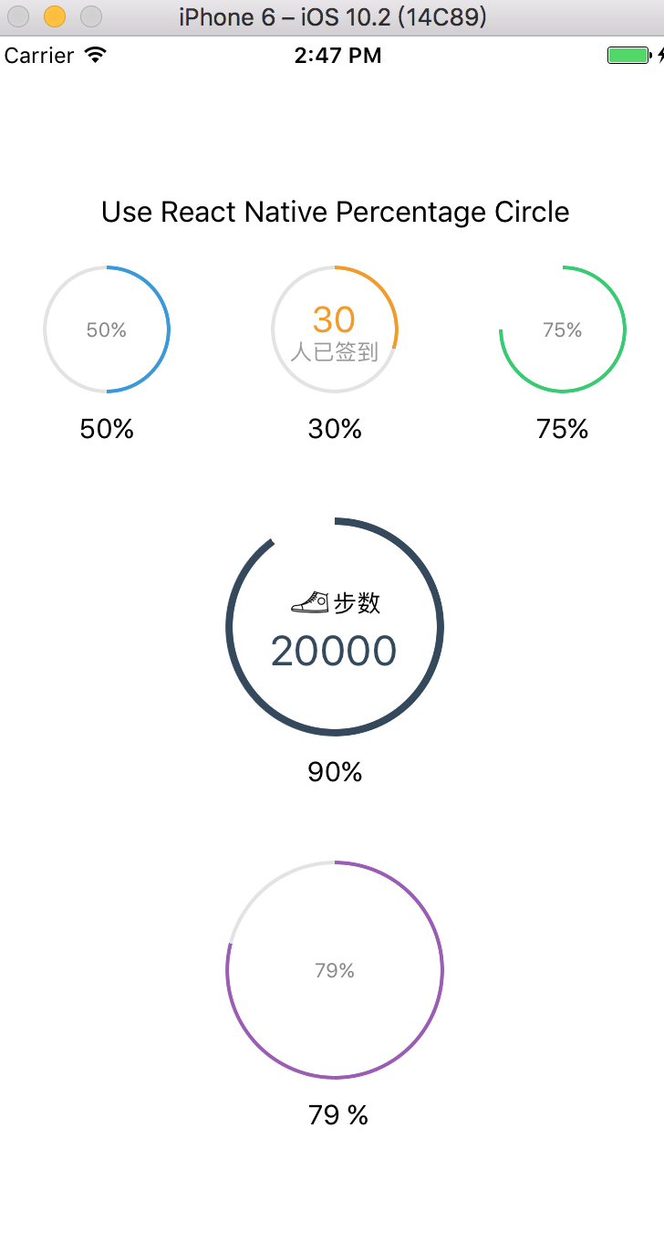
This is a screenshot of the Demo
Start
npm i react-native-percentage-circle --save
import PercentageCircle from 'react-native-percentage-circle';

//...

render() {
  <View>
    <PercentageCircle radius={35} percent={50} color={"#3498db"}></PercentageCircle>
  </View>
   <View>
    <PercentageCircle radius={35} percent={50} color={"#3498db"}>
      <Image style={{width:20,height:20}} source={{require('your image')}} />
    </PercentageCircle>
  </View>
}
Options
| Props | Type | Example | Description |
|---|---|---|---|
| color | string | '#000' | the color of border |
| bgcolor | string | '#e3e3e3' | the background color of the circle |
| innerColor | string | '#fff' | the color of the inside of the circle |
| percent | Number | 30 | the percent you need |
| radius | Number | 20 | how large the circle is |
| borderWidth | Number(default 2) | 5 | the width of percentage progress bar |
| textStyle | Array | {fontSize: 24, color: 'red'} | define the style of the text which in the circle |
| children | jsx | <Text>123</Text> |
define the children component in the circle |
Contributions
Your contributions and suggestions are welcome 😄😄😄