
Package Exports
- react-native-progress-bar-animated
This package does not declare an exports field, so the exports above have been automatically detected and optimized by JSPM instead. If any package subpath is missing, it is recommended to post an issue to the original package (react-native-progress-bar-animated) to support the "exports" field. If that is not possible, create a JSPM override to customize the exports field for this package.
Readme
react-native-progress-bar-animated
📊 Simple, customizable and animated progress bar for React Native
Features
- Flexible style
- Plain simple and flexible API
- Listeners for actions
Demo
You can try on expo: https://expo.io/@rafaelmotta021/react-native-progress-bar-animated-demo
Setup
yarn add react-native-progress-bar-animated
or
npm install --save react-native-progress-bar-animated
Usage
import React from 'react';
import {
View,
StyleSheet,
Dimensions,
Button,
Alert,
Text,
} from 'react-native';
import ProgressBarAnimated from 'react-native-progress-bar-animated';
export default class App extends React.Component {
state = {
progress: 20,
progressWithOnComplete: 0,
progressCustomized: 0,
}
increase = (key, value) => {
this.setState({
[key]: this.state[key] + value,
});
}
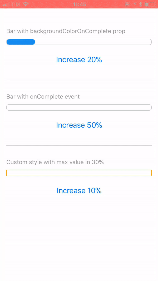
render() {
const barWidth = Dimensions.get('screen').width - 30;
const progressCustomStyles = {
backgroundColor: 'red',
borderRadius: 0,
borderColor: 'orange',
};
return (
<View style={styles.container}>
<View>
<Text style={styles.label}>Bar with backgroundColorOnComplete prop</Text>
<ProgressBarAnimated
width={barWidth}
value={this.state.progress}
backgroundColorOnComplete="#6CC644"
/>
<View style={styles.buttonContainer}>
<View style={styles.buttonInner}>
<Button
title="Increase 20%"
onPress={this.increase.bind(this, 'progress', 20)}
/>
</View>
</View>
</View>
<View style={styles.separator} />
<View>
<Text style={styles.label}>Bar with onComplete event</Text>
<ProgressBarAnimated
width={barWidth}
value={this.state.progressWithOnComplete}
onComplete={() => {
Alert.alert('Hey!', 'onComplete event fired!');
}}
/>
<View style={styles.buttonContainer}>
<View style={styles.buttonInner}>
<Button
title="Increase 50%"
onPress={this.increase.bind(this, 'progressWithOnComplete', 50)}
/>
</View>
</View>
</View>
<View style={styles.separator} />
<View>
<Text style={styles.label}>Custom style with max value in 30%</Text>
<ProgressBarAnimated
{...progressCustomStyles}
width={barWidth}
maxValue={30}
value={this.state.progressCustomized}
/>
<View style={styles.buttonContainer}>
<View style={styles.buttonInner}>
<Button
title="Increase 10%"
onPress={this.increase.bind(this, 'progressCustomized', 10)}
/>
</View>
</View>
</View>
</View>
);
}
}
const styles = StyleSheet.create({
container: {
flex: 1,
backgroundColor: '#FFF',
marginTop: 50,
padding: 15,
},
buttonContainer: {
marginTop: 15,
},
separator: {
marginVertical: 30,
borderWidth: 0.5,
borderColor: '#DCDCDC',
},
label: {
color: '#999',
fontSize: 14,
fontWeight: '500',
marginBottom: 10,
},
});Available props
| Name | Type | Default | Description |
|---|---|---|---|
| value | number | 0 | Progress value |
| maxValue | number | 500 | Max percentage bar can have |
| barEasing | string | 'linear' | Easing animation type(bounce, cubic, ease, sin, linear, quad) |
| barAnimationDuration | number | [] | Duration in ms of bar width animation |
| backgroundAnimationDuration | number | null | Duration in ms of bar background color change |
| width | number | REQUIRED | Width of bar |
| height | number | 15 | Height of bar |
| backgroundColor | string | '#148cF0' | Color that will complete the bar |
| backgroundColorOnComplete | string | null | Optional color that will overwrite background color when reach the max value prop |
| borderWidth | number | 1 | Style prop |
| borderColor | string | '#148cF0' | Style prop |
| borderRadius | number | 6 | Style prop |
| onComplete | function | null | Callback after bar reach the max value prop |