
Package Exports
- react-native-smart-tip
This package does not declare an exports field, so the exports above have been automatically detected and optimized by JSPM instead. If any package subpath is missing, it is recommended to post an issue to the original package (react-native-smart-tip) to support the "exports" field. If that is not possible, create a JSPM override to customize the exports field for this package.
Readme
react-native-smart-tip
React-native smart tip, including Toast、Modal、SnackBar

2021.4
In react native >= 0.62, the new LogBox component would impact this component's initialization. To make it work we have to explicitly insert a mount point in your app like this
import { WRootToastApp } from 'react-native-smart-tip'

// in your entry file like `App.js`

return (
  <WRootToastApp>  // <- use WRootToastApp to wrap your root component
    <App />
  </WRootToastApp>
);
2020.5
- Add property isShowShadow to WSnackBar and WToast
- Add sliding hide function for WSnackBar
2020.3 Show Toast above Modal (Compatible with Android and iOS)
import { ModalShowToastView } from 'react-native-smart-tip'

getToastInstance = (toastInstance) => {
    this.toastInstance = toastInstance;
}

<Modal>
    <View>
        <ModalShowToastView toastInstance={this.getToastInstance} />
    </View>
</Modal>

this.toastInstance({data: 'toast'})
2019.7 Remove the method in the componentWillMount method. Compatible with future React 17 versions, React-Native@0.6 version.
Installation
yarn add react-native-smart-tip
or
npm i react-native-smart-tip --save 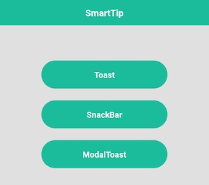
Features
Toast
SnackBar
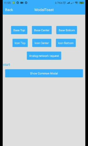
Modal
Show tips on Modal
Tip: Modal shows that modal can only be used on Android issue
Usage
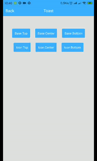
WToast
import {WToast} from 'react-native-smart-tip'

// Base
show = () => {
    WToast.show({data: 'hello world'})
}

// Other
show = () => {
    const toastOpts = {
        data: 'Success',
        textColor: '#ffffff',
        backgroundColor: '#444444',
        duration: WToast.duration.LONG, //1.SHORT 2.LONG
        position: WToast.position.TOP, // 1.TOP 2.CENTER 3.BOTTOM
        icon: <Image source={require('../data/img/success.png')} style={{width: 32,height: 32,resizeMode: 'contain'}}/>
    }

    WToast.show(toastOpts)
}
WToast API
| Props | Type | Required | Default | Description |
|---|---|---|---|---|
| data | String | true | ' ' | Displayed content |
| duration | Number | false | WToast.duration.SHORT | The duration of the toast |
| position | Number | false | WToast.position.BOTTOM | Displayed position |
| inEasing | Easing | false | Easing.elastic(1) | Admission animation |
| textColor | String | false | 'white' | font color |
| backgroundColor | String | false | 'black' | background color |
| icon | Component | fasse | undefined | Image to be displayed |
| isShowShadow | boolean | false | true | Shadow effect |
WSnackBar
import {WSnackBar} from 'react-native-smart-tip'

// Base
show = () => {
    WSnackBar.show({data: 'hello world'})
}

// Other
show = () => {
    const snackBarOpts = {
        data: 'Please check the network first.',
        position: WSnackBar.position.BOTTOM, // 1.TOP 2.CENTER 3.BOTTOM
        duration: WSnackBar.duration.LONG, //1.SHORT 2.LONG 3.INDEFINITE
        textColor: '#ff490b',
        backgroundColor: '#050405',
        actionText: 'Sure',
        actionTextColor: '#ff490b',
        onActionHide: (isSlideHide)=>{
        	// Click Action
        },
    }

    WSnackBar.show(snackBarOpts)
}
WSnackBar API
| Props | Type | Required | Default | Description |
|---|---|---|---|---|
| data | String | true | ' ' | Displayed content |
| statusBarHeight | Number | false | -1 | Prevent Android statusBar |
| height | Number | false | 44 | Height to display |
| duration | Number | false | WSnackBar.duration.SHORT | The duration of the toast |
| position | Number | false | WSnackBar.position.BOTTOM | Displayed position |
| inEasing | Easing | false | Easing.linear | Admission animation |
| textColor | String | false | 'white' | font color |
| backgroundColor | String | false | 'black' | background color |
| actionText | String | false | undefined | action text |
| actionTextColor | String | false | 'white' | action text color |
| isAllowSlideExit | boolean | false | true | Whether to run sliding hide |
| onActionHide | Function | false | undefined | listener click |
| isShowShadow | boolean | false | true | Shadow effect |
| numberOfLines | number | false | 1 | Maximum number of rows |
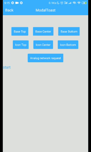
WModal
import {WModal} from 'react-native-smart-tip'

// Base
show = () => {
    WModal.show({data: 'hello world'})
}

// Other
show = () => {
    const modalOpts = {
        data: 'Loading',
        textColor: '#fff',
        backgroundColor: '#444444',
        position: WModal.position.CENTER,
        icon: <ActivityIndicator color='#fff' size={'large'}/>
    }

    WModal.show(modalOpts)
}
WToast API
| Props | Type | Required | Default | Description |
|---|---|---|---|---|
| data | String | true | ' ' | Displayed content |
| position | Number | false | WToast.position.BOTTOM | Displayed position |
| inEasing | Easing | false | Easing.elastic(1) | Admission animation |
| textColor | String | false | 'white' | font color |
| backgroundColor | String | false | 'black' | background color |
| icon | Component | fasse | undefined | Image to be displayed |
| onRequestClose | Function | false | undefined | Android Back |