
Package Exports
- react-native-swiper-flatlist
This package does not declare an exports field, so the exports above have been automatically detected and optimized by JSPM instead. If any package subpath is missing, it is recommended to post an issue to the original package (react-native-swiper-flatlist) to support the "exports" field. If that is not possible, create a JSPM override to customize the exports field for this package.
Readme
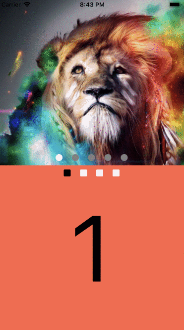
👆 Swiper FlatList component


Installation
yarn add react-native-swiper-flatlistor
npm install react-native-swiper-flatlist --saveImplemented using with FlatList
Example
Expo
Code
import React, { PureComponent } from 'react';
import { Text, Dimensions, Image, StyleSheet, View } from 'react-native';

import SwiperFlatList from 'react-native-swiper-flatlist';

export default class App extends PureComponent {
  render() {
    return (
      <View style={styles.container}>
        <SwiperFlatList
          autoplay
          autoplayDelay={2}
          autoplayLoop
          index={2}
          showPagination
        >
          <View style={[styles.child, { backgroundColor: 'tomato' }]}>
            <Text style={styles.text}>1</Text>
          </View>
          <View style={[styles.child, { backgroundColor: 'thistle' }]}>
            <Text style={styles.text}>2</Text>
          </View>
          <View style={[styles.child, { backgroundColor: 'skyblue' }]}>
            <Text style={styles.text}>3</Text>
          </View>
          <View style={[styles.child, { backgroundColor: 'teal' }]}>
            <Text style={styles.text}>4</Text>
          </View>
        </SwiperFlatList>
      </View>
    );
  }
}

export const { width, height } = Dimensions.get('window');

const styles = StyleSheet.create({
  container: {
    flex: 1,
    backgroundColor: 'white'
  },
  child: {
    height: height * 0.5,
    width,
    justifyContent: 'center'
  },
  text: {
    fontSize: width * 0.5,
    textAlign: 'center'
  }
});Props
| Prop | Default | Type | Description |
|---|---|---|---|
| data | not required if children is used | array |
Data to use in renderItem |
| children | - | node |
Children elements |
| renderItem | not required if children is used | func |
Takes an item from data and renders it into the list |
| onMomentumScrollEnd | - | func |
Called after scroll end and the first parameter is the current index |
| vertical | false | bool |
Show vertical swiper |
| index | 0 | number |
Index to start |
| renderAll | false | bool |
Render all the items before display it |
| Pagination | |||
| showPagination | false | bool |
Show pagination |
| paginationDefaultColor | gray | string |
Pagination color |
| paginationActiveColor | white | string |
Pagination color |
| PaginationComponent | Component | node |
Overwrite Pagination component |
| Autoplay | |||
| autoplay | false | bool |
Change index automatically |
| autoplayDelay | 3 | number |
Delay between every page |
| autoplayLoop | false | bool |
Continue playing after reach end |
Limitations
Note: Vertical pagination is not supported on Android. Doc
Author
Gustavo Gard