
Package Exports
- react-native-tear-lines
This package does not declare an exports field, so the exports above have been automatically detected and optimized by JSPM instead. If any package subpath is missing, it is recommended to post an issue to the original package (react-native-tear-lines) to support the "exports" field. If that is not possible, create a JSPM override to customize the exports field for this package.
Readme
react-native-tear-lines
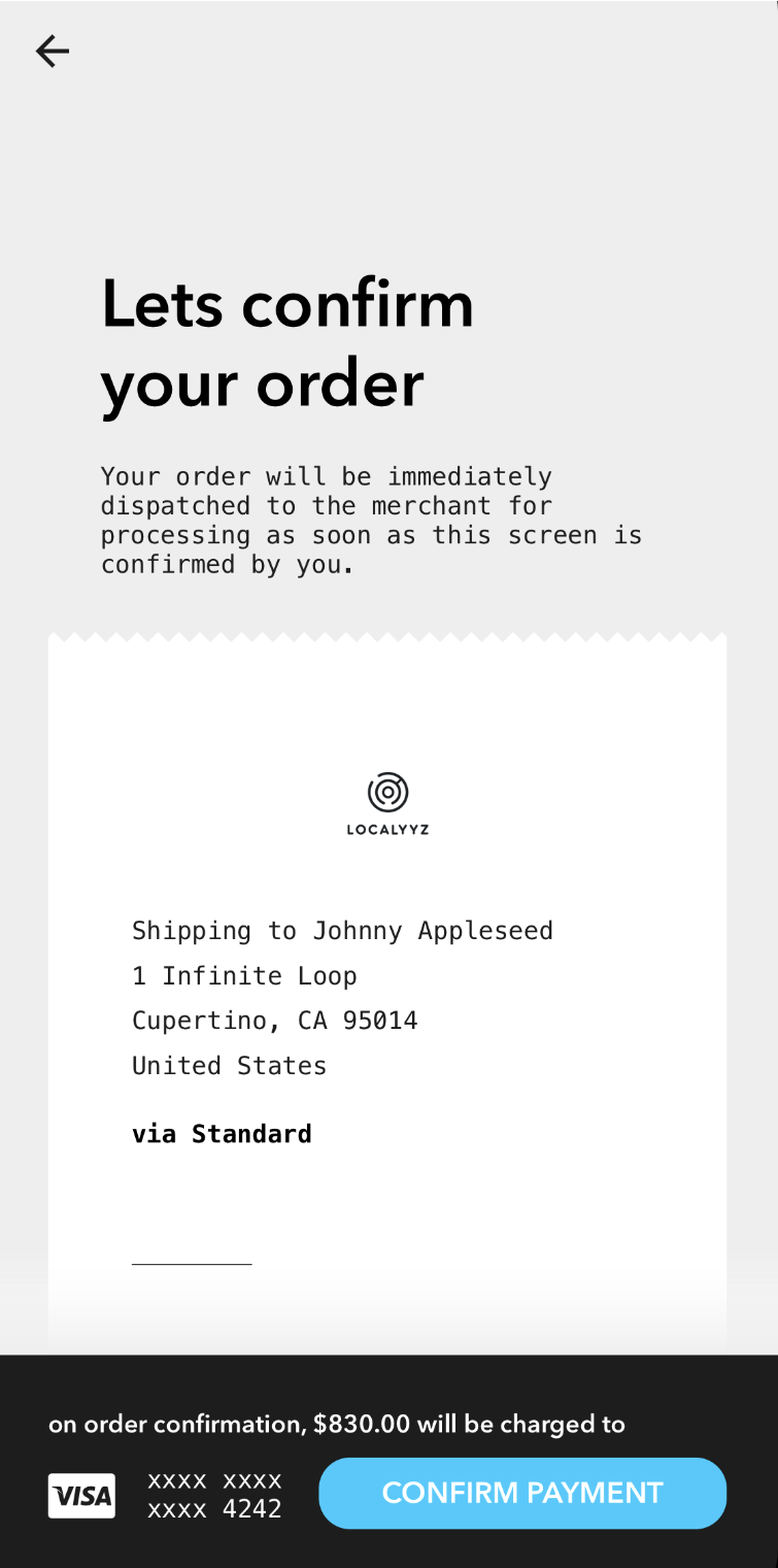
Zig-zag borders to simulate tear lines normally seen on receipts.
Installation
yarn add react-native-tear-linesUsage
Use TearLines's onLayout method in the attached component's onLayout prop
to dynamically match its width as demonstrated below:
import { View } from "react-native";
import TearLines from "react-native-tear-lines";

<View style={{ backgroundColor: "#CCCCCC" }}>
  <TearLines
    ref="top"
    color="#FFFFFF"
    backgroundColor="#CCCCCC">
  <View
    style={{ backgroundColor: "#FFFFFF" }}
    onLayout={e => {
      this.refs.top.onLayout(e);
      this.refs.bottom.onLayout(e);
    }} />
  <TearLines
    isUnder
    ref="bottom"
    color="#FFFFFF"
    backgroundColor="#CCCCCC">
</View>
Properties
| Prop | Description | Default | Required |
|---|---|---|---|
isUnder |
true if this TearLines is used at the bottom of the attached view rather than the top. |
false |
No |
color |
Foreground color; should match attached content view's background color. | #FFFFFF |
No |
backgroundColor |
Background color, should match container's background color. | #CCCCCC |
No |
tearSize |
Specifies how large each tear tile is. Larger values will render less tiles. | 10 |
No |
width |
Width can be provided if you don't want to use the onLayout method to dynamically match the attached content view. |
None | No |
License
MIT License. © Kenneth Ma