
Package Exports
- react-native-ui-stepper
This package does not declare an exports field, so the exports above have been automatically detected and optimized by JSPM instead. If any package subpath is missing, it is recommended to post an issue to the original package (react-native-ui-stepper) to support the "exports" field. If that is not possible, create a JSPM override to customize the exports field for this package.
Readme
react-native-ui-stepper


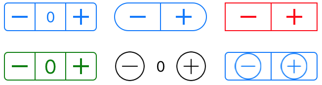
A react-native component which mirrors the functionality of UIStepper from iOS.
A stepper control provides a user interface for incrementing or decrementing a value. A stepper displays two buttons, one with a minus (“–”) symbol and one with a plus (“+”) symbol.
Installation
npm i react-native-ui-stepper
Usage
import UIStepper from 'react-native-ui-stepper';
...
setValue = (value) => {
  // do something with value
}
render() {
  return (
      <UIStepper
        onValueChange={(value) => { this.setValue(value) }}
      />
  )
}
Demo

Props
| Name | Type | Description | Default |
|---|---|---|---|
initialValue |
Number | Start value | 0 |
minimumValue |
Number | Minimum value | 0 |
maximumValue |
Number | Maximum value | 100 |
steps |
Number | Increment value | 1 |
displayValue |
Boolean | Displays the stepper value between the increment and decrement button | false |
wraps |
Boolean | When set to true, incrementing beyond the maximumValue will set the value to minimumValue and vice versa |
false |
tintColor |
String | Changes the color of all the non-transparent pixels to the tintColor. | #0076FF |
overrideTintColor |
Boolean | When using an external image, set whether you want the tintColor to be applied to non-transparent pixels. | false |
backgroundColor |
String | Background color | transparent |
width |
Number | Width | 94 |
height |
Number | Height | 29 |
textColor |
String | The desired text colour which will be used when displayValue is set to true |
#0076FF |
fontSize |
Number | The font size used on the value displayed when displayValue is set to true |
15 |
borderColor |
String | Color used for the border | #0076FF |
borderWidth |
Number | Width of the border | 1 |
borderRadius |
Number | Radius of the border | 4 |
onValueChange |
Function | Executed when the value changes. The value is passed as a parameter | null |
onIncrement |
Function | Executed when the User clicks the increment (+) button. The value is passed as a parameter | null |
onDecrement |
Function | Executed when the User clicks the decrement (+) button. The value is passed as a parameter | null |
onMinimumReached |
Function | Executed when the minimumValue is reached. The value is passed as a parameter |
null |
onMaximumReached |
Function | Executed when the maximumValue is reached. The value is passed as a parameter |
null |