
Package Exports
- react-native-walkthrough-swiper
- react-native-walkthrough-swiper/index.js
This package does not declare an exports field, so the exports above have been automatically detected and optimized by JSPM instead. If any package subpath is missing, it is recommended to post an issue to the original package (react-native-walkthrough-swiper) to support the "exports" field. If that is not possible, create a JSPM override to customize the exports field for this package.
Readme

react-native-walkthrough-swiper
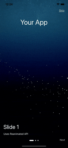
A Intro Swiper component for React-Native. Uses Reanimated API to create smooth animations.
Demo
Installation
npm  install  react-native-walkthrough-swiper
or
yarn add react-native-walkthrough-swiper
React Native Reanimated is essential for this and must be installed. Follow the installation steps here: react-native-reanimated
Usage
import { WalkthroughSwiper } from  'react-native-walkthrough-swiper';

// ...
<View style={{flex:1}}>
  <WalkthroughSwiper
      data={sliderData}
      skipText={'Skip'}
      skipTextStyle={{ color:  '#ccc' }}
      nextButton={<Text  style={{ color:  '#ccc' }}>{'Next'}</Text>}
      centerComponent={
      <Text  style={{ fontSize:  40, color:  'white' }}>{'Your App'}</Text>
      }
      titleStyle={{ color:  'white' }}
      subTitleStyle={{ color:  'white' }}
      activeSlideColor={'#fff'}
      inActiveSlideColor={'#b2b2b2'}
      onSkipBtnPress={() => {
      // Navigate to the next screen
      }}
  />
</View>

const data = [
{
    title: 'Slide 1',
    subTitle: 'Uses Reanimated API',
    age: 29,
    bgImage: 'some image URI',
  },
  ...
  ]
Properties
| Prop | Description | Types |
|---|---|---|
data |
Slide actual data, Should be in format. Check the format above. | Array |
skipText |
String value of the skipText. |
string |
skipTextStyle |
Style for skipText. |
TextStyle |
nextButton |
Next Button. Can be text/image or any component. | React.Component |
centerComponent |
The center component, can be any React component | React.Component |
titleStyle |
Styles for the title. | TextStyle |
subTitleStyle |
Styles for the sub-title. | TextStyle |
activeSlideColor |
Active Slide color (circle dot at bottom). | string |
inActiveSlideColor |
Inactive slide color. | string |
onSkipBtnPress |
Event to trigger on press of Skip Button. | GestureResponderEvent |