
Package Exports
This package does not declare an exports field, so the exports above have been automatically detected and optimized by JSPM instead. If any package subpath is missing, it is recommended to post an issue to the original package (react-notion-table) to support the "exports" field. If that is not possible, create a JSPM override to customize the exports field for this package.
Readme
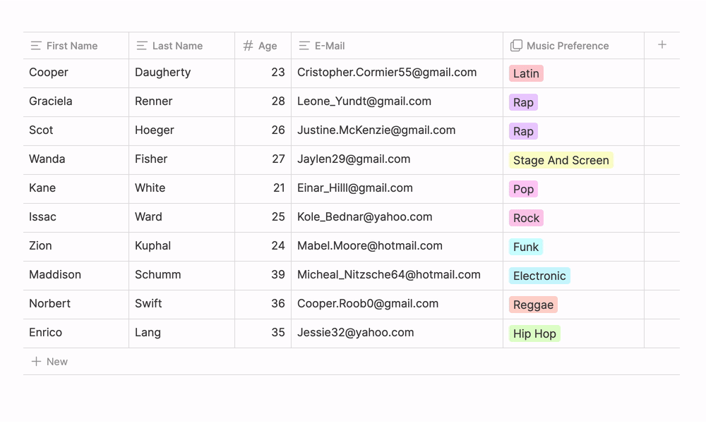
React Notion Table
React Notion Table is a modern and flexible editable table library for React with TypeScript support.
[!NOTE] Implementation of editable tables with a rich user interface and intuitive features inspired by Notion.
Installation
npm install react-notion-table
# or
yarn add react-notion-table
Key Features
- ✅ Resizable columns
- ✅ Cell data types: text, number, select
- ✅ Rename column headers
- ✅ Sort individual columns
- ✅ Add columns to the left or right
- ✅ Add a new column to the end
- ✅ Edit data in cells
- ✅ Add a new row of data
- ✅ Delete a column
- ✅ Change column data types
- ✅ Add options for select-type cells
- ✅ Support for virtualized rows
- ✅ Full TypeScript support
Quick Start
import { NotionTable } from 'react-notion-table';
import 'react-notion-table/dist/style.css'; // optional, if you want to use basic styles

// Example data and columns
const columns = [
  {
    id: 'name',
    label: 'Name',
    accessor: 'name',
    dataType: 'text',
  },
  {
    id: 'age',
    label: 'Age',
    accessor: 'age',
    dataType: 'number',
  },
  {
    id: 'status',
    label: 'Status',
    accessor: 'status',
    dataType: 'select',
    options: ['Active', 'Blocked', 'Pending'],
  },
];

const data = [
  { id: '1', name: 'Ivan', age: 25, status: 'Active' },
  { id: '2', name: 'Maria', age: 30, status: 'Pending' },
];

function App() {
  const [tableData, setTableData] = useState(data);
  const [tableColumns, setTableColumns] = useState(columns);

  return (
    <NotionTable
      columns={tableColumns}
      data={tableData}
      onDataChange={setTableData}
      onColumnsChange={setTableColumns}
      virtualized={true}
      height={500}
    />
  );
}
API
TableProps
| Property | Type | Default | Description |
|---|---|---|---|
| columns | Column[] | required | Array of column definitions |
| data | Row[] | required | Array of row data |
| onDataChange | (data: Row[]) => void | undefined | Callback when data changes |
| onColumnsChange | (columns: Column[]) => void | undefined | Callback when columns change |
| height | number | undefined | Table height (px) |
| width | number | undefined | Table width (px) |
| rowHeight | number | 35 | Row height (px) |
| virtualized | boolean | false | Enable row virtualization |
| editable | boolean | true | Allow table editing |
Column
| Property | Type | Description |
|---|---|---|
| id | string | Unique identifier for the column |
| label | string | Displayed column header |
| accessor | string | Key to access the property in the data object |
| dataType | 'text' | 'number' | 'select' | Data type of the column |
| options | string[] | Options for the 'select' type |
| width | number | Column width (px) |
| minWidth | number | Minimum column width (px) |
| maxWidth | number | Maximum column width (px) |
Row
interface Row {
  id: string;
  [key: string]: any;
}
Roadmap
- Support for virtualized rows
- Full TypeScript typing
- Date data type
- Multi-select data type
- Checkbox data type
- Animated dropdowns
- Performance - support for 100,000+ rows
Contributing
Contributions are welcome! Feel free to pick an item from the roadmap or open a new issue!
- Fork the repository
- Create a branch for your feature (
git checkout -b feature/amazing-feature) - Commit your changes (
git commit -m 'Added an amazing feature') - Push to the branch (
git push origin feature/amazing-feature) - Open a Pull Request
License
Distributed under the MIT License. See LICENSE.md for more information.