

Package Exports
- react-overflow-tabs
- react-overflow-tabs/package.json
Readme
react-overflow-tabs
A headless React hook to gracefully collapse overflowing tabs into a dropdown menu.
Works with any UI framework (Tailwind, Bootstrap, MUI, custom CSS).


A lightweight React hook for responsive tab navigation with automatic overflow handling.
Perfect for building tab systems, breadcrumbs, or step navigators.
🎥 Demo
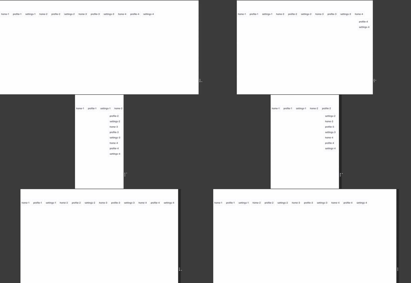
✨ Features
- 🔗 Headless – no styles, works with your own UI
- 📏 Responsive – detects tab overflow using
IntersectionObserver - ⚡ Lightweight – tree-shakeable, no dependencies
- 🎯 Framework-agnostic – use with Tailwind, Bootstrap, MUI, or custom CSS
📦 Installation
npm install react-overflow-tabs
# or
yarn add react-overflow-tabs
# or
pnpm add react-overflow-tabs
Peer dependencies:
react >=18 <20
🚀 Quickstart
⚠️ Do not use display: none or move elements out of flow with position: absolute;
Both will cause IntersectionObserver to stop tracking the element. Instead:
- Use
visibility: hidden
import { useRef } from "react";
import { useOverflowTabs } from "react-overflow-tabs";

const Example = () => {
    const containerRef = useRef<HTMLDivElement>(null);

    const { overflowKeys, isOverflowing } = useOverflowTabs({
        container: containerRef,
    });

    const KEYS = [
        "home-1",
        "profile-1",
        "settings-1",
        "home-2",
        "profile-2",
        "settings-2",
        "home-3",
        "profile-3",
        "settings-3",
        "home-4",
        "profile-4",
        "settings-4",
    ];

    return (
        <div
            ref={containerRef}
            style={{
                display: "flex",
                gap: 12,
                overflow: "hidden",
            }}
        >
            {KEYS.map((k) => (
                <button
                    key={k}
                    data-overflow-key={k}
                    style={{
                        whiteSpace: "nowrap",
                        visibility: overflowKeys.includes(k) ? "hidden" : "visible",
                    }}
                >
                    {k}
                </button>
            ))}
            {isOverflowing && (
                <div style={{ marginLeft: "auto" }}>
                    <div
                        style={{
                            position: "absolute",
                            marginTop: 40,
                            right: 4,
                            border: "1px solid red",
                            padding: 6,
                        }}
                    >
                        {overflowKeys.map((key) => (
                            <div key={key} style={{ padding: "6px 10px", whiteSpace: "nowrap" }}>
                                {key}
                            </div>
                        ))}
                    </div>
                </div>
            )}
        </div>
    );
};
⚙️ API
useOverflowTabs(options: IOverflowTabsOptions): IOverflowState
Options (IOverflowTabsOptions)
| Option | Type | Default | Description |
|---|---|---|---|
container |
RefObject<HTMLElement> | HTMLElement |
required | The container element to observe. |
tabSelector |
string |
"[data-overflow-key]" |
Selector for tab elements. Each tab must have a unique data-overflow-key. |
disabled |
boolean |
false |
Temporarily disable overflow tracking. |
Return (IOverflowState)
| Key | Type | Description |
|---|---|---|
visibleKeys |
string[] |
Keys of tabs currently visible in the container. |
overflowKeys |
string[] |
Keys of tabs pushed into overflow (hidden). |
isOverflowing |
boolean |
Whether overflow is currently happening. |
🛠 Example with Tailwind
import { useRef } from "react";
import useOverflowTabs from "./useOverflowTabs";

const Example = () => {
    const containerRef = useRef<HTMLDivElement>(null);

    const { overflowKeys, isOverflowing } = useOverflowTabs({
        container: containerRef,
    });

    const KEYS = [
        "home-1",
        "profile-1",
        "settings-1",
        "home-2",
        "profile-2",
        "settings-2",
        "home-3",
        "profile-3",
        "settings-3",
        "home-4",
        "profile-4",
        "settings-4",
    ];

    return (
        <div ref={containerRef} className="flex gap-3 overflow-hidden">
            {KEYS.map((k) => (
                <button
                    key={k}
                    data-overflow-key={k}
                    className={"p-2 whitespace-nowrap border" + (overflowKeys.includes(k) ? " invisible" : "")}
                >
                    {k}
                </button>
            ))}

            {isOverflowing && (
                <div className="ml-auto">
                    <div className="absolute right-4 mt-14 border">
                        {overflowKeys.map((key) => (
                            <div key={key} className="p-2 whitespace-nowrap">
                                {key}
                            </div>
                        ))}
                    </div>
                </div>
            )}
        </div>
    );
};
📖 Notes
- Uses
IntersectionObserverunder the hood → supported in modern browsers. threshold: 0.999by default → requires full visibility to count as visible.- Works with RTL layouts, as it only tracks visibility.
🤝 Contributing
Contributions, issues, and feature requests are welcome!
Feel free to open an issue or submit a PR.
- Fork the repo
- Create your feature branch (
git checkout -b feature/my-feature) - Commit your changes (
git commit -m 'Add some feature') - Push to the branch (
git push origin feature/my-feature) - Open a Pull Request
📜 License
MIT © Baver Bozdağ