
Package Exports
- react-picky-date-time
- react-picky-date-time/index.js
This package does not declare an exports field, so the exports above have been automatically detected and optimized by JSPM instead. If any package subpath is missing, it is recommended to post an issue to the original package (react-picky-date-time) to support the "exports" field. If that is not possible, create a JSPM override to customize the exports field for this package.
Readme
react-picky-date-time

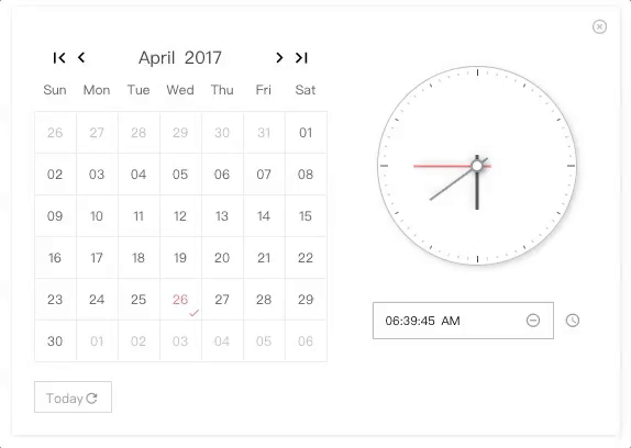
A react component for date time picker.
NO Jquery, NO Moment.js
🎉 For range surpport, please take a look at react-minimal-datetime-range
Demo & Examples
Please check the online demo example
Attention: you can find demo source here :)
Codesandbox Examples
- Online demo example playground
- Custom locales(when providing
window.REACT_PICKY_DATE_TIME['customLocale'])
🎉 For version >= 2.0.0, please update react and react-dom to at least 16.8.6, since it is rewrited with hooks.
  "peerDependencies": {
    "react": ">= 16.8.6",
    "react-dom": ">= 16.8.6"
  }
Docs Link
Custom Locale Guid(can be multiple locales)
Usage
import ReactPickyDateTime from 'react-picky-date-time';

...
class YourOwnComponent extends Component {
  constructor(props) {
    super(props);
    this.state = {
      showPickyDateTime: true,
      date: '30',
      month: '01',
      year: '2000',
      hour: '03',
      minute: '10',
      second: '40',
      meridiem: 'PM'
    };
  }
  ...
  render() {
    const {
      showPickyDateTime,
      date,
      month,
      year,
      hour,
      minute,
      second,
      meridiem
    } = this.state;

    return(
      <ReactPickyDateTime
        size="m"// 'xs', 's', 'm', 'l'
        mode={0} //0: calendar only, 1: calendar and clock, 2: clock only; default is 0
        locale={`zh-cn`}// 'en-us' or 'zh-cn'; default is en-us
        show={showPickyDateTime} //default is false
        onClose={() => this.setState({ showPickyDateTime: false })}
        defaultTime={`${hour}:${minute}:${second} ${meridiem}`} // OPTIONAL. format: "HH:MM:SS AM"
        defaultDate={`${month}/${date}/${year}`} // OPTIONAL. format: "MM/DD/YYYY"
        onYearPicked={res => this.onYearPicked(res)}
        onMonthPicked={res => this.onMonthPicked(res)}
        onDatePicked={res => this.onDatePicked(res)}
        onResetDate={res => this.onResetDate(res)}
        onResetDefaultDate={res => this.onResetDefaultDate(res)}
        onSecondChange={res => this.onSecondChange(res)}
        onMinuteChange={res => this.onMinuteChange(res)}
        onHourChange={res => this.onHourChange(res)}
        onMeridiemChange={res => this.onMeridiemChange(res)}
        onResetTime={res => this.onResetTime(res)}
        onResetDefaultTime={res => this.onResetDefaultTime(res)}
        onClearTime={res => this.onClearTime(res)}
        // markedDates={['10/19/2021']} // OPTIONAL. format: "MM/DD/YYYY"
        // supportDateRange={['12/03/2021', '12/05/2021']} // OPTIONAL. min date and max date. format: "MM/DD/YYYY"
      />
    );
  }
}
Installation
npm install react-picky-date-time --saveDonate
Thanks for donating me a donut! ⁄(⁄ ⁄•⁄ω⁄•⁄ ⁄)⁄
Browser support
Tested on IE9+ and Chrome and Safari(10.0.3)
This library relies new AbortController, so if you are developing for IE10+ you should include the polyfill like below
import 'promise-polyfill/src/polyfill';
import 'unfetch/polyfill';
import 'abortcontroller-polyfill';
For IE9, you also need performance requestAnimationFrame polyfill for clock ticking
Events
Also consoled out on the demo page examples
  onYearPicked(res) {
    const { year } = res;
    this.setState({ year: year});
  }

  onMonthPicked(res) {
    const { month, year } = res;
    this.setState({ year: year, month: month});
  }

  onDatePicked(res) {
    const { date, month, year } = res;
    this.setState({ year: year, month: month, date: date });
  }

  onResetDate(res) {
    const { date, month, year } = res;
    this.setState({ year: year, month: month, date: date });
  }

  onResetDefaultDate(res) {
    const { date, month, year } = res;
    this.setState({ year: year, month: month, date: date });
  }

  onSecondChange(res) {
    this.setState({ second: res.value });
  }

  onMinuteChange(res) {
    this.setState({ minute: res.value });
  }

  onHourChange(res) {
    this.setState({ hour: res.value });
  }

  onMeridiemChange(res) {
    this.setState({ meridiem: res });
  }

  onResetTime(res) {
    this.setState({
      second: res.clockHandSecond.value,
      minute: res.clockHandMinute.value,
      hour: res.clockHandHour.value
    });
  }

  onResetDefaultTime(res) {
    this.setState({
      second: res.clockHandSecond.value,
      minute: res.clockHandMinute.value,
      hour: res.clockHandHour.value
    });
  }

  onClearTime(res) {
    this.setState({
      second: res.clockHandSecond.value,
      minute: res.clockHandMinute.value,
      hour: res.clockHandHour.value
    });
  }

  // just toggle your outter component state to true or false to show or hide <PickyDateTime/>
  openPickyDateTime() {
    this.setState({showPickyDateTime: true});
  }

  onClose() {
    this.setState({showPickyDateTime: false});
  }
Custom Locale (can be multiple locales)
By providing window.REACT_PICKY_DATE_TIME['customLocale'], you can overwrite the current locale if you like or add a new locale.
codesandbox example(located in index.html)
        <script type="text/javascript">
        window.REACT_PICKY_DATE_TIME = {
            customLocale: {
                "my-own-locale": {...},//structure must follow below
                'es': {
                    today: 'Hoy',
                    reset: 'Reiniciar',
                    'reset-date': 'Reiniciar Fecha',
                    clear: 'Borrar',
                    now: 'Ahora',
                    weeks: ['Dom', 'Lun', 'Mar', 'Mié', 'Jue', 'Vie', 'Sáb'],
                    months: ['Enero', 'Febrero', 'Marzo', 'Abril', 'Mayo', 'Junio', 'Julio', 'Agosto', 'Septiembre', 'Octubre', 'Noviembre', 'Diciembre'],
                }
            }
        }
        </script>
Contributors ✨
Thanks goes to these wonderful people (emoji key):
 Edward Xiao 💻 📖 🚇 ⚠️ 👀 |
This project follows the all-contributors specification. Contributions of any kind welcome!