
Package Exports
- react-simple-typeahead
This package does not declare an exports field, so the exports above have been automatically detected and optimized by JSPM instead. If any package subpath is missing, it is recommended to post an issue to the original package (react-simple-typeahead) to support the "exports" field. If that is not possible, create a JSPM override to customize the exports field for this package.
Readme
React simple typeahead
React simple typeahead is a react based typeahead(autocomplete) component.
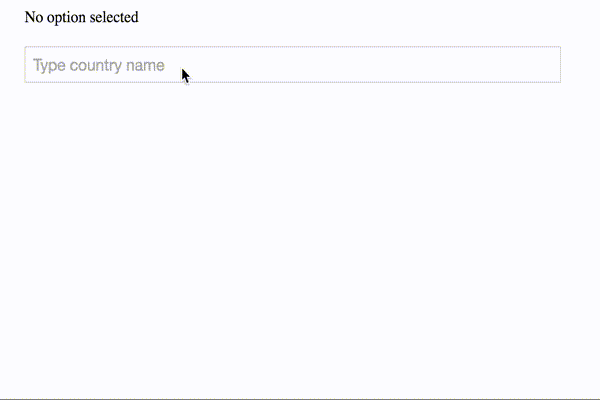
Demo
Installation
npm install react-simple-typeaheadIf you are using npm and CommonJS modules you simply require react-simple-typeahead:
var Typehead = require('react-simple-typeahead');or you can load react-simple-typeahead.js file from dist folder.
Usage
<SimpleTypeahead
      options={['Red', 'Green', 'Yellow', 'Blue']}
      onOptionSelected={function(option) { console.log("Option selected:", option)}}
      maxOptionsCount={4}
      placeholder="Type color here"
      customClasses={{
        input: 's-typeahead-input',
        list: 's-typeahead-list',
        listItem: 's-typeahead-list-item',
        listItemSelected: 's-typeahead-list-item--selected'
      }}
    />
API
Component properties:
defaultValue
Type: String
Default: ""
Default value will be shown when no option selected
placeholder
Type: String
Default: ""
Placeholder text for the input field
options
Type: Array
Default: []
List of options available for selection
onOptionSelected
Type: Function
Default: none
Callback function which will be called on each option selection by user, function will receive as parameter an option
onInputEmpty
Type: Function
Default: none
Callback function which will be called once the input of component get empty
maxOptionsCount
Type: Number
Default: -1
Limit number of suggested options to show. By default there is no limit
customClasses
Type: Object
Default:
      wrapper: 'ss-typeahead-wrapper',
      input: 'ss-typeahead-input',
      list: 'ss-typeahead-list',
      listItem: 'ss-typeahead-list-item',
      listItemSelected: 'ss-typeahead-list-item--selected',
      listItemValue: 'ss-typeahead-list-item__value'
Object of CSS class names to apply to the component.
Possible property names:
- wrapper: reference to the class property of wrapping
divof the component - input: reference to the class property of
inputelement - list: reference to the class property of
ulelement - listItem: refernce to the class property of
lielement - listItemSelected: refernce to the class property of
lielement in selected state - listItemValue: refernce to the class property of
spanelement which used for displaying an option