
Package Exports
- react-stepper-horizontal-sppro
This package does not declare an exports field, so the exports above have been automatically detected and optimized by JSPM instead. If any package subpath is missing, it is recommended to post an issue to the original package (react-stepper-horizontal-sppro) to support the "exports" field. If that is not possible, create a JSPM override to customize the exports field for this package.
Readme
react-stepper
Well-designed stepper component for react
Installation
npm install react-stepper-horizontal --saveThen just add import Stepper from 'react-stepper-horizontal'; into your file.
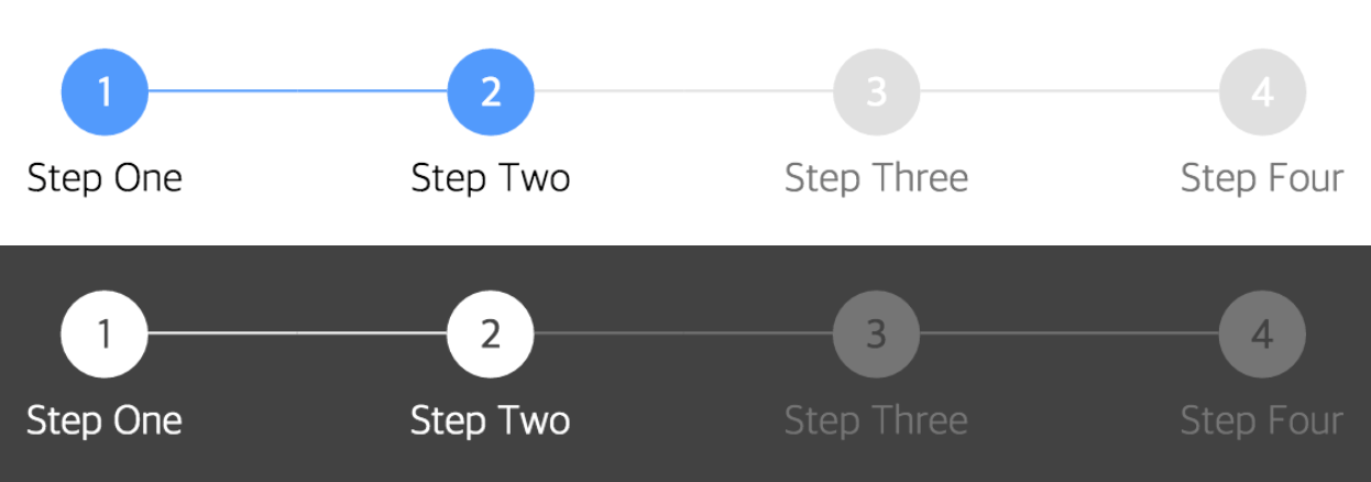
Screenshot
Usage
render() {
  return (
    <div>
      <Stepper steps={ [{title: 'Step One'}, {title: 'Step Two'}, {title: 'Step Three'}, {title: 'Step Four'}] } activeStep={ 1 } />
    </div>
  );
}
See full example here
API
Main Component
| name | description | default | type |
|---|---|---|---|
| activeStep | Active step index, starts at 0 | 0 | number |
| steps | List of step objects (see below) | array | |
| activeColor | Active circle color | #5096FF | string |
| completeColor | Completed circle color | #5096FF | string |
| defaultColor | Default circle color - not active or completed | #E0E0E0 | string |
| activeTitleColor | Active title color | #000 | string |
| completeTitleColor | Completed title color | #000 | string |
| defaultTitleColor | Default title color - not active or completed | #757575 | string |
| circleFontColor | Circle text color (for index) | #FFF | string |
| size | Circle size | 32 | number |
| circleFontSize | Circle text size | 16 | number |
| titleFontSize | Title text size | 16 | number |
| circleTop | Top margin of Stepper component |
24 | number |
| titleTop | Space between circle and title | 8 | number |
| defaultOpacity | Default circle opacity | 1 | string |
| completeOpacity | Completed circle opacity | 1 | string |
| activeOpacity | Active circle opacity | 1 | string |
| defaultTitleOpacity | Default title opacity | 1 | string |
| completeTitleOpacity | Completed title opacity | 1 | string |
| activeTitleOpacity | Active title opacity | 1 | string |
| barStyle | Style of bar separating steps | solid | string |
| defaultBorderColor | Default color of border surrounding circle | string | |
| completeBorderColor | Color of border surrounding completed circle | string | |
| activeBorderColor | Color of border surrounding active circle | string | |
| defaultBorderStyle | Default style of border surrounding circle | solid | string |
| completeBorderStyle | Style of border surrounding completed circle | solid | string |
| activeBorderStyle | Style of border surrounding active circle | solid | string |
| defaultBarColor | Default color of bar separating circles | #E0E0E0 | string |
| completeBarColor | Color of bar connected to a completed step | #E0E0E0 | string |
| lineMarginOffset | Offset for line margin | 4 | number |
| defaultBorderWidth | Default Border Width | 3 | number |
Step Objects
| name | description | default | type |
|---|---|---|---|
| title | Displayed text of the step below the number | undefined | string |
| icon | Displayed icon of the step | undefined | image/object |
| href | Link to send them to on click | undefined | string |
| onClick | Event handler for when the step is clicked | undefined | function |
Author
InJung Chung / @mu29