
Package Exports
- react-tailwind-date-range-picker
- react-tailwind-date-range-picker/dist/index.cjs.js
- react-tailwind-date-range-picker/dist/index.esm.js
This package does not declare an exports field, so the exports above have been automatically detected and optimized by JSPM instead. If any package subpath is missing, it is recommended to post an issue to the original package (react-tailwind-date-range-picker) to support the "exports" field. If that is not possible, create a JSPM override to customize the exports field for this package.
Readme
React Tailwind Date Range Picker
A modern, customized date range picker component for React using Tailwind CSS 3.
Based on react-tailwindcss-datepicker with custom enhancements.
Contents
Features
- 📆 Date Range Selection
- 🎨 Fully customizable with Tailwind CSS
- 🌙 Dark mode support
- 📱 Responsive design
- 🔍 Min/Max date constraints
- 🌐 Internationalization support
- 🎯 Single date picker mode
- ⌨️ Keyboard navigation support
Installation
# npm
npm install react-tailwind-date-range-picker

# yarn
yarn add react-tailwind-date-range-picker
Make sure you have the peer dependencies installed:
npm install dayjs reactUsage
import React, { useState } from 'react';
import Datepicker from 'react-tailwind-date-range-picker';

const MyComponent = () => {
  const [value, setValue] = useState({
    startDate: new Date(),
    endDate: new Date().setMonth(new Date().getMonth() + 1)
  });

  const handleValueChange = (newValue) => {
    console.log("newValue:", newValue);
    setValue(newValue);
  }

  return (
    <div>
      <Datepicker
        value={value}
        onChange={handleValueChange}
        primaryColor={"teal"}
      />
    </div>
  )
}

export default MyComponent;
Props
| Prop | Type | Default | Description |
|---|---|---|---|
value |
object |
null |
The selected date range |
onChange |
function |
required |
Function called when the date selection changes |
primaryColor |
string |
"teal" |
Primary theme color |
asSingle |
boolean |
false |
Use as single date picker |
useRange |
boolean |
true |
Enable date range selection |
showFooter |
boolean |
false |
Show footer with apply/cancel buttons |
showShortcuts |
boolean |
false |
Show predefined date range shortcuts |
displayFormat |
string |
"YYYY-MM-DD" |
Format for displaying dates |
readOnly |
boolean |
false |
Make the input read-only |
disabled |
boolean |
false |
Disable the datepicker |
inputClassName |
string |
null |
Custom class for the input field |
containerClassName |
string |
null |
Custom class for the container |
popupClassName |
string |
null |
Custom class for the popup |
Examples
Single Date Picker
<Datepicker
  asSingle={true}
  value={value}
  onChange={handleValueChange}
/>
With Shortcuts
<Datepicker
  showShortcuts={true}
  value={value}
  onChange={handleValueChange}
/>
Custom Display Format
<Datepicker
  displayFormat="MMM DD, YYYY"
  value={value}
  onChange={handleValueChange}
/>
Customization
You can customize various aspects of the datepicker by providing custom class names or changing default values in your own fork of the component.
Custom Classes
<Datepicker
  inputClassName="my-custom-input"
  containerClassName="my-custom-container"
  popupClassName="my-custom-popup"
  value={value}
  onChange={handleValueChange}
/>
Customizing Default Values
License
MIT
| Version | React Version |
|---|---|
| 2.x | 19.x |
| 1.x | 17.x, 18.x |
Installation
React Tailwindcss Datepicker uses Tailwind CSS 3 (with the @tailwindcss/forms plugin) & Dayjs under the hood to work.
Install via npm
npm install react-tailwind-date-range-pickerInstall via yarn
yarn add react-tailwind-date-range-pickerInstall for react 18 project
yarn add react-tailwind-date-range-picker@1.7.3Make sure you have installed the peer dependencies as well with the below versions.
"dayjs": "^1.11.12",
"react": "^17.0.2 || ^18.2.0" || "^19.0.0"
Simple Usage
Tailwindcss Configuration
Add the datepicker to your tailwind configuration using this code
// in your tailwind.config.js
module.exports = {
    // ...
    content: [
        "./src/**/*.{js,jsx,ts,tsx}",
        "./node_modules/react-tailwindcss-datepicker/dist/index.esm.js"
    ]
    // ...
};
Then use react-tailwindcss-select in your app:
import { useState } from "react";
import Datepicker from "react-tailwind-date-range-picker";

const App = () => {
    const [value, setValue] = useState({
        startDate: null,
        endDate: null
    });

    return (
        <>
            <Datepicker value={value} onChange={newValue => setValue(newValue)} />
        </>
    );
};

export default App;
Theming options
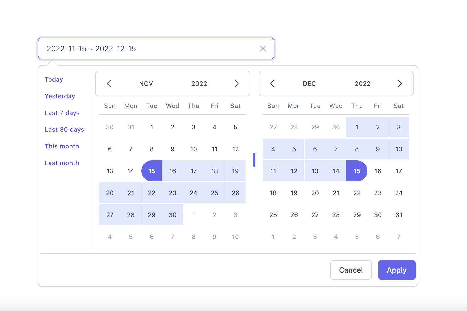
Light Mode
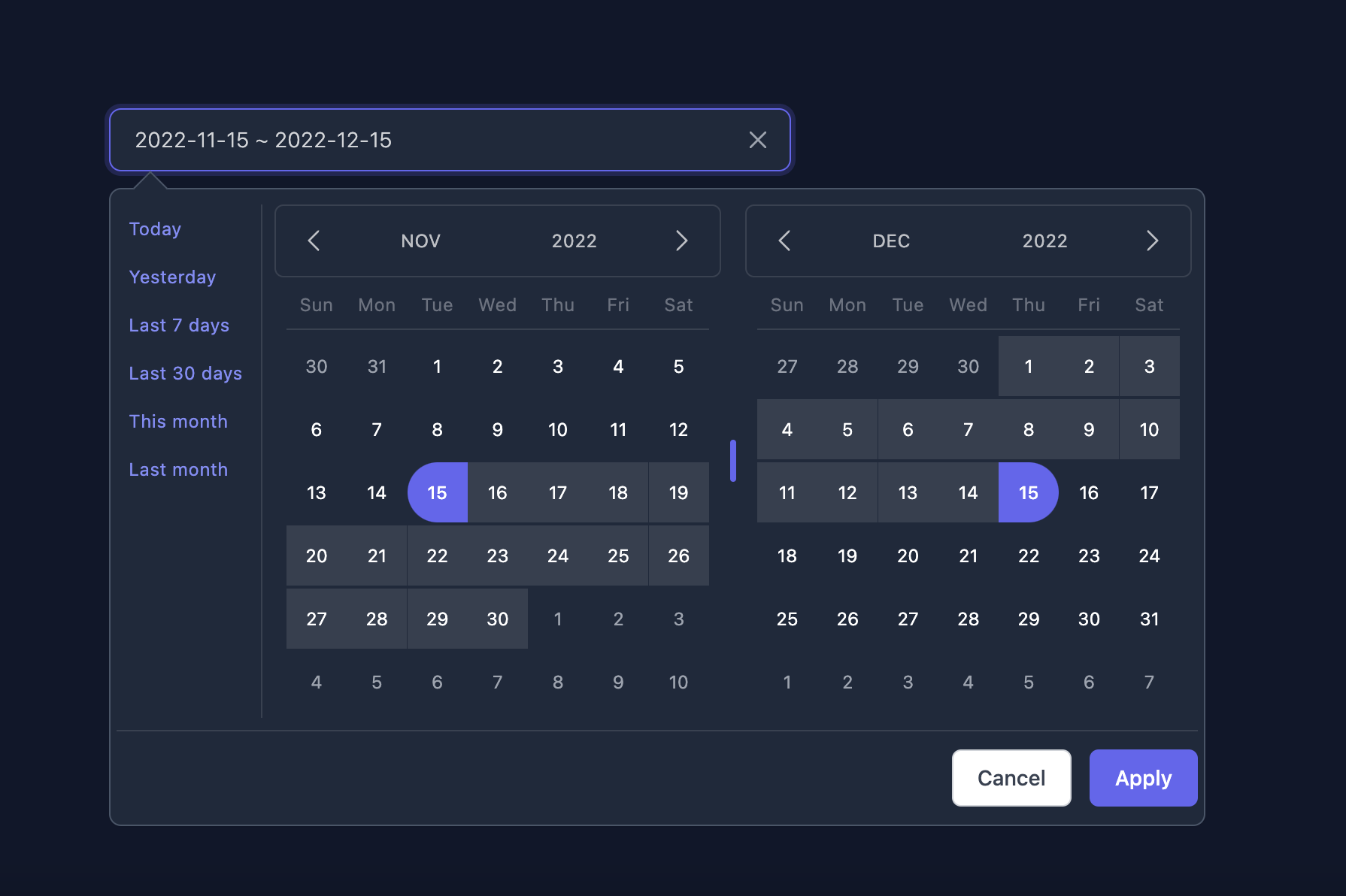
Dark Mode
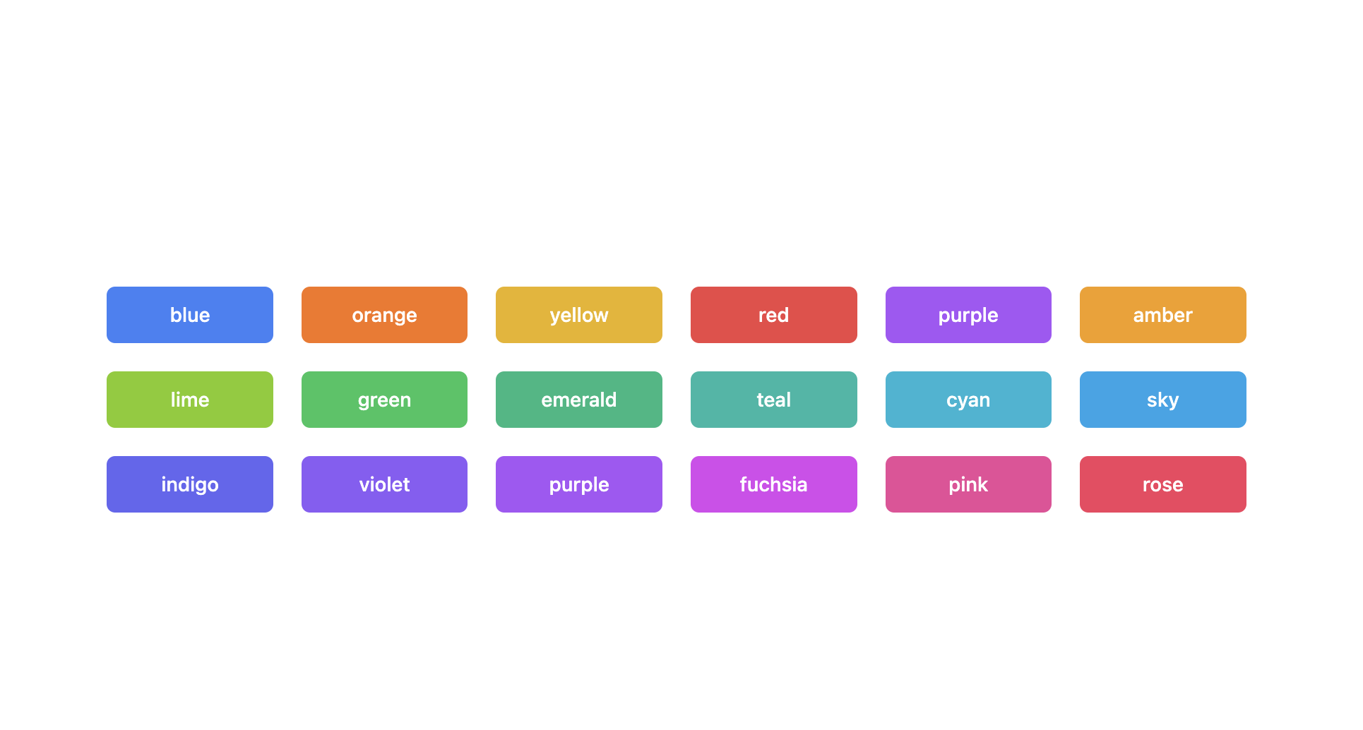
Supported themes
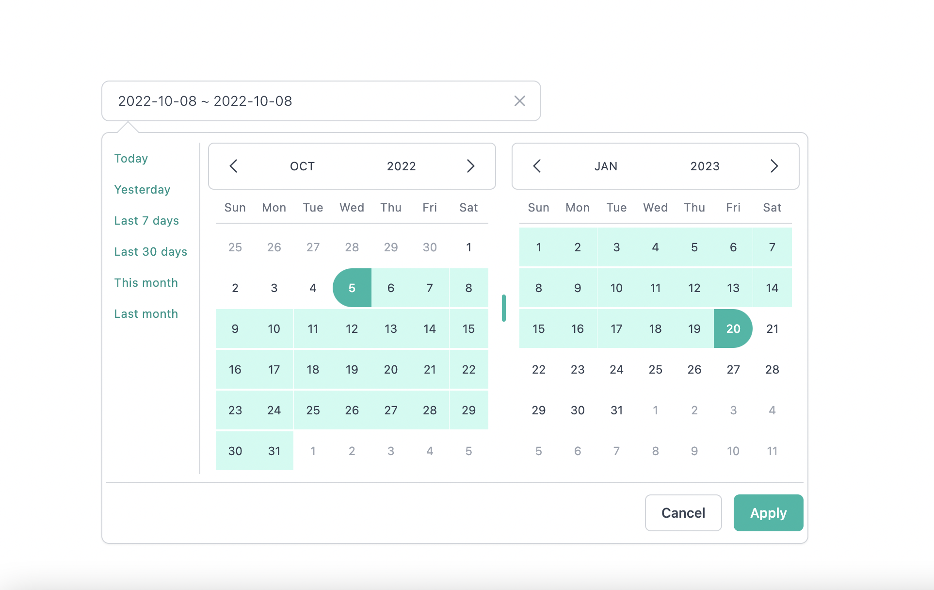
Teal themes example
You can find the demo at here
Info
👉 To discover the other possibilities offered by this library, you can consult the full documentation.
PlayGround
Clone the master branch and run commands:
# Using npm
npm install && npm dev

# Using yarn
yarn install && yarn dev
Open a browser and navigate to http://localhost:8888
Contributing
See CONTRIBUTING.md
Official Documentation repo
https://github.com/onesine/react-tailwindcss-datepicker-doc
Thanks to
I thank you in advance for your contribution to this project.
License
MIT Licensed. Copyright (c) Anonimous 2025.