Package Exports
- roundy
This package does not declare an exports field, so the exports above have been automatically detected and optimized by JSPM instead. If any package subpath is missing, it is recommended to post an issue to the original package (roundy) to support the "exports" field. If that is not possible, create a JSPM override to customize the exports field for this package.
Readme
roundy

Configurable react round slider. Supports touch events.
Installation
npm i roundy (or yarn add roundy)Usage
 You can use Roundy as a single slider:
import Roundy from 'roundy';

const {value} = this.state
<Roundy
   value={value}
   min={10}
   max={30}
   stepSize={5}
   radius={100}
   color='pink'
   onChange={value => this.setState({value})}
   onAfterChange={(value, props) => ... }
   overrideStyle={ ... string template as CSS ...}
/>
You can create pie round chart
<Roundy
arcSize={270}
min={10}
max={30}
rotationOffset={-45}
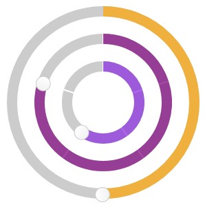
/>Or use roundy as a group of sliders:
import { RoundyGroup } from 'roundy'

<RoundyGroup sliders={[
    { value: 30, step: 10, id: 'mjaw', max: 50,  radius: 60, color: 'blueviolet', onChange:(val, props) => console.log(props) },
    { value: 30, step: 10, max: 50, radius: 100 },
    { value: 100, step: 20, max: 200, color: 'orange', radius: 140, sliced: false, step: 1 }
]} />
API
Roundy provides the following API:
| Prop | Description | Default |
|---|---|---|
| value | number: Slider value | 50 |
| min | number: Minimal value | 0 |
| max | number: Maximum value | 100 |
| stepSize | number: Step value to snap value | 0 |
| steps | number: Number of steps that will be snapable | 0 |
| radius | number: Slider radius | 100 |
| color | string: Active slider color | 'purple' |
| bgColor | string: Slider arc color | '#ccc' |
| strokeWidth | number: Slider arc width | 15 |
| thumbSize | number: Size (diameter) of thumb | 20 |
| sliced | boolean: Provide slices based on step value | true |
| onChange | function: immediate callback function (value, props) | null |
| onAfterChange | function: callback function after release (value, props) | null |
| overrideStyle | string: provide additional class style which will be injected into styled-components class | null |
| arcSize | number: Size of the arc. Default is 360, can be between 1 and 360 | 360 |
| rotationOffset | number: rotation of the whole circle. Can be between -180 and 180 | 0 |
| render | render prop function that has a signature: ({value, angle}, props) => Node | null |
Testing
TODO
Contribution
Always happy to take PRs.