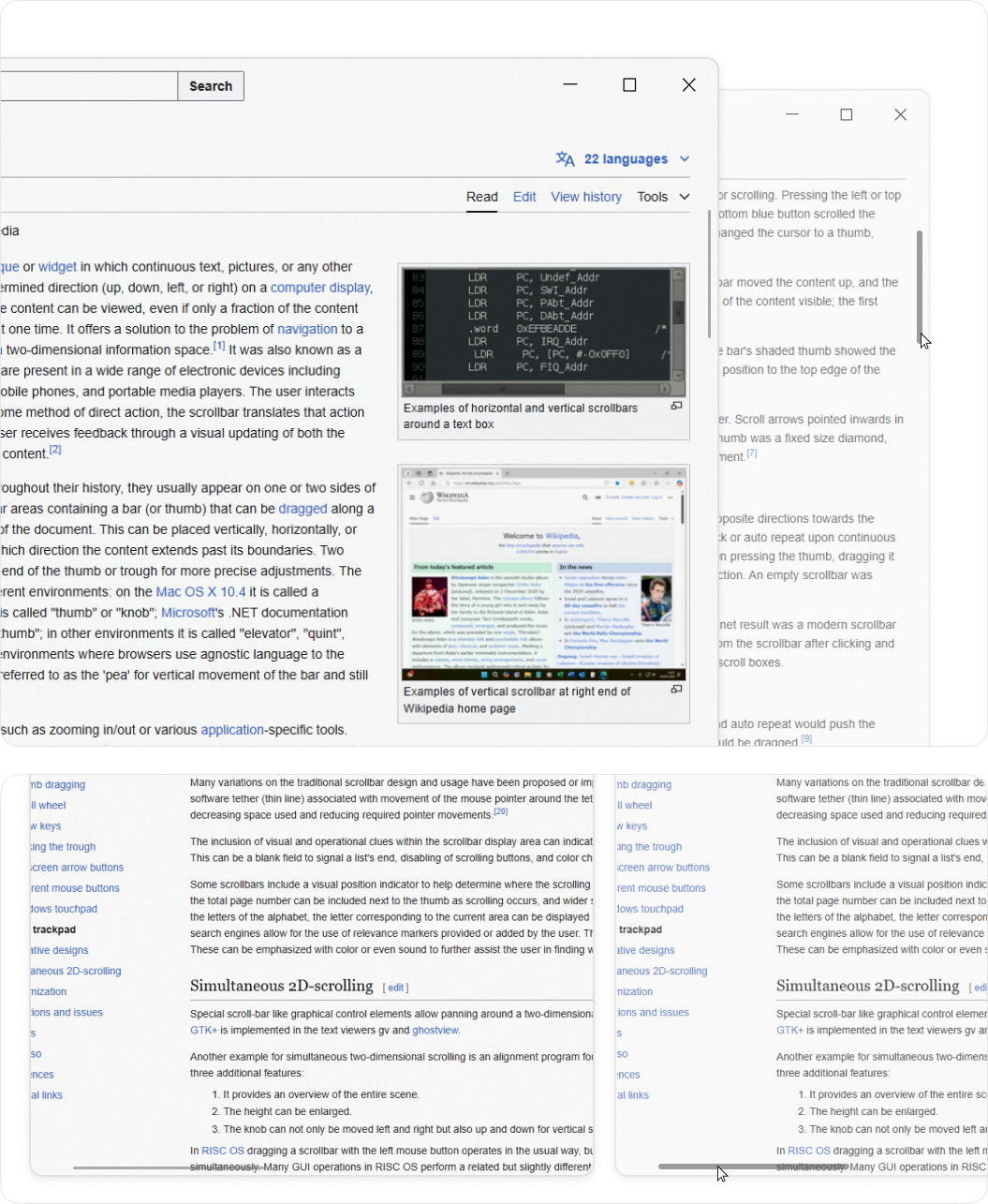
Package Exports
- scrollbar-gui-react
- scrollbar-gui-react/dist/index.js
This package does not declare an exports field, so the exports above have been automatically detected and optimized by JSPM instead. If any package subpath is missing, it is recommended to post an issue to the original package (scrollbar-gui-react) to support the "exports" field. If that is not possible, create a JSPM override to customize the exports field for this package.
Readme
Scrollbar Gui
A minimalist, modern, and lightweight React component for implementing custom scrollbars with a sleek and clean design. Perfect for projects that prioritize simplicity and elegance and create no gaps and spaces
View

Features
- Minimalist and modern scrollbar design
- Clean UI without creating unwanted gaps or spaces
- Auto-hide UI functionality for the scrollbar when not in use
- Supports both X and Y axis scrollbars
- Lightweight and easy to implement
- Seamless integration with React applications
- Customizable to fit different design needs and preferences
Usage
Below is a simple example of how to implement the ScrollbarGui component into your React app.
Basic Example
Install the package via npm:
npm install scrollbar-gui-react
Import and Use the Component in your React application:
import React from 'react';
import { ScrollbarGUI } from 'scrollbar-gui-react/dist/ScrollBar'  // Import the ScrollbarGui component

const App = () => {
  return (
    <div style={{ width: '100%', height: '100dvh' }}>
      <ScrollbarGUI>
        <div style={{ height: '100%' }}>
          {/* Your content goes here */}
        </div>
      </ScrollbarGUI>
    </div>
  );
};

export default App;
Custom CSS Styling
You can customize the styles of the scrollbar by modifying the scrollbar-gui-react component. Here’s an example of custom styling:
/* Custom CSS */
.thumb-y,
.thumb-x {
    background-color: rgba(192, 192, 192, 0.6);
}

.thumb-y.dragging,
.thumb-x.dragging {
    background-color: #c0c0c0;
}

.thumb-y.hover,
.thumb-x.hover {
    background-color: #c0c0c0;
}
Advaced CSS Styling
/* Custom Spacing */
.thumb-x{
    margin-bottom: 5px;
}

.thumb-y {
    margin-right: 5px;
}

/* Custom Height */
/* Scroll Area */
.scrollbar-x {
      height: 12px;
}
.scrollbar-y {
     width: 12px;
}

/* Scroll Unactive */
.thumb-x{
     height: 2px;
}

.thumb-y {
      width: 2px;
}

/* Scroll Active */
.scrollbar-y:hover .thumb-y,
.scrollbar-y.dragging .thumb-y,
.thumb-y:hover,
.thumb-y.dragging {
  width: 6px  ;

}

.scrollbar-x:hover .thumb-x,
.scrollbar-x.dragging .thumb-x,
.thumb-x:hover,
.thumb-x.dragging {
  height: 6px ;
}

/* Auto Hide Scrollbar */
.scroll-container:hover .scrollbar-y,
.scroll-container:hover .scrollbar-x {
  opacity: 1;

}

.scrollbar-y,
 .scrollbar-x{
  /* opacity: 0; */

  /* Adding opacity 0 auto hides scrollbar when cusror not over scroll area */
}