
Package Exports
- semantic-ui-react-labeledinput
This package does not declare an exports field, so the exports above have been automatically detected and optimized by JSPM instead. If any package subpath is missing, it is recommended to post an issue to the original package (semantic-ui-react-labeledinput) to support the "exports" field. If that is not possible, create a JSPM override to customize the exports field for this package.
Readme
semantic-ui-react-labeledinput
Input control with integrated label and validation support for Semantic UI React


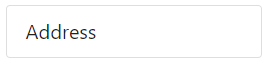
Examples of box inputs
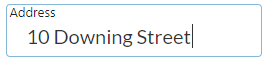
Examples of line inputs


Prerequisites
"react": "^16.0.0",
"react-dom": "^16.0.0",
"semantic-ui-react": "^0.87.0"
Installation
npm install --save semantic-ui-react-labeledinputDemo
LabeledInput demo
Example usage
import React from 'react';
import LabeledInput from 'semantic-ui-react-labeledinput';

class LabeledInputExample extends React.Component {

    constructor(props) {
        super(props);
        this.state = {
            value: ""
        };
    }

    changeValue = (newValue) => {
        this.setState({ value: newValue });
    }

    render() => {(
        <LabeledInput inputId="address" label="Address" value={this.state.value} onValueChange={this.changeValue} />
    )};
}
LabeledInput with box presentation (default presentation mode)
<LabeledInput inputId="address" label="Address" presentation="box" value={this.state.value} onValueChange={this.changeValue} />LabeledInput with line presentation
<LabeledInput inputId="address" label="Address" presentation="line" value={this.state.value} onValueChange={this.changeValue} />LabeledInput with predefined validations
<LabeledInput errorText="value must be an integer" inputId="input1" label="Age" validation="integer" value={this.state.value} onValueChange={this.changeValue} />
<LabeledInput errorText="Invalid e-mail address" inputId="input2" label="E-mail address" validation="emailAddress" value={this.state.value} onValueChange={this.changeValue} />
LabeledInput with regular expression validation
const regExp = /^\d{3,4}$/;
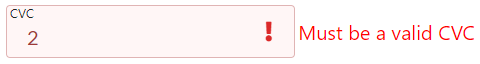
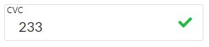
<LabeledInput inputId="input1" label="CVC" validation={regExp} value={this.state.value} onValueChange={this.changeValue} />
LabeledInput with validation function
const isEvenNumber = (valueStr) => {
    const value = parseInt(valueStr, 10);
    return value % 2 === 0;
}

<LabeledInput inputId="input1" label="Enter even number" validation={isEvenNumber} value={this.state.value} onValueChange={this.changeValue} />
LabeledInput with list of allowed values validation (case sensitive)
const allowedValues = ['value1', 'value2', 'value3'];
<LabeledInput inputId="input1" label="Enter value" validation={allowedValues} value={this.state.value} onValueChange={this.changeValue} />
More examples can be found in demo/demo.tsx file
Mandatory properties
inputId: string,  // Each input must to have a unique id
label: string,
value: string,
onValueChange: (newValue: string) => void,
Optional properties
| Property | Description |
|---|---|
| allowEmptyValue | Specifies if empty value for input is allowed |
| className | class names for outer div |
| countryCode | Default country code ISO 3166-1 Alpha-2 code for phone number validation, if not supplied, browser's country code is used |
| creditCardNumber | Credit card number to be used for CVC validation |
| disabled | Specifies if input is enabled or disabled |
| errorText | Text shown if validation fails |
| errorTextPosition | Position where error text is shown |
| focus | Specifies if input has initially focus style |
| icon | Name of Semantic UI icon to be shown in input, is overridden by validationErrorIcon or validationSuccessIcon, has no effect for validation type 'creditCardNumber |
| iconColor | Color for icon (red, orange, yellow, olive, green, teal, blue, violet, purple, pink, brown, grey, black |
| iconPosition | Position where the icon is shown |
| maxLength | Maximum number of characters allowed for input control value |
| maxValue | Maximum allowed value when validation is 'number' or 'integer' |
| minLength | Minimum number of characters needed for input control value |
| minValue | Minimum allowed value when validation is 'number' or 'interger' |
| presentation | Look & feel of input control (box or line) |
| size | Size of control |
| type | HTML input type, if undefined, sets type automatically according to validation or otherwise 'text' |
| validation | Validation keyword, a regular expression or a validation function |
| validationErrorIcon | Semantic UI icon name to be shown if validation fails, overrides icon set by icon prop, has no effect for validation type 'creditCardNumber' |
| validationSuccessIcon | Semantic UI icon name to be shown if validation succeeds, overrides icon set by icon prop, has no effect for validation type 'creditCardNumber' |
Optional property types
allowEmptyValue: boolean,
className: string,
countryCode: string,
creditCardNumber: string,
disabled: boolean,
errorText: string,
errorTextPosition: 'bottom' | 'right',
focus: boolean,
icon: string,
iconColor: string,
iconPosition: 'right',
maxLength: number,
maxValue: number,
minLength: number,
minValue: number,
presentation: 'box' | 'line',
size: 'large' | 'big' | 'huge' | 'massive',
type: string,
validation: RegExp | string[] | (inputString: string) => boolean | 'url' | 'emailAddress' | 'creditCardNumber' | 'creditCardExpiration' | 'creditCardVerificationCode' | 'number' | 'integer' | 'alphaNumeric' | 'usZipCode' | 'caPostCode' | 'ukPostCode' | 'phoneNumber' | 'usSSN' | 'ipAddress' | 'ipv4Address' | 'ipv6Address' | 'hexColor'
Default values for optional properties
allowEmptyValue: false,
className: undefined,
countryCode: '',
creditCardNumber: '',
disabled: false,
errorText: '',
errorTextPosition: 'bottom',
focus: false,
icon: '',
iconColor: undefined,
iconPosition: 'right',
maxLength: undefined,
maxValue: undefined,
minLength: undefined,
minValue: undefined,
presentation: 'box',
size: 'huge',
type: undefined,
validation: undefined
Class names
| Class name | Description |
|---|---|
| errorLabel | Applied to div that contains error label, see following styling examples how it can be used to style error messages |
| focusedOrValued | Applied to input label when input has focus or it contains a value. This class name can be used to adjust label top offset (default: 2px) or font size, for example. |
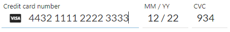
Box input styling example
styles.css
.creditCardNumber .ui.label.errorLabel, .creditCardExpiration .ui.label.errorLabel, .cvc .ui.label.errorLabel {
  font-size: 0.9em;
}

.creditCardNumber input {
  width: 14em;
}

.creditCardExpiration {
  margin-left: 0.5em;
}

.creditCardExpiration input {
  width: 6em;
}

.cvc {
  margin-left: 0.5em;
}

.cvc input {
  margin-left: 0.5em;
  width: 4.5em;
}
Applying CSS using className
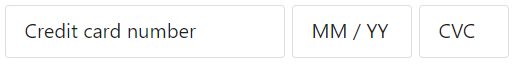
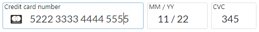
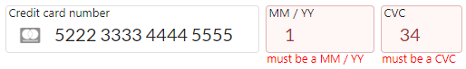
<LabeledInput className="creditCardNumber" inputId="creditCardNumber" label="Credit card number" errorText="must be a cc number" presentation="box" validation="creditCardNumber" onValueChange={this.changeCreditCardNumber} value={creditCardNumber}/>
<LabeledInput className="creditCardexpiration" inputId="creditCardExpiration" label="MM / YY" errorText="must be a MM / YY" presentation="box" validation="creditCardExpiration" onValueChange={this.changeCreditCardExpiration} value={creditCardExpiration}/>
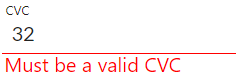
<LabeledInput className="cvc" inputId="cvc" label="CVC" errorText="must be a CVC" presentation="box" validation="creditCardVerificationCode" onValueChange={this.changeCVC} value={cvc}/>Line input styling example

styles.css
.creditCardNumber .ui.label.errorLabel, .creditCardExpiration .ui.label.errorLabel, .cvc .ui.label.errorLabel {
  font-size: 0.7em;
}

.creditCardNumber input {
  width: 13.5em;
}

.creditCardExpiration {
  margin-left: 0.5em;
}

.creditCardExpiration input {
  width: 4.5em;
}

.cvc {
  margin-left: 0.5em;
}

.cvc input {
  margin-left: 0.5em;
  width: 3.5em;
}
Applying CSS using className
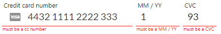
<LabeledInput className="creditCardNumber" inputId="creditCardNumber" label="Credit card number" errorText="must be a cc number" presentation="line" validation="creditCardNumber" onValueChange={this.changeCreditCardNumber} value={creditCardNumber}/>
<LabeledInput className="creditCardexpiration" inputId="creditCardExpiration" label="MM / YY" errorText="must be a MM / YY" presentation="line" validation="creditCardExpiration" onValueChange={this.changeCreditCardExpiration} value={creditCardExpiration}/>
<LabeledInput className="cvc" inputId="cvc" label="CVC" errorText="must be a CVC" presentation="line" validation="creditCardVerificationCode" onValueChange={this.changeCVC} value={cvc}/>
Credit card validations
Supported cards
- American Express
- Dankort
- Diners Club
- Discover
- JCB
- Laser
- Maestro
- MasterCard
- UnionPay
- Visa
- Visa Electron
Credit card number must pass Luhn check
Credit card expiration is supported in format 'MM / YY'
Credit card verification code (CVC) can validated with two options
- Without credit card number: it must be 3-4 digits
- With credit card number: it must be 3-4 digits depending on the supplied credit card type
License
MIT License