
Package Exports
This package does not declare an exports field, so the exports above have been automatically detected and optimized by JSPM instead. If any package subpath is missing, it is recommended to post an issue to the original package (slidev-theme-unicorn) to support the "exports" field. If that is not possible, create a JSPM override to customize the exports field for this package.
Readme
slidev-theme-unicorn

A Unicorn theme for Slidev.
This theme is based on dawntraoz.com website design.
Live demo: https://unicorn-theme.dawntraoz.com/
Install
Add the following frontmatter to your slides.md. Start Slidev then it will prompt you to install the theme automatically.
---
theme: unicorn
---
Learn more about how to use a theme.
Layouts
This theme provides the following layouts:
Common properties
By default any layout will contain a header and a footer expecting:
---
logoHeader: 'https://www.dawntraoz.com/images/logo.svg'
website: 'dawntraoz.com'
handle: 'dawntraoz'
---
If you don't add this property it will be an empty slide expecting your content:
| With properties | Without properties |
|---|---|
 |
 |
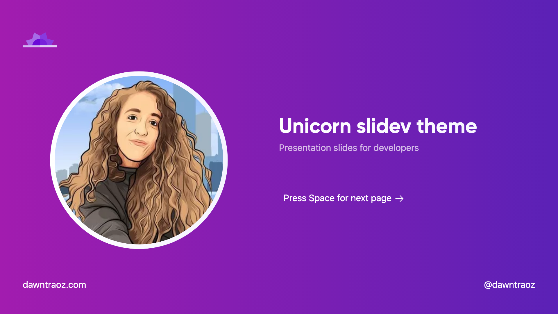
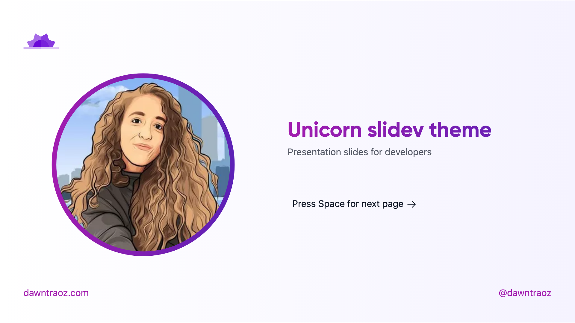
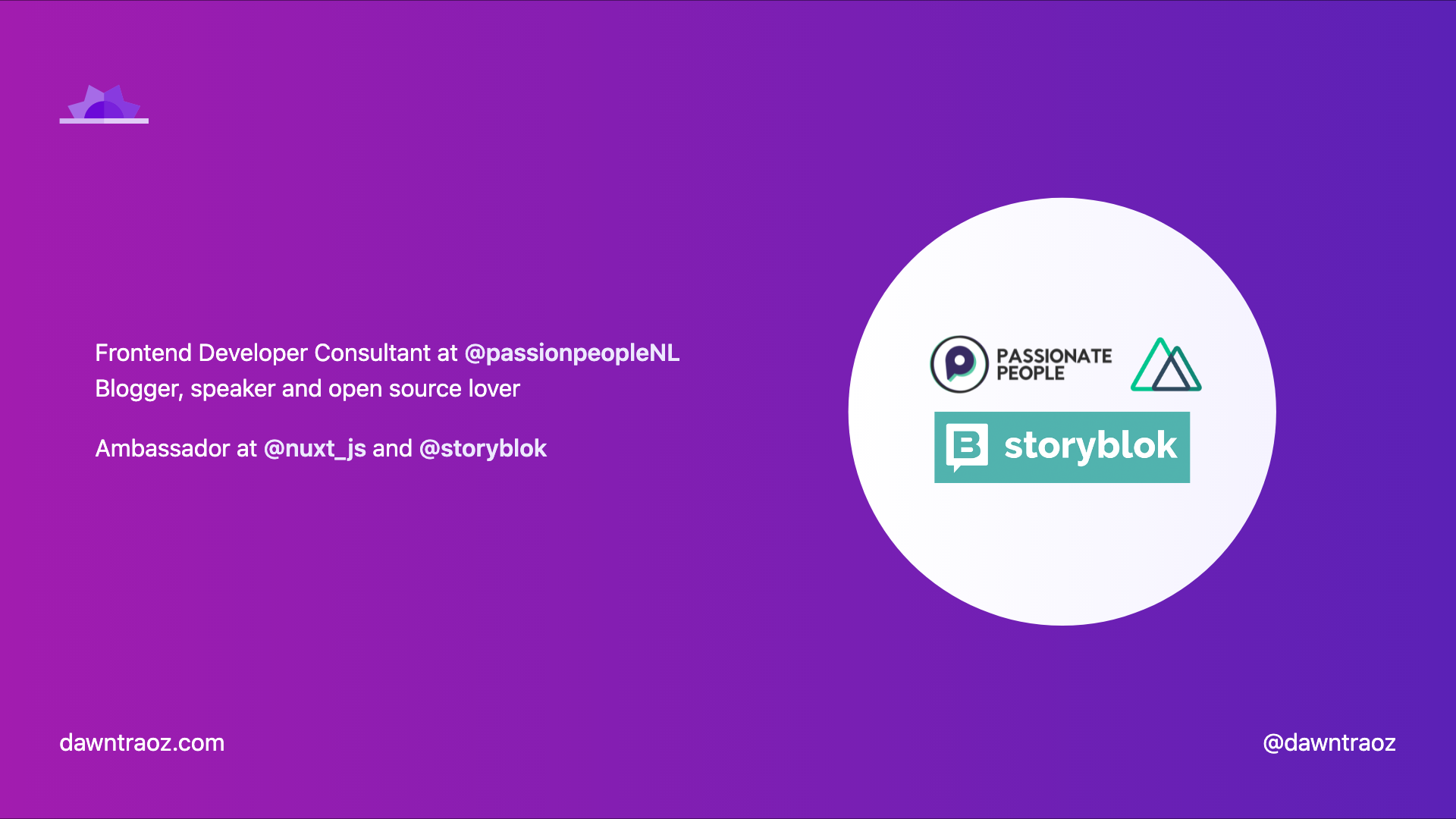
Intro intro
Usage:
- Add
introin the layout field. - Add your profile image in the
introImagefield.
---
layout: intro
introImage: 'https://img2.storyblok.com/312x312/filters:format(webp)/f/79165/400x400/1082ff0d24/dawntraoz-alba-silvente.jpg'
---| Dark | Light |
|---|---|
 |
 |
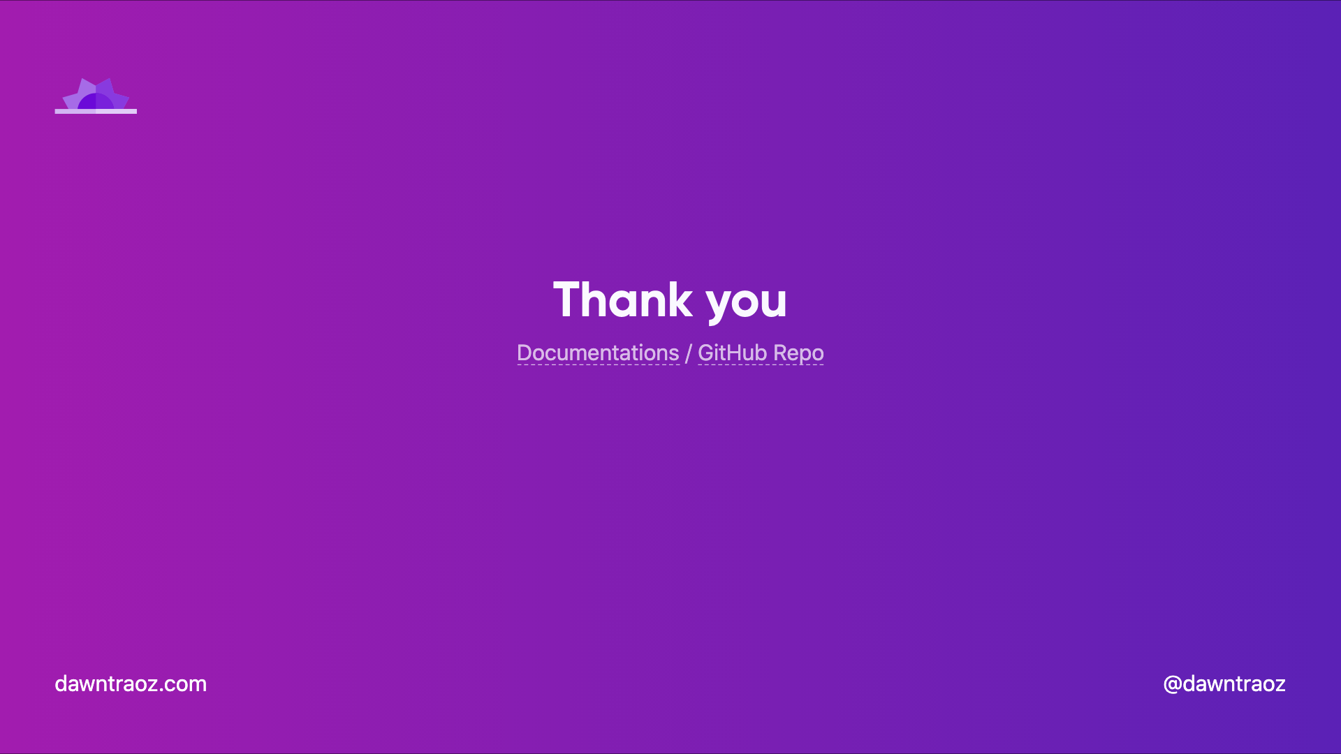
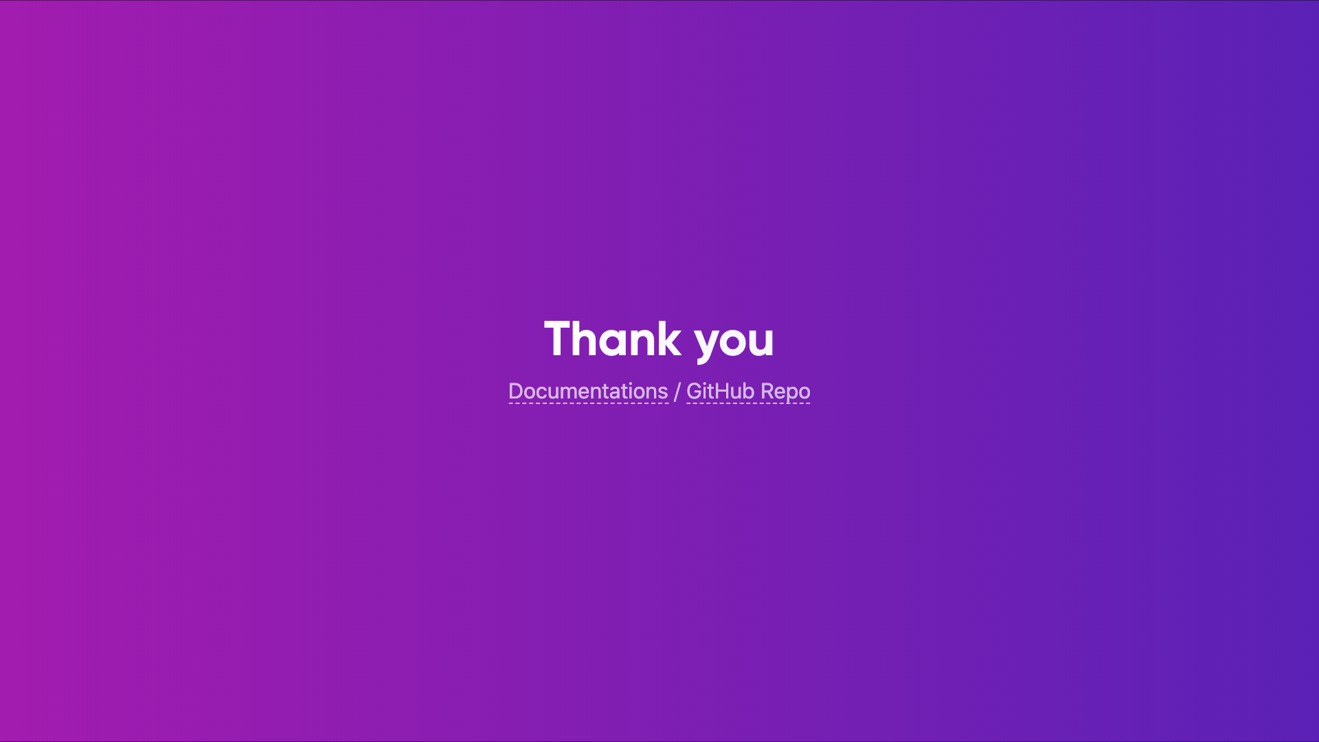
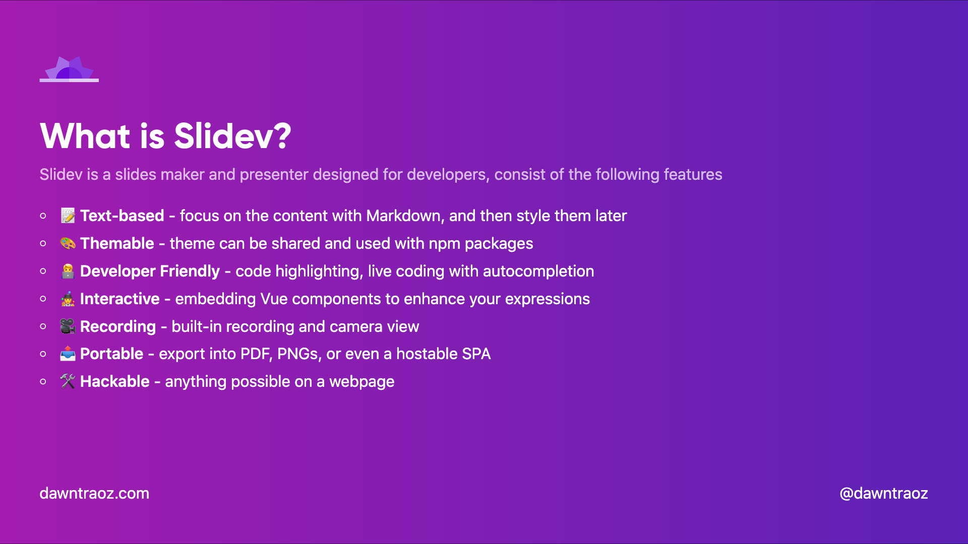
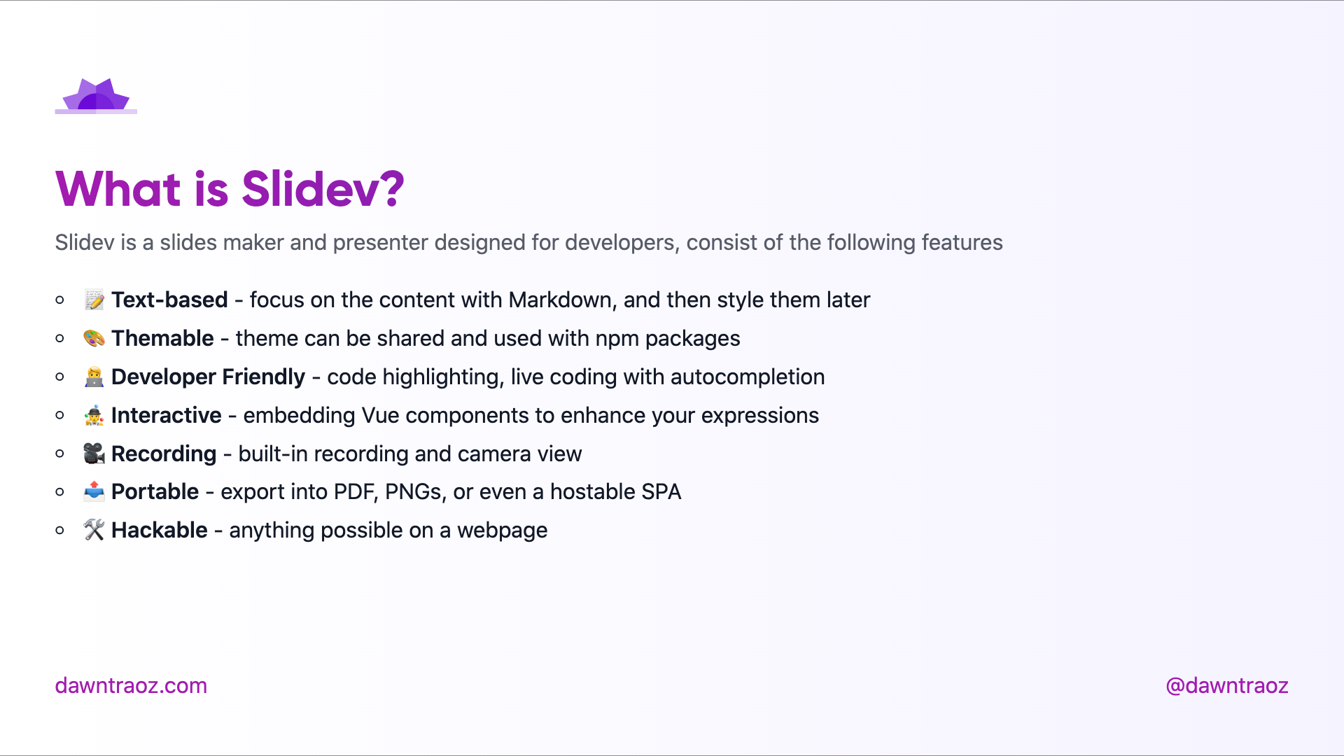
Default cover
Cover is the default layout when none is specified.
Usage:
---
layout: cover
---| Dark | Light |
|---|---|
 |
 |
Presentation cover-logos
Usage:
- Add
cover-logosin the layout field. - Add an Array of logo URLs in the
logosfield.
---
layout: cover-logos
logos: [
  'https://img2.storyblok.com/588x0/filters::format(webp)/f/86387/x/21aa32ed18/logo-normal.svg',
  'https://nuxtjs.org/logos/nuxt-emoji.png',
]
---| Dark | Light |
|---|---|
 |
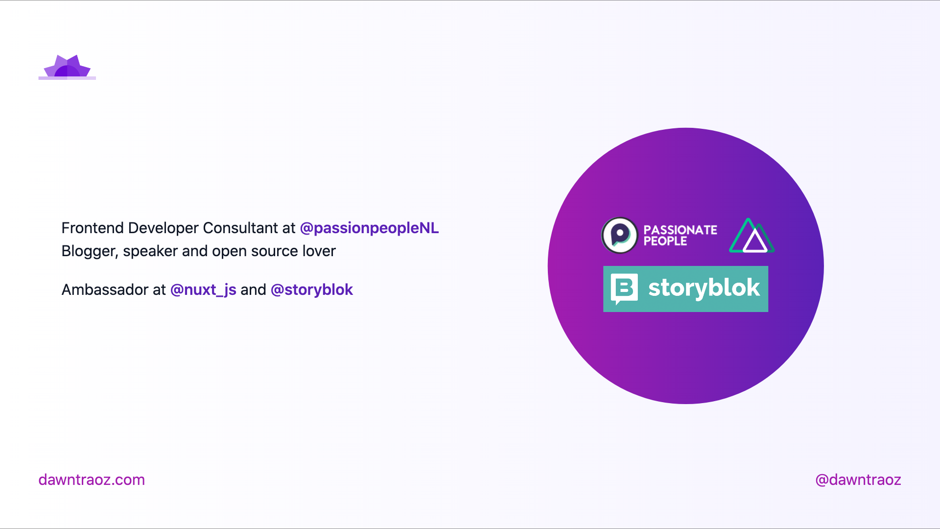 |
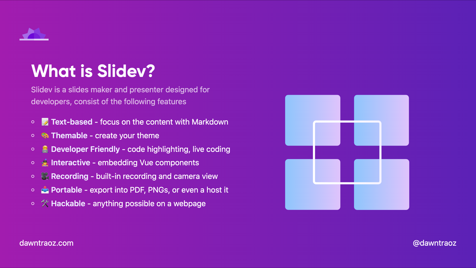
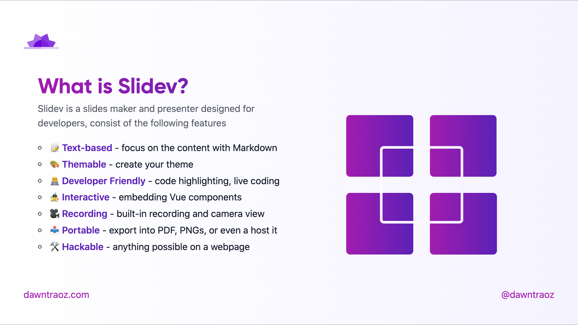
Table of contents table-contents
Usage:
- Add
table-contentsin the layout field. - Add an Array of hexadecimal colours in the
gradientColorsfield to fill the illustration.
---
layout: table-contents
gradientColors: ['#8EC5FC', '#E0C3FC']
---| Dark (added gradient) | Light (default gradient) |
|---|---|
 |
 |
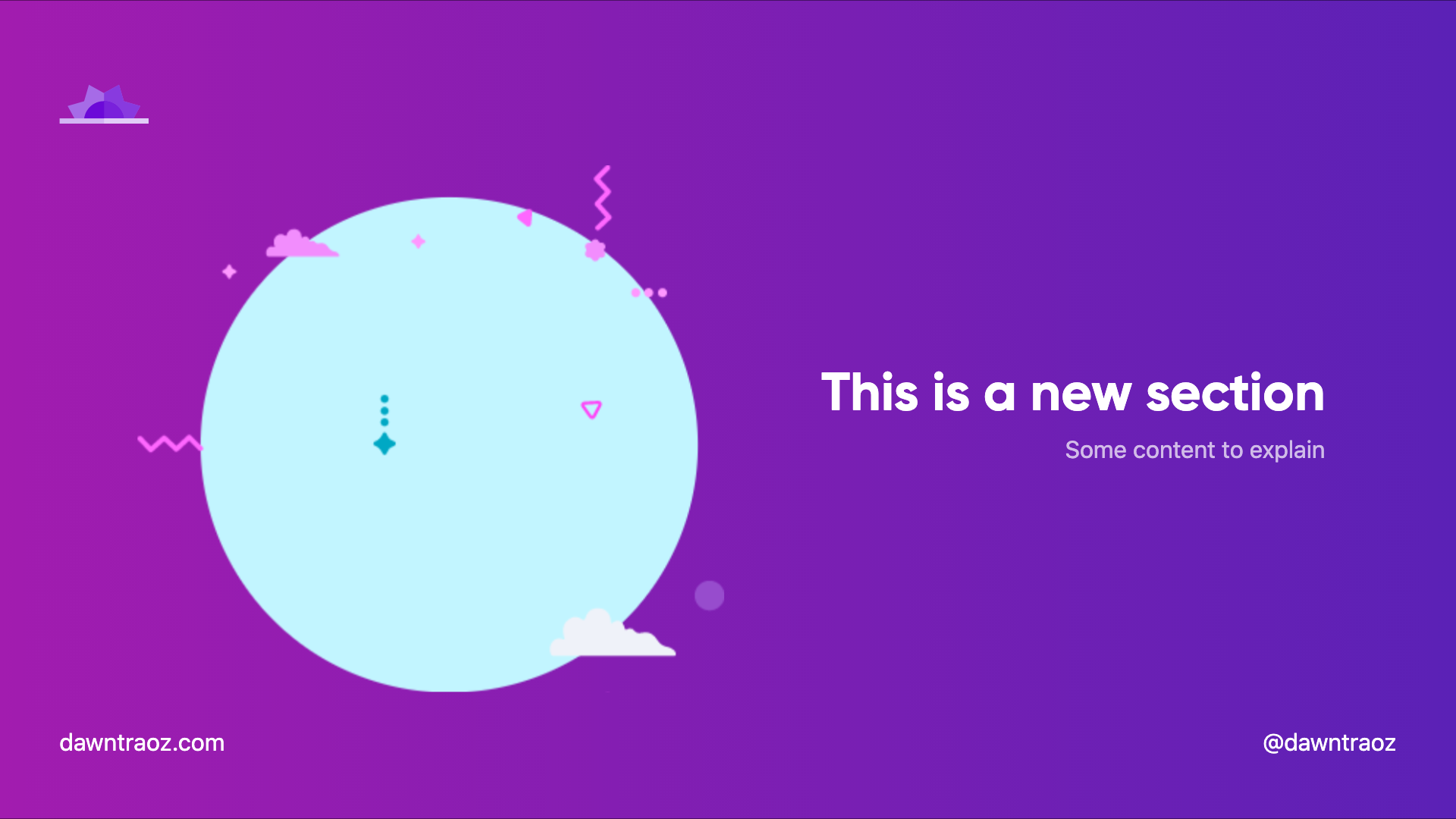
New section slide new-section
Always in dark version
Usage:
- Add
new-sectionin the layout field.
---
layout: new-section
---| Dark | Light |
|---|---|
 |
|
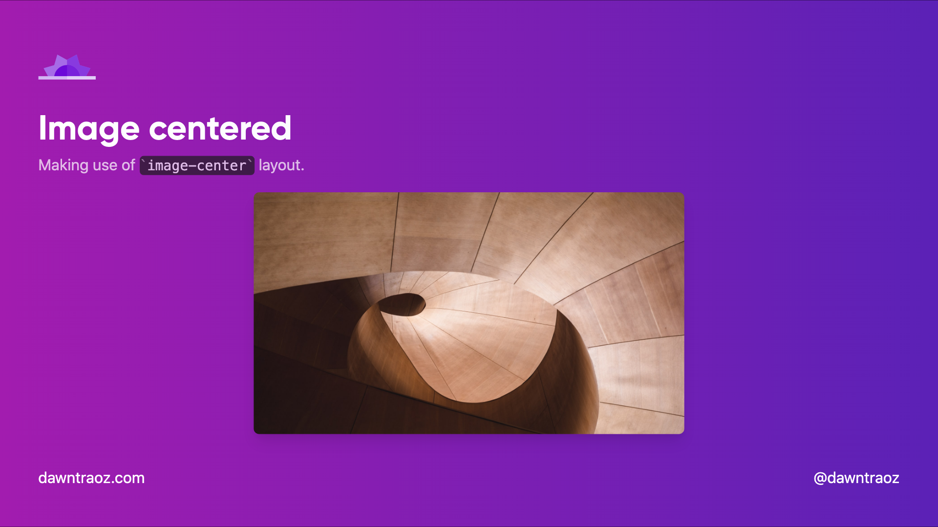
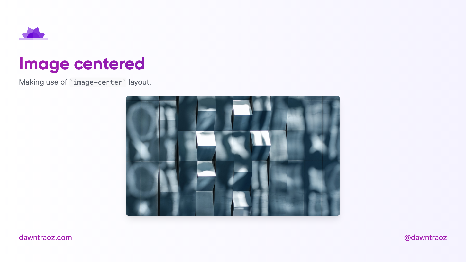
Image Centered image-center
The content will be place before the image, you can add a title, subtitle to give context to the image.
---
layout: image-center
image: 'https://source.unsplash.com/collection/94734566/1920x1080'
imageWidth: '450'
imageHeight: '950'
---| Dark | Light |
|---|---|
 |
 |
Text centered center
---
layout: center
---| Dark | Light |
|---|---|
|
 |
Contributing
pnpm installpnpm devto start theme preview ofexample.md- Edit the
example.mdand style to see the changes pnpm exportto generate the preview PDFpnpm screenshotto generate the preview PNG