
Package Exports
This package does not declare an exports field, so the exports above have been automatically detected and optimized by JSPM instead. If any package subpath is missing, it is recommended to post an issue to the original package (storybook-plugin-labels) to support the "exports" field. If that is not possible, create a JSPM override to customize the exports field for this package.
Readme
Fork of https://github.com/etchteam/storybook-addon-status with updated deps versions and with seprecated statuses in the tree

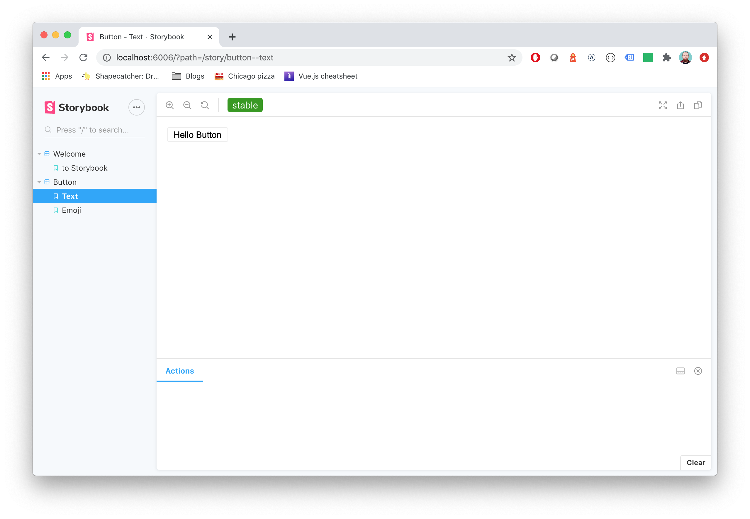
Storybook Addon Status
Storybook Status Addon can be used to add a component status label in Storybook.
Installation
npm install @etchteam/storybook-addon-status --save-devConfiguration
Then create a file called main.js in your storybook config.
Add the following content to it:
module.exports = {
  addons: ['@etchteam/storybook-addon-status'],
};
In preview.js you can globally configure custom status configurations, or overwrite the built in "beta", "deprecated", "stable" & "releaseCandidate"
export const parameters = {
  status: {
    statuses: {
      released: {
        background: '#0000ff',
        color: '#ffffff',
        description: 'This component is stable and released',
      },
    },
  },
};
Story Usage
Then write your stories like this:
.js
import React from 'react';

export default {
  title: 'BetterSoftwareLink',
  parameters: {
    status: {
      type: 'beta', // 'beta' | 'stable' | 'deprecated' | 'releaseCandidate'
      url: 'http://www.url.com/status', // will make the tag a link
      statuses: {...} // add custom statuses for this story here
    }
  },
};

export const defaultView = () => (
  <a href="https://makebetter.software">Make Better Software</a>
);
For multiple statuses type also accepts array values. If not specifically set every status uses status.url as the linked Url.
status: {
  type: ['beta', 'released', 'myCustomStatus', { name: 'stable', url: 'http://www.example.com' }],
  // url, statuses ...
}
NOTE: The status dot in the sidebar only shows the color of the first status.
.mdx (using addon-docs)
import { Meta } from "@storybook/addon-docs/blocks";
<Meta title="BetterSoftwareLink" parameters={{ status: { type: 'beta' } }}  /> // 'beta' | 'stable' | 'deprecated' | 'releaseCandidate'
...
You'll get an awesome label injected in the top toolbar and the sidebar.
Note the type will be used as label for tag and will convert camelCase to words (release)
Made with ☕ at Etch