
Package Exports
- tailwind-inverted-border
- tailwind-inverted-border/index.js
This package does not declare an exports field, so the exports above have been automatically detected and optimized by JSPM instead. If any package subpath is missing, it is recommended to post an issue to the original package (tailwind-inverted-border) to support the "exports" field. If that is not possible, create a JSPM override to customize the exports field for this package.
Readme
Tailwind CSS Inverted Border Plugin
A Tailwind CSS plugin that adds utilities for creating inverted borders - circular cutouts in the corners of elements that create a unique visual effect.
Installation
- Install the plugin via npm:
npm install tailwindcss-inverted-border- Add the plugin to your
tailwind.config.js:
module.exports = {
    plugins: [require("tailwindcss-inverted-border")],
};
Usage
The plugin provides two types of utilities:
1. Inverted Border Size
Use inverted-border-{size} to set the size of the inverted border. This uses your theme's border radius values.
<div class="inverted-border-xl">
    <!-- Content -->
</div>
Available sizes correspond to your Tailwind border radius theme values:
inverted-border-sminverted-border-mdinverted-border-lginverted-border-xlinverted-border-2xl- etc.
2. Inverted Border Color
Use inverted-border-{color} to set the color of the inverted border. This uses your theme's color palette.
<div class="inverted-border-blue-500">
    <!-- Content -->
</div>
Examples
<!-- Basic usage -->
<div class="inverted-border-2 inverted-border-blue-500">
Basic inverted border
</div>
<!-- Larger size -->
<div class="inverted-border-4 inverted-border-purple-600">
Larger inverted border
</div>
<!-- Combined with other utilities -->
<div class="p-4 bg-gray-100 inverted-border-2 inverted-border-black">
Styled element with inverted border
</div>
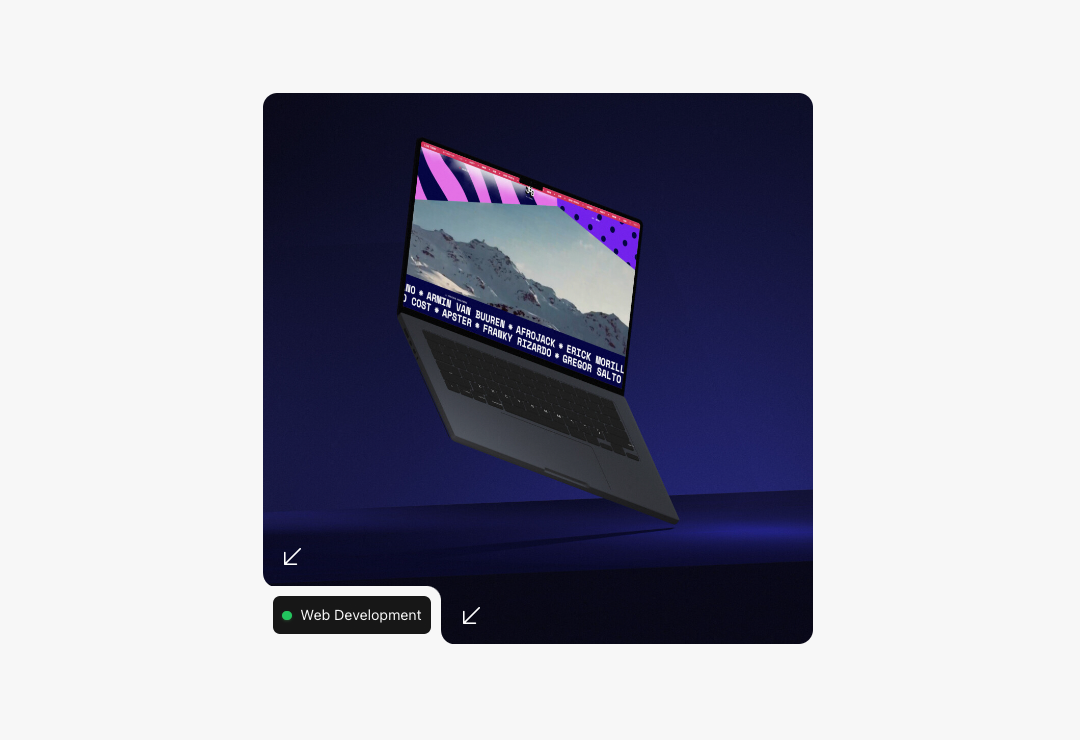
<!-- Styling as the header image -->
<div class="aspect-square rounded-xl relative overflow-hidden bg-white">
<div class="absolute left-0 bottom-0">
<div class="inverted-border-xl inverted-border-gray-900 -rotate-90 flex-none -mb-px"></div>
<div class="flex items-end">
<div class="bg-gray-900 p-2 rounded-tr-xl text-xs flex gap-2">
<div class="rounded-md bg-white p-2 text-gray-900">
Web Development
</div>
</div>
<div class="inverted-border-xl inverted-border-gray-900 -rotate-90 flex-none -mb-px"></div>
</div>
</div>
</div>How It Works
The plugin creates a radial gradient that forms a circular cutout in the corner of the element. It:
- Uses CSS custom properties for dynamic color control
- Maintains a 1:1 aspect ratio for consistent circles
- Creates proper stacking context using
isolation: isolate - Supports all colors from your Tailwind theme
Configuration
The plugin uses your existing Tailwind configuration for:
- Border radius values (for sizes)
- Color palette (for border colors)
No additional configuration is required, but you can customize the available values by modifying your theme's borderRadius and colors settings.
Browser Support
This plugin works in all modern browsers that support:
- CSS Custom Properties
- Radial Gradients
- Aspect Ratio
License
MIT
Contributing
Contributions are welcome! Please feel free to submit a Pull Request.