Package Exports
- testing-responsively
This package does not declare an exports field, so the exports above have been automatically detected and optimized by JSPM instead. If any package subpath is missing, it is recommended to post an issue to the original package (testing-responsively) to support the "exports" field. If that is not possible, create a JSPM override to customize the exports field for this package.
Readme
Responsively
Responsively is created with the intention to easily adjust components with a responsive, mobile-first approach in mind; it may resemble single purpose classes (e.g. .mt-0, or .mt-0--mobile).
This library plays nicely with emotion and styled components since the code output is string.
Usage
Responsively adjust the value of the passed property according to passed breakpoints. Breakpoints can be defined on a component/page basis, but it can also be defined across the whole app, depending on one's needs.
Simple flow
- Define breakpoints for responsively
- Call
responsivelywith desired property and its responsive values - Done 😇
import React from 'react';
import { css } from 'react-emotion';
import responsively from 'responsively';

const responsive = responsively([480, 768, 990, 1170]);

const baseStyles = css`${responsive('margin-top')([10, 20, 30, 40, 50])};`;

// or, add responsively directly to component

<Component className={css`${responsive('margin-top')([10, 20, 30, 40, 50])};`} />
Use Responsively as component props
Another handy approach is to integrate responsively in component:
import React from 'react';
import PropTypes from 'prop-types';
import styled, { css } from 'react-emotion';
import responsively from 'responsively';

const responsive = responsively([480, 768, 990, 1170]);

const baseStyles = ({ property, values }) =>
  css`
    ${responsive(property)(values)};
  `;

const BoxStyles = styled('div')(baseStyles);

/**
 * Box component
 */
const Box = ({ property, values }) => <BoxStyles property={property} values={values} {...props} />;

Box.propTypes = {
  property: PropTypes.string.isRequired,
  values: PropTypes.array.isRequired,
};

export default Box;
and then define its propery and values as props:
import Box from '../ui';

...

<Box property="margin" values={[10, 20, 30, 40, 50]}>
  <h1>Section Heading</h1>
</Box>
Install
npm i responsively -S
or,
yarn add responsively
API
responsively([breakpointsArray])(propertyName)([propertyArrayValues]);Arguments
breakpointsArray— An array of breakpoint valuespropertyName— CSS property namepropertyArrayValues— An array of values which maps to provided breakpoints. By default, the first value is applied without a media query, while the rest of the values are applied as children of media query selectors.
breakpointsArray and propertyArrayValues values
- Support all unit kinds (px, em, rem, vw, vh, %, etc.).
If a unitless value is passed, it will automatically be converted topx. CSS properties with unitless values are processed as is (e.g.line-height: 1.5;orflex: 1;).
responsive('margin-top')([10, 20, 30, '4em', '5rem']);will yield:
margin-top: 10px;
@media screen and (min-width: 480px) {
  margin-top: 20px;
}
@media screen and (min-width: 768px) {
  margin-top: 30px;
}
@media screen and (min-width: 990px) {
  margin-top: 4em;
}
@media screen and (min-width: 1170px) {
  margin-top: 5rem;
}- Clean output
The number of generated breakpoints depends on the number of passed property values.
responsive('margin')([10]);
responsive('padding')([10, 20]);
will yield:
margin: 10px;
padding: 10px;
@media screen and (min-width: 480px) {
  margin-top: 20px;
}- Shorthand values per breakpoint
responsive('margin')(['10px 20px']);will yield:
margin: 10px 20px;- Correction for common typos
responsive('margin')(['10 20']);
responsive('padding')(['10px']);
will yield:
margin: 10px 20px;
padding: 10px;
Warning message
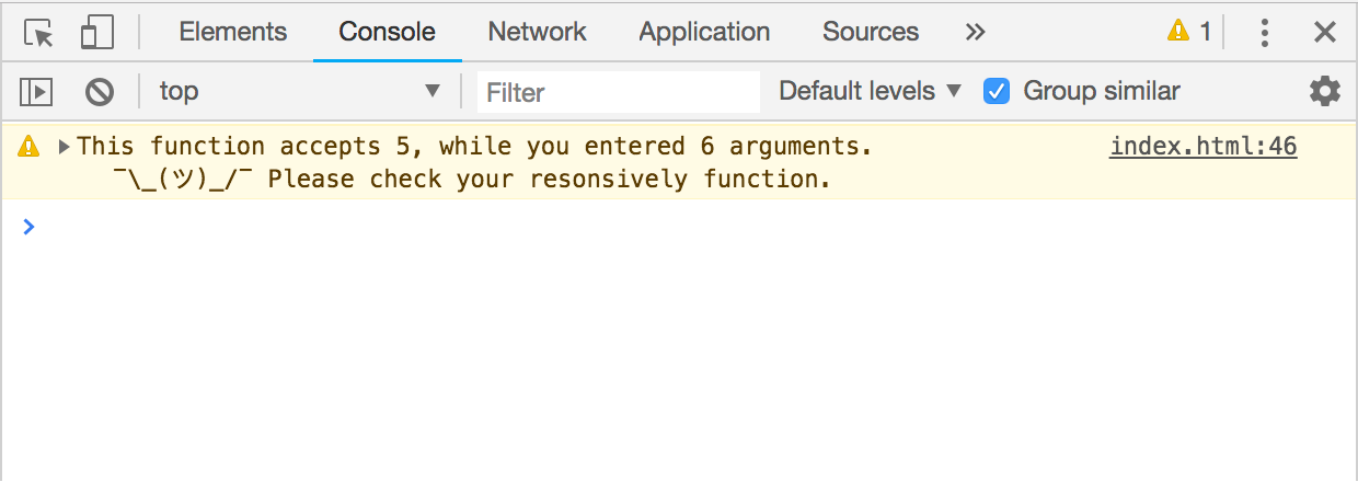
In case one passed more property values then there are breakpoint values, responsively provides the warning in the browser's console.
const responsive = responsively([480, 768, 990, 1170]);
responsive('padding')([10, 20, 30, 40, 50, 60]); // first argument is `default value`
will compile the code, but the last value will be nested in undefined breakpoint:
...

@media screen and (max-width: undefined) {
  padding: 60px;
}
Console warning message:

Skipping breakpoint
If particular breakpoint needs to be skipped, undefined value should be passed:
const responsive = responsively([480, 768, 990, 1170]);
responsive('padding')([undefined, 20, undefined, undefined, 60]);
will yield:
...

@media screen and (max-width: 480px) {
  padding: 20px;
}
@media screen and (max-width: 1170px) {
  padding: 60px;
}
TODO
- Merge exact shorthand values, e.g.
'10 10' → 10px -
¯\_(ツ)_/¯