Package Exports
- tw-elements-react
- tw-elements-react/dist/css/tw-elements-react.min.css
- tw-elements-react/dist/js/tw-elements-react.es.min.js
- tw-elements-react/dist/js/tw-elements-react.umd.min.js
- tw-elements-react/dist/plugin.cjs
This package does not declare an exports field, so the exports above have been automatically detected and optimized by JSPM instead. If any package subpath is missing, it is recommended to post an issue to the original package (tw-elements-react) to support the "exports" field. If that is not possible, create a JSPM override to customize the exports field for this package.
Readme
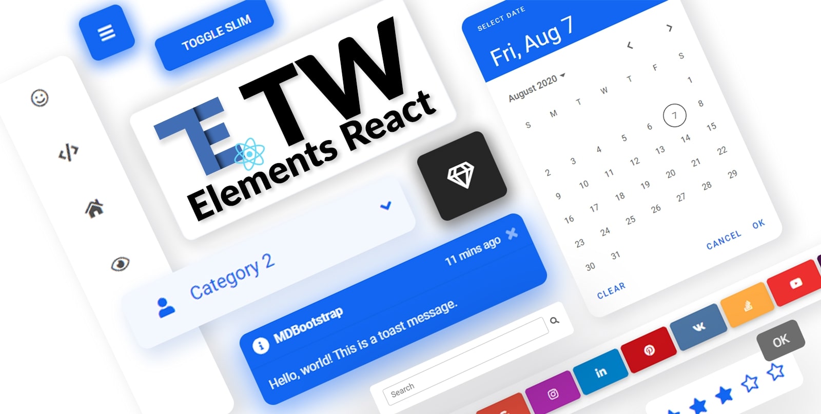
TW Elements React 


TW Elements React is a huge collection of free, interactive React components for Tailwind CSS.
|
|
Table of Contents
Community
TW Elements is a community-driven project. We invite you to track our live progress 👁️ on the upcoming release.
In the meantime you can also:
- Motivate us with some words of encouragament ❤️
- Share your ideas & feature requests 💡
- Aks for help & help others in our community support 🙏
- Engage, discuss & have fun in our open-source community 💬
If you want to help the project grow, start by simply sharing it with your peers!
- Share via Dev.to
- Share via Twitter
- Share via Facebook
- Share via LinkedIn
- Share via Pinterest
- Share via Reddit
- Share via StumbleUpon
- Share via Vkontakte
- Share via Weibo
- Share via Hackernews
- Share via Gmail
- Share via email
](https://tw-elements.com/docs/react/)%20%20%20%20%20%20%20%20\n%20%20%20%20%20%20%20%20%20%20%20%20%20%20%20%20%20%20%20%20%20%20%20%20I%27d%20like%20to%20share%20my%20latest%20discovery%20with%20you.%20\n%20%20%20%20%20%20%20%20[Tailwind%20Elements](https://tw-elements.com/docs/react/)%20is%20currently,%20the%20most%20popular%203rd%20party%20UI%20kit%20for%20TailwindCSS%20with%20over%2010k%20Github%20stars.%20%20%20%20%20%20%20%20[](https://github.com/mdbootstrap/TW-Elements/)%20%20%20%20%20%20%20%20It%27s%20a%20**huge%20collection%20of%20stunning%20components**%20made%20with%20attention%20to%20the%20smallest%20detail.%20%20%20%20%20%20%20%20%20Forms,%20cards,%20buttons,%20and%20hundreds%20of%20others.%20%20%20%20%20%20%20%20%20All%20components%20have%20**dark%20mode**%20and%20very%20intuitive%20**theming%20options**.%20%20%20%20%20%20%20%20The%20project%20is%20supported%20by%20an%20[engaged%20community%20on%20GitHub](https://github.com/mdbootstrap/TW-Elements/discussions),%20I%20recommend%20you%20check%20it%20out%20and%20join%20one%20of%20the%20many%20discussions.%20%20%20%20%20%20%20%20\n%20%20%20%20%20%20%20%20You%20will%20find%20installation%20instructions%20[here](https://tw-elements.com/docs/react/getting-started/installation),%20and%20you%20can%20track%20the%20progress%20of%20the%20project%20live%20%20%20%20%20%20%20%20%20[here](https://tw-elements.com/docs/react/getting-started/changelog/).%20%20%20%20%20%20%20%20\n%20%20%20%20%20%20%20%20The%20project%20was%20kickstarted%20by%20@MDBootstrap,%20a%20group%20of%20open-source%20developers%20behind%20[MDB%20UI%20Kit](https://github.com/mdbootstrap/mdb-ui-kit)%20-%20a%20high-quality%20UI%20kit%20for%20Bootstrap,%20and%20also%20behind%20[MDB%20GO](https://mdbgo.com/)%20-%20hosting%20and%20deployment%20platform.%20%20%20%20%20%20%20%20\n%20%20%20%20%20%20%20%20I%20highly%20recommend%20you%20to%20check%20it%20out!%20%20%20%20%20%20%20%20\n%20%20%20%20%20%20%20%20%7B%25%20link%20mdbootstrap/tw-elements-breakthrough-version-is-here-59hh%20%25%7D%20%20%20%20%20%20%20%20\n)
Thank you!
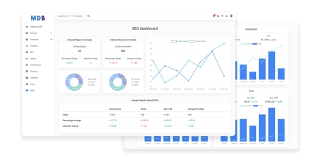
Coming soon
Check out the upcoming features - watch our social profiles to get early access!
|
|

|
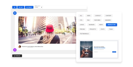
| Drag & drop builder | Templates | Design blocks |
Components
A collection of stunning components made with attention to the smallest details. Forms, cards, buttons, and hundreds of others – in TW Elements React you will find all the essential elements necessary for every project.
|
|
|
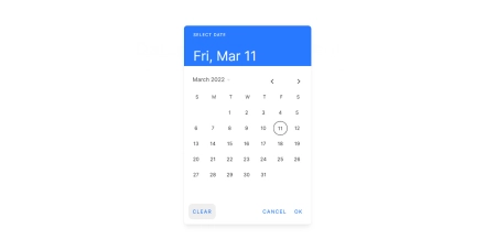
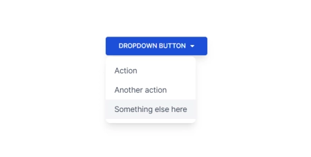
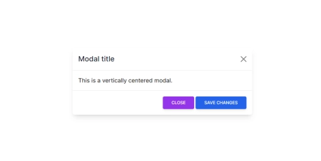
| Datepicker (coming soon) | Dropdown (coming soon) | Modal |
|
|
|
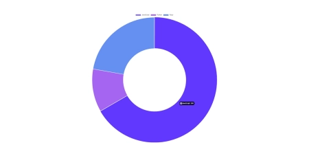
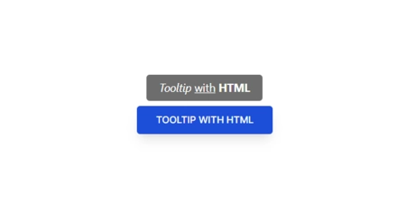
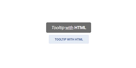
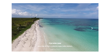
| Charts (coming soon) | Tooltips (coming soon) | Carousel (coming soon) |
|
|
|
| Accordion | Tabs | Stepper (coming soon) |
|
|
|
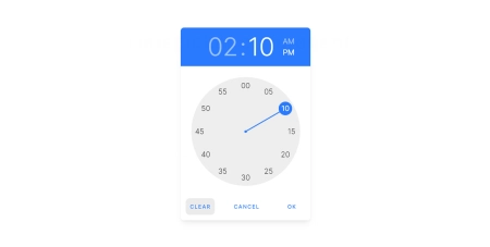
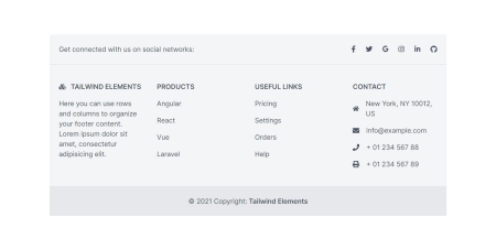
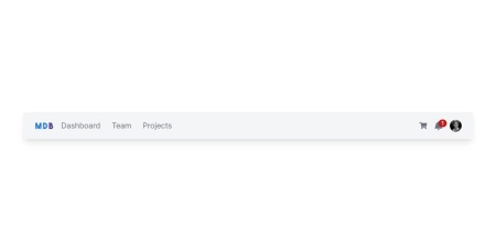
| Timepicker (coming soon) | Footer | Navbar (coming soon) |
|
|
|
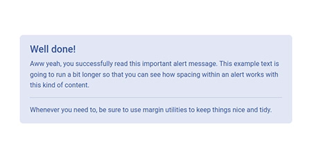
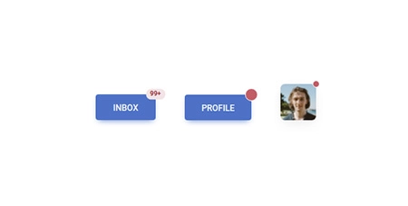
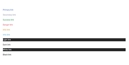
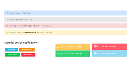
| Alerts (coming soon) | Avatar | Badges |
|
|
|
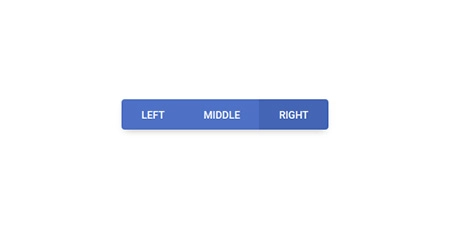
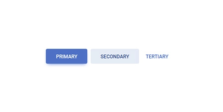
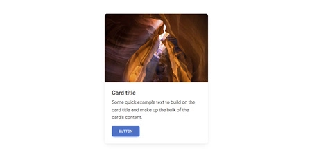
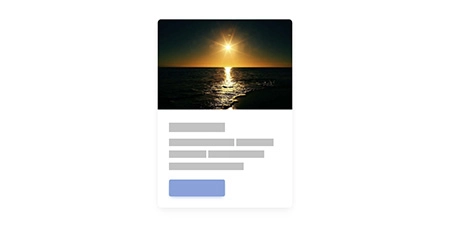
| Button group | Buttons | Cards |
|
|
|
| Chips (coming soon) | Collapse | Gallery (coming soon) |
|
|
|
| Jumbotron (coming soon) | Link | List group |
|
|
|
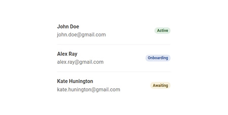
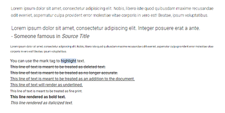
| Notifications (coming soon) | Paragraphs | Placeholders |
|
|
|
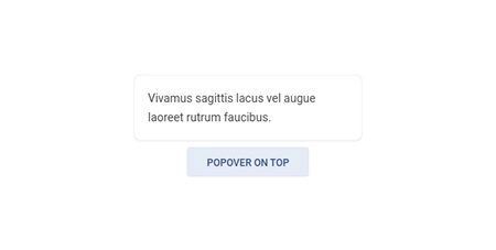
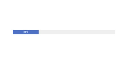
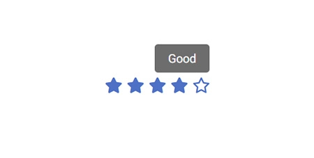
| Popover (coming soon) | Progress | Rating |

|
|
|
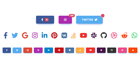
| Scroll to top | Social buttons | Spinners |
|
|
|
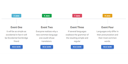
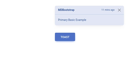
| Timeline | Toast (coming soon) | Tooltip (coming soon) |
|
|
|
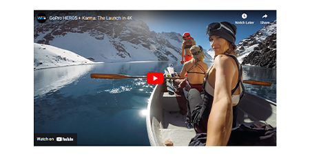
| Video (coming soon) | Video carousel (coming soon) | Checkbox |
|
|
|
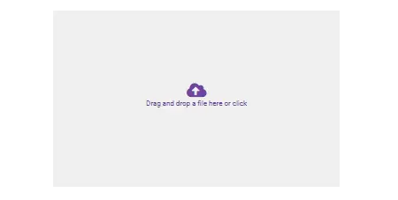
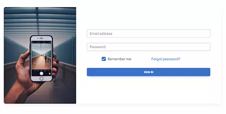
| File input | Input group (coming soon) | Login form |
|
|

|
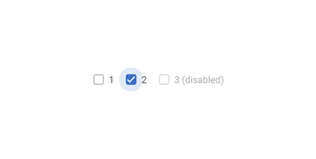
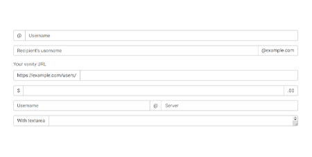
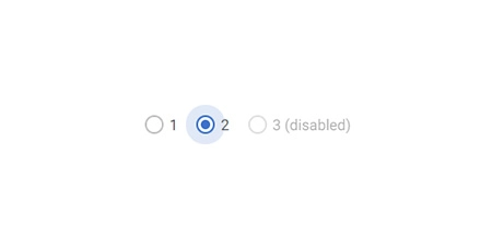
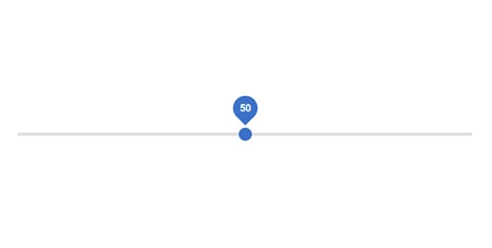
| Radio | Range | Registration form |
|
|
|
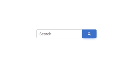
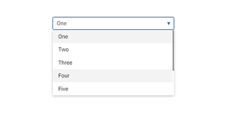
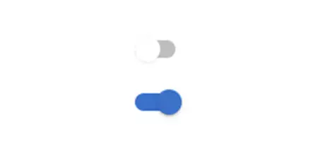
| Search | Select (coming soon) | Switch |
|
|
|
| Textarea (coming soon) | Tables | Ripple |
|
|

|
| Animations (coming soon) | Masks | Shadows |
Installation
NPM
Before starting the project make sure to install Node.js (LTS) version 14+, 16+ and TailwindCSS.
Run the following command to install the package via NPM:
npm install tw-elements-react- Add the TW Elements React css file to your main js/tsx file
import "tw-elements-react/dist/css/tw-elements-react.min.css";- TW Elements is a plugin and should be included inside the tailwind.config.js file. It is also recommended to extend the content array with a js file that loads dynamic component classes:
module.exports = {
  content: [
    "./index.html",
    "./src/**/*.{js,ts,jsx,tsx}",
    "./node_modules/tw-elements-react/dist/js/**/*.js",
  ],
  theme: {
    extend: {},
  },
  darkMode: "class",
  plugins: [require("tw-elements-react/dist/plugin.cjs")],
};- Components will work after importing the package:
import { TECollapse } from "tw-elements-react";MDB GO / CLI
Create, deploy and host anything with a single command.
- To start using MDB GO / CLI install it with one command:
npm install -g mdb-cli- Log into the CLI using your MDB account:
mdb login- Initialize a project and choose TW Elements React from the list:
mdb init tw-elements-react- Install the dependencies (inside the project directory):
npm install- Run the app:
npm start- Publish when you're ready:
mdb publish