
Package Exports
- vue-dynamic-dropdown
This package does not declare an exports field, so the exports above have been automatically detected and optimized by JSPM instead. If any package subpath is missing, it is recommended to post an issue to the original package (vue-dynamic-dropdown) to support the "exports" field. If that is not possible, create a JSPM override to customize the exports field for this package.
Readme
vue-dynamic-dropdown
A Highly Customizable, easy-to-use, elegant, dropdown component
Feedback would be much appreciated, questions, suggestions, issues are more than welcome.

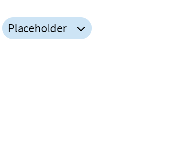
Demo

Usage:
First
Install via NPM npm i vue-dynamic-dropdown
Second
Require in your project:
var VueDropdown = require('vue-dynamic-dropdown');or ES6 syntax:
import VueDropdown from 'vue-dynamic-dropdown'Third
You can register the component globally:
Vue.component('vue-dropdown', VueDropdown);Or locally in a single Vue component:
components: {
  VueDropdown
}
Insert the following selector anywhere in your project (global) or in your existing component (local): NOTE: To get up and running quickly the package now supports rendering just the selector with default values.
<vue-dropdown></vue-dropdown>Docs:
config: {...} is a configuration object that is to be bound to vue-dropdown, API properties are:
Basics
| Property | Type | Description |
|---|---|---|
| options | array | Holds the inner selection options of the dropdown (shown when open), each single option is an object that has the value key that pairs with the given value e.g { value: '1st Option' } |
| width | number | Determines the width of the dropdown button & options drawer |
| placeholder | string | The text shown on the dropdown button by default |
| prefix | string | A text prefix that will be added before the placeholder text |
Customized Styling
| Property | Type | Description |
|---|---|---|
| backgroundColor | string | Set the dropdown button & options area background color |
| hoverBackgroundColor | string | Set the dropdown button & options hover background color |
| border | string | Set the dropdown button & options border |
| textColor | string | Set the dropdown button & options text color |
Events
| Event Name | Returns | Description |
|---|---|---|
| setSelectedOption | Option Object | Clicking a dropdown option emits an option data object upwards |
Listening to the event e.g:
<vue-dropdown @setSelectedOption="myLocalSetterFunction($event)"></vue-dropdown>Implementation Example
Define your config options object in the component importing VueDropdown e.g
data: function() {
    return {
        config: {
            options: [
                {
                    value: "option 1"
                },
                {
                    value: "option 2"
                },
                {
                    value: "option 3"
                },
            ],
            prefix: "The",
            backgroundColor: "green"
        }
    }
}
And bind it to the selector like so
<vue-dropdown :config="config"></vue-dropdown>
If you like to support my open-source contributions and feeling generous, feel free to:
