Package Exports
- vue-js-progress
This package does not declare an exports field, so the exports above have been automatically detected and optimized by JSPM instead. If any package subpath is missing, it is recommended to post an issue to the original package (vue-js-progress) to support the "exports" field. If that is not possible, create a JSPM override to customize the exports field for this package.
Readme
Vue Js Progress

With Vue Js Progress, you will have the opportunity to create your own animated progress bars.
The good thing is that even if you do not use bootstrap, you will be able to create progress bars with high visual direction thanks to the default background alternatives.
Setup
npm install vue-js-progress
Import
import VueJsProgress from 'vue-js-progress'
    export default {
        components: {
            VueJsProgress
        }
    }
</script>
npmjs
You can visit to https://www.npmjs.com/package/vue-js-progress
Usage
<VueJsProgress title="bg='electronblue'" :percentage="82" bg="electronblue" :delay="600" :striped="true" :animation="true"></VueJsProgress >Simple Usage (Percentage)
<ProgressBar :percentage="50" />There will be no title or no animations.
Usage (w/ Title)
<ProgressBar :percentage="50" title="My First Example" />Notes
The all attributes are optional. When you do not fill the percentage attribute default value will be 100.
Attributes
title (optional): You will have a title above of your progress bar.
percentage (optional): What percentage do you want your progress bar to fill?
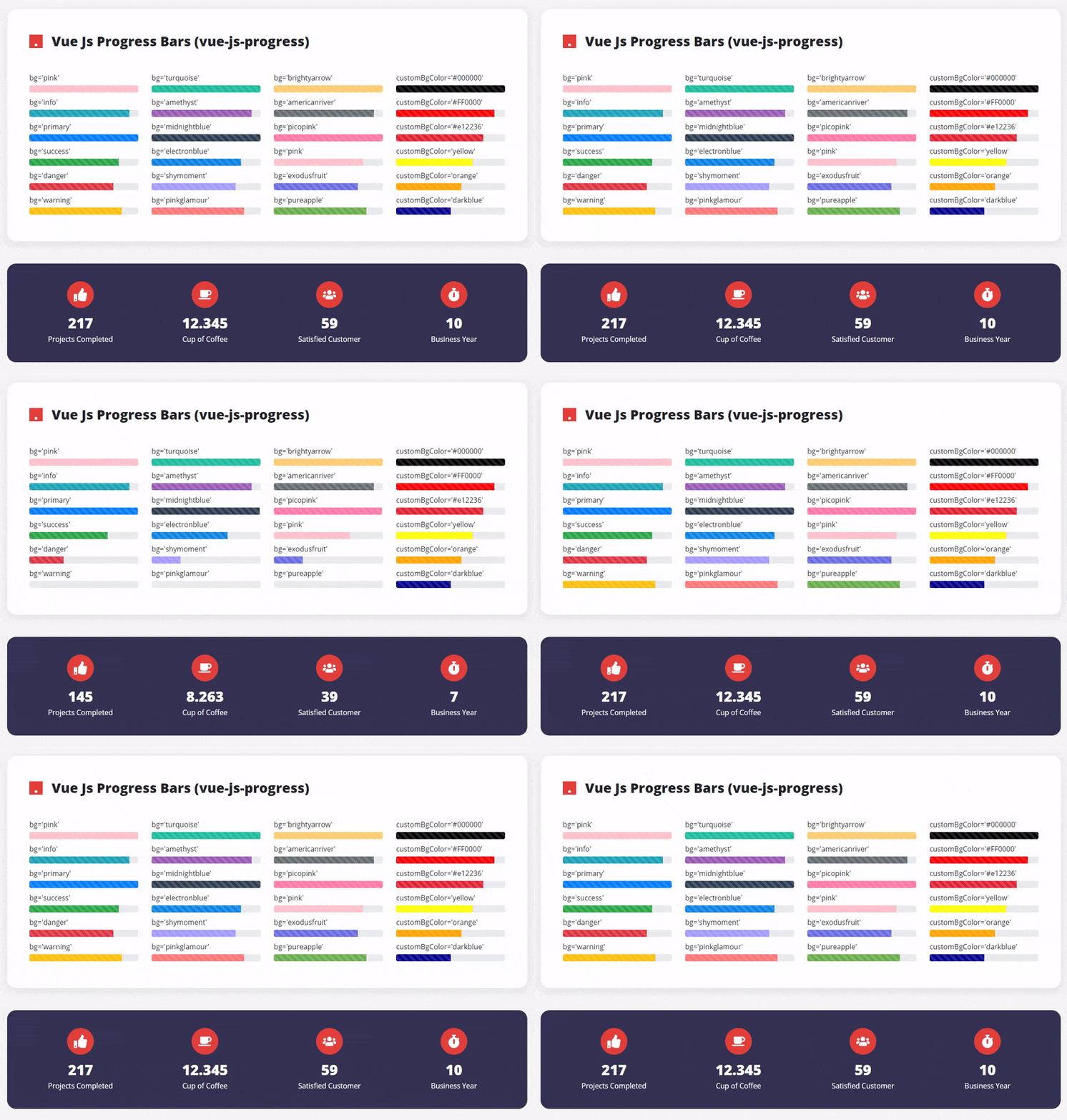
bg (optional): Currently, there are 15 different pre-defined progress bar colors. This number is more than bootstrap's progress bars!
options: pink, info, primary, success, danger, warning, turquoise, amethyst, midnightblue, electronblue, shymoment, pinkglamour, brightyarrow, americanriver, picopink, exodusfruit, pureapple.
Note: ** primary ** is the default value for bg!
customBgColor (optional): Do not like the default colors? You can also use any color you want in the progress bar. No limit!
examples: <ProgressBar customBgColor="#FF0000" /> or <ProgressBar customBgColor="red" />
Here you are not limited to just HEX colors. You can also use the color names such as red, blue, orange etc.
striped (optional): If you want your progress bar to be striped, you can type "true", if not, you can type "false". default value is "false"
animation (optional): If you want your progress bar to be animated, you can type "true", if not, you can type "false". default value is "false"
delay (optional): Would you like your progress bar to start after a certain amount of time (in millisecond)? default value is "0"