
Package Exports
- vue2-slot-calendar
- vue2-slot-calendar/index.js
This package does not declare an exports field, so the exports above have been automatically detected and optimized by JSPM instead. If any package subpath is missing, it is recommended to post an issue to the original package (vue2-slot-calendar) to support the "exports" field. If that is not possible, create a JSPM override to customize the exports field for this package.
Readme
vue3-calendar
vue 3 calendar, datepicker component which supported lunar or date event


This project is not only a vue component, but also a webpack multi-page project in action.
Boostrap style like
I18n support
Community feedback
vue 2.x version
Install
vue 2.x
$ pnpm i vue2-slot-calendar@2.x.x --save
vue 3.x
$ pnpm i vue3-slot-calendar@3.x.x --saveImport using module
// js file
import 'vue3-slot-calendar/lib/calendar.min.css';
import calendar from 'vue3-slot-calendar/lib/calendar';

// vue file
import Calendar from 'vue3-slot-calendar';
Import using script tag
<link rel="stylesheet" href="../node_modules/vue3-slot-calendar/lib/calendar.min.css" >
<script src="../node_modules/vue3-slot-calendar/lib/calendar.min.js"></script>
Also see the demo file, example/demo.html
I18n support
currently, provide window.VueCalendarLang function hook to change your lang
  translations(lang) {
    lang = lang || "en";
    let text = {
      daysOfWeek: ["Su", "Mo", "Tu", "We", "Th", "Fr", "Sa"],
      limit: "Limit reached ({{limit}} items max).",
      loading: "Loading...",
      minLength: "Min. Length",
      months: [
        "January",
        "February",
        "March",
        "April",
        "May",
        "June",
        "July",
        "August",
        "September",
        "October",
        "November",
        "December"
      ],
      notSelected: "Nothing Selected",
      required: "Required",
      search: "Search"
    };
    return window.VueCalendarLang ? window.VueCalendarLang(lang) : text;
  },
locale files
import cn from 'vue3-slot-calendar/lib/locale/zh-CN'
import en from 'vue3-slot-calendar/lib/locale/en-US'
import tw from 'vue3-slot-calendar/lib/locale/zh-TW'
Build Setup
# install dependencies
npm install
# serve with hot reload at localhost:4000
npm run dev
# build for production with minification
npm run build
# run unit tests
npm run unit
# run all tests
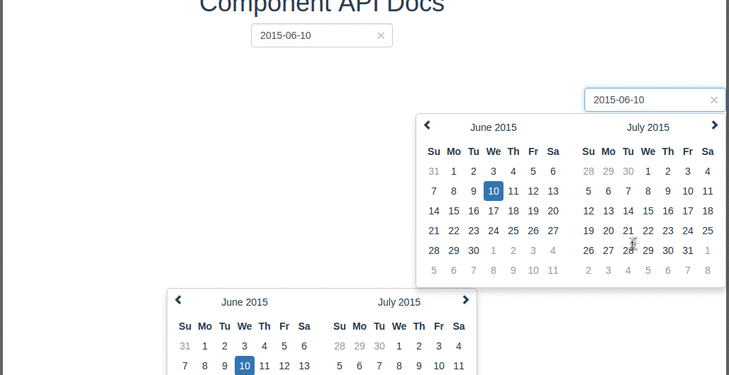
npm testScreenshot
Usage
<calendar
  v-model="value"
  :disabled-days-of-week="disabled"
  :format="format"
  :clear-button="clear"
  :placeholder="placeholder"
  :pane="2"
  :has-input="false"
  :on-day-click="onDayClick2"
  :special-days="_dateMap"
></calendar>
Use slot to render async data
<calendar
  class="event-calendar"
  v-model="value"
  :disabled-days-of-week="disabled"
  :format="format"
  :clear-button="clear"
  :placeholder="placeholder"
  :pane="2"
  :has-input="false"
  :on-day-click="onDayClick3"
  :change-pane="changePane"
>
  <div v-for="evt in events" :slot="evt.date">
    ${{evt.content}} <i :class="{low : evt.low}" v-if="evt.low">↓</i>
  </div>
</calendar>
Range Hover Status
<calendar
  v-model="value"
  :disabled-days-of-week="disabled"
  :format="format"
  :clear-button="clear"
  :placeholder="placeholder"
  :pane="2"
  :range-bus="getBus"
  :range-status="1"
></calendar>

<calendar
  v-model="value"
  :disabled-days-of-week="disabled"
  :format="format"
  :clear-button="clear"
  :placeholder="placeholder"
  :pane="2"
  :range-bus="getBus"
  :range-status="2"
></calendar>
Input Slot
    <calendar v-model="value" showDateOnly @drawDate="onDrawDate" :disabled-days-of-week="disabled" :format="format" :clear-button="clear" :placeholder="placeholder">
      <template #input="scope">
        <div class="mb-1">
          <label for="exampleFormControlInput1" class="form-label">Input slot focus to trigger</label>
          <input type="text" class="form-control form-control-lg" id="exampleFormControlInput1"  @focus="scope.inputClick" v-model="scope.inputValue" placeholder="focus to trigger">
        </div>
      </template>
    </calendar>
Props
Options/Props
| Name | Type | Default | Description |
|---|---|---|---|
| v-model | String |
'' | Value of the input DOM |
| width | String |
'200px' | Width of the input DOM |
| format | String |
MMMM/dd/yyyy |
The date format, combination of d, dd, M, MM, MMM, MMMM, yyyy. |
| disabled-days-of-week | Array |
Days of the week that should be disabled. Values are 0 (Sunday) to 6 (Saturday). Multiple values should be comma-separated. | |
| clear-button | Bollean |
false | If true shows an × shaped button to clear the selected date. Usefull in forms where date entry is optional. |
| placeholder | String |
Placeholder to put on the input field when no date (null or empty) is set | |
| hasInput | Boolean |
true | Default is has-input style, if don't have input will show pane directly |
| pane | Number |
1 | pane count |
| borderWidth | Number |
2 | This value is for calculating the pane width |
| onDayClick | Function |
Only for hasInput set false |
|
| specialDays | Object |
To repalce the day text | |
| changePane | Function |
For pane change parameter (year, month, pane) month[0,11], demo /src/modules/Docs.vue |
|
| rangeBus | Function |
should return new Vue() as sibling component communication events bus |
|
| rangeStatus | Number |
0 | Default is disabled range hover effect, currently only support [0,1,2] 1 will communicate with 2 |
| onDrawDate | Function |
DrawDate Function allowSelect to update date cell style |
|
| showDateOnly | Boolean |
false | show date pane only |
| transfer | Boolean |
false | transfer popup to document.body |
| elementId | String |
elementId for label tag for attribute |
|
| firstDayOfWeek | Number |
0 | first day of the week, default sunday, [0,6] |
Events
| Name | Description |
|---|---|
| drawDate | drawDate Event |
  props: {
    modelValue: {
      type: [String, Date]
    },
    format: {
      default: 'MM/dd/yyyy'
    },
    firstDayOfWeek: {
      // sunday
      default: 0
    },
    disabledDaysOfWeek: {
      type: Array,
      default () {
        return []
      }
    },
    width: {
      type: String,
      default: '200px'
    },
    clearButton: {
      type: Boolean,
      default: false
    },
    inputClasses: {
      type: String,
      default: ''
    },
    lang: {
      type: String,
      default: navigator.language
    },
    placeholder: {
      type: String
    },
    hasInput: {
      type: Boolean,
      default: true
    },
    pane: {
      type: Number,
      default: 1
    },
    borderWidth: {
      type: Number,
      default: 2
    },
    onDayClick: {
      type: Function,
      default () {}
    },
    changePane: {
      type: Function,
      default () {}
    },
    specialDays: {
      type: Object,
      default () {
        return {}
      }
    },
    rangeBus: {
      type: Function,
      default () {
        // return new Vue()
      }
    },
    rangeStatus: {
      type: Number,
      default: 0
    },
    // onDrawDate: {
    //   type: Function,
    //   default () {}
    // },
    maxDate: {
      type: String
    },
    minDate: {
      type: String
    },
    showDateOnly: {
      type: Boolean,
      default: false
    },
    transfer: {
      type: Boolean,
      default: false
    },
    elementId: [String]
  }
Methods
eventbus
import { eventbus } from 'vue3-slot-calendar/lib/utils/event'

eventbus.$on('drawDate', (date) => {
  console.log(date)
})
transfer directive
transfer directive like <Teleport>
import transfer from 'vue3-slot-calendar/lib/directives/transfer'

directives: {
  transfer
}
Credits
Inspired by vue-strap datepicker component.
For detailed explanation on how things work, checkout the guide and docs for vue-loader.