
Package Exports
- vue3-tree-vue
- vue3-tree-vue/dist/vue3-tree-vue.esm.js
- vue3-tree-vue/dist/vue3-tree-vue.ssr.js
This package does not declare an exports field, so the exports above have been automatically detected and optimized by JSPM instead. If any package subpath is missing, it is recommended to post an issue to the original package (vue3-tree-vue) to support the "exports" field. If that is not possible, create a JSPM override to customize the exports field for this package.
Readme
A Simple vue3 project for rendering items in a tree.
npm i vue3-tree-vue
<template>
    <vue3-tree-vue :items="items"
                   :isCheckable="false"  //Set to true if you want to get checkable items
                   :hideGuideLines="false"
                   @onCheck="onItemChecked"
                   @dropValidator="onBeforeItemDropped"
                   @onSelect="onItemSelected"
                   @onExpand="onItemExpanded"
                   >
      <!-- Applying some simple styling to tree-items -->
       <template v-slot:item-prepend-icon="treeViewItem" >
              <img src="./assets/folder.svg"
                   alt="folder"
                   v-if="treeViewItem.type === 'folder'"
                   height="20" width="20" />
       </template>
    </vue3-tree-vue>
</template>
import 'vue3-tree-vue/dist/style.css'; // remember to add this in your component or maint.[ts/js]
setup() {
const onItemChecked = (checkedItems: TreeViewItem[]) => console.log(checkedItems);
const onItemSelected = (item: TreeViewItem) => console.log(item);
// How to handle drag and drop logic
const onBeforeItemDropped = (droppedItem: TreeViewItem, destinationNode: TreeViewItem | undefined) => {
// destinationNode == undefined means dropping at the root of the tree.
// Here you can specify any kind of drop validation you will like.
// this function should return true if the drop operation is valid.
return new Promise((resolve, _) => {
resolve(droppedItem !== destinationNode) // Replace this logic with your logic.
});
}
const onItemExpanded = (expandedItem: TreeViewItem) => {
//to use this feature properly you need to set lazyLoad property as true
//fetch data
const lazyLoadedItems = fetchFromApi(...);
expandedItem.children.push(...lazyLoadedItems)
}
const items = ref<TreeViewItem[]>([]); // define your tree items here.
return {
onItemChecked,
onItemSelected,
onBeforeItemDropped,
onItemExpanded,
items
}
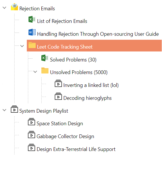
}Selectable Tree Items
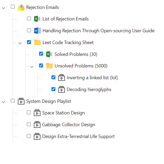
Checkable Tree Items
Drag and Drop
Properties of the TreeView
| Property | Default | Description |
|---|---|---|
| items | Empty array | An array of TreeViewItem. |
| hideGuideLines | false |
Determines the visibility of the guidelines |
| lazyLoad | false |
Determines if the tree supports lazy-loading |
| isCheckable | false |
Defines if items can be selected (one at a time) or selected (using a checkbox) |
| checkboxStyle | undefined | Defines the style to be applied to the checkboxes on the tree. |
| dropValidator | undefined | Specifies a callback of drag and drop rules. |
Basic properties of each tree-node.
export interface TreeViewItem {
  name: string;
  id?: string | number;
  children?: TreeViewItem[];
  checked?: boolean;
  selected?: boolean;
  expanded?: boolean;
  disableDragAndDrop?: boolean; // Disable drag and drop for a specific node.
  collapsible?: boolean; // When set to false, item can not be collapsed (children always visible)
  disabled?: boolean;// When disabled, an item can neither be selected nor checked
  styles?: string[]; // Add the .css styles for a given item
  meta?: any;// provides meta-data of any type per node.
}
Event Handlers
| Events | Description |
|---|---|
| onSelect | Callback function when an item is selected from the tree .Returns an ItemEventArgs. |
| onCheck | Callback function when an item is checked/unchecked from the tree. |
| onExpand | Callback function when an item is expanded (Can be used for lazy-loading) |
| onCollapse | Callback function when an item is collapsed |
The `onCheck` event may be fired more than once to show the change in state of deep hierachies.
Styles
| Class | Description |
|---|---|
| selected-tree-item | Defines the style for the selectedItem |
Slots
| Name | Description |
|---|---|
| item-prepend-icon | Defines the node's prepend icon. |
| item-prepend | Defines a slot to house content before the node's label. |
| item-expander | Defines a slot for custom expander implementations |
| item-append | Defines a slot for adding custom content after the item name |
| child-append | Defines a slot for adding a custom item after the last child |
Classes
| Name | Description |
|---|---|
| on-item-hover | Use in child-append and item-append slots to only show when the cursor is hovering on the node |