
Package Exports
- whatsapp-click-to-chat
- whatsapp-click-to-chat/dist/index.js
This package does not declare an exports field, so the exports above have been automatically detected and optimized by JSPM instead. If any package subpath is missing, it is recommended to post an issue to the original package (whatsapp-click-to-chat) to support the "exports" field. If that is not possible, create a JSPM override to customize the exports field for this package.
Readme
whatsapp-click-to-chat
A reusable WhatsApp button component for React, designed to make it easy for users to start a WhatsApp chat with a single click. This package automatically detects whether the user is on mobile or desktop and opens the correct WhatsApp app or web interface. The button is fully customizable with Tailwind CSS, supports multiple sizes and variants, and allows you to pre-fill messages, set custom colors, and control icon and label visibility. Ideal for websites, landing pages, support portals, and e-commerce stores that want to offer instant WhatsApp communication.
Features
- 📱 Detects mobile/desktop devices automatically
- 🎨 Fully customizable with Tailwind CSS
- 💫 Smooth animations and transitions
- 🖼️ Multiple size options
- 🎯 Accessible and SEO-friendly
- 🌐 Works with WhatsApp Web and Desktop app
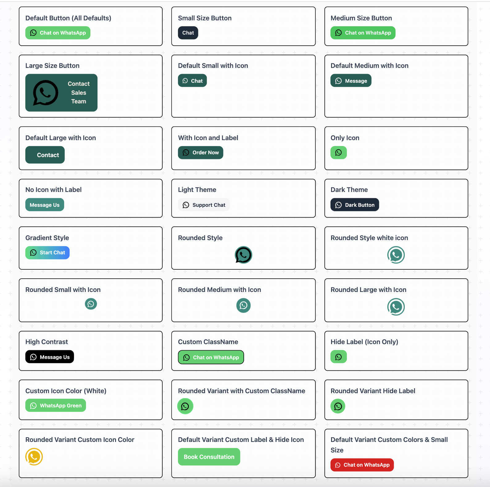
🧩 WhatsAppButton Variations
🔧 Summary of Props
| Prop | Type | Default | Behavior |
|---|---|---|---|
phoneNumber |
string |
'+1234567890' | WhatsApp number, digits only |
message |
string |
'' |
Pre-filled message in chat |
variant |
'default' | 'rounded' |
'default' |
Button style |
color |
string |
'bg-[#25D366]' |
Tailwind or HEX background color |
textColor |
string |
'text-white' |
Tailwind or HEX text color |
showIcon |
boolean |
true |
Show WhatsApp icon |
iconColor |
'black' | 'white' |
'black' |
WhatsApp icon color |
label |
string |
'Chat on WhatsApp' |
Text shown next to icon (default variant only) |
showLabel |
boolean |
true |
Show/hide label (default variant only) |
size |
'small' | 'medium' | 'large' |
'medium' |
Button size |
className |
string |
'' |
Custom CSS classes for button |
1️⃣ Variants
| Variant | Description | Example |
|---|---|---|
default |
Standard rectangular button. Can show icon + label. | ✅ Show label and icon: "Chat on WhatsApp" |
rounded |
Circular button. Only icon is shown. | ✅ Icon only (good for floating buttons) |
Tailwind classes adjust automatically depending on
variant.
2️⃣ Icon Options (showIcon, iconColor)
| Prop | Description |
|---|---|
showIcon |
Show WhatsApp logo on button |
iconColor |
Icon color: 'black' or 'white' |
For
roundedvariant, the icon is usually shown by default.
3️⃣ Colors (color prop, textColor prop)
| Type | Description |
|---|---|
| Tailwind class | e.g., "bg-green-500" |
| HEX | e.g., "bg-[#25D366]" |
| Custom CSS class | Any valid CSS class string |
This allows your button to fit any design system.
4️⃣ Label (label prop, showLabel prop)
| Usage | Description |
|---|---|
| Default variant only | Shows text next to icon |
| Rounded variant | Text is ignored, only icon is shown |
| Custom text | Set your own button label |
showLabel |
Show/hide label for default variant |
Example:
<WhatsAppButton label="Contact Us" showLabel={true} />5️⃣ Message Pre-fill (message prop)
| Usage | Description |
|---|---|
| Any string | The message that appears automatically in WhatsApp chat. |
| Empty string | Opens WhatsApp with only the number |
| URL encoding | Automatically encodes spaces and special chars |
Example:
<WhatsAppButton message="Hi! Please pay your pending invoice." />6️⃣ Phone Number (phoneNumber prop)
| Usage | Description |
|---|---|
| International format | Include country code, e.g., +1234567890 |
| Only numbers | Non-digit characters are automatically removed |
7️⃣ Automatic Mobile/Desktop Detection
The button automatically chooses the right URL:
| Device | URL used |
|---|---|
| Mobile | https://api.whatsapp.com/send?phone=... |
| Desktop/Web | https://web.whatsapp.com/send?phone=... |
Works automatically with no extra configuration.
8️⃣ Behavior on Click
| Option | Description |
|---|---|
| Opens WhatsApp app | Mobile device opens the installed WhatsApp app |
| Opens WhatsApp Web | Desktop opens WhatsApp Web in a new browser tab |
| Message auto-filled | If message prop provided, it is prefilled in chat input |
| Optional icon-only button | Rounded variant is perfect for floating buttons without text |
9️⃣ Combination Examples
Here are comprehensive combinations demonstrating all possible configurations:
// 1. Default Button (All Defaults)
<WhatsAppButton phoneNumber="+1234567890" message="Hello! I'm interested in your services." />

// 2. Small Size Button
<WhatsAppButton
  phoneNumber="+1234567890"
  message="Quick question about your service."
  variant="default"
  size="small"
  showIcon={false}
  label="Chat"
  color="bg-gray-800"
  textColor="text-gray-200"
/>

// 3. Medium Size Button
<WhatsAppButton
  phoneNumber="+1234567890"
  message="Hi, you have a pending payment!"
  variant="default"
  color="bg-green-500"
  textColor="text-gray-100"
  size="medium"
  showIcon={true}
/>

// 4. Large Size Button
<WhatsAppButton
  phoneNumber="+1234567890"
  message="I'd like to speak with a sales representative."
  variant="default"
  size="large"
  color="bg-[#075E54]"
  textColor="text-[#ECE5DD]"
  label="Contact Sales Team"
/>

// 5. Default Small with Icon
<WhatsAppButton
  phoneNumber="+1234567890"
  message="Quick chat"
  variant="default"
  size="small"
  color="bg-[#075E54]"
  textColor="text-white"
  showIcon={true}
  iconColor="white"
  label="Chat"
/>

// 6. Default Medium with Icon
<WhatsAppButton
  phoneNumber="+1234567890"
  message="Let's talk"
  variant="default"
  size="medium"
  color="bg-[#075E54]"
  textColor="text-white"
  showIcon={true}
  iconColor="white"
  label="Message"
/>

// 7. Default Large with Icon
<WhatsAppButton
  phoneNumber="+1234567890"
  message="Contact us"
  variant="default"
  size="large"
  color="bg-[#075E54]"
  textColor="text-white"
  showIcon={true}
  iconColor="white"
  label="Contact"
/>

// 8. With Icon and Label
<WhatsAppButton
  phoneNumber="+1234567890"
  label="Order Now"
  color="bg-[#075E54]"
  showIcon={true}
  message="I'd like to place an order."
/>

// 9. Only Icon
<WhatsAppButton
  phoneNumber="+1234567890"
  label=""
  showLabel={false}
  showIcon={true}
  message="Hi, I need assistance."
/>

// 10. No Icon with Label
<WhatsAppButton
  phoneNumber="+1234567890"
  variant="default"
  showIcon={false}
  label="Message Us"
  color="bg-[#128C7E]"
  message="Hello! How can we help you today?"
/>

// 11. Light Theme
<WhatsAppButton
  phoneNumber="+1234567890"
  message="I need technical support."
  color="bg-gray-100"
  textColor="text-gray-800"
  label="Support Chat"
  showIcon={true}
/>

// 12. Dark Theme
<WhatsAppButton
  phoneNumber="+1234567890"
  message="Hello from a dark background!"
  variant="default"
  color="bg-gray-800"
  textColor="text-white"
  label="Dark Button"
  showIcon={true}
  iconColor="white"
/>

// 13. Gradient Style
<WhatsAppButton
  phoneNumber="+1234567890"
  message="Hello, I'd like to start a conversation."
  color="bg-gradient-to-r from-green-400 to-blue-500"
  textColor="text-white"
  label="Start Chat"
/>

// 14. Rounded Style
<WhatsAppButton
  phoneNumber="+1234567890"
  message="Need help with my order."
  variant="rounded"
  color="bg-[#128C7E]"
  textColor="text-[#FFFFFF]"
  size="large"
/>

// 15. Rounded Style white icon
<WhatsAppButton
  phoneNumber="+1234567890"
  message="Need help with my order."
  variant="rounded"
  color="bg-[#128C7E]"
  textColor="text-[#FFFFFF]"
  size="large"
  iconColor='white'
/>

// 16. Rounded Small with Icon
<WhatsAppButton
  phoneNumber="+1234567890"
  message="Quick chat"
  variant="rounded"
  size="small"
  color="bg-[#128C7E]"
  showIcon={true}
  iconColor="white"
/>

// 17. Rounded Medium with Icon
<WhatsAppButton
  phoneNumber="+1234567890"
  message="Quick chat"
  variant="rounded"
  size="medium"
  color="bg-[#128C7E]"
  showIcon={true}
  iconColor="white"
  showLabel={false}
/>

// 18. Rounded Large with Icon
<WhatsAppButton
  phoneNumber="+1234567890"
  message="Contact us"
  variant="rounded"
  size="large"
  showLabel={false}
  color="bg-[#128C7E]"
  showIcon={true}
  iconColor="white"
/>

// 19. High Contrast
<WhatsAppButton
  phoneNumber="+1234567890"
  message="I need accessibility support."
  color="bg-black"
  textColor="text-white"
  label="Message Us"
  showIcon={true}
  iconColor="white"
/>

// 20. Custom ClassName
<WhatsAppButton
  phoneNumber="+1234567890"
  message="Custom style"
  className="border-2 border-black"
/>

// 21. Hide Label (Icon Only)
<WhatsAppButton
  phoneNumber="+1234567890"
  message="Quick inquiry."
  showLabel={false}
/>

// 22. Custom Icon Color (White)
<WhatsAppButton
  phoneNumber="+1234567890"
  message="Testing white icon"
  color="bg-[#25D366]"
  textColor="text-white"
  label="WhatsApp Green"
  iconColor="white"
/>

// 23. Rounded Variant with Custom ClassName
<WhatsAppButton
  phoneNumber="+1234567890"
  message="Custom rounded style"
  variant="rounded"
  className="ring-2 ring-green-400"
/>

// 24. Rounded Variant Hide Label
<WhatsAppButton
  phoneNumber="+1234567890"
  message="Quick chat"
  variant="rounded"
  showLabel={false}
/>

// 25. Rounded Variant Custom Icon Color
<WhatsAppButton
  phoneNumber="+1234567890"
  message="VIP support request."
  variant="rounded"
  size="large"
  color="bg-yellow-500"
  textColor="text-gray-900"
  iconColor="white"
/>

// 26. Default Variant Custom Label & Hide Icon
<WhatsAppButton
  phoneNumber="+1234567890"
  message="Booking request for consultation."
  size="large"
  label="Book Consultation"
  showIcon={false}
/>

// 27. Default Variant Custom Colors & Small Size
<WhatsAppButton
  phoneNumber="+1234567890"
  message="Priority support needed."
  size="small"
  color="bg-red-600"
  textColor="text-white"
  iconColor='white'
/>
💡 Pro Tip: Always include a relevant message that provides context for the recipient when the chat opens in WhatsApp.
WhatsApp Click to Chat Button
A customizable React WhatsApp click-to-chat button component with Tailwind CSS.
Installation
npm install whatsapp-click-to-chatUsage
import { WhatsAppButton } from 'whatsapp-click-to-chat';

function App() {
  return (
    <WhatsAppButton
      phoneNumber="+1234567890"
      message="Hello! I'm interested in your services."
    />
  );
}
License
MIT
Contributing
Pull requests are welcome!