JSPM

Found 317 results for styled-system

@welcome-ui/tag

Customizable design system with react • styled-components • styled-system and ariakit.

  • v6.5.0
  • 30.26
  • Published

@welcome-ui/label

Customizable design system with react • styled-components • styled-system and ariakit.

  • v6.5.0
  • 30.17
  • Published

@welcome-ui/text

Customizable design system with react • styled-components • styled-system and ariakit.

  • v6.2.0
  • 29.82
  • Published

react-native-reflect

Responsive, themeable style system for React Native and React Native Web

  • v0.1.6
  • 29.72
  • Published

@welcome-ui/loader

Customizable design system with react • styled-components • styled-system and ariakit.

  • v6.4.0
  • 29.41
  • Published

@welcome-ui/field-group

Customizable design system with react • styled-components • styled-system and ariakit.

  • v6.5.0
  • 28.97
  • Published

@welcome-ui/hint

Customizable design system with react • styled-components • styled-system and ariakit.

  • v6.1.1
  • 28.64
  • Published

@welcome-ui/field

Customizable design system with react • styled-components • styled-system and ariakit.

  • v6.5.0
  • 28.38
  • Published

@walltowall/system

Collection of React components providing an opinionated base for Wall-to-Wall Gatsby websites.

    • v11.0.10
    • 27.94
    • Published

    @welcome-ui/alert

    Customizable design system with react • styled-components • styled-system and ariakit.

    • v6.6.0
    • 27.71
    • Published

    @welcome-ui/toast

    Customizable design system with react • styled-components • styled-system and ariakit.

    • v6.6.0
    • 27.71
    • Published

    @welcome-ui/file-upload

    Customizable design system with react • styled-components • styled-system and ariakit.

    • v6.6.0
    • 27.62
    • Published

    @welcome-ui/clear-button

    Customizable design system with react • styled-components • styled-system and ariakit.

    • v6.6.0
    • 27.12
    • Published

    @welcome-ui/select

    Customizable design system with react • styled-components • styled-system and ariakit.

    • v6.6.0
    • 27.02
    • Published

    @welcome-ui/stack

    Customizable design system with react • styled-components • styled-system and ariakit.

    • v6.1.1
    • 26.68
    • Published

    @welcome-ui/date-picker

    Customizable design system with react • styled-components • styled-system and ariakit.

    • v6.6.0
    • 26.28
    • Published

    @welcome-ui/link

    Customizable design system with react • styled-components • styled-system and ariakit.

    • v6.5.0
    • 26.18
    • Published

    @welcome-ui/modal

    Modal from Ariakit with a really nice theme 👀

    • v6.6.0
    • 25.96
    • Published

    @welcome-ui/connected-field

    Customizable design system with react • styled-components • styled-system and reakit.

    • v3.11.0
    • 25.90
    • Published

    @welcome-ui/pagination

    Customizable design system with react • styled-components • styled-system and ariakit.

    • v6.5.0
    • 25.78
    • Published

    @welcome-ui/checkbox

    Customizable design system with react • styled-components • styled-system and ariakit.

    • v6.6.0
    • 25.76
    • Published

    @welcome-ui/files

    Customizable design system with react • styled-components • styled-system and ariakit.

    • v6.5.0
    • 25.63
    • Published

    @welcome-ui/tabs

    Customizable design system with react • styled-components • styled-system and ariakit.

    • v6.6.0
    • 25.53
    • Published

    @react-yuki/ui

    Simple React components built with styled-system

      • v0.0.44
      • 25.37
      • Published

      @welcome-ui/close-button

      Customizable design system with react • styled-components • styled-system and ariakit.

      • v6.6.0
      • 25.31
      • Published

      @welcome-ui/badge

      Customizable design system with react • styled-components • styled-system and ariakit.

      • v6.1.1
      • 25.08
      • Published

      @welcome-ui/textarea

      Customizable design system with react • styled-components • styled-system and ariakit.

      • v6.4.0
      • 24.99
      • Published

      @dcp-ui/system

      Customizable design system with react • styled-components • styled-system and reakit.

      • v1.0.0
      • 24.50
      • Published

      @welcome-ui/accordion

      Customizable design system with react • styled-components • styled-system and ariakit.

      • v6.6.0
      • 24.09
      • Published

      @welcome-ui/table

      Welcome UI - Table | Repaint html for table tr td... etc with a scrollable table

      • v6.1.1
      • 24.02
      • Published

      @welcome-ui/radio-tab

      Customizable design system with react • styled-components • styled-system and ariakit.

      • v6.6.0
      • 22.35
      • Published

      @welcome-ui/emoji-picker

      Customizable design system with react • styled-components • styled-system and ariakit.

      • v6.6.0
      • 21.89
      • Published

      coral-system

      a lightweight style system with react ui primitives

      • v1.0.6
      • 21.64
      • Published

      @welcome-ui/search

      Customizable design system with react • styled-components • styled-system and ariakit.

      • v6.6.0
      • 20.75
      • Published

      @welcome-ui/radio-group

      Customizable design system with react • styled-components • styled-system and ariakit.

      • v6.6.0
      • 19.76
      • Published

      @braineet/ui

      Braineet design system

      • v11.0.3
      • 19.37
      • Published

      infocharts

      <img src="https://raw.githubusercontent.com/garethslinn/public_infocharts/refs/heads/main/logo.svg" />

        • v1.1.63
        • 18.92
        • Published

        @dcp-ui/utils

        Customizable design system with react • styled-components • styled-system and reakit.

        • v1.0.0
        • 18.26
        • Published

        @dcp-ui/hint

        Customizable design system with react • styled-components • styled-system and reakit.

        • v1.0.0
        • 18.15
        • Published

        @welcome-ui/time-picker

        Customizable design system with react • styled-components • styled-system and ariakit.

        • v6.6.0
        • 17.92
        • Published

        react-landing-page

        [![Demo](https://user-images.githubusercontent.com/2906365/43375514-94cfb9ae-9383-11e8-9489-cffe5212fd2e.png)
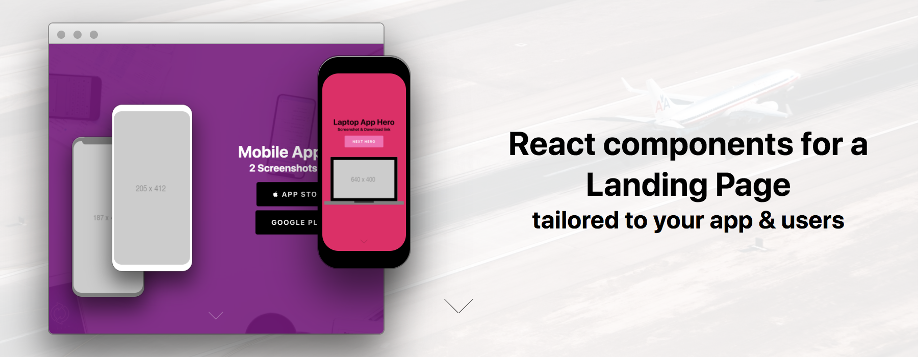
](https://hermanya.github.io/react-landing-page/)

        • v2.0.2
        • 17.83
        • Published

        @welcome-ui/card

        Customizable design system with react • styled-components • styled-system and ariakit.

        • v6.4.0
        • 17.59
        • Published

        @welcome-ui/avatar

        Customizable design system with react • styled-components • styled-system and ariakit.

        • v6.4.0
        • 17.50
        • Published

        @dcp-ui/box

        Is an export of xstyled's <Box> component.

        • v1.0.0
        • 17.38
        • Published

        @magicsoup.io/instant

        An instant React-Native starter for instant apps. Open lid, add hot water, boil, enjoy!

        • v0.0.70
        • 16.87
        • Published

        @welcome-ui/password-input

        Customizable design system with react • styled-components • styled-system and ariakit.

        • v6.6.0
        • 16.86
        • Published

        @atomik-ui/icon

        A React component used by Atomik

        • v1.0.38
        • 16.81
        • Published

        @dcp-ui/button

        Built with Reakit for a better accessibility 🥰

        • v1.0.0
        • 16.67
        • Published

        @welcome-ui/radio

        Customizable design system with react • styled-components • styled-system and ariakit.

        • v6.6.0
        • 16.60
        • Published

        @atomik-ui/text

        A React component used by Atomik

        • v1.0.38
        • 16.53
        • Published

        @phobon/grimoire

        Component patterns using @phobon/base

          • v1.2.5
          • 16.52
          • Published

          react-basic-kit

          Some basic React components

            • v0.13.0
            • 16.46
            • Published

            @charlietango/ui

            Collection of shared UI elements for Charlie Tango projects

            • v1.0.2
            • 16.37
            • Published

            @vue-styled-components/plugin

            A Vite plugin that provides TypeScript generic syntax support for Vue Styled Components, similar to React styled-components.

            • v1.0.1
            • 16.29
            • Published

            @atomik-ui/box

            A React component used by Atomik

            • v1.0.38
            • 16.29
            • Published

            @atomik-ui/link

            A React component used by Atomik

            • v1.0.38
            • 16.27
            • Published

            @rapido/components

            Library of common primitive components used in Rapido apps.

            • v0.0.29
            • 16.08
            • Published

            @welcome-ui/drawer

            Customizable design system with react • styled-components • styled-system and ariakit.

            • v6.7.1
            • 16.06
            • Published

            @welcome-ui/markdown-editor

            Customizable design system with react • styled-components • styled-system and ariakit.

            • v6.5.0
            • 15.98
            • Published

            @dcp-ui/text

            The `Text` component allows you to remain consistent with your text sizing and line-height. To add additional padding/margins use the `space` values from xstyled.

            • v1.0.0
            • 15.85
            • Published

            @welcome-ui/grid

            Customizable design system with react • styled-components • styled-system and ariakit.

            • v6.1.1
            • 15.67
            • Published

            @welcome-ui/swiper

            Customizable design system with react • styled-components • styled-system and ariakit.

            • v6.6.0
            • 15.37
            • Published

            @dcp-ui/variant-icon

            Customizable design system with react • styled-components • styled-system and reakit.

            • v1.0.0
            • 15.37
            • Published

            @phobon/base

            Essential compositional components using CSS-in-JS and styled-system

            • v3.2.5
            • 15.36
            • Published

            @dcp-ui/utils.copy

            A simple hook to copy text from a given HTML element to your clipboard with copy-to-clipboard library

            • v1.0.0
            • 15.30
            • Published

            @welcome-ui/utils.copy

            Customizable design system with react • styled-components • styled-system and ariakit.

            • v6.1.1
            • 15.23
            • Published

            stack-styled

            Stacking layouts for React

            • v3.2.1
            • 14.53
            • Published

            fluid-system

            Fluid System is a style props function transformer for generating fluid styles.

            • v1.1.3
            • 14.53
            • Published

            @dcp-ui/toast

            Notification component with toasted-note and 2 components : Growl and Snackbar.

            • v1.0.0
            • 14.53
            • Published

            styled-native

            Styled native-base UI components using styled-system

            • v0.1.15
            • 14.12
            • Published

            @welcome-ui/flex

            Customizable design system with react • styled-components • styled-system and ariakit.

            • v6.1.1
            • 13.99
            • Published

            re-jok

            <img src='http://res.cloudinary.com/lighter/image/upload/v1532614796/logo-preview-4851acb3-1251-4cc4-af87-3646f0407894_hdubzv.jpg' width='128' height='128' />

            • v0.2.0
            • 13.98
            • Published

            @alexanderjeurissen/flex

            A declarative React primitive Flex component that exposes flexbox specification in JSX

            • v1.1.0
            • 13.63
            • Published

            @welcome-ui/emoji

            Customizable design system with react • styled-components • styled-system and ariakit.

            • v6.1.1
            • 13.50
            • Published

            styled-type

            Responsive type system for styled-components

            • v1.0.2
            • 13.49
            • Published

            @equinor/opt-ui-lab

            OPT-UI Lab - Incubator for Opt-UI React components.

            • v6.12.4
            • 13.49
            • Published

            @dcp-ui/stack

            The `Stack` component is a layout component that allows you to easily stack elements with space between them.

            • v1.0.0
            • 13.07
            • Published

            @welcome-ui/aspect-ratio

            Customizable design system with react • styled-components • styled-system and ariakit.

            • v6.1.1
            • 13.02
            • Published

            styled-gel

            [![Build Status](https://travis-ci.org/dagda1/styled-gel.svg?branch=master)](https://travis-ci.org/dagda1/styled-gel)

              • v0.1.15
              • 12.57
              • Published

              @tillen/fresco

              Tillen's design system

                • v0.0.2-alpha.5
                • 12.47
                • Published

                styled-shapes

                html shapes implemented with styled-system props

                • v0.1.5
                • 12.47
                • Published

                @dcp-ui/shape

                Overflow child with hidden child.

                • v1.0.0
                • 12.23
                • Published

                @dcp-ui/alert

                Simple feedback messages for user actions.

                • v1.0.0
                • 12.14
                • Published

                rebass-native

                Flexible & functional React native design system, built with styled-system

                • v2.2.1
                • 12.04
                • Published

                styled-system-html

                HTML elements extended as styled components via styled system, ready for theming.

                • v3.0.0
                • 11.70
                • Published

                rebass-extend

                Rebass primitive UI components generator built with styled-system

                • v1.0.1
                • 11.62
                • Published

                @dcp-ui/card

                Simple Box with specific style.

                • v1.0.0
                • 11.52
                • Published

                @dcp-ui/code

                Basic component to display theme code.

                • v1.0.0
                • 11.52
                • Published

                @bestatic/styled

                Styled scope provider for Markdown/MDX/TDX documents

                • v7.3.6
                • 11.52
                • Published

                @asyarb/system

                Collection of opinionated React components.

                  • v1.5.0
                  • 11.31
                  • Published

                  agonkit

                  Agon UI Design System

                  • v1.0.6
                  • 11.29
                  • Published

                  @weimi/ui

                  React styled-components built with theming

                  • v1.0.1-1
                  • 11.29
                  • Published

                  @welcome-ui/icons.font

                  Customizable design system with react • styled-components • styled-system and ariakit.

                  • v6.5.0
                  • 11.26
                  • Published

                  cattous

                  CSS in JSX for lazy developers

                  • v1.2.0
                  • 11.26
                  • Published

                  @dcp-ui/label

                  Customizable design system with react • styled-components • styled-system and reakit.

                  • v1.0.0
                  • 11.04
                  • Published

                  moonrocks

                  Just another UI component library based on Styled System.

                  • v1.1.1
                  • 10.94
                  • Published

                  jscodeshift-theme-get-styled-system-v5

                  A Codemod for transforming styled-system `theme-get` util imports from 'styled-system' package to dedicated '@styled-system/theme-get'

                  • v0.1.2
                  • 10.94
                  • Published

                  jolie

                  Jolie is a component based UI library built using Vue.js and Typescript to build scalable web applications

                  • v0.4.0
                  • 10.53
                  • Published

                  @dcp-ui/tag

                  Show a styled tag.

                  • v1.0.0
                  • 10.17
                  • Published

                  @stnew/typography

                  Responsive type system for styled-components

                  • v1.2.0
                  • 10.17
                  • Published

                  react-flexer

                  flexbox grid layout like rebass but fastest

                  • v1.0.1
                  • 10.17
                  • Published

                  @welcome-ui/breadcrumb

                  Customizable design system with react • styled-components • styled-system and ariakit.

                  • v6.5.0
                  • 10.17
                  • Published

                  blacklist-tag

                  utility tags for styled-components inspired by clean-tag

                  • v1.1.0
                  • 10.06
                  • Published

                  st-css

                  Tiny css-in-js library for a heavenly developer experience

                  • v0.0.12
                  • 9.67
                  • Published

                  native-grid-styled

                  Responsive React grid system built with styled-system, with support for styled-components and emotion

                    • v5.0.3
                    • 9.53
                    • Published

                    crafter-ui

                    Crafter UI is a simple component library to build more complex Vue applications

                    • v0.3.4
                    • 9.13
                    • Published

                    @syfxlin/styops

                    Provide theme props support for styled system.

                    • v1.0.7
                    • 9.00
                    • Published

                    @welcome-ui/file-drop

                    Customizable design system with react • styled-components • styled-system and ariakit.

                    • v6.6.0
                    • 8.98
                    • Published

                    @dcp-ui/link

                    A link component who can get `as` property to pass custom linker. This component is a child from `UniversalLink` component.

                    • v1.0.0
                    • 8.54
                    • Published

                    responsive-styles

                    Use arrays as values to specify mobile-first responsive styles for CSS-in-JS projects

                    • v0.2.0
                    • 8.46
                    • Published

                    badash-ui

                    React BADASH UI Components

                      • v0.0.8
                      • 8.44
                      • Published

                      use-color-system

                      Make a color palette for styled-system

                      • v0.4.0
                      • 8.41
                      • Published

                      @dcp-ui/group

                      Children grouped without space or radius.

                      • v1.0.0
                      • 7.87
                      • Published

                      @dcp-ui/colors

                      Basic component to display theme colors.

                      • v1.0.0
                      • 7.87
                      • Published

                      styled-system-direction

                      Provides a function to add direction (RTL/LTR) aware css props to your component

                      • v1.0.5
                      • 7.80
                      • Published

                      recastui

                      Solidjs components library focused on usability, whitelabel theming, accessibility and developer experience

                      • v0.1.0
                      • 7.80
                      • Published

                      @noema/motif

                      A type-safe styling library for React components built on top of [Vanilla Extract](https://vanilla-extract.style/). `@noema/motif` allows you to create styled components with consistent theme-aware props that cleanly separate styling from component logic.

                      • v0.3.0
                      • 7.78
                      • Published

                      @welcome-ui/date-time-picker

                      Customizable design system with react • styled-components • styled-system and ariakit.

                      • v6.6.0
                      • 7.78
                      • Published

                      @puppies4life/lyca

                      Primitive UI elements for component-based design

                      • v1.0.4
                      • 7.78
                      • Published

                      @dcp-ui/badge

                      Show your badge with swag 🦄.

                      • v1.0.0
                      • 7.74
                      • Published

                      basedp-ui

                      A set of primitive react components based on styled components and styled-system.

                      • v1.0.3
                      • 7.53
                      • Published

                      @dcp-ui/select

                      Component based on the downshift library.

                      • v1.0.0
                      • 7.53
                      • Published

                      @dcp-ui/breadcrumb

                      Customizable design system with react • styled-components • styled-system and reakit.

                      • v1.0.0
                      • 7.11
                      • Published

                      @bestyled/system

                      BeStyled System Property Groups, for React, React Native, React Native Web, and typescript

                      • v1.0.3
                      • 7.03
                      • Published

                      landings-ui

                      A set of ui components for teledirekt landings.

                      • v1.0.4
                      • 7.00
                      • Published

                      styled-system-dir

                      Provides a function to add direction (RTL/LTR) aware css props to your component

                        • v0.0.3
                        • 6.99
                        • Published

                        @reptil/system

                        Responsive, theme-based style props for building design systems

                        • v1.0.0
                        • 6.94
                        • Published

                        @dcp-ui/switcher

                        The [Switcher](https://design.cloud.renault-digital.com/components/switcher) component from [@dcp-ui](https://design.cloud.renault-digital.com).

                        • v1.0.0
                        • 6.23
                        • Published

                        tachyons-system

                        A Tachyons theme file for use with http://jxnblk.com/styled-system

                        • v0.0.2
                        • 6.18
                        • Published

                        @manishxdev/litui

                        A UI component library built with styled components and styled-system.

                          • v0.0.7
                          • 6.17
                          • Published

                          styled-system-booleans

                          enable a boolean-style prop syntax for styled-system components

                            • v1.0.3
                            • 6.13
                            • Published

                            @dcp-ui/brand

                            The [Brand](https://design.cloud.renault-digital.com/components/brand) component from [@dcp-ui](https://design.cloud.renault-digital.com).

                            • v1.0.0
                            • 6.13
                            • Published

                            twyled

                            React UI library inspired by Tailwind + Styled System

                            • v0.0.9
                            • 6.13
                            • Published

                            buluk

                            Bulux Design System

                              • v1.0.5
                              • 5.97
                              • Published

                              props-to-styled

                              Transform custom props of your styled components to styles

                              • v2.0.0
                              • 5.20
                              • Published

                              @el-react/ui-core

                              Simple React components built with styled-system

                                • v0.0.7
                                • 5.20
                                • Published

                                @dcp-ui/loader

                                Basic loading spin with xtyled.

                                • v1.0.0
                                • 5.20
                                • Published

                                @welcome-ui/logo

                                Customizable design system with react • styled-components • styled-system and ariakit.

                                • v6.1.1
                                • 5.14
                                • Published

                                @seedblocks/system

                                SeedBlocks design system, tokens and helper utilities

                                • v0.21.2
                                • 5.14
                                • Published

                                o-ui4

                                <p align="center"> <img alt="Build & Test Components" src="https://github.com/chakra-ui/chakra-ui-vue/workflows/Build%20&%20Test%20Components/badge.svg" /> <img alt="Netlify Status" src="https://api.netlify.com/api/v1/badges/0140cfa8-f093-4a69-b29b-6b

                                  • v0.0.1
                                  • 5.11
                                  • Published

                                  @agriffis/xstyled-emotion

                                  A utility-first CSS-in-JS framework built for React (Emotion bindings).

                                  • v3.1.3-agriffis.2
                                  • 5.11
                                  • Published

                                  cra-template-ts-styled

                                  CRA Typescript Template with Styled-System, Eslint and Prettier.

                                  • v1.0.2
                                  • 5.08
                                  • Published

                                  @dcp-ui/toggle

                                  A toggle component. We prefer toggle over switch for easy to use. Switch is a usual keyword in development.

                                  • v1.0.0
                                  • 5.08
                                  • Published

                                  @magicsoup.io/stock

                                  The stock for our react component library soup. - 100% veggie & gluten-free

                                  • v0.0.14
                                  • 4.98
                                  • Published

                                  @dcp-ui/page

                                  Basic compoment to get a default background based on your theme.

                                  • v1.0.0
                                  • 4.98
                                  • Published

                                  rebassxx

                                  React primitive UI components built with styled-system

                                    • v3.0.0
                                    • 3.93
                                    • Published

                                    basic-kit-theme

                                    The basic theme and theme specification for react-basic-kit

                                      • v0.13.0
                                      • 3.93
                                      • Published

                                      @dcp-ui/avatar

                                      Avatar component with initials letter when have no image.

                                      • v1.0.0
                                      • 3.90
                                      • Published

                                      @cbryant24/styled-react

                                      CSS Styles can be applied to components by writing css styles as props or themeing

                                      • v0.1.11
                                      • 3.87
                                      • Published

                                      @setlife/ui

                                      React UI components used across all Setlife projects

                                      • v1.0.1
                                      • 3.87
                                      • Published

                                      emotion-grid-system

                                      A mobile-first responsive grid system built with @emotion/css.

                                      • v1.1.0
                                      • 3.84
                                      • Published

                                      @bestyled/router

                                      Implementation of the BeStyled Design System, built with react-router

                                      • v0.1.6
                                      • 2.30
                                      • Published

                                      @sorosora/grid

                                      grid system for [styled-components](https://github.com/styled-components/styled-components).

                                      • v1.1.4
                                      • 2.28
                                      • Published

                                      @dcp-ui/props

                                      Display a list of props and details.

                                      • v1.0.0
                                      • 2.27
                                      • Published

                                      @bestyled/layout

                                      Implementation of the BeStyled Design System, built with @bestyled/primitives and bestyled-system, and typescript

                                      • v0.1.6
                                      • 2.27
                                      • Published

                                      @thiago_brolly/ui

                                      All UI components from the Zenny UI design system

                                      • v0.1.2
                                      • 2.27
                                      • Published

                                      @dcp-ui/scroll

                                      Add useful libraries for your ui as dependencies

                                      • v1.0.0
                                      • 2.26
                                      • Published

                                      brolly-ui-components

                                      All UI components from the Zenny UI design system

                                      • v0.0.1-alpha.0
                                      • 2.26
                                      • Published

                                      mdx0

                                      React MDX-based static site generator

                                        • v1.0.0-16
                                        • 2.25
                                        • Published

                                        styled-toolbox

                                        React primitive UI components built with styled-system. Inspired by Rebass

                                        • v0.2.3
                                        • 2.25
                                        • Published

                                        styled-system-flex-box

                                        React primitive UI components built with styled-components and styled-system. Inspired by Rebass

                                        • v1.1.0
                                        • 2.25
                                        • Published