
Package Exports
- @jaames/iro
This package does not declare an exports field, so the exports above have been automatically detected and optimized by JSPM instead. If any package subpath is missing, it is recommended to post an issue to the original package (@jaames/iro) to support the "exports" field. If that is not possible, create a JSPM override to customize the exports field for this package.
Readme
⚠️ This readme is for the beta release of iro.js v4. Some parts are currently incomplete or lacking detail. Please read this issue thread for more info!
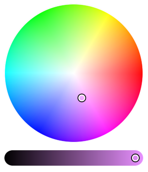
iro.js
A highly customizable svg-based color picker with zero external dependencies | iro.js.org
Features
- Simple: Easy-to-use API, with support for hex, rgb, hsl and hsv color formats.
- Extendable: Tweak the library to your requirements with Plugins and custom UI elements.
- Consistent behavior: Works across all modern browsers and is responsive on touchscreen devices.
- Small footprint: Around ~7kb minified and gzipped, with absolutely no external dependencies, extra stylesheets/images, or jQuery in sight.
- Licenced under MPL 2.0: 100% free for personal and commercial use.
Installation
Install with NPM
$ npm install @jaames/iro@beta --saveIf you are using a module bundler like Webpack or Rollup, import iro.js into your project:
// Using ES6 module syntax
import iro from '@jaames/iro';

// Using CommonJS modules
const iro = require('@jaames/iro');
Download and host yourself
Development version
Uncompressed at around 50kB, with source comments included
Production version
Minified to 19kB
Then add it to the <head> of your page with a <script> tag:
<html>
  <head>
    <!-- ... -->
    <script src="./path/to/iro.min.js"></script>
  </head>
  <!-- ... -->
</html>
When manually inluding the library like this, it will be globally available as window.iro.
Using the unpkg CDN
<script src="https://unpkg.com/@jaames/iro@beta/dist/iro.min.js"></script>
Demo
Coming soon!
Usage
Getting Started
Create a HTML element with a unique identifier (such as an id attribute) to act as a container for the color picker:
<div id="color-picker-container"></div>Then use JavaScript to create a new iro.ColorPicker and provide a CSS selector that matches the container element:
var colorPicker = new iro.ColorPicker('#color-picker-container');You can use a DOM object instead of a CSS selector -- this might be more suitable if you're integrating iro.js into an application built with Vue, React, Angular, etc.
Color Picker Options
The the color picker can be configured by passing a set of options to the second iro.ColorPicker parameter:
var colorPicker = new iro.ColorPicker("#color-picker-container", {
  // Set the size of the color picker
  width: 320,
  // Set the initial color to red
  color: "#f00"
});
Available Options
| Name | Purpose | Default Value |
|---|---|---|
color |
The initial color value. This can be any supported color format. | "#fff" |
width |
Total width of the control UI. | 300 |
padding |
Padding around the control handles. | 6 |
handleRadius |
Radius of the control handles. | 8 |
handleUrl |
SVG reference for custom handles. TODO: document this in more detail | null |
handleOrigin |
Custom handle origin point. | { x: 0, y: 0 } |
wheelLightness |
If set to 'false', the color wheel will not fade to black as the color's lightness decreases. | true |
sliderHeight |
Slider control height. By default this will be calculated automatically | undefined |
sliderMargin |
Distance between the wheel and the slider controls. | 12 |
borderWidth |
Width of the border around the controls. Defaults to 0 (no border). | 0 |
borderColor |
Color of the border. Any valid CSS color is supported. | "#fff" |
display |
CSS display value for the color picker root element. | "block" |
Color API
Each color picker instance has a color object which stores the currently selected color.
Color Properties
The color object has a few properties which can be used to both get and set the selected color in different formats. When the color is set this way, the UI will update and the color:change event will fire.
| Name | Example Format |
|---|---|
hexString |
#ff0000 |
rgb |
{ r: 255, g: 0, b: 0 } |
rgbString |
"rgb(255, 0, 0)" |
hsl |
{ h: 360, s: 100, l: 50 } |
hslString |
"hsl(360, 100%, 50%)" |
hsv |
{ h: 360, s: 100, v: 100 } |
For example, to get the current color as a hex string:
var hex = colorPicker.color.hexString;
console.log(hex); // hex = "#ff0000"
Or to set the selected color from a hsl object:
colorPicker.color.hsl = { h: 180, s: 100, l: 50 };
// colorPicker UI updates
Supported Color Formats
The following color formats are supported by the color picker's color config option, as well as the color.set() method:
- hex string:
"#ff0000" - shorthand hex string:
"#f00" - rgb(a) string:
"rgb(255, 0, 0)" - percentage rgb(a) string:
"rgb(100%, 0%, 0%)" - rgb object:
{r: 255, g: 0, b: 0} - hsl(a) string:
hsl(360, 50%, 100%) - hsl object:
{h: 360, s: 50, l: 100} - hsv object:
{h: 360, s: 100, v: 50}
Color Picker Events
The color picker's on method can be used to register callbacks for color picker events, such as when the selected color changes or when the user begins interacting with the picker. These callbacks can also be removed with the off method.
color:change
Fired whenever the color changes -- either when the user interacts with the controls, or when it is set via code. This event's callback function gets passed two values:
color: the currently selected colorchanges: an object showing which HSV channels have changed since the last time the event was fired
For example:
colorPicker.on('color:change', function(color, changes) {
  // Log the color's hex RGB value to the dev console
  console.log(color.hexString);
  // If the "H" channel has changed, log the color's HSV value too
  if (changes.h) {
    console.log(color.hsv);
  }
})
Check out the Color API documentation for more details on the color object.
input:start
Fired whenever the users starts interacting with the color picker controls. The colorPicker's color object is passed to this event's callback function.
input:end
Fired whenever the user stops interacting with the color picker controls. The colorPicker's color object is passed to this event's callback function.
mount
Fired when the colorPicker's UI has been mounted to the DOM and is ready for user interaction. A reference to the colorPicker object is passed to this event's callback function.
Documentation
⚠️ Full v4 documentation is currently being written
- Introduction
- Getting Started
- Color Picker Options
- Using the Selected Color
- Events
- ColorPicker API
- Color API
Plugins
Coming soon!
Website | Documentation | Codepen Demo | Contribution Guide | Changelog | License