
Package Exports
- @material/mwc-fab
- @material/mwc-fab/mwc-fab
- @material/mwc-fab/mwc-fab.js
This package does not declare an exports field, so the exports above have been automatically detected and optimized by JSPM instead. If any package subpath is missing, it is recommended to post an issue to the original package (@material/mwc-fab) to support the "exports" field. If that is not possible, create a JSPM override to customize the exports field for this package.
Readme
<mwc-fab> 
IMPORTANT: The Material Web Components are a work in progress and subject to major changes until 1.0 release.
A floating action button (FAB) represents the primary action of a screen.


Material Design Guidelines: Floating Action Button
Installation
npm install @material/mwc-fabNOTE: The Material Web Components are distributed as ES2017 JavaScript Modules, and use the Custom Elements API. They are compatible with all modern browsers including Chrome, Firefox, Safari, Edge, and IE11, but an additional tooling step is required to resolve bare module specifiers, as well as transpilation and polyfills for Edge and IE11. See here for detailed instructions.
Example usage
Standard
<link rel="stylesheet" href="https://fonts.googleapis.com/icon?family=Material+Icons&display=block">

<mwc-fab icon="favorite"></mwc-fab>

<script type="module">
  import '@material/mwc-fab';
  const fab = document.querySelector('mwc-fab');
  fab.addEventListener('click', () => {
    addFavorite();
  });
</script>
Mini
<mwc-fab mini icon="add"></mwc-fab>Extended
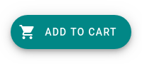
<mwc-fab extended icon="shopping_cart" label="Add to cart"></mwc-fab>Customize colors
mwc-fab {
  --mdc-theme-secondary: white;
  --mdc-theme-on-secondary: black;
}
API
Slots
None
Properties/Attributes
| Name | Type | Description |
|---|---|---|
icon |
string |
The icon to display. |
label |
string |
The label to display when using the extended layout, and the aria-label attribute in all layouts. |
mini |
boolean |
Modifies the FAB to be a smaller size, for use on smaller screens. Defaults to false. |
extended |
boolean |
Enable the extended layout which includes a text label. Defaults to false. |
showIconAtEnd |
boolean |
When in the extended layout, position the icon after the label, instead of before. Defaults to false. |
Methods
None
Events
None
CSS Custom Properties
| Name | Default | Description |
|---|---|---|
--mdc-icon-font |
Material Icons |
Font to use for the icon. |
--mdc-theme-on-secondary |
 #ffffff |
Foreground color of the label and icon. |
--mdc-theme-secondary |
 #018786 |
Background color of the FAB. |