
Package Exports
- @progresso/react-giphy-picker-https
This package does not declare an exports field, so the exports above have been automatically detected and optimized by JSPM instead. If any package subpath is missing, it is recommended to post an issue to the original package (@progresso/react-giphy-picker-https) to support the "exports" field. If that is not possible, create a JSPM override to customize the exports field for this package.
Readme
react-giphy-picker-https
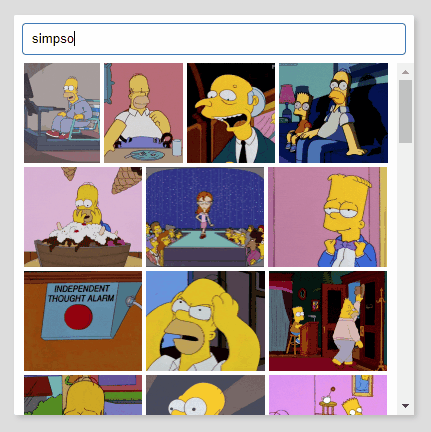
react-giphy-picker-https is a simple gif picker component using giphy API over https.
Install
yarn add @progresso/react-giphy-picker-https
Usage basic
import Picker from 'react-giphy-picker-https'
import ReactDOM from 'react-dom'
import React, { Component, PropTypes } from 'react'

class TestComponent extends Component {
  log (gif) {
    console.log(gif)
  }

  render () {
    return (
      <div>
        <Picker apiKey="your-giphy-api-key" onSelected={this.log.bind(this)} />
      </div>
    )
  }
}

ReactDOM.render(
  <TestComponent />,
  document.getElementById('root')
)
Props
apiKey (required)
Your giphy api key, see API Quickstart Guide on developers.giphy.com.
onSelected (required)
Handles a gif selection and provides the selected gif as a Gif Object.
visible
Set to true to make the component visible.
modal
Set to true, if you want the component to be displayed as a floating layer. It will set the component position: absolute and add a box shadow.
style
A React.CSSProperties object that appies to the outer component shape.
searchBoxStyle
A React.CSSProperties object that applies to the component's search box.
gifStyle
A React.CSSProperties object that applies to each rendered gif image within the component.
Styles
Uses styled-components 💅 for the base styling.
Development
yarn
yarn dev
Test
yarn testBuild
yarn
yarn build