
Package Exports
- @radial-color-picker/react-color-picker
This package does not declare an exports field, so the exports above have been automatically detected and optimized by JSPM instead. If any package subpath is missing, it is recommended to post an issue to the original package (@radial-color-picker/react-color-picker) to support the "exports" field. If that is not possible, create a JSPM override to customize the exports field for this package.
Readme
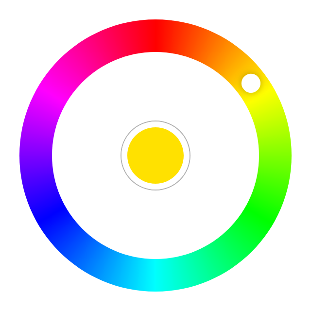
Radial Color Picker - React


Introduction
Great UX starts with two basic principles - ease of use and simplicity. Selecting a color should be as easy as moving a slider, clicking a checkbox or pressing a key just like other basic form elements behave.
This is a flexible and minimalistic color picker. Developed with mobile devices and keyboard usage in mind. Key features:
- Small size - 3.7 KB gzipped (JS and CSS combined)
- Supports touch devices
- Optimized animations
- Ease of use
- Double click anywhere to move the knob to a color
- Tab to focus the picker
- ↑ or → arrow key to increase hue. Shift + ↑/→ to go quicker and Ctrl + ↑/→ to go even quicker.
- ↓ or ← arrow key to decrease hue. Shift + ↓/← to go quicker and Ctrl + ↓/← to go even quicker.
- Enter to select a color and close the picker or to open it
- Mouse ScrollUp to increase and ScrollDown to decrease hue (Opt-in)
Ecosystem
The right color picker, but not the framework you're looking for?
Quick Links
Demos
- Basic Example - Codepen
Usage
With Module Build System
Color Picker on npm
npm install @radial-color-picker/react-color-pickerAnd in your app:
import ColorPicker from '@radial-color-picker/react-color-picker';
import '@radial-color-picker/react-color-picker/dist/react-color-picker.umd.min.css';

class App extends React.Component {
    state = {
        hue: 90,
        saturation: 100,
        luminosity: 50,
        alpha: 1,
    };

    onChange = ({ hue, saturation, luminosity, alpha }) => {
        this.setState({ hue, saturation, luminosity, alpha });
    };

    render() {
        return <ColorPicker {...this.state} onChange={this.onChange} />;
    }
}
Depending on your build tool of choice (webpack, parcel, rollup) you may have to setup the appropriate loaders or plugins. If you're using create-react-app you don't have to do anything else - it comes preconfigured and supports CSS import out of the box.
Options
ColorPicker is a controlled component. It's current state is defined and updated by the props you pass to it.
Props
| Options | Type | Default/Description |
|---|---|---|
hue |
Number | Defaults to 0 (red color) |
saturation |
Number | Defaults to 100 |
luminosity |
Number | Defaults to 50 |
alpha |
Number | Defaults to 1 |
mouseScroll |
Boolean | Use wheel (scroll) event to rotate. Defaults to false. |
step |
Number | Amount of degrees to rotate the picker with keyboard and/or wheel. Defaults to 2 degrees. |
onSelect |
Function | Callback which is triggered when a color is selected. |
onChange |
Function | A function to invoke when color is changed (i.e. on rotation). |
First Asked Questions
How to select other shades of the solid colors?
We suggest to add a custom slider for saturation and luminosity or use <input type="range">.
Why does Google Chrome throw a [Violation] Added non-passive event listener to a scroll-blocking 'touchmove' event. warning in the console?
touchmove is used with preventDefault() to block scrolling on mobile while rotating the color knob. Even the Web Incubator Community Group acknowledges that in some cases a passive event listener can't be used.
Why is the scroll-to-rotate functionality not turned on by default?
It's another non-passive event that could potentially introduce jank on scroll. To rotate the color knob, but stay on the same scrolling position the wheel event is blocked with preventDefault(). Thus, if you really want this feature for your users you'll have to explicitly add :mouse-scroll="true".
Change log
Please see Releases for more information on what has changed recently.
Contributing
If you're interested in the project you can help out with feature requests, bugfixes, documentation improvements or any other helpful contributions. You can use the issue list of this repo for bug reports and feature requests and as well as for questions and support.
Please see CONTRIBUTING and CODE_OF_CONDUCT for details.
Credits
This component is based on the great work that was done for the AngularJs color picker angular-radial-color-picker.
License
The MIT License (MIT). Please see License File for more information.