
Package Exports
This package does not declare an exports field, so the exports above have been automatically detected and optimized by JSPM instead. If any package subpath is missing, it is recommended to post an issue to the original package (@rc-component/cascader) to support the "exports" field. If that is not possible, create a JSPM override to customize the exports field for this package.
Readme
rc-cascader
React Cascader Component.


Browser Support
 IE / Edge |
 Firefox |
 Chrome |
 Safari |
 Electron |
|---|---|---|---|---|
| IE11, Edge | last 2 versions | last 2 versions | last 2 versions | last 2 versions |
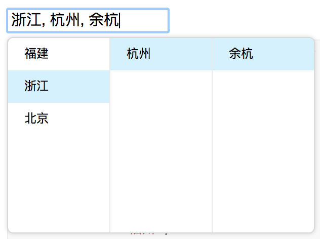
Screenshots
Example
https://cascader-react-component.vercel.app
Install

$ npm install rc-cascader --saveUsage
import React from 'react';
import Cascader from '@rc-component/cascader';

const options = [{
  'label': '福建',
  'value': 'fj',
  'children': [{
    'label': '福州',
    'value': 'fuzhou',
    'children': [{
      'label': '马尾',
      'value': 'mawei',
    }],
  }, {
    'label': '泉州',
    'value': 'quanzhou',
  }],
}, {
  'label': '浙江',
  'value': 'zj',
  'children': [{
    'label': '杭州',
    'value': 'hangzhou',
    'children': [{
      'label': '余杭',
      'value': 'yuhang',
    }],
  }],
}, {
  'label': '北京',
  'value': 'bj',
  'children': [{
    'label': '朝阳区',
    'value': 'chaoyang',
  }, {
    'label': '海淀区',
    'value': 'haidian',
  }],
}];

React.render(
  <Cascader options={options}>
    ...
  </Cascader>
, container);
API
props
| name | type | default | description |
|---|---|---|---|
| autoClearSearchValue | boolean | true | Whether the current search will be cleared on selecting an item. Only applies when checkable |
| options | Object | The data options of cascade | |
| value | Array | selected value | |
| defaultValue | Array | initial selected value | |
| onChange | Function(value, selectedOptions) | callback when finishing cascader select | |
| changeOnSelect | Boolean | false | change value on each selection |
| loadData | Function(selectedOptions) | callback when click any option, use for loading more options | |
| expandTrigger | String | 'click' | expand current item when click or hover |
| open | Boolean | visibility of popup overlay | |
| onPopupVisibleChange | Function(visible) | callback when popup overlay's visibility changed | |
| transitionName | String | transition className like "slide-up" | |
| prefixCls | String | rc-cascader | prefix className of popup overlay |
| popupClassName | String | additional className of popup overlay | |
| popupPlacement | String | bottomLeft | use preset popup align config from builtinPlacements:bottomRight topRight bottomLeft topLeft |
| getPopupContainer | function(trigger:Node):Node | () => document.body | container which popup select menu rendered into |
| dropdownMenuColumnStyle | Object | style object for each cascader pop menu | |
| fieldNames | Object | { label: 'label', value: 'value', children: 'children' } | custom field name for label and value and children |
| expandIcon | ReactNode | > | specific the default expand icon |
| loadingIcon | ReactNode | > | specific the default loading icon |
| hidePopupOnSelect | Boolean | >true | hide popup on select |
option
| name | type | default | description |
|---|---|---|---|
| label | String | option text to display | |
| value | String | option value as react key | |
| disabled | Boolean | disabled option | |
| children | Array | children options |
Development
$ npm install
$ npm start
Test Case
$ npm testCoverage
$ npm run coverageLicense
rc-cascader is released under the MIT license.