Package Exports
- @sedeh/icon-select
This package does not declare an exports field, so the exports above have been automatically detected and optimized by JSPM instead. If any package subpath is missing, it is recommended to post an issue to the original package (@sedeh/icon-select) to support the "exports" field. If that is not possible, create a JSPM override to customize the exports field for this package.
Readme
Welcome to ICon Select!
Have you ever wanted to have an easy to use component that looks exactly (almost) like a select tag with the added benefit of showing icons instead of words? Have you wanted to transform a select tag into a more meaningful drop-down when it comes to have a list of images to pick? Have you thought of makeing it all animate and slide? If so, then welcome to Icon Select!
NOTE: Starting with version 1.1.0 this library is compatible with Angular 6+.
NOTE: Starting with version 1.2.1 you need to import this library through @sedeh/icon-select.
Live Demo | Source code | Comments/Requests
Dependencies
MODULE:
    ISelectModule

EXPORTS
    ISelect,
    IconInfo,
    IRenderer,
    CSSImagePipe,
    ISelectDirective

DEPENDENCIES:
    "font-awesome": "^4.7.0"
So... How it can be done?
your data set should follow the following pattern:
export interface IconInfo {
    name: string,
    value: string,
    label?: string,
    animation?: string, // name of animation to be applied on image
    opacity?: number,
    selected?: boolean, // default selected.
    disabled?: boolean,
    repeat?: boolean, // image should repeat or fit
    molded?: boolean, // display a pattern from the image
    favorite?: boolean // image is in user's favorite list
}
Run npm install @sedeh/icon-select in your application. and do either of the following:
Sample usage through using i-select component or i-select directive.
    <i-select
        id="backgroundPicker"
        name="selectedBackground"
        [size]="6"
        [template]="temp1"
        [applyOpacity]="false"
        [entries]="iconpickeData"
        [applyLayoutType]="true"
        [applyPattern]="true"
        [applyAnimation]="true"
        [applySlideShow]="true"
        [searchEnabled]="true"
        (ontoggle)="toggleSelection($event)"
        (onchange)="updateSelection($event)">
    </i-select>

    <select
        i-select
        id="overlayPicker1"
        size="6"
        name="selectedOverlay"
        [searchEnabled]="false"
        [applyOpacity]="true"
        [applyLayoutType]="false"
        [applyPattern]="false"
        [applyAnimation]="true"
        [applySlideShow]="true"
        (ontoggle)="toggleOverlay($event)"
        (change)="updateOverlay($event)" >
        <option *ngFor="let x of iconpickeOverlay"
            [attr.opacity]="x.opacity"
            [attr.repeat]="x.repeat"
            [attr.pattern]="x.molded"
            [attr.favorite]="x.favorite"
            [selected]="x.selected ? 'true' : null"
            [value]="x.value"
            [textContent]="x.name"></option>
    </select>
    <ng-template #temp1>show something here...</ng-template>

<i-renderer *ngIf="selectedImage != null"
  refrenceId="backgroundPicker"
  [absolute]="true"
  [cover]="selectedImage.repeat === false"
  [repeat]="selectedImage.repeat"
  [value]="selectedImage.value"
  [molded]="selectedImage.molded"
  [animation]="selectedImage.animation">

  <i-renderer *ngIf="selectedPattern != null"
    refrenceId="overlayPicker1"
    [value]="selectedPattern.value"
    [opacity]="selectedPattern.opacity >= 0 ? selectedPattern.opacity : null"
    [animation]="selectedPattern.animation"></i-renderer>
</i-renderer>
Attributes
I-SELECT
| Attribute | Description |
|---|---|
| searchEnabled | Display search field to find / filter images in the list. |
| size | Display size. number of images in the popup. |
| showIconName | Display name of the selected icon at the bottom of the image. |
| template | Area in which you can display additional content or input fields. |
| applyOpacity | Display a opacity input range section on the popup. |
| applyLayoutType | Display a check option to decide if image should repeat or fit. |
| applyPattern | Display a check option to enable / disable pettern generation on a selected image. This option makes it necessary to use i-renderer since it implements animations. |
| applySlideShow | Display Start a slide show from users favorite image. |
| applyAnimation | Display dropdown options to choose animation for selected image. |
| Available animation types are: grayout, sepia, fade, zoom, shake | |
| entries | List of all images to be displayed. |
I-RENDERER
| Attribute | Description |
|---|---|
| refrenceId | ID that corelates with the I-SELECt id. It should be exactly the same id as what is assigned to i-select. |
| absolute | If the view should have position absolute. |
| repeat | If the image sgould be styled to repeat. |
| molded | If the image sgould be styled to pattern. |
| animation | The name of animation to be applied on the view. |
| favorite | If the image is in user's favorite list. |
| value | The image URL or image data to be displayed. |
Events
| Event | Description |
|---|---|
| onchange | Event that fires when an image is selected mainly to store selection. |
| ontoggle | Event that fires when an image is selected, highlighted, or toggled in slide show mainly to display the selected, highlighted, or slided item. |
| enabledShow | Fired when used enables/disables slide show. |
Revision History
| Version | Description |
|---|---|
| 1.4.0 | Added option to have slide show of the favorite items in a list. |
| 1.3.0 | Added option to animate the image. |
| 1.2.6 | Added option to create pattern out of an image before displaying it. |
| 1.2.5 | Added section to allow image repeat or image fit. |
| 1.2.4 | Fixed situation when there is a default selected item in the list. |
| 1.2.3 | Added template and applyOpacity attributes. |
| 1.2.2 | Fixed accessibility issues. |
| 1.2.1 | Updated dependencies. |
| 1.2.0 | It was brought to my attention that some users have trouble using my components in their angular 6 environment. Since I had only updated few dependencies when moved to Angular 6, I am thinking dependencies are causing issues. So, for this release, I am updating all dependencies to what Angular 6 applications are expecting to have. Please let me know if this is fixing or not fixing any issues you are facing. |
| 1.1.0 | Updated libraries to become compatible with Angular 6+. |
| 1.0.0 | Compiled with AOT option and resolved issues. |
| 0.0.1 | Initial Release. |
It is that simple..!!
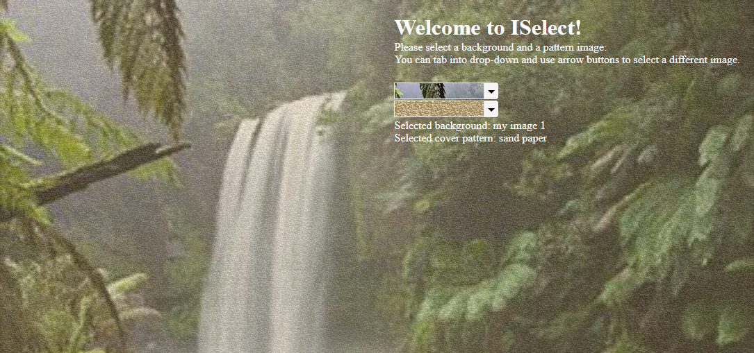
Sample view of the component at work!

How to include font-awesome in your project?
In your project root folder, find and open the file 'angular-cli.json' in any editor Locate the styles[] array and add font-awesome references directory. like:
"apps":
    [
        {
            ....
            "styles": [
              "../node_modules/font-awesome/css/font-awesome.css"
              "styles.css"
            ],
            ...
        }
    ]