
Package Exports
- @sherby/code-block
This package does not declare an exports field, so the exports above have been automatically detected and optimized by JSPM instead. If any package subpath is missing, it is recommended to post an issue to the original package (@sherby/code-block) to support the "exports" field. If that is not possible, create a JSPM override to customize the exports field for this package.
Readme


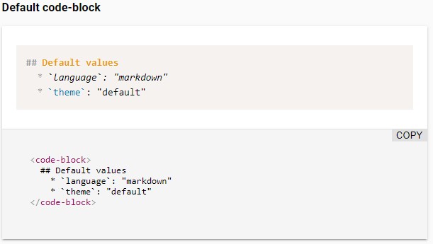
<code-block>
A Web component that displays colorfully formatted code with Prism.js and LitElement.
Features
- Loads Prism.js language definitions and custom themes on demand via dynamic imports
- Support the languages aliases of Prism.js
- Add the language name automatically in the top-right corner of the block
- Remove automatically beginning spaces to allow you to format your code with indentation
- Allow to extend the class for further customizations
- Built as a web component on LitElement
Installation
npm install @sherby/code-blockUse
To use this element, import it in your component:
import '@sherby/code-block';And add a code-block element in your component template.
<code-block language="javascript">function helloWorld(say) { console.log(say); } helloWorld('Hi there!');</code-block>Attributes
You can override the following attributes to met your needs:
| Name | Description | Default |
|---|---|---|
language |
Code language you wish to utilize from Prism | markdown |
languageFileTemplate |
Template URL where the language file can be automatically imported, where {LANGUAGE} will be replaced by the language |
/node_modules/prismjs/components/prism-{LANGUAGE}.min.js |
theme |
Path to Prism CSS theme file | twilight |
themeFileTemplate |
Template URL where the theme file can be automatically imported, where {THEME} will be replaced by the theme |
/node_modules/prismjs/themes/prism.css |
Building
If you want the ability to load the full spectrum of languages that Prism
supports, you'll want to make sure your build script includes the
/node_modules/prismjs/**, as there are many language resources.
Develop
# Clone the project
git clone git@github.com:sherby/code-block.git

# Go to the project directory
cd code-block

# Install the dependencies
npm install

# Start the demo page
npm start
Polyfills Required
code-block utilizes Custom Elements and Shadow DOM (Web Components). As you can see in the table below, you'll need some polyfills to make use of this across a wide range of browsers.
| Platform Support | Chrome | Chrome for Android | Firefox | Safari | iOS Safari | Edge | IE 11 |
|---|---|---|---|---|---|---|---|
| Supported | ✓ | ✓ | ✓ | ✓ | ✓ | ✓ | ✓ |
| Polyfill(s) Required | - | - | ✓ | ✓ | ✓ | ✓ | ✓ |
Within your project, you can load them as such:
<script src="../node_modules/@webcomponents/webcomponentsjs/webcomponents-loader.js"></script>Thanks
Special thanks to Justin Ribeiro for his code-block component that this project is forked from.
Publish
Increment the version defined in the package.json file and run the command below to publish the module in the
registry:
# Dry run
npm publish --dry-run

# For real (are you really sure?)
npm publish --access public
License
The MIT License (MIT)