Package Exports
- @thi.ng/meta-css
Readme


This project is part of the @thi.ng/umbrella monorepo and anti-framework.
- About
- Framework generation rules
- Bundled CSS base framework
- Status
- Related packages
- Installation
- Dependencies
- Usage examples
- CLI
- Authors
- License
About
Data-driven CSS framework codegen, transpiler & bundler.
This toolchain and the overall workflow proposed by it is heavily building atop the concept of CSS utility classes and how they're utilized (as you might know from using Tachyons, Turret or the newer Tailwind projects). How and where those CSS classes are applied is however a defining point of difference to other existing approaches. This readme aims to provide a thorough overview and some concrete usage examples...
This package provides a CLI multi-tool to:
Generate CSS frameworks
The generate command is used to generate custom frameworks with (likely)
hundreds of CSS utility classes from a number of extremely compact, parametric
JSON rule specs. This process generates all desired, combinatorial versions of
various rules/declarations and exports them to another JSON file used as
intermediatary for the other commands provided by this toolchain. The
syntax/format of the generator rules is explained
further on. These rule specs can be split up into multiple files for better
handling, can define arbitrary media query criteria (all later combinable),
shared lookup tables for colors, margins, sizes, timings etc.
The package provides generator specs for a basic, fully customizable, tachyons.io-derived CSS framework. These specs and resulting framework are used for some example projects in this repo, but are mainly intended as basic starting points for creating other custom frameworks (in the hope they'll be shared back similarly)...
metacss generate --help

Usage: metacss generate [opts] input-dir

Flags:

-p, --pretty            Pretty print output
-v, --verbose           Display extra process information

Main:

-o STR, --out STR       Output file (or stdout)
--prec INT              Number of fractional digits (default: 3)
Convert meta stylesheets to CSS
The convert command is used to compile & bundle actual CSS from user-provided
MetaCSS stylesheets (*.meta files) and the JSON framework specs created by the
generate command. The meta-stylesheets support any CSS selectors, are nestable
and compose full CSS declarations from lists of the utility classes in the
generated framework.
Each item (aka utility class name) can be prefixed with an arbitrary number of
media query IDs (also custom defined in the framework): e.g. dark:bg-black
might refer to a CSS class to set a black ground, with the dark: prefix
referring to a defined media query which only applies this class when dark mode
is enabled...
Selectors, declarations and media query criteria will be deduplicated and merged
from multiple input files. The resulting CSS will only contain referenced rules
and can be generated in minified or pretty printed formats (it's also possible
to force include CSS classes which are otherwise unreferenced, using the
--force CLI arg). Additionally, multiple .meta files can be watched for
changes, their definitions will be merged, and existing CSS files can be
included (prepended) in the bundled outout too.
metacss convert --help

Usage: metacss convert [opts] input [...]

Flags:

--no-header             Don't emit generated header comment
-p, --pretty            Pretty print output
-v, --verbose           Display extra process information
-w, --watch             Watch input files for changes

Main:

--force STR[,..]        [multiple] CSS classes to force include (wildcards are
                        supported, @-prefix will read from file)
-I STR, --include STR   [multiple] Include CSS files (prepend)
-o STR, --out STR       Output file (or stdout)
-s STR, --specs STR     [required] Path to generated JSON defs
Including custom CSS files
One or more existing CSS files can be included & prepended to the output via the
--include/-I arg (which can be given multiple times). These files are used
verbatim and will not be transformed or reformatted in any way.
Force inclusion of unreferenced classes
Only the CSS classes (and their optionally associated media queries) referenced
in a .meta stylesheet will appear in the export CSS bundle. This ensures that
the resulting CSS will only contain what's actually used (same effect as
tree-shaking, only vastly more efficient). However, this also means any CSS
classes (and optionally, their media query qualifiers) which are otherwise
referenced (e.g. from JS/TS source code or HTML docs) will not be included
by default and they will need to be listed manually for forced inclusion.
This can be achieved via the --force/-f arg (also can be given multiple
times). This option also supports basic *-wildcard patterns, e.g. bg-* to
include all classes with prefix bg-. Furthermore, for larger projects it's
useful to store these names/patterns in a separate file. For that purpose, use
the @ prefix (e.g. -f @includes.txt) to indicate reading from file (only
reading from a single file is supported at current)... See the meta-css-basics
example
project
for concrete usage...
Export
The export command is intended for those who're mainly interested in the CSS
framework generation aspects of this toolchain. This command merely takes an
existing generated framework JSON file and serializes it to a single CSS file,
e.g. to be then used with other CSS tooling (e.g. postcss).
Media query variations
Users can choose to generate variations of all defined utility classes for any of the framework-defined media query IDs. This will create additional suffixed versions of all classes (with their appropriate media query wrappers) and cause a potentially massive output (depending on the overall number/complexity of the generated classes). Again, the idea is that the resulting CSS file will be post-processed with 3rd party CSS tooling...
For example, if the framework contains a CSS class w-50 (e.g. to set the width
to 50%) and media queries for different screen sizes (e.g. named ns, l),
then the export with said media queries will also generate classes w-50-ns
and w-50-l (incl. their corresponding @media wrappers).
As with the convert command, additional CSS files can also be included
(prepended) in the output file.
metacss export --help

Usage: metacss export [opts] input

Flags:

--no-header             Don't emit generated header comment
-p, --pretty            Pretty print output
-v, --verbose           Display extra process information

Main:

-I STR, --include STR   [multiple] Include CSS files (prepend)
-m STR, --media STR     Media query IDs (use 'ALL' for all)
-o STR, --out STR       Output file (or stdout)
Note: In all cases, final CSS generation itself is handled by thi.ng/hiccup-css
👷🏻 This is all WIP! See example below for basic example usage...
Framework generation rules
This section gives an overview of the JSON format used to generate CSS frameworks of dozens (usually hundreds) of utility classes, including many possible variations (per spec).
Overall file structure
Generation specs use a simple JSON structure as shown below. The specs can be
split over multiple files within a directory and will all be merged by the
generate command of the toolchain.
{
    // optional meta data (later used for comment injection in generated CSS)
    "info": {
        "name": "Framework name",
        "version": "0.0.0",
    },
    // optional media queries and their criteria
    "media": {
        "large": { "min-width": "60rem" },
        "dark": { "prefers-color-scheme": "dark" }
    },
    // optional shared values/LUTs (arrays or objects)
    "tables": {
        "margins": [0, 0.25, 0.5, 1, 2, 4]
    },
    // array of actual generation specs
    "specs": [
        //...
    ]
}
Example spec
The following generator document uses a single small generative rule spec to create altogether 21 utility classes for various possible margins (where 21 = 3 margin sizes provided × 7 variations).
For each additional value added to the margins table, 7 more CSS classes will be
generated. The name (class) and props (CSS property name) are parametric and
will be explained in more detail further below.
{
    "tables": {
        "margins": [0, 0.5, 1]
    },
    "specs": [
        {
            "name": "m<vid><k>",
            "props": "margin<var>",
            "values": "margins",
            "unit": "rem",
            "var": ["a", "t", "r", "b", "l", "h", "v"]
        }
    ]
}
Assuming the above spec has been saved to a JSON file in the myspecs
directory...
# the `generate` cmd is directory based and will read all
# JSON files in the provided dir (recursively)...

# if no `--out` file is given, the result will go to stdout
metacss generate --pretty myspecs
...this command (with the above spec) will generate the following output (here
we're only interested in the entries under classes):
{
    "info": {
        "name": "TODO",
        "version": "0.0.0"
    },
    "media": {},
    "classes": {
        "ma0": { "margin": "0rem" },
        "ma1": { "margin": ".5rem" },
        "ma2": { "margin": "1rem" },
        "mh0": { "margin-left": "0rem", "margin-right": "0rem" },
        "mh1": { "margin-left": ".5rem", "margin-right": ".5rem" },
        "mh2": { "margin-left": "1rem", "margin-right": "1rem" },
        "mv0": { "margin-top": "0rem", "margin-bottom": "0rem" },
        "mv1": { "margin-top": ".5rem", "margin-bottom": ".5rem" },
        "mv2": { "margin-top": "1rem", "margin-bottom": "1rem" },
        "mt0": { "margin-top": "0rem" },
        "mt1": { "margin-top": ".5rem" },
        "mt2": { "margin-top": "1rem" },
        "mr0": { "margin-right": "0rem" },
        "mr1": { "margin-right": ".5rem" },
        "mr2": { "margin-right": "1rem" },
        "mb0": { "margin-bottom": "0rem" },
        "mb1": { "margin-bottom": ".5rem" },
        "mb2": { "margin-bottom": "1rem" },
        "ml0": { "margin-left": "0rem" },
        "ml1": { "margin-left": ".5rem" },
        "ml2": { "margin-left": "1rem" }
    }
}
When later used in stylesheets, we can then refer to each of these classes by
their generated names, e.g. ma0 to disable all margins or mh2 to set both
left & right margins to 1rem (in this case)...
Spec structure
An individual generator spec JSON object can contain the following keys:
| ID | Type | Description |
|---|---|---|
name |
string | Parametric name for the generated CSS class(es) |
props |
string or object | CSS property name(s), possibly parametric |
values |
string, array or object | Values to be assigned to CSS properties, possibly parametric |
unit |
string, optional | CSS unit to use for values |
key |
string, optional | Method for deriving keys from current value |
var |
string[], optional | Array of variation IDs (see section below) |
user |
any, optional | Custom user data, comments, metadata etc. |
The number of generated CSS classes per spec is number of items in values
multiplied with the number of variations in var (if any).
Any user data will be stored (as is) with each generated CSS class, but
currently has no other direct use in the toolchain and is meant for additional
user-defined tooling.
Variations
Variations can be requested by providing an array of valid variation IDs. If
used, <vid> or <var> parameters must be used in the name or else naming
conflicts will occur.
| ID | Expanded values |
|---|---|
"" |
[""] |
"a" |
[""] |
"b" |
["-bottom"] |
"bottom" |
["bottom"] |
"h" |
["-left", "-right"] |
"l" |
["-left"] |
"left" |
["left"] |
"r" |
["-right"] |
"right" |
["right"] |
"t" |
["-top"] |
"top" |
["top"] |
"v" |
["-top", "-bottom"] |
"x" |
["-x"] |
"y" |
["-y"] |
Parametric IDs
The following parameters can (and should) be used in a spec's name and props
to generate multiple pattern-based values (more examples below).
<vid>is a value from the ID column of the above variations table. If no variations are requested, its value will be an empty string.<var>is one of the expanded values for the current variation (2nd column of variations table). If no variations are defined, this too will be an empty string.<v>is the currently processed value of a spec'svalues.<k>is the key (possibly derived) for the currently processed value of a spec'svaluesand will depend on the type ofvalues(see below)
Values
The values are used to populate the props (CSS properties). If values is a
string it will be used as table-name to look up in the current spec file's
tables, an object storing values which should be shared among specs (only in
the same file).
Other allowed types of values: string array, numeric array or object of
key-value pairs (where values are strings or numbers too). The following
examples will all produce the same outcome:
Using a named tables entry:
{
    "tables": {
        "test": ["red", "green", "blue"]
    },
    "specs": [
        {
            "name": "test<v>",
            "props": "color",
            "values": "test"
        }
    ]
}
Using an array directly (here only showing the spec itself for brevity):
{
    "name": "test<v>",
    "props": "color",
    "values": ["red", "green", "blue"]
}
Using an object (ignoring the keys, only using the values here):
{
    "name": "test<v>",
    "props": "color",
    "values": { "r": "red", "g": "green", "b": "blue"}
}
All 3 versions will result in these utility classes:
{
    "test-red": { "color": "red" },
    "test-green": { "color": "green" },
    "test-blue": { "color": "blue" }
}
Properties
The props field is used to define one or more CSS property names and
optionally their intended values (both can be parametric). If props is a
string, the values assigned to the property will be those given in values
(optionally with assigned unit, if provided)
{
    "name": "bg<k>",
    "props": {
        "background-image": "url(<v>)",
        "background-size": "cover",
    },
    "values": ["abc.jpg", "def.jpg", "xyz.jpg"]
}
Will result in these definitions:
{
    "bg0": { "background-image": "url(abc.jpg)", "background-size": "cover" },
    "bg1": { "background-image": "url(def.jpg)", "background-size": "cover" },
    "bg2": { "background-image": "url(xyz.jpg)", "background-size": "cover" }
}
Key value generation
The key field is only used when values is resolving to an array. In this
case this field determines how a "key" value (aka the <k> param for string
interpolation, see below) will be derived for each value in values:
key |
values |
Description | Examples |
|---|---|---|---|
v |
[10, 20, ...] |
Actual array item value | 10, 20, ... |
i |
[10, 20, ...] |
Array item index | 0, 1,... |
i1 |
[10, 20, ...] |
Array item index + 1 | 1, 2,... |
If values resolves to an object, the <k> param will always be the key of the
currently processed value.
{
    "name": "test-<k>",
    "props": "test-prop",
    "values": { "abc": 23, "xyz": 42 }
}
The above spec will generate the following (some parts omitted):
{
    "test-abc": { "test-prop": 23 },
    "test-xyz": { "test-prop": 42 },
}
Media query definitions
Media queries can be defined via the top-level media object in a spec file.
Each query has an ID and an object of one or more query criteria.
The key-value pairs of the conditional object are interpreted as follows and
ALWAYS combined using and:
| Key/Value pair | Result |
|---|---|
"min-width": "10rem" |
(min-width: 10rem) |
"prefers-color-scheme": "dark" |
(prefers-color-scheme: dark) |
print: true |
print |
print: false |
not print |
print: "only" |
only print |
See media queries in the bundled base specs
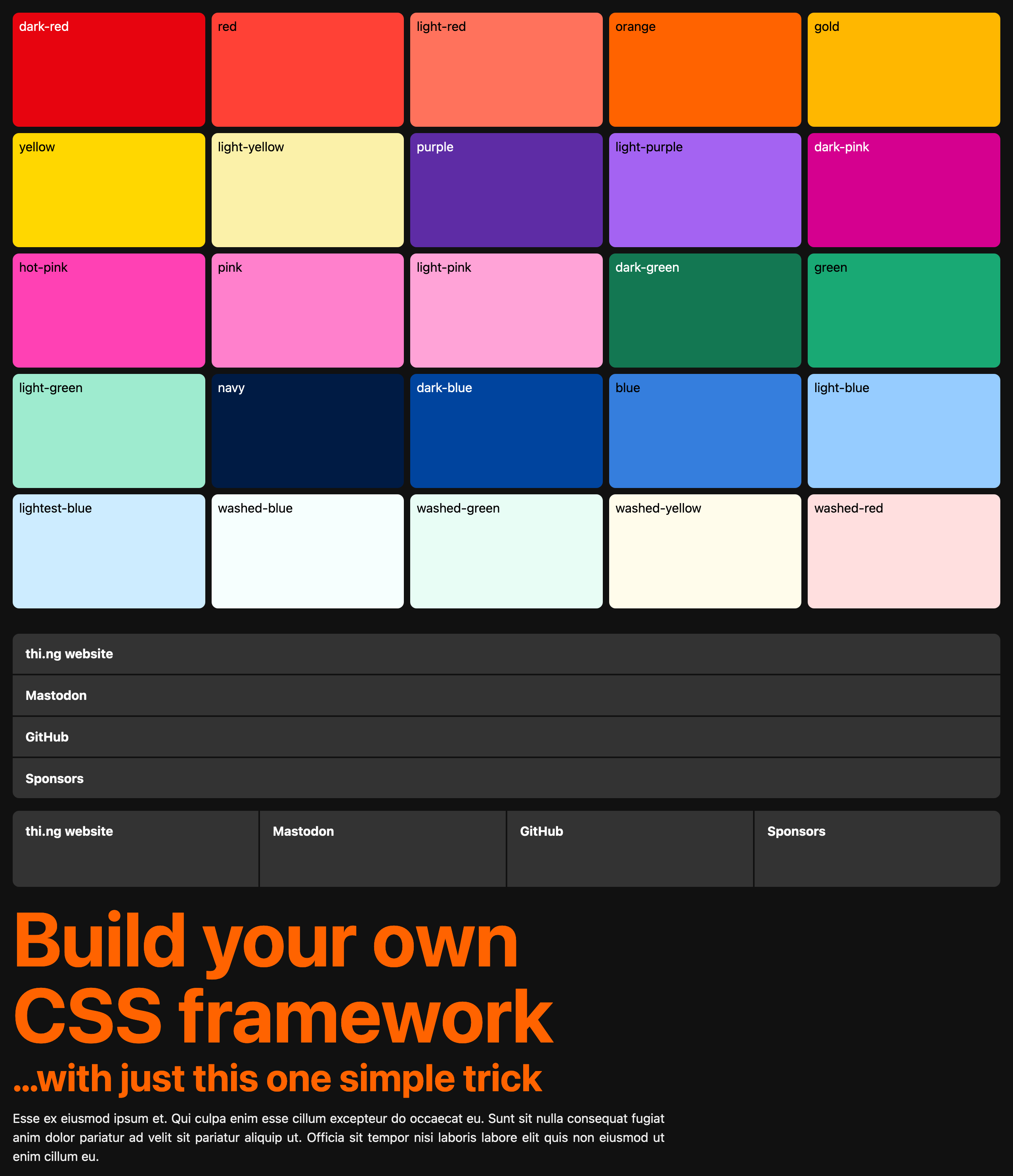
Bundled CSS base framework
The package includes a large number of useful specs in /specs. These are provided as starting point to define your custom framework(s)...
Currently available CSS classes in MetaCSS base v0.0.1:
Classes by category
Animations / transitions
bg-anim1 / bg-anim2 / bg-anim3
Border radius
br0 / br1 / br2 / br3 / br4 / brb0 / brb1 / brb2 / brb3 / brb4 / brl0 / brl1 / brl2 / brl3 / brl4 / brr0 / brr1 / brr2 / brr3 / brr4 / brt0 / brt1 / brt2 / brt3 / brt4
Border width
bw0 / bw1 / bw2 / bw3 / bw4 / bw5 / bwb0 / bwb1 / bwb2 / bwb3 / bwb4 / bwb5 / bwl0 / bwl1 / bwl2 / bwl3 / bwl4 / bwl5 / bwr0 / bwr1 / bwr2 / bwr3 / bwr4 / bwr5 / bwt0 / bwt1 / bwt2 / bwt3 / bwt4 / bwt5
Colors
b--black / b--blue / b--dark-blue / b--dark-gray / b--dark-green / b--dark-pink / b--dark-red / b--gold / b--gray / b--green / b--hot-pink / b--light-blue / b--light-gray / b--light-green / b--light-pink / b--light-purple / b--light-red / b--light-silver / b--light-yellow / b--lightest-blue / b--mid-gray / b--moon-gray / b--navy / b--near-black / b--near-white / b--orange / b--pink / b--purple / b--red / b--silver / b--transparent / b--vcol1 / b--vcol10 / b--vcol11 / b--vcol12 / b--vcol13 / b--vcol14 / b--vcol15 / b--vcol16 / b--vcol2 / b--vcol3 / b--vcol4 / b--vcol5 / b--vcol6 / b--vcol7 / b--vcol8 / b--vcol9 / b--washed-blue / b--washed-green / b--washed-red / b--washed-yellow / b--white / b--yellow / bg-black / bg-blue / bg-dark-blue / bg-dark-gray / bg-dark-green / bg-dark-pink / bg-dark-red / bg-gold / bg-gray / bg-green / bg-hot-pink / bg-light-blue / bg-light-gray / bg-light-green / bg-light-pink / bg-light-purple / bg-light-red / bg-light-silver / bg-light-yellow / bg-lightest-blue / bg-mid-gray / bg-moon-gray / bg-navy / bg-near-black / bg-near-white / bg-orange / bg-pink / bg-purple / bg-red / bg-silver / bg-transparent / bg-vcol1 / bg-vcol10 / bg-vcol11 / bg-vcol12 / bg-vcol13 / bg-vcol14 / bg-vcol15 / bg-vcol16 / bg-vcol2 / bg-vcol3 / bg-vcol4 / bg-vcol5 / bg-vcol6 / bg-vcol7 / bg-vcol8 / bg-vcol9 / bg-washed-blue / bg-washed-green / bg-washed-red / bg-washed-yellow / bg-white / bg-yellow / black / blue / dark-blue / dark-gray / dark-green / dark-pink / dark-red / gold / gray / green / hot-pink / light-blue / light-gray / light-green / light-pink / light-purple / light-red / light-silver / light-yellow / lightest-blue / mid-gray / moon-gray / navy / near-black / near-white / o-0 / o-10 / o-100 / o-20 / o-30 / o-40 / o-50 / o-60 / o-70 / o-80 / o-90 / orange / pink / purple / red / silver / transparent / vcol1 / vcol10 / vcol11 / vcol12 / vcol13 / vcol14 / vcol15 / vcol16 / vcol2 / vcol3 / vcol4 / vcol5 / vcol6 / vcol7 / vcol8 / vcol9 / washed-blue / washed-green / washed-red / washed-yellow / white / yellow
Cursors
cursor-alias / cursor-auto / cursor-cell / cursor-col / cursor-context / cursor-copy / cursor-cross / cursor-default / cursor-e / cursor-ew / cursor-forbidden / cursor-grab / cursor-grabbing / cursor-help / cursor-in / cursor-move / cursor-n / cursor-ne / cursor-news / cursor-no-drop / cursor-none / cursor-ns / cursor-nw / cursor-nwse / cursor-out / cursor-pointer / cursor-progress / cursor-row / cursor-s / cursor-scroll / cursor-se / cursor-sw / cursor-text / cursor-vtext / cursor-w / cursor-wait
Width
w-10 / w-100 / w-20 / w-25 / w-30 / w-33 / w-34 / w-40 / w-50 / w-60 / w-66 / w-70 / w-75 / w-80 / w-90 / w1 / w2 / w3 / w4 / w5
Max. width
mw-10 / mw-100 / mw-20 / mw-25 / mw-30 / mw-33 / mw-34 / mw-40 / mw-50 / mw-60 / mw-66 / mw-70 / mw-75 / mw-80 / mw-90 / mw1 / mw2 / mw3 / mw4 / mw5
Height
h-10 / h-100 / h-20 / h-25 / h-30 / h-33 / h-34 / h-40 / h-50 / h-60 / h-66 / h-70 / h-75 / h-80 / h-90 / h1 / h2 / h3 / h4 / h5
Display mode
db / df / dg / di / dib / dif / dig / dn / dt / dtc / dtr
Grid layout
gap0 / gap1 / gap2 / gap3 / gap4 / gap5 / gc1 / gc10 / gc2 / gc3 / gc4 / gc5 / gc6 / gc7 / gc8 / gc9 / gr1 / gr10 / gr2 / gr3 / gr4 / gr5 / gr6 / gr7 / gr8 / gr9
Lists
list
Padding
pa0 / pa1 / pa2 / pa3 / pa4 / pb0 / pb1 / pb2 / pb3 / pb4 / ph0 / ph1 / ph2 / ph3 / ph4 / pl0 / pl1 / pl2 / pl3 / pl4 / pr0 / pr1 / pr2 / pr3 / pr4 / pt0 / pt1 / pt2 / pt3 / pt4 / pv0 / pv1 / pv2 / pv3 / pv4
Margin
center / ma0 / ma1 / ma2 / ma3 / ma4 / mb0 / mb1 / mb2 / mb3 / mb4 / mh0 / mh1 / mh2 / mh3 / mh4 / ml0 / ml1 / ml2 / ml3 / ml4 / mr0 / mr1 / mr2 / mr3 / mr4 / mt0 / mt1 / mt2 / mt3 / mt4 / mv0 / mv1 / mv2 / mv3 / mv4
Overflow
overflow-auto / overflow-hidden / overflow-scroll / overflow-visible / overflow-x-auto / overflow-x-hidden / overflow-x-scroll / overflow-x-visible / overflow-y-auto / overflow-y-hidden / overflow-y-scroll / overflow-y-visible
Positions
absolute / bottom--1 / bottom--2 / bottom-0 / bottom-1 / bottom-2 / fixed / left--1 / left--2 / left-0 / left-1 / left-2 / relative / right--1 / right--2 / right-0 / right-1 / right-2 / sticky / top--1 / top--2 / top-0 / top-1 / top-2
Z-indices
z-0 / z-1 / z-2 / z-3 / z-4 / z-5 / z-999 / z-9999
Shadow
i-shadow-1 / i-shadow-2 / i-shadow-3 / i-shadow-4 / shadow-1 / shadow-2 / shadow-3 / shadow-4
Font families
monospace / sans-serif / serif / system
Font sizes
f-subtitle / f-title / f1 / f2 / f3 / f4 / f5 / f6 / f7
Font weights
b / fw100 / fw200 / fw300 / fw400 / fw500 / fw600 / fw700 / fw800 / fw900 / normal
Font variants
small-caps
Text decorations
no-underline / strike / underline
Text transforms
ttc / ttfsk / ttfw / tti / ttl / ttn / ttu
Text align
tc / tj / tl / tr
Vertical align
v-btm / v-mid / v-top
Line heights
lh-copy / lh-double / lh-solid / lh-title
Whitespace
ws-0 / ws-1 / ws-2
Letter spacing
ls--1 / ls--2 / ls-0 / ls-1 / ls-2 / ls-3
Media queries
- ns:
{"min-width":"30rem"} - m:
{"min-width":"30rem","max-width":"60rem"} - l:
{"min-width":"60rem"} - dark:
{"prefers-color-scheme":"dark"} - light:
{"prefers-color-scheme":"light"} - anim:
{"prefers-reduced-motion":false} - noanim:
{"prefers-reduced-motion":true}
Status
ALPHA - bleeding edge / work-in-progress
Search or submit any issues for this package
Related packages
- @thi.ng/hiccup-css - CSS from nested JS data structures
Installation
npx @thi.ng/meta-css --helpBun is required instead of Node JS. The toolchain itself is distributed as CLI bundle with no runtime dependencies. The following dependencies are only shown for informational purposes and are (partially) included in the bundle.
Package sizes (brotli'd, pre-treeshake): ESM: 11.25 KB
Dependencies
- @thi.ng/api
- @thi.ng/args
- @thi.ng/arrays
- @thi.ng/checks
- @thi.ng/compose
- @thi.ng/errors
- @thi.ng/file-io
- @thi.ng/hiccup-css
- @thi.ng/logger
- @thi.ng/rstream
- @thi.ng/strings
- @thi.ng/text-format
- @thi.ng/transducers
Usage examples
One project in this repo's /examples directory is using this package:
| Screenshot | Description | Live demo | Source |
|---|---|---|---|
 |
Basic thi.ng/meta-css usage & testbed | Demo | Source |
CLI
Basic usage example
The metacss tool provides multiple commands. You can install & run it like so:
npx @thi.ng/meta-css --help

 █ █   █           │
██ █               │
 █ █ █ █   █ █ █ █ │ @thi.ng/meta-css 0.0.1
 █ █ █ █ █ █ █ █ █ │ Data-driven CSS component & framework codegen
                 █ │
               █ █ │

Usage: metacss <cmd> [opts] input [...]
       metacss <cmd> --help

Available commands:

convert         : Transpile & bundle meta stylesheets to CSS
export          : Export entire generated framework as CSS
generate        : Generate framework rules from specs

Flags:

-v, --verbose           Display extra process information

Main:

-o STR, --out STR       Output file (or stdout)
Generating framework code from bundled base definitions
To create our first framework, we first need to generate CSS utility classes from given JSON generator specs. For simplicity the generated framework definitions will be stored as JSON too and then used as lookup tables for actual CSS translation in the next step.
# write generated CSS classes (in JSON)
metacss generate --out framework.json node_modules/@thi.ng/meta-css/specs
Generating CSS from .meta stylesheets
*.meta stylesheets
The naming convention used by the default framework
specs
is loosely based on tachyons.io, with the important
difference of media query handling. Using MetaCSS we don't have to pre-generate
mediaquery-specific versions, and any class ID/token can be prefixed with an
arbitrary number of media query IDs (separated by :). These media queries
are defined as part of the framework JSON specs and when used as a prefix,
multiple query IDs can be combined freely. E.g. the token dark:anim:bg-anim2
will auto-create a merged CSS @media-query block for the query IDs dark and
anim and only emit the definition of bg-anim2 for this combination (see
generated CSS further below).
readme.meta:
body { ma0 dark:bg-black dark:white bg-white black }

#app { ma3 }

.bt-group-v > a {
    db w-100 l:w-50 ph3 pv2 bwb1
    dark:bg-purple dark:white dark:b--black
    light:bg-light-blue light:black light:b--white
    {
        :hover { bg-gold black anim:bg-anim2 }
        :first-child { brt3 }
        :last-child { brb3 bwb0 }
    }
}
readme2.meta:
We will merge the definitions in this file with the ones from the file above (i.e. adding & overriding some of the declarations, here: border radius):
#app { pa2 }

.bt-group-v > a {
    {
        :first-child { brt4 }
        :last-child { brb4 }
    }
}
# if not out dir is specified writes result to stdout
# use previously generated specs for resolving all identifiers & media queries
metacss convert --pretty --specs framework.json readme.meta readme2.metaResulting CSS output
/*! MetaCSS base v0.0.1 - generated by thi.ng/meta-css @ 2023-12-18T12:22:36.548Z */
body {
    margin: 0rem;
    background-color: #fff;
    color: #000;
}

#app {
    margin: 1rem;
    padding: .5rem;
}

.bt-group-v > a {
    display: block;
    width: 100%;
    padding-left: 1rem;
    padding-right: 1rem;
    padding-top: .5rem;
    padding-bottom: .5rem;
    border-bottom-style: solid;
    border-bottom-width: .125rem;
}

.bt-group-v > a:hover {
    background-color: #ffb700;
    color: #000;
}

.bt-group-v > a:first-child {
    border-top-left-radius: 1rem;
    border-top-right-radius: 1rem;
}

.bt-group-v > a:last-child {
    border-bottom-left-radius: 1rem;
    border-bottom-right-radius: 1rem;
    border-bottom-style: solid;
    border-bottom-width: 0rem;
}

@media (prefers-color-scheme:dark) {

    body {
        background-color: #000;
        color: #fff;
    }

    .bt-group-v > a {
        background-color: #5e2ca5;
        color: #fff;
        border-color: #000;
    }

}

@media (min-width:60rem) {

    .bt-group-v > a {
        width: 50%;
    }

}

@media (prefers-color-scheme:light) {

    .bt-group-v > a {
        background-color: #96ccff;
        color: #000;
        border-color: #fff;
    }

}

@media not (prefers-reduced-motion) {

    .bt-group-v > a:hover {
        transition: 0.2s background-color ease-in-out;
    }

}
A simple HTML example using above MetaCSS styles:
index.html
<!doctype html>
<html>
    <head>
        <link rel="stylesheet" href="bundle.css"/>
    </head>
    <body>
        <div id="app" class="bt-group-v">
            <a href="#">One</a>
            <a href="#">Two</a>
            <a href="#">Three</a>
            <a href="#">Four</a>
        </div>
    </body>
</html>
Authors
If this project contributes to an academic publication, please cite it as:
@misc{thing-meta-css,
  title = "@thi.ng/meta-css",
  author = "Karsten Schmidt",
  note = "https://thi.ng/meta-css",
  year = 2023
}
License
© 2023 Karsten Schmidt // Apache License 2.0