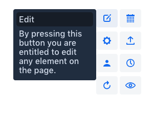
Package Exports
- @vaadin-component-factory/vcf-tooltip
This package does not declare an exports field, so the exports above have been automatically detected and optimized by JSPM instead. If any package subpath is missing, it is recommended to post an issue to the original package (@vaadin-component-factory/vcf-tooltip) to support the "exports" field. If that is not possible, create a JSPM override to customize the exports field for this package.
Readme
<vcf-tooltip>
This is the npm version vcf-tooltip developed using Polymer 3.
Live demo ↗ | API documentation ↗

Installation
Install vcf-tooltip:
npm i @vaadin-component-factory/vcf-tooltip --saveUsage
Once installed, import it in your application:
import '@vaadin-component-factory/vcf-tooltip';Add <vcf-tooltip> element with attribute for which will contain id of target element, to the page. Now after hovering on target element, toltip will be displayed.
<button id="element-id">Hover me</button>
<vcf-tooltip for="element-id" position="top">
  A short text describing the element.
</vcf-tooltip>
Running demo
Fork the
vcf-tooltiprepository and clone it locally.Make sure you have npm installed.
When in the
vcf-tooltipdirectory, runnpm installto install dependencies.Run
npm startto open the demo.
Contributing
To contribute to the component, please read the guideline first.
Vaadin Prime
This component is available in the Vaadin Prime subscription. It is still open source, but you need to have a valid CVAL license in order to use it. Read more at: https://vaadin.com/pricing
License
Commercial Vaadin Add-on License version 3 (CVALv3). For license terms, see LICENSE.
Vaadin collects development time usage statistics to improve this product. For details and to opt-out, see https://github.com/vaadin/vaadin-usage-statistics.
