
Package Exports
- @vaadin/vaadin-split-layout
- @vaadin/vaadin-split-layout/vaadin-split-layout.js
This package does not declare an exports field, so the exports above have been automatically detected and optimized by JSPM instead. If any package subpath is missing, it is recommended to post an issue to the original package (@vaadin/vaadin-split-layout) to support the "exports" field. If that is not possible, create a JSPM override to customize the exports field for this package.
Readme
<vaadin-split-layout>
Live Demo ↗ | API documentation ↗
<vaadin-split-layout> is a Web Component implementing a split layout for two content elements with a draggable splitter between them, part of the Vaadin components.

<vaadin-split-layout>
  <vaadin-split-layout orientation="vertical">
    <div>First layout content</div>
    <div>Second layout content</div>
  </vaadin-split-layout>
  <vaadin-split-layout orientation="vertical">
    <div>Third layout content</div>
    <div>Fourth layout content</div>
  </vaadin-split-layout>
</vaadin-split-layout>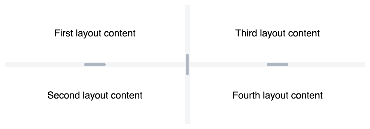
Installation
Install vaadin-split-layout:
npm i @vaadin/vaadin-split-layout --saveOnce installed, import it in your application:
import '@vaadin/vaadin-split-layout/vaadin-split-layout.js';Getting started
Vaadin components use the Lumo theme by default.
To use the Material theme, import the correspondent file from the theme/material folder.
Entry points
The component with the Lumo theme:
theme/lumo/vaadin-split-layout.jsThe component with the Material theme:
theme/material/vaadin-split-layout.jsAlias for
theme/lumo/vaadin-split-layout.js:vaadin-split-layout.js
Contributing
Read the contributing guide to learn about our development process, how to propose bugfixes and improvements, and how to test your changes to Vaadin components.
License
Apache License 2.0
Vaadin collects development time usage statistics to improve this product. For details and to opt-out, see https://github.com/vaadin/vaadin-usage-statistics.