Package Exports
- angular-star-rating
This package does not declare an exports field, so the exports above have been automatically detected and optimized by JSPM instead. If any package subpath is missing, it is recommended to post an issue to the original package (angular-star-rating) to support the "exports" field. If that is not possible, create a JSPM override to customize the exports field for this package.
Readme
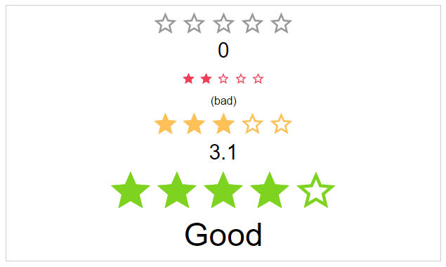
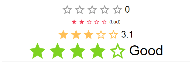
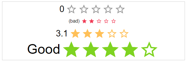
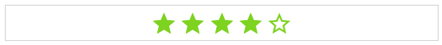
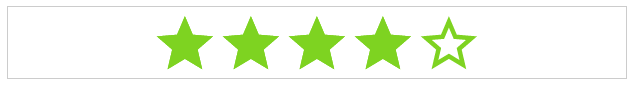
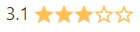
Angular Star Rating ⭐⭐⭐⭐⭐
⭐ Angular Component written in typescript, based on css only techniques. ⭐


Angular Star Rating is a >2 Angular component written in typescript.
It is based on css-sar-rating, a fully featured and customizable css only star rating component written in scss.
DEMO
##Related Projects
| Css | Angular1 (>=1.5)| Angular (>=2) |
|--- |--- |--- |
|  |
|  |
|  |
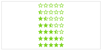
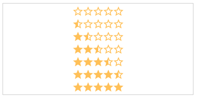
| Css Star Rating | Angular1 Star Rating | Angular Star Rating |
|
| Css Star Rating | Angular1 Star Rating | Angular Star Rating |
Features
This module implements all Features from CSS-STAR-RATING. It also provides callbacks for all calculation functions used in the component as well as all possible event emitters.
- id - The html id attribute of the star rating
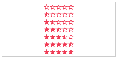
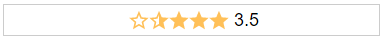
- rating - The actual Star rating
- showHalfStars - To display half stars or not
- numOfStars - The max number of stars you can rate
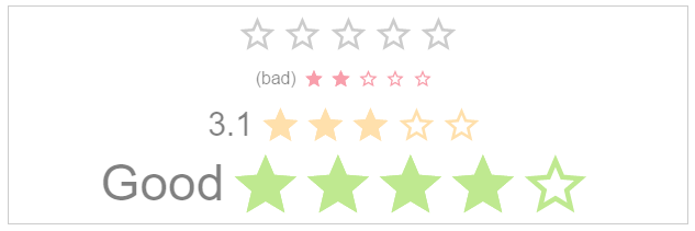
- size - The different sizes of the component
- spread - Stars are spreaded over whole width or not
- color - A static color for the stars
- disabled - Component is in disabled mode
- starType - Stars can be displayed as svg, character or icon-font like fontawesome, glyphicons or ionicons
- text - The value of the label text
- labelPosition - The position of the label
- speed - The duration of the animation
- direction - The direction of the component i.e. right to left
- readOnly - Click event is disabled
- getColor - Custom function to calculate the color for a rating
- getHalfStarVisible - Custom function to calculate value for displaying half stars or not
- onClick - Hook for Click action
- onRatingChange - Hook for onRatingChange event
Browser support
| IE | Firefox | Chrome | Safari | Opera |
|--- |--- |--- |--- |---|
| >11 | >50 | >55 | >10 | >41 |
|  |
|  |
|  |
|  |
|  |
|
Install
Get Angular Star Rating:
- clone & build this repository
- download as .zip
- via npm: by running
$ npm install angular-star-ratingfrom your console - via bower: by running
$ bower install angular2-star-ratingfrom your console
Load library
<script src="[bower or npm folder]/angular-star-rating/dist/index.js"></script>Register module
...
import { StarRatingModule } from 'path/to/star/rating/star-rating.module';
...
@NgModule({
  ...
  imports: [
    ...
    StarRatingModule
    ...
  ]
  ...
})
export class AppModule { }
Use it
<star-rating-comp
         [size]="'large'"
         [rating]="3"
         [text]="'Rating:'"
         (onRatingChange)="crtl.onRatingChange($event)">
 </star-rating-comp>
Component Properties
Inputs
id: string (Optional)
The html id attribute of the star rating
Default: undefined
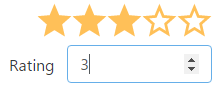
<star-rating-comp [id]="'my-id'"></star-rating-comp>rating: number (Optional)
The actual star rating value
Default: no
<star-rating-comp [rating]="3"></star-rating-comp>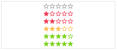
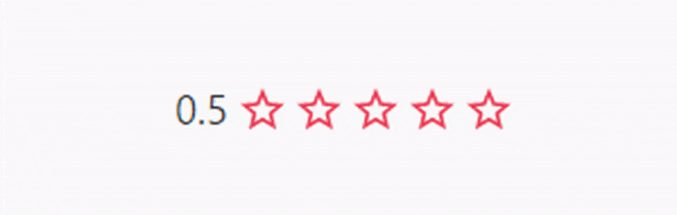
showHalfStars: boolean (Optional)
To show half stars or not
Options: true, false
Default: false
<star-rating-comp [showHalfStars]="true"></star-rating-comp>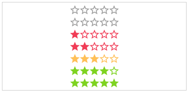
numOfStars: number (Optional)
The possible number of stars to choose from
Default: 5
<star-rating-comp [numOfStars]="6"></star-rating-comp>
text: string (Optional)
The text next to the stars.
Default: undefined
<star-rating-comp [text]="'My text!'"></star-rating-comp>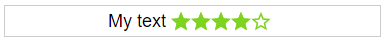
labelPosition: starRatingPosition (Optional)
The position of the label
Options: top, right, bottom, left
Default: left
<star-rating-comp [labelPosition]="'top'"></star-rating-comp>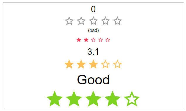
spread: boolean (Optional)
If the start use the whole space or not.
Default: false
<star-rating-comp [space]="true"></star-rating-comp>

size: starRatingSizes (Optional)
The height and width of the stars.
Options: small, medium, large
Default: middle
<star-rating-comp [size]="'small'"></star-rating-comp>
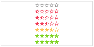
color: starRatingColors (Optional)
Possible color names for the stars.
Options: default, negative, middle, positive
Default: undefined
<star-rating-comp [color]="'positive'"></star-rating-comp>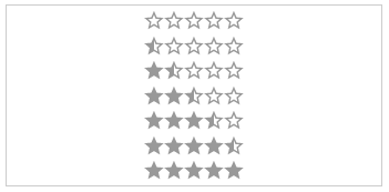
disabled: boolean (Optional)
The click callback is disabled, colors are transparent
Default: false
<star-rating-comp [disabled]="true"></star-rating-comp>
direction: string (Optional)
The direction of the stars and label.
Options: rtl, ltr
Default: rtl
<star-rating-comp [direction]="'ltr'"></star-rating-comp>
readOnly: boolean (Optional)
The click callback is disabled
Default: false
<star-rating-comp [readOnly]="true"></star-rating-comp>
speed: starRatingSpeed (Optional)
The duration of the animation in ms.
Options: immediately, noticeable, slow
Default: noticeable
<star-rating-comp [speed]="'slow'"></star-rating-comp>


starType: starRatingStarTypes (Optional)
The type of start resource to use.
Options: svg, icon
Default: svg
<star-rating-comp [starType]="'icon'"></star-rating-comp>getColor: Function (Optional)
Calculation of the color by rating.
Params: rating, number,numOfStars and staticColor
Return: color name
<star-rating-comp [getColor]="ctrl.getColor(rating, numOfStars, staticColor)"></star-rating-comp>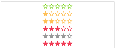
getHalfStarVisible: Function (Optional)
Calculation for adding the "half" class or not, depending on the rating value.
Params: rating
Return: boolean
<star-rating-comp [getHalfStarClass]="ctrl.getHalfStarClass(rating)" rating="3.2"></star-rating-comp>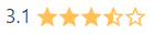
Outputs
onClick: Function (Optional)
Callback function for star click event
Params: $event
<star-rating-comp (onClick)="ctrl.onClick($event)"></star-rating-comp>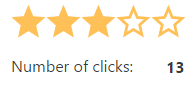
onRatingChange: Function (Optional)
Callback function for rating change event
Params: $event
<star-rating-comp (onRatingChange)="ctrl.onRatingChange($event)"></star-rating-comp>