
Package Exports
- atomico
- atomico/html
This package does not declare an exports field, so the exports above have been automatically detected and optimized by JSPM instead. If any package subpath is missing, it is recommended to post an issue to the original package (atomico) to support the "exports" field. If that is not possible, create a JSPM override to customize the exports field for this package.
Readme
Atomico


Small library for the creation of interfaces based on web-components, only using functions and hooks, if you want to try Atomico and you need help tell me in Twitter Uppercod 🤓.
- Installation,
npm init @atomico - Installation in the browser
- Hooks
- Modules
- Examples
- Props
- Styling a web-component
- Advanced
Installation
Atomico has a project generator, you can initialize using npm init @atomico.
⚠️ Remember Atomico is a modern package, which is distributed and maintained as an MJS module
npm init @atomico

Welcome to Atomico, let's create your project

√ name? ... project-name
√ description? ... project-description

Ready!, check the folder ./project-name and ./project-name/README.md

Next step, commands!

  cd project-name
  yarn | npm i
Alternatively, if you have an existing project you can incorporate Atomico simply using, JS pragma used by Atomico is defined as part of the module exporting h orcreateELement.
npm install atomicoInstallation in the browser
Bundle is distributed in MJS and is browser friendly, you can prototype without a bundle manager. to facilitate this Atomico distributes a module called html that is a configuration generated thanks to htm. This way of working is only for prototypes, as an author I recommend the use of Rollup for the creation of distributable applications or web-components.
<!--declare your web-component-->

<web-component message="Hello!"></web-component>

<!--create your web-component-->
<script type="module">
    import { customElement } from "https://unpkg.com/atomico@0.9.0";
    import html from "https://unpkg.com/atomico@0.9.0/html.js";

    function WebComponent({ message }) {
        return html`
            <host shadowDom>
                ${message}
            </host>
        `;
    }

    WebComponent.props = {
        message: String
    };

    customElement("web-component", WebComponent);
</script>
Hooks
What are hooks?
Hooks, allows to add states and effects(life cycle) to functional components, allowing to reuse the logic between components in a simple and scalable way.
Why use hooks?
Reuse of logic between components, unlike a class its components will not require belonging to the context of
this.Simpler and less code, when using hooks your component will not require a declaration as a class, bringing as a benefit less code as your application scales.
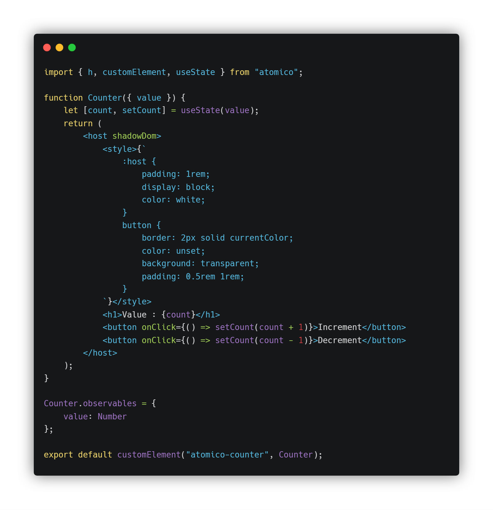
useState
let [state, setState] = useState(initialState);setState function, allows controlling one or more states associated with a component, the declarationlet [state, setState], is equivalent to:
state: current statesetState: status updater, ifsetStatereceives a function as a parameter it will receive and must return the next state.
Example
function WebComponent() {
    let [state, setState] = useState(0);
    return (
        <host>
            <h1>example counter</h1>
            <button onClick={() => setState(state + 1)}>Increment</button>
        </host>
    );
}useEffect
useEffect(afterRender);useEffect function allows you to add side effects to a component.
function WebComponent() {
    useEffect(() => {
        document.head.title = "web-component mounted";
        return () => (document.head.title = "web-component unmounted");
    }, []);

    return (
        <host>
            <h1>example useEffect</h1>
        </host>
    );
}
useEffect, supports a second matrix of type of parameter, this allows to compare between renders the immutability of the parameters of the array, if there is a change useEffect will be executed again, the previous example will execute the function only when the component has been mounted.
useReducer
let [state, dispatch] = useReducer(reducer, initialState);useReducer is usually preferable to useState when you have complex state logic that involves multiple sub-values or when the next state depends on the previous one.
const initialState = { count: 0 };

function reducer(state, action) {
    switch (action.type) {
        case "increment":
            return { count: state.count + 1 };
        case "decrement":
            return { count: state.count - 1 };
        default:
            throw new Error();
    }
}

function WebComponent() {
    let [state, dispatch] = useReducer(reducer, initialState);
    return (
        <host>
            Count: {state.count}
            <button onClick={() => dispatch({ type: "increment" })}>+</button>
            <button onClick={() => dispatch({ type: "decrement" })}>-</button>
        </host>
    );
}
useMemo
let memoizedValue = useMemo(() => computeExpensiveValue(a, b), [a, b]);useMemo will only recalculate the stored value when one of the dependencies has changed. This optimization helps avoid costly calculations in each render.
useRef
let ref = useRef(initialValue);useRef returns a mutable ref object whose .current property is initialized to the passed argument (initialValue). The returned object will persist for the full lifetime of the component.
useHost
let ref = useHost();Returns a ref object, which allows to extract extract the web-component, it is ideal for the construction of hooks that interact with web-components directly.
useEvent
useEvent allows you to dispatch a custom Event from the web-component, this hook accepts 2 parameters:
- name of the event
- native configuration of the event, this is optional.
let optionalConfig = {
    bubbles: true
};
function WebComponent() {
    let dispatchMyCustomEvent = useEvent("MyCustomEvent", optionalConfig);
    return <host onclick={dispatchMyCustomEvent} />;
}

document
    .querySelector("web-component")
    .addEventListener("MyCustomEvent", handler);
useProp
useProp allows, the state of one of the props, previously defined. useProp requires the previous definition of the props of the web-component
let [myProp, setMyProp] = useProp("myProp");The behavior is similar to
useState, but with the difference that useProp, it makes the value visible from the web-component, eg:
document.querySelector("web-component").myProp; // will always own the last state of the propertyConsider the use of useProps on useState, when you need to read the status modified by the web-component's logic.
useProvider and useConsumer
This hook works in conjunction with useConsumer, it allows to generate a state a shared state between web-components, the state that shares this hooks propagates from the web-component that declaresuseProvider towards its children that declare useConsumer.
This hooks is able to avoid the blocking of memo, since it works thanks to event.bubbles.
This hooks allows an optimized communication between web-components regardless of who or what structure the DOM.
// Thanks to Symbol, the name of the event will be unique, eg I2NoYW5uZWwtLTE=
let CHANNEL = Symbol();
// This value is optional and allows to communicate an initial state
let initialState = { any: "value" };

function WebComponentParent() {
    let [state, setState] = useProvider(CHANNEL, initialState);
    return (
        <host>
            <pre>{state.any}</pre>
            <slot />
        </host>
    );
}

function WebComponentChild() {
    let [state, setState] = useConsumer(CHANNEL);
    return (
        <host>
            <pre>{state.any}</pre>
            <input oninput={({target})=>setState(target.value)}>
        </host>
    );
}
the previous example, if the
WebComponentParentnests withWebComponentChild, the latter controls the state between these 2 web-components, this behavior is useful for synchronizing ui, egtabs
by default userConsumer, update the web-component when using setState, but you can prevent this by defining a function as a second parameter, in this way the update is subject to customization,eg:
let [state, setState] = useState();
useConsumer(CHANNEL, function handler([parentState]) {
    setState(parentState);
});
props
The props are a layer of the statico method observedAttributes characteristic of web-components. using a key object and value you can define attributes and properties, the key format of the prop is camelCase, which Atomico will transform into a valid attribute, examplemyPropertywill be the attributemy-property.
import { h, customElement } from "atomico";

function WebComponent({ message, showMessage }) {
    return <host>my {showMessage && message}!</host>;
}

WebComponent.props = {
    message: String,
    showMessage: Boolean
};

customElement("web-component", WebComponent);
Example of use from HTML
<web-component show-message message="Atomico"></web-component>Example of use from the JS
let wc = document.querySelector("web-component");

wc.showMessage = true;
wc.message = "Atomico";
Types of props
The types are defined by the use of primitive constructors, eg String, Number or Object.
| Type | Description |
|---|---|
| String | - |
| Number | - |
| Boolean | It is reflected, this status is shown as an attribute in the web-component |
| Object | - |
| Array | - |
| Promise | - |
| Function | If this one comes from an attribute Atomico will look for the callback in window |
Styling a web-component
To nest encapsulated styles within the web-component, you must enable the use of shadowDom, use <host shadowDom>.
Tag style
Style generation can be declared inside the <style> tag, this form allows the generation of dynamic styles.
import { h, customElement, css } from "atomico";

function WebComponent() {
    return (
        <host shadowDom>
            <style>{`
                :host {
                    color: red;
                }
            `}</style>
            hello!
        </host>
    );
}

customElement("web-component", WebComponent);
Import css
You can import using the plugins @atomico/rollup-plugin-import-css, css in flat format, preprocessed by postcss, by default this already delivered minified.
import { h, customElement, css } from "atomico";
import style from "./style.css";

function WebComponent() {
    return (
        <host shadowDom>
            <style>{style}</style>
            hello!
        </host>
    );
}

customElement("web-component", WebComponent);
CSSStyleSheet
Atomico supports the definition of styles created by the CSSStyleSheet constructor.
import { h, customElement, css } from "atomico";

function WebComponent() {
    return <host shadowDom>hello!</host>;
}

WebComponent.styles = [
    css`
        :host {
            color: red;
        }
    `
];

customElement("web-component", WebComponent);
Advanced
Components
Atomico allows a hybrid use between react style components and web-components, the components can use hooks like useEffect, useState, useMemo, useRef and useReducer. With these you can apply the pattern of HIGH ORDER COMPONENTS, atomico/router and atomico/lazy are apis created with this pattern.
Memorization
Atomico applies the memorization pattern to all components, the effect is similar to applying React.memo.
This allows to generate optimizations to the tree of dom, avoiding that a component is forced by an update from parent if this has not modified its properties, this is applicable both for web-component and components, eg:
function PartComponent({ message }) {
    useEffect(() => {
        console.log("update");
    });
    return <div>{message}</div>;
}

function WebComponent() {
    let [value = 0, setValue] = useProp("value");
    return (
        <host>
            <PartComponent message="PartComponent!" />
            {counter}
            <button onClick={() => setValue((value += 1))}>increment</button>
        </host>
    );
}

WebComponent.props = {
    value: Number
};
The
<PartComponent/>component is only rendered once, since themessageproperty does not mutate, this is useful when applying complex trees, through this optimization you can avoid the proceeding of virtual-dom forced by the parent.
customElement
This function allows you to register a web-component and return a functional instance of it. useful to declare the web-component, not as tagHtml but as a component, this is useful to apply tree-shaking, since you can address the import, eg:
import { customElement } from "atomico";
export default customElement("web-component", WebComponent);
Statement as tag-html
import "./web-component.js";
function MyApp() {
    return (
        <host>
            <web-component />
        </host>
    );
}
Statement as a component
Prefer this option if you are conformed the DOM trees from Atomico
import WebComponent from "./web-component.js";
function MyApp() {
    return (
        <host>
            <WebComponent />
        </host>
    );
}
Template Factory
Atomico facilitates the creation of completely isolated and reusable interfaces between components, thanks to the HoCs pattern you can compose conditional interfaces in a simple way.
import styleButton from "./style-button.css";
import styleInput from "./style-input.css";
import styleRadio from "./style-radio.css";

function TypeButton() {
    return (
        <host shadowDom>
            <style>{styleButton}</style>
        </host>
    );
}

function TypeInput() {
    return (
        <host shadowDom>
            <style>{styleInput}</style>
        </host>
    );
}

function TypeRadio() {
    return (
        <host shadowDom>
            <style>{styleRadio}</style>
        </host>
    );
}

function FormInput({ type }) {
    switch (type) {
        case "button":
            return <TypeButton />;
        case "radio":
            return <TypeRadio />;
        default:
            return <TypeRadio />;
    }
}

FormInput.props = {
    type: String
};

customElement("atom-form-input", FormInput);<atom-form-input type="button"></atom-form-input>
<atom-form-input type="radio"></atom-form-input>
<atom-form-input type="text"></atom-form-input>You can even use
atomico/lazyfor asynchronous loads.
children
When using HoCs, the invoked component will return the children property, already known to React users.
it has the same behavior as React, so children is not always an array. so that this is always an array you must use the toList function, eg:
import {toList} from "atomico";

toList(values:any,map?:Function):VNode[];
Example
import { toList } from "atomico";

function Part({ children }) {
    return (
        <div>
            {toList(children, child => (
                <button>{child}</button>
            ))}
        </div>
    );
}

function WebComponent() {
    return (
        <host>
            <Part>
                <span>1</span>
                <span>2</span>
                <span>3</span>
            </Part>
            <Part>
                <span>1</span>
            </Part>
        </host>
    );
}