
Package Exports
- circular-menu
This package does not declare an exports field, so the exports above have been automatically detected and optimized by JSPM instead. If any package subpath is missing, it is recommended to post an issue to the original package (circular-menu) to support the "exports" field. If that is not possible, create a JSPM override to customize the exports field for this package.
Readme
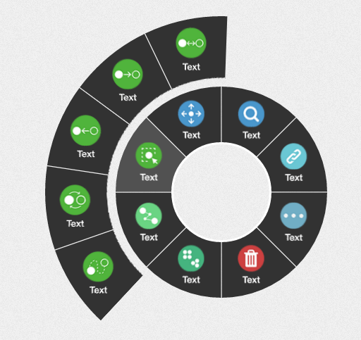
Circular-Menu
aka, circular menu, wheel menu, circular navigation, wheel navigation.
##Thanks for Circular Navigation With CSS Transforms by Sara Soueidan
install
```npm install circular-menu```usage
Directly include dist/js/circular-menu.js and dist/css/circular-menu.css
It is wrapped as AMD module, meaning could use with RequireJS or commonJS, or just global varible "CMenu"
Sample
Live Demo
Browser compatibility
I tested in newer chrome, firefox, and IE Edge.
Config
Options
totalAngle (demo):
- value:
0-360(unit is unnecessary) - default:
360deg (complete circle)
- value:
spaceDeg (demo):
- value:
Int(0-5 is suitable) - default:
0(The default is good)
- value:
background:
- value: Acceptable CSS color value
- default:
#323232
backgroundHover:
- value: Acceptable CSS color value
- default:
#515151
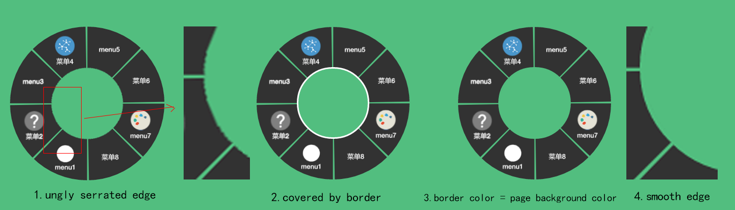
pageBackground (For antialiasing, example explanation):
- value: Acceptable CSS color value ( You should pass the color of your page. )
- default:
transparent
diameter(circular menu radius):
- value: Int (unit is unnecessary)
- default:
300px
position(demo):
- value: "top" | "left" | "right" | "bottom"
- default: "top"
start(demo):
- value:
0-360(unit is unnecessary) - default:
0deg
- value:
horizontal (Whether horizontal icon and text demo):
- value:
true | false - default:
true
- value:
hideAfterClick (Whether hide menu after click):
- value:
true | false - default:
true
- value:
menus: (Array of objects, specifying menu items, angle of each item mush < 90deg, it meaning "totalAngle / items number" must <= 90deg wrong use demo )
- title: String (Title is not too long, otherwise it will overflow container)
- icon: String (css class, e.g. "fa fa-facebook" "custom-icon icon1")
- href:
- String (like "http://google.com" or "#hash")
- Object (like
{url: "..", blank: true})- url: String
- blank:
true | false(True will open a new browser tab)
- click: Function (click callback function)
- disabled:
- String:
true | false - Function: (Function must return boolean value)
- String:
Method
styles(properties): add styles to menus
- properties: Acceptable css properties object ( like
{ "background-color": "#ffe", "border-left": "5px solid #ccc" })
- properties: Acceptable css properties object ( like
show ([left, top]**)**:show menus
- [left, top] : Optional, set menu fixed position left and top, (like
menus.show([e.pageX, e.pageY]), unit is unnecessary)
- [left, top] : Optional, set menu fixed position left and top, (like
hide(): hide menus