
Package Exports
- command-line-usage
This package does not declare an exports field, so the exports above have been automatically detected and optimized by JSPM instead. If any package subpath is missing, it is recommended to post an issue to the original package (command-line-usage) to support the "exports" field. If that is not possible, create a JSPM override to customize the exports field for this package.
Readme


Upgraders, please check the release notes.
command-line-usage
A simple, data-driven module for creating a usage guide.
Synopsis
A usage guide is created by first defining an arbitrary number of sections, e.g. a description section, synopsis, option list, examples, footer etc. Each section has an optional header, some content and must be of type content or optionList. This section data is passed to commandLineUsage() which returns a usage guide.
Inline ansi formatting can be used anywhere within section content using chalk template literal syntax.
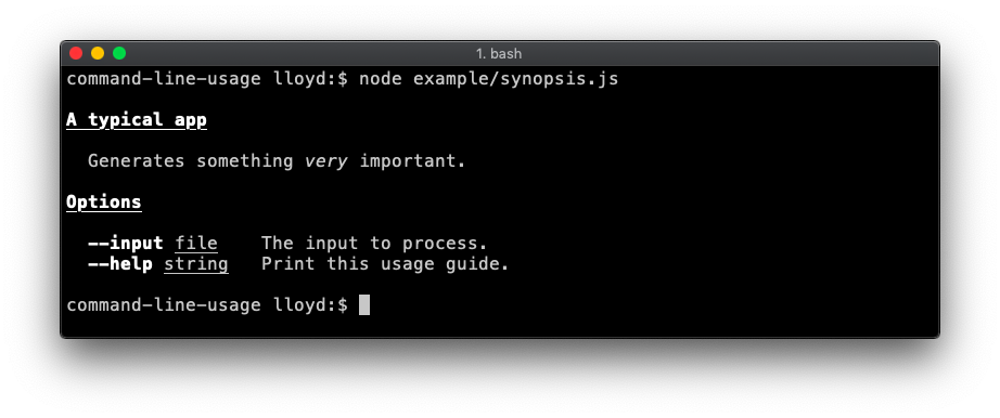
For example, this script:
const commandLineUsage = require('command-line-usage')

const sections = [
  {
    header: 'A typical app',
    content: 'Generates something {italic very} important.'
  },
  {
    header: 'Options',
    optionList: [
      {
        name: 'input',
        typeLabel: '{underline file}',
        description: 'The input to process.'
      },
      {
        name: 'help',
        description: 'Print this usage guide.'
      }
    ]
  }
]
const usage = commandLineUsage(sections)
console.log(usage)
Outputs this guide:
More examples
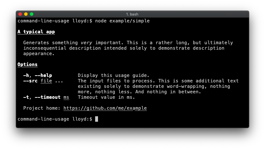
Simple
A fairly typical usage guide with three sections - description, option list and footer. Code.
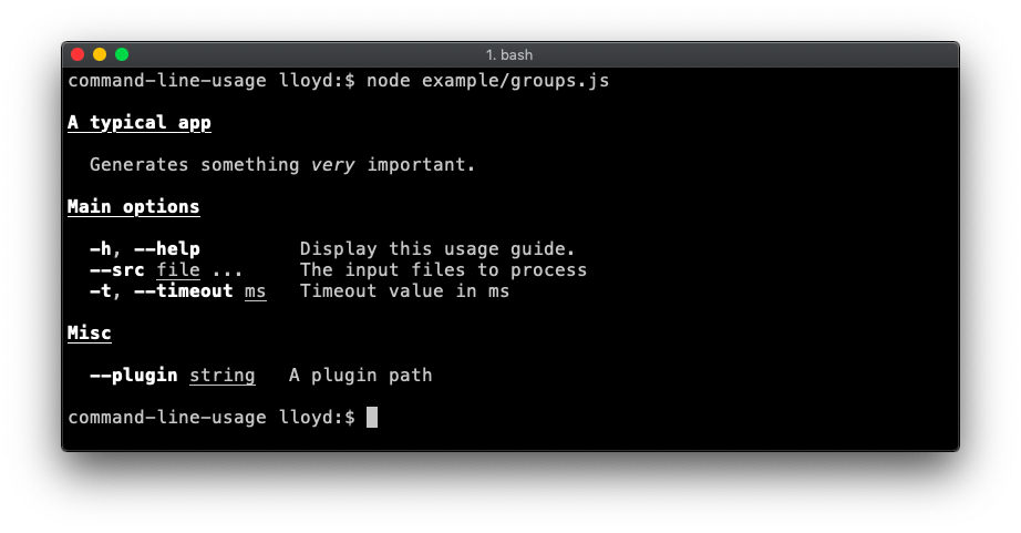
Option List groups
Demonstrates breaking the option list up into groups. Code.
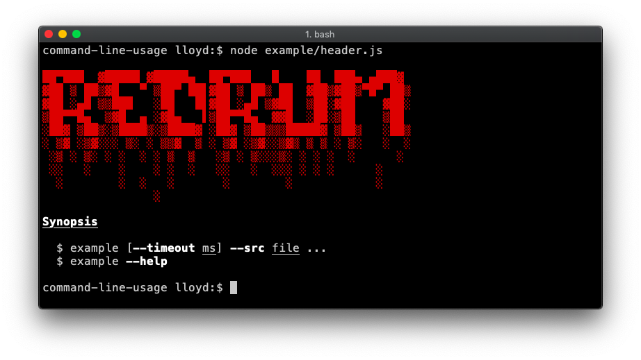
Banners
A banner is created by adding the raw: true property to your content. This flag disables any formatting on the content, displaying it raw as supplied.
Header
Demonstrates a banner at the top. This example also adds a synopsis section. Code.
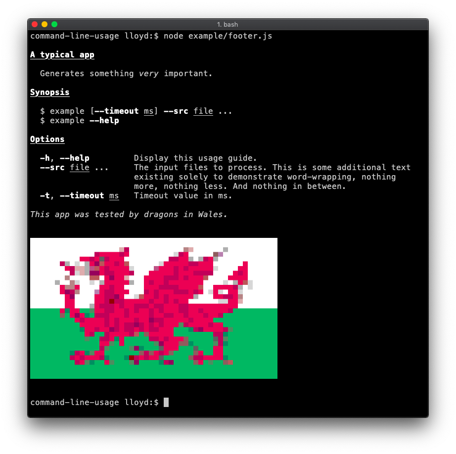
Footer
Demonstrates a footer banner. Code.
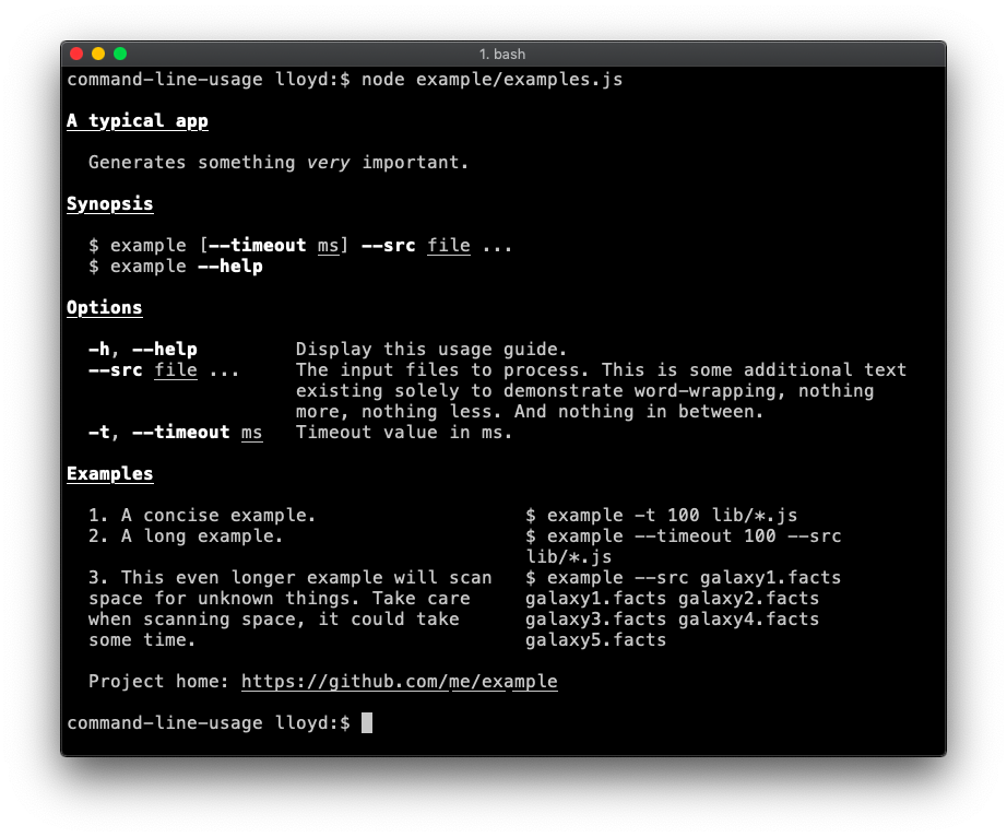
Examples section (table layout)
An examples section is added. To achieve this table layout, supply the content as an array of objects. The property names of each object are not important, so long as they are consistent throughout the array. Code.
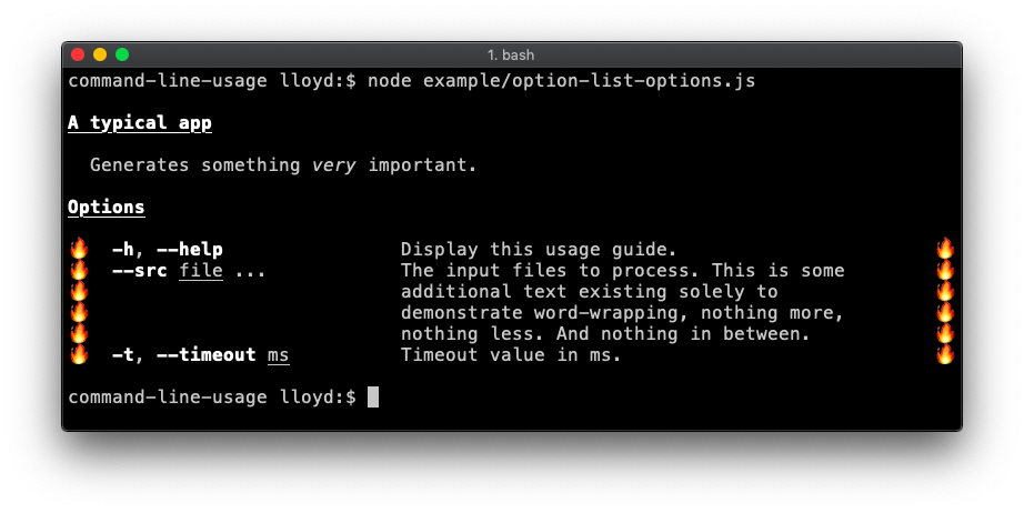
Advanced optionList layout
The optionList layout is fully configurable by setting the tableOptions property with an options object suitable for passing into table-layout. This example overrides the default column widths and adds flame padding. Code.
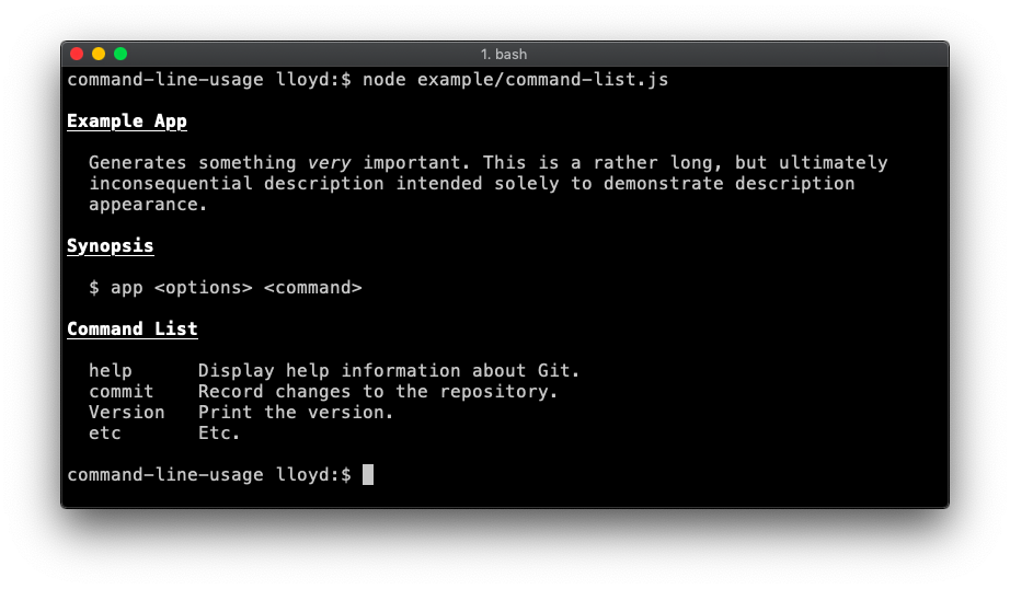
Command list
Useful if your app is command-driven, like git or npm. Code.
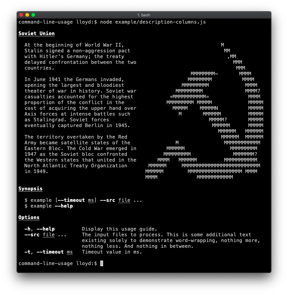
Description section (table layout)
Demonstrates supplying specific table layout options to achieve more advanced layout. In this case the second column (containing the hammer and sickle) has a fixed width of 40 and noWrap enabled (as the input is already formatted as desired). Code.
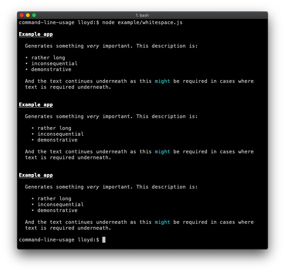
Whitespace
By default, whitespace from the beginning of each line is trimmed to ensure wrapped text always aligns neatly to the left edge of the column. This can be undesirable when whitespace is intentional like the indented bullet points shown in this example. The two ways to disable whitespace trimming are shown in this example code.
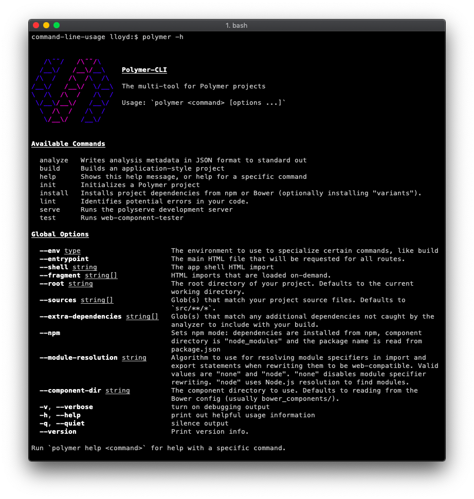
Real-life
The polymer-cli usage guide is a good real-life example.
© 2015-19 Lloyd Brookes <75pound@gmail.com>. Documented by jsdoc-to-markdown.