
Package Exports
- css-mesh
Readme
CSS Mesh
Animated gradient backgrounds using CSS blur effects and positioned ellipses - no WebGL required.
✨ Features
- 🎨 34 Built-in Themes - Organized into Base, Orb, Dramatic, and Special categories
- 🔮 Orb Mode - Floating circular gradients with 3D lighting and drop shadows
- ⚡ CSS-Based - Pure CSS blur effects, no WebGL or shaders required
- 🪶 Lightweight - Small bundle size, no heavy 3D dependencies
- 🎛️ Animation System - 7 animation types: float, pulse, rotation, orbit, wave, morph, hue
- 🖱️ Mouse Tracking - Interactive attract/repel modes with configurable intensity
- 🔧 Fully Customizable - Configure ellipse size, position, gradients, blur, and opacity
- 🎨 Visual Effects - Saturation, contrast, brightness, and hue adjustments
- 💡 3D Lighting - Realistic lighting overlays with position and intensity controls
- 🌑 Drop Shadows - Configurable shadows with direction, size, and opacity
- 🎯 TypeScript - Full type safety and IntelliSense support
- 📦 Smart Configs - Diff-based customization system for efficient overrides
🚀 Quick Start
npm install css-meshimport { MeshGradient } from 'css-mesh';
function App() {
return (
<MeshGradient
theme="sunset"
animated={true}
animationType="float"
>
<div>Your content here</div>
</MeshGradient>
);
}
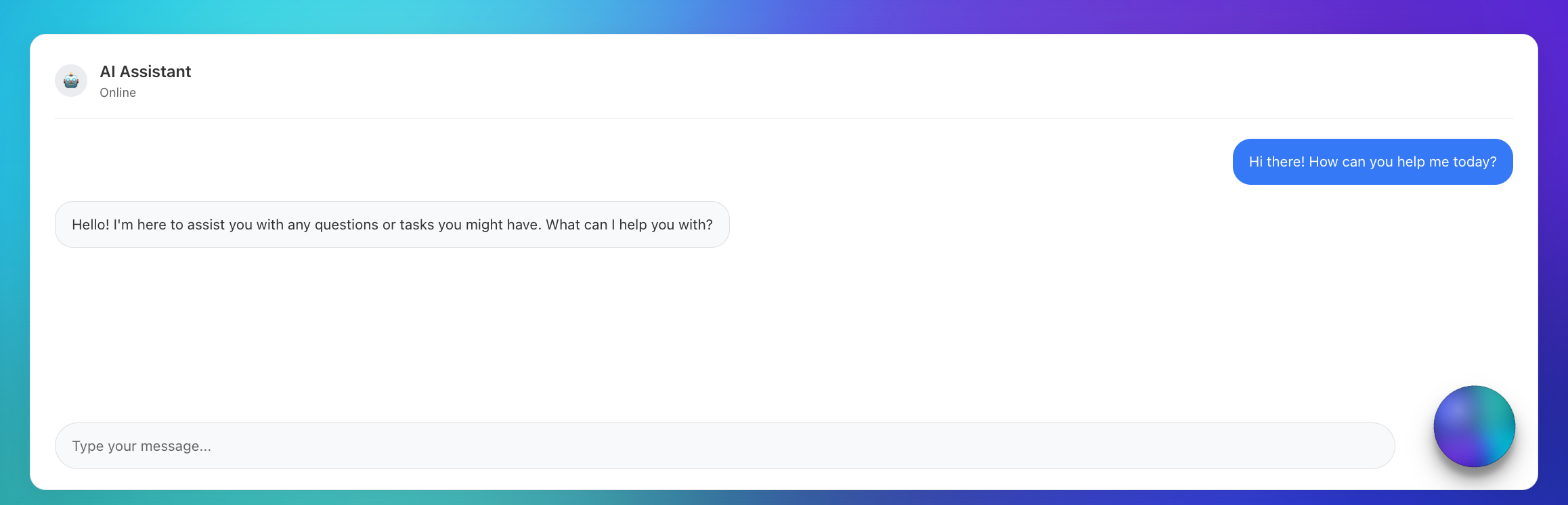
// Orb Mode for AI Assistants
function ChatBot() {
return (
<MeshGradient
theme="sunsetGlow"
shape="orb"
size={85}
animated={true}
animationType="morph"
containerAnimation="rotation"
dropShadow={32}
lighting3d={{
enabled: true,
position: { x: 75, y: 15 },
intensity: 0.85
}}
/>
);
}🌐 Live Demo
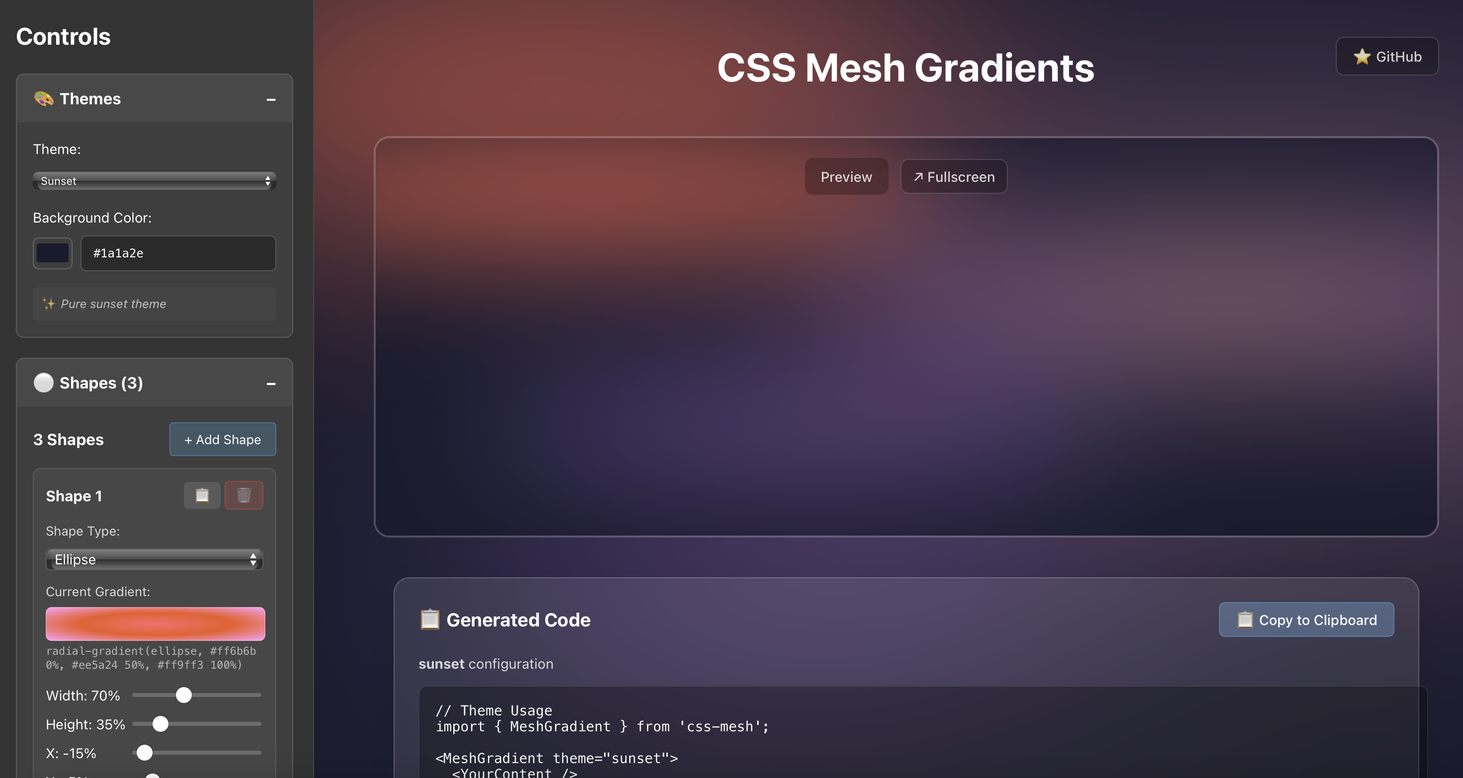
cssmesh.dev - Explore all 20 themes, customize ellipses, try animations, and generate code in real-time.
📦 Installation
npm install css-meshNPM Package: https://www.npmjs.com/package/css-mesh
GitHub Repository: https://github.com/stevesouth/css-mesh
🎨 CSS-Based Approach
CSS Mesh creates beautiful animated gradients using pure CSS techniques:
✨ Key Qualities
- Pure CSS animations - Leverages browser-native CSS blur and transforms
- Lightweight bundle - Minimal dependencies, fast loading
- Familiar patterns - Standard CSS/React patterns for easy customization
- Drop-in component - Simple integration with familiar React props
- Reliable performance - Predictable CSS animations that work everywhere
🎯 Perfect For
- Landing page backgrounds
- Hero sections
- App backgrounds
- Marketing sites
- Any project wanting beautiful animated gradients
🎨 Available Themes (34 Total)
🔮 Orb Themes (14) - Optimized for floating circular gradients
| Theme | Style | Colors | Background |
|---|---|---|---|
cyberpunk |
Neon | Electric green & pink | Dark |
voidPulse |
Mystical | Deep purples & blues | Black |
fireCore |
Intense | Fiery oranges & reds | Dark |
deepSpace |
Cosmic | Space blues & purples | Dark |
shadowGlow |
Dramatic | Dark with bright accents | Black |
sunsetGlow |
Premium | Warm sunset enhanced | Dark |
twilightDark |
Rich | Purple twilight colors | Dark |
midnightGlow |
Electric | Bright blues & cyans | Black |
crystalBlue |
Cool | Crystal blue tones | Light |
sunbeam |
Bright | Golden yellow rays | Light |
roseDawn |
Elegant | Pink & purple dawn | Light |
mintFresh |
Cool | Fresh mint greens | Light |
lavenderMist |
Soft | Lavender & purple | Light |
dawnLight |
Warm | Soft golden dawn | Light |
🎨 Base Themes (13) - Classic gradient backgrounds
| Theme | Style | Colors | Background |
|---|---|---|---|
sunset |
Warm | Oranges & pinks | Dark |
ocean |
Cool | Blues & teals | Dark |
aurora |
Vibrant | Purples & greens | Dark |
cosmic |
Dark | Deep space colors | Dark |
forest |
Natural | Greens & earth tones | Dark |
monochrome |
Minimal | Grays & blues | Dark |
minimal |
Clean | Soft blues & grays | Light |
spring |
Fresh | Light greens & pastels | Light |
sky |
Airy | Light blues & whites | Light |
cream |
Warm | Cream & beige tones | Light |
dawn |
Gentle | Soft oranges & pinks | Light |
pearl |
Elegant | Pearl & lavender | Light |
blush |
Delicate | Soft pinks & roses | Light |
⚡ Dramatic Themes (4) - Bold, intense gradients
| Theme | Style | Colors | Background |
|---|---|---|---|
volcanic |
Dramatic | Reds & oranges | Dark |
electric |
Bold | Neon blues & purples | Dark |
neon |
Vibrant | Bright neon colors | Dark |
dreamy |
Soft | Pastel pinks & purples | Light |
✨ Special Themes (3) - Unique features and shapes
| Theme | Style | Colors | Background |
|---|---|---|---|
shapes |
Demo | Mixed geometric shapes | Dark |
lavender |
Serene | Purple & lavender | Light |
mint |
Cool | Mint green & aqua | Light |
🎛️ Animation Types
float- Gentle floating movement (default)pulse- Scale pulsing effectrotation- Continuous rotationorbit- Circular orbital motionwave- Wave-like undulationmorph- Organic morphing animationhue- Color hue shifting (container-level)
📖 API Reference
MeshGradient Props
interface MeshGradientProps {
  theme?: string;                          // Theme name (default: 'sunset')
  customConfig?: Partial<BackgroundConfig>; // Custom ellipse configuration
  className?: string;                      // Additional CSS classes
  style?: React.CSSProperties;             // Custom styles
  children?: React.ReactNode;              // Content to overlay
  animated?: boolean;                      // Enable animations (default: false)
  animationType?: AnimationType;           // Animation type (default: 'float')
  animationConfig?: Partial<AnimationConfig>; // Animation settings
  containerAnimation?: ContainerAnimationType; // Container-level animations
  mouseTracking?: MouseTrackingConfig;     // Mouse interaction settings
  visualEffects?: VisualEffectsConfig;     // Color/visual adjustments
  shape?: 'background' | 'orb';           // Display mode (default: 'background')
  size?: number;                          // Orb size percentage (default: 80)
  dropShadow?: number | boolean;          // Drop shadow size or enable (default: false)
  dropShadowOpacity?: number;             // Shadow opacity 0-1 (default: 0.4)
  dropShadowDirection?: { x: number; y: number }; // Shadow direction (default: {x: 0, y: 8})
  lighting3d?: {                          // 3D lighting overlay
    enabled: boolean;
    position?: { x: number; y: number };  // Light position 0-100% (default: {x: 30, y: 30})
    intensity?: number;                   // Light intensity 0-1 (default: 0.3)
  };
}
🔧 Custom Configuration
Create your own ellipse configurations:
const customConfig = {
  backgroundColor: '#1a1a2e',
  shapes: [
    {
      id: 'custom-1',
      width: 80,        // Percentage of container width
      height: 30,       // Percentage of container height
      x: -10,           // X position (percentage, can be negative)
      y: 20,            // Y position (percentage, can be negative)
      gradient: 'radial-gradient(ellipse, #ff6b6b 0%, #ee5a24 100%)',
      blur: 60,         // Blur intensity in pixels
      opacity: 0.7,     // Opacity (0-1)
      zIndex: 1,        // Stacking order
      shape: 'ellipse', // Shape type
    },
    // ... more ellipses
  ],
};

<MeshGradient customConfig={customConfig}>
  <YourContent />
</MeshGradient>
🖱️ Mouse Tracking
<MeshGradient
  theme="sunset"
  mouseTracking={{
    enabled: true,
    mode: 'attract',    // 'attract' or 'repel'
    intensity: 0.3,     // 0-1 strength
    radius: 30          // Effect radius in pixels
  }}
>
  <YourContent />
</MeshGradient>
🔮 Orb Mode
Create floating circular gradients perfect for AI assistants and modern interfaces:
<MeshGradient
  theme="cyberpunk"
  shape="orb"
  size={85}
  animated={true}
  animationType="morph"
  containerAnimation="rotation"
  dropShadow={32}
  dropShadowOpacity={0.6}
  dropShadowDirection={{ x: 0, y: 12 }}
  lighting3d={{
    enabled: true,
    position: { x: 75, y: 25 },
    intensity: 0.8
  }}
/>
💡 3D Lighting & Shadows
Add realistic depth with lighting and shadows:
<MeshGradient
  theme="deepSpace"
  lighting3d={{
    enabled: true,
    position: { x: 30, y: 30 },  // Light position (0-100%)
    intensity: 0.5               // Light intensity (0-1)
  }}
  dropShadow={25}                // Shadow size in pixels
  dropShadowOpacity={0.4}        // Shadow opacity (0-1)
  dropShadowDirection={{ x: 5, y: 10 }} // Shadow offset
>
  <YourContent />
</MeshGradient>

## 📄 License

MIT License - see [LICENSE](./LICENSE) for details.

---

*CSS-based animated gradient backgrounds for React*