
Package Exports
- dev-portfolio
- dev-portfolio/dist/index.js
This package does not declare an exports field, so the exports above have been automatically detected and optimized by JSPM instead. If any package subpath is missing, it is recommended to post an issue to the original package (dev-portfolio) to support the "exports" field. If that is not possible, create a JSPM override to customize the exports field for this package.
Readme
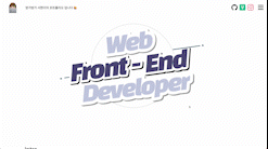
dev-porfolio
An open source component library for React that helps you develop your web portfolio easily and quickly.
List
Install
npm i dev-portfolio --save
Usage
import { Header, Intro, Contact, ... } from 'dev-portfolio';

const App = () => {
  return (
    // The 'className' in the <div> tag surrounding the components of 'dev-portfolio' must be 'App'.
    // Only then can the SideBar in the <Header> component recognize id props and automatically assign all components into the SideBar.
    <div className="App">
      <Header />
      <Intro />
      <Contact />
      ...
    </div>
  );
}

export default App;
Components
- Header
- Intro
- TechStackList
- Experience
- Carousel
- Gallery
- Masonry
- Image
- Item
- Card
- Contact
- VisitorCounter
- VisitorComment
Header

import { Header } from 'dev-portfolio';

const logoOption = { ... };
const channels = [ ... ];
const sideBarOption = { ... };

const App = () => {
  return (
    <Header
      id="Header Component"
      headerHeight="80px"
      headerWidth="100%"
      headerBackgroundColor="whitesmoke"
      logoOption={logoOption}
      channels={channels}
      sideBarOption={sideBarOption}
    />
  );
}

export default App;| props | type | description | default | note |
|---|---|---|---|---|
id |
string | Name to be added to Sidebar | ||
headerHeight |
string | Header Height | 80px | |
headerWidth |
string | Header Width | 100% | |
headerBackgroundColor |
string | CSS for Background color of Header Component | white | |
logoOption |
LogoOptionPropsType | Logo & Header_Title only props | See "More about Header's Props" | |
channels |
ChannelType[] | Channel-only props such as Github and LinkedIn, etc | See "More about Header's Props" | |
sideBarOption |
SideBarOptionPropsType | Sidebar-only props such as Sidebar's Icon, etc | See "More about Header's Props" |
More about Header's props
logoOption example
const logoOption = {
  redirectUrl: '/',
  logoImg: 'logo.png',
  logoHidden: false,
  title: 'dev-portfolio',
  logoMargin: '0px 16px 0px 16px',
  logoWidth: '50px',
  logoHeight: '50px',
  titleColor: 'black',
  titleSize: '24px',
  titleWeight: '800',
};
channels example
const channels = [
  { name: 'github', redirectUrl: 'https://', color: '#181717BB', size: '24px' },
  { name: 'naver', redirectUrl: 'https://', color: '#47A141BB', size: '24px' },
  { name: 'facebook', redirectUrl: 'https://', color: '#1877F2BB', size: '24px' },
  { name: 'youtube', redirectUrl: 'https://', color: '#FF0000BB', size: '24px' },
];
sideBarOption example
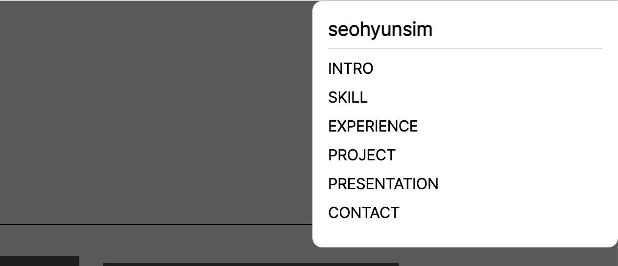
const sideBarOption = {
  mainTitle: 'dev-portfolio',
  iconSize: '28px',
  iconColor: '#181717BB',
  iconMargin: '0px 12px 0px 12px',
};
Intro
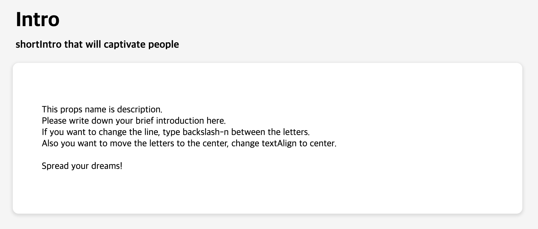
import { Intro } from 'dev-portfolio';

const introOption = [ ... ];

const App = () => {
  return (
    <Intro
      id="Intro Component"
      textAlign="left"
      backgroundColor="whitesmoke"
      introOption={introOption}
    />
  );
}

export default App;| props | type | description | default | note |
|---|---|---|---|---|
id |
string | Name to be added to Sidebar | ||
textAlign |
string | Intro Text align | center | |
backgroundColor |
string | Intro Background color | whitesmoke | |
introOption |
IntroOptionType | Intro-only props such as title, description, etc | See "More about Intro's Props" |
More about Intro's props
introOption example
const IntroOption = {
  title: 'Intro',
  shortIntro: 'shortIntro that will captivate people',
  description:
    'This props name is description.\nPlease write down your brief introduction here.\nIf you want to change the line, type backslash-n between the letters.\nAlso you want to move the letters to the center, change textAlign to center.\n\nSpread your dreams!',
};
TechStackList
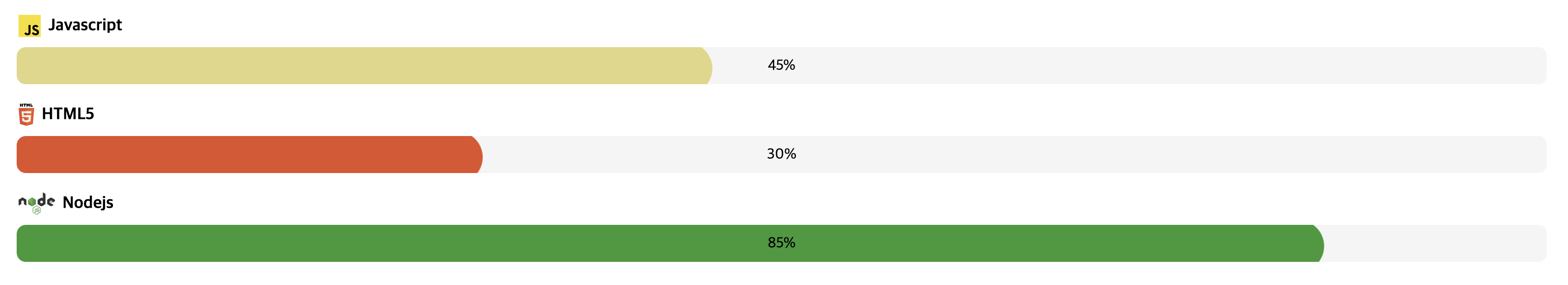
import { TechStackList } from 'dev-portfolio';

const techStackList = [ ... ];

const App = () => {
  return (
    <TechStackList
      id="Tech Stack Component"
      gap="normal" // 'narrower' | 'narrow' | 'normal' | 'wide' | 'wider'
      techStackList={techStackList}
    />
  );
}

export default App;| props | type | description | default | note |
|---|---|---|---|---|
id |
string | Name to be added to Sidebar | ||
gap |
TechStackGapType | Spacing between TechStacks in TechStackList | normal | |
techStackList |
TechStackPropsType[] | TechStack-only props such as tech name, tech logo, and progressbar, etc | See "More about TechStackList's Props" |
More about TechStackList's props
techStackList example
const techStackList = [
  {
    nameOption: { name: 'Javascript', logoName: 'Javascript', fontSize: '18px', logoSize: '24px' },
    progressBarOption: {
      rate: '45%',
      isHiddenRateText: false,
      colorTo: '#E2D784',
      colorFrom: 'whitesmoke',
      width: '100%',
      height: '40px',
    },
  },
  {
    nameOption: { name: 'HTML5', logoName: 'HTML-5', fontSize: '18px', logoSize: '24px' },
    progressBarOption: {
      rate: '30%',
      isHiddenRateText: false,
      colorTo: '#E34F26',
      colorFrom: 'whitesmoke',
      width: '100%',
      height: '40px',
    },
  },
  {
    nameOption: { name: 'Nodejs', logoName: 'Nodejs', fontSize: '18px', logoSize: '24px' },
    progressBarOption: {
      rate: '85%',
      isHiddenRateText: true,
      colorTo: '#339933',
      colorFrom: 'whitesmoke',
      width: '100%',
      height: '40px',
    },
  },
];
gap example

// 'narrower' | 'narrow' | 'normal' | 'wide' | 'wider';
const gap = 'normal';
Experience
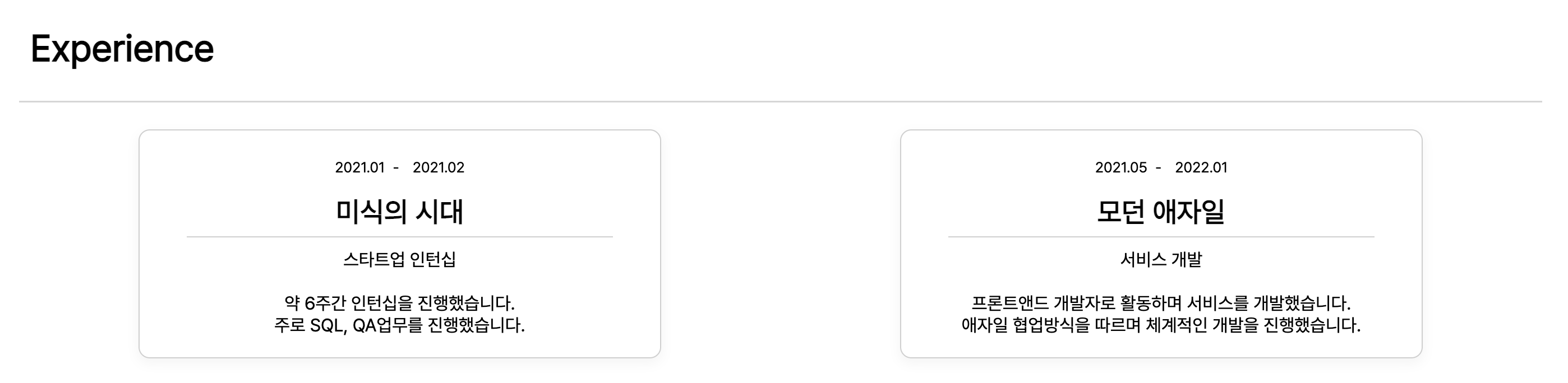
import { Experience } from 'dev-portfolio';

const verticalOption = { ... };
const historyList = [ ... ];

const App = () => {
  return (
    <Experience
      id="Experience Component"
      title="Experience Title"
      textAlign="left"
      theme="vertical" // 'basic' | 'box' | 'vertical'
      verticalOption={verticalOption}
      historyList={historyList}
    />
  );
}

export default App;| props | type | description | default | note |
|---|---|---|---|---|
id |
string | Name to be added to Sidebar | ||
title |
string | Main title text of Experience Component | Experience | |
textAlign |
string | Experience Text align | left | |
theme |
ExperienceThemeType | You can decorate your experience with a variety of theme such as 'basic', 'box', 'vertical'. | basic | |
verticalOption |
ExperienceVerticalOptionType | Special settings can be added when the theme is 'vertical'. | See "More about Experience's Props" | |
historyList |
ExperienceHistoryListType[] | You can add your history data such as date, title, description, etc. | See "More about Experience's Props" |
More about Experience's props
theme example
const theme = "basic"; // 'basic' | 'box' | 'vertical'verticalOption example
const verticalOption = {
  titleColor: "#000000",
  shape: "round-square" // 'square' | 'round-square'
};
historyList example
const historyList = [
  {
    startDate: '2022.01.01',
    endDate: '2022.03.10',
    title: 'this is title',
    des: 'This prop name is des.\nWrite down the additional explanation you want here.\nYou can break the line to backslash-n.',
  },
  {
    startDate: '2020.02',
    title: 'this is title',
    des: `If you just want to write the date and time without the text,\ndon't worry !\nYou can write a des props just by emptying it.\nAn example is shown below.`,
  },
  {
    startDate: '2018',
    endDate: '2019.12',
    title: 'this is title',
  },
];
Carousel
import { Carousel, Image } from 'dev-portfolio';

const App = () => {
  return (
    <Carousel
      id="Carousel Component"
      width="65%"
      transition={1000} // ms
      autoplaySpeed={3000} // ms
      slideToShow={1}
      isArrowShow={true}
      isAutoplay={false}
      isAutoplayControl={true}
      arrowLocation="mid-side" // 'bottom' | 'mid-side' | 'top' | 'bottom-side' | 'top-side'
      playerLocation="bottom-mid" // 'bottom-mid' | 'bottom-left' | 'bottom-right' | 'top-mid' | 'top-left' | 'top-right'
      prevArrowIcon={<YOUR_COMPONENT />} // ReactElement
      nextArrowIcon={<YOUR_COMPONENT />} // ReactElement
      startAutoplayIcon={<YOUR_COMPONENT />} // ReactElement
      pauseAutoplayIcon={<YOUR_COMPONENT />} // ReactElement
    >
      // Must insert components customized
      <YOUR_COMPONENT />
      <Image src="anything.png" /> // Component of dev-portfolio
      ...
    </Carousel>
  );
}

export default App;| props | type | description | default | note |
|---|---|---|---|---|
id |
string | Name to be added to Sidebar | ||
width |
string | Carousel width | 100% | |
transition |
number | Transition animation speed | 1000 | Unit : ms |
autoplaySpeed |
number | Time to stay in a item | 3000 | Unit : ms |
slideToShow |
number | Number of item to show at once | 1 | |
isArrowShow |
boolean | Flag for whether to show buttons | true | |
isAutoplay |
boolean | Flag for play carousel automatically | false | |
isAutoplayControl |
boolean | Flag for whether to show carousel player | true | |
arrowPosition |
ArrowLocationType | Position of arrow icon | mid-side | |
playerLocation |
PlayerLocationType | Position of Play icon | bottom-mid | |
prevArrowIcon |
ReactElement | Icon Component for moving into previous item | <FiChevronLeft /> |
|
nextArrowIcon |
ReactElement | Icon Component for moving into next item | <FiChevronRight /> |
|
startAutoplayIcon |
ReactElement | Icon Component for starting autoplay | <TbPlayerPlay /> |
|
pauseAutoplayIcon |
ReactElement | Icon Component for pause autoplay | <TbPlayerPause /> |
Gallery
import { Gallery, Item } from 'dev-portfolio';

const App = () => {
  return (
    <Gallery
      id="Gallery Component"
      column={3}
      gap="normal" // 'wider' | 'wide' | 'normal' | 'narrow' | 'narrower'
      theme="mid-night" // 'mid-night' | 'blossom' | 'fruits' | 'bare-bare' | 'mint-chocolate'
      padding="2em 10em"
    >
      // Must insert components customized
      <YOUR_COMPONENT />
      <Item /> // Component of dev-portfolio
      ...
    </Gallery>
  );
}

export default App;| props | type | description | default | note |
|---|---|---|---|---|
id |
string | Name to be added to Sidebar | ||
column |
number | Number of vertical lines | 3 | |
gap |
GalleryGapType | Spacing between items in Gallery | normal | |
theme |
GalleryThemeType | You can decorate your Gallery with a variety of theme such as 'mid-night', 'blossom', 'fruits', 'bare-bare', 'mint-chocolate'. | mid-night | |
padding |
string | Gallery padding | 2em 10em |
More about Gallery's props
gap example
// 'wider' | 'wide' | 'normal' | 'narrow' | 'narrower'
const gap = 'normal';
theme example
// 'mid-night' | 'blossom' | 'fruits' | 'bare-bare' | 'mint-chocolate'
const theme = 'mid-night';
Masonry
import { Masonry, Image } from 'dev-portfolio';

const App = () => {
  return (
    <Masonry
      id="Masonry Component"
      column={4}
      padding="2em 4em"
    >
      // Must insert components customized
      <YOUR_COMPONENT />
      <Image src="anything.png" redirectURL="/" /> // Component of dev-portfolio
      <Image src="https://picsum.photos/900/1100/?random" redirectURL="/" /> // Component of dev-portfolio
      ...
    </Masonry>
  );
}

export default App;| props | type | description | default | note |
|---|---|---|---|---|
id |
string | Name to be added to Sidebar | ||
column |
number | Number of vertical lines | 4 | |
padding |
string | Masonry padding | 2em 4em |
Image
import { Image } from 'dev-portfolio';

const App = () => {
  return (
    <Image
      src="https://picsum.photos/500/600/?random"
      head="Write your head"
      subhead="Write your subhead"
      redirectURL="/"
      noShowHead={false}
      zoomWhenHover={false}
    />
  );
}

export default App;| props | type | description | default | note |
|---|---|---|---|---|
src |
string | Image source url | ||
head |
string | Main Title Text | Write your head | |
subhead |
string | Sub Title Text | Write your subhead | |
redirectURL |
string | URL to redirect | / | |
noShowHead |
boolean | Flag for whether to hide texts | false | |
zoomWhenHover |
boolean | Flag for whether to zoom image when hovered on item | false |
Item
import { Item } from 'dev-portfolio';

const App = () => {
  return (
    <Item
      src="https://picsum.photos/600/600/?random"
      title="This is title"
      description="description"
      redirectURL="/"
      textRisingSpeed={300}
      isTextRising={false}
    />
  );
}

export default App;| props | type | description | default | note |
|---|---|---|---|---|
src |
string | Image source url | https://picsum.photos/600/600/?random | |
title |
string | Main Title Text | This is title | |
description |
string | Description Text | description | |
redirectURL |
string | URL to redirect | / | |
textRisingSpeed |
number | 300 | ||
isTextRising |
boolean | false |
Card
import { Card } from 'dev-portfolio';

const App = () => {
  return (
    <Card
      width="10em"
      height="10em"
      redirectURL="/"
      shape="square" // 'square' | 'round-square' | 'round'
      hover="none" // 'up' | 'down' | 'zoom'
    />
  );
}

export default App;| props | type | description | default | note |
|---|---|---|---|---|
width |
string | Card width | 10em | |
height |
string | Card height | 10em | |
redirectURL |
string | URL to redirect | / | |
shape |
CardShapeType | You can decorate shape of Card a variety of theme such as 'square', 'round-square', 'round'. | square | |
hover |
CardHoverType | You can make an effect on Card a variety of theme such as 'up', 'down', 'zoom'. | none |
More about Card's props
shape example
// 'square' | 'round-square' | 'round'
const shape = "square";
hover example
// 'up' | 'down' | 'zoom'
const hover = "zoom";
Contact

import { Contact } from 'dev-portfolio';

const contactOption = { ... };

const App = () => {
  return (
    <Contact
      id="Contact Component"
      backgroundColor="whitesmoke"
      contactOption={contactOption}
    />
  );
}

export default App;| props | type | description | default | note |
|---|---|---|---|---|
id |
string | Name to be added to Sidebar | ||
backgroundColor |
string | Contact Background Color | whitesmoke | |
contactOption |
ContactOptionType | Contact-only props such as title, email button, channels and my personal info, etc | See "More about Contact's Props" |
More about Contact's props
contactOption example
const contactOption = {
  title: 'Hello, I'm dev-portfolio.',
  subTitle: 'If you're interested in me, please press the button below :D',
  buttonText: 'Want to work with me?',
  channels: [
    {
      name: 'github',
      redirectUrl: 'https://',
      color: '#181717BB',
      size: '18px',
      margin: '0px 12px 0px 0px',
    },
    {
      name: 'naver',
      redirectUrl: 'https://',
      color: '#47A141BB',
      size: '18px',
      margin: '0px 12px 0px 0px',
    },
    {
      name: 'facebook',
      redirectUrl: 'https://',
      color: '#1877F2BB',
      size: '18px',
      margin: '0px 12px 0px 0px',
    },
    {
      name: 'youtube',
      redirectUrl: 'https://',
      color: '#FF0000BB',
      size: '18px',
      margin: '0px 12px 0px 0px',
    },
  ],
  aboutMeInfos: [
    {
      title: 'Where I live',
      description: 'Gangdong-gu, Seoul, Republic of Korea',
    },
    {
      title: 'Give me a call',
      description: 'T. +82 (0)10 1234 5678',
    },
    {
      title: 'Or, why don’t you email me?',
      description: 'dev-portfolio@gmail.com',
    },
  ],
};
VisitorCounter
import { VisitorCounter } from 'dev-portfolio';

const App = () => {
  return (
    <VisitorCounter
      title="hits"
      theme="big-size" // 'default' | 'big-size' | 'simple'
      todayVisitor={0} // Your fetched variable
      totalVisitor={123} // Your fetched variable
      todayTitle="today"
      totalTitle="total"
      backgroundColor="#91c230c4"
      size="14" // unit: px
      todayBoldColor="red"
      totalBoldColor="red"
    />
  );
}

export default App;| props | type | description | default | note |
|---|---|---|---|---|
title |
string | Hit title used in 'default' and 'big-size' | hits | |
theme |
string | Visitor Counter theme 'default' | 'big-size' | 'simple' |
todayVisitor |
number | Number of today's visitors | 0 | |
totalVisitor |
number | Title of today's visit count used in 'big-size' and 'simple' | 123 | |
todayTitle |
string | Title of totla visit count used in 'big-size' and 'simple' | today | |
totalTitle |
string | Background color of todayTitle | total | |
backgroundColor |
string | #91c230c4 | ||
size |
string | Font size of all text used in VisitorCounter Component | 14 | unit: px |
todayBoldColor |
string | Color of today's visit count used in 'big-size' and 'simple' | red | |
totalBoldColor |
string | Color of total visit count used in 'big-size' and 'simple' | red |
More about VisitorCounter's props
theme example
// 'default' | 'big-size' | 'simple'
const theme = "default";
VisitorComment
import { VisitorComment } from 'dev-portfolio';

const commentList = [ ... ];

const App = () => {
  return (
    <VisitorComment
      id="VisitorComment Component"
      theme="basic"
      backgroundColor="whitesmoke"
      buttonColor="#1877f2"
      commentInputProps=
      commentList={commentList}
    />
  );
}

export default App;| props | type | description | default | note |
|---|---|---|---|---|
width |
string | Card width | 10em |
More about VisitorComment's props
shape example
// 'square' | 'round-square' | 'round'
const shape = "square"
hover example
// 'up' | 'down' | 'zoom'
const hover = "zoom"
Example


License
MIT