
Package Exports
- enum-plus
- enum-plus/enum
- enum-plus/enum-item
- enum-plus/enum-items
- enum-plus/es-legacy
- enum-plus/localize-interface
- enum-plus/package.json
- enum-plus/types
- enum-plus/utils
Readme

Like native enum, but much better!


Supported Platforms

⬇️ Introduction | Features | Installation | Enum Initialization | API | Static Methods | User Stories | Plugin System | Localization | Extensibility | Naming Conflicts | Best Practices | Compatibility | Q&A | Contributing ⬇️
🎉
v3.0Has Been Released!The new version brings more exciting features and improvements. Please check the release notes and migration guide for details.
Introduction
enum-plus is an enhanced enum library that is fully compatible with the native enum and extends it with powerful features such as display text, localization, UI control binding, enum members traversal, and more useful extension methods. This lightweight, zero-dependency, TypeScript library works with any front-end framework.
With the extended display text capability, enum members can be used to generate dropdowns, checkboxes, and other UI controls with a single line of code. By using the extension methods of the enum, you can easily traverse the array of enum members, get the display text of a certain enum value, determine whether a value exists, etc. The display text of the enum member supports localization, which can return the corresponding text according to the current language environment, making the display text of the enum member more flexible and more in line with user needs.
What other exciting features are there? Please continue to explore! Or you can check out this usage video first.
Features
- Full compatibility with native
enumbehavior - Support for multiple data types including
numberandstring - Enhanced enum members with customizable display text
- Built-in localization capabilities that integrate with any i18n library
- Streamlined conversion from enum values to human-readable display text
- Extensible design allowing unlimited metadata fields on enum members
- Plugin system with a variety of practical plugins available for installation
- Seamless integration with any UI libraries like Ant Design, ElementPlus, Material-UI, in a single line of code
- Support for server-side rendering (SSR)
- Support for multiple environments including Web browsers, Node.js, ReactNative, Taro, and Mini Programs
- Zero dependencies - pure JavaScript implementation usable in any front-end framework
- First-class TypeScript support with comprehensive type inference
- Lightweight (only 2KB+ gzipped)
Installation
Install using npm:
npm install enum-plusInstall using pnpm:
pnpm add enum-plusInstall using bun:
bun add enum-plusOr using yarn:
yarn add enum-plusInstall in a browser:
- The specific version:
<!-- ES2020 modern version -->
<script src="https://cdn.jsdelivr.net/npm/enum-plus@v3.0.0-beta.2/script>
<!-- ES2015 legacy version -->
<script src="https://cdn.jsdelivr.net/npm/enum-plus@v3.0.0-beta.2/script>- The latest version:
<!-- ES2020 modern version -->
<script src="https://cdn.jsdelivr.net/npm/enum-plus/umd/enum-plus.min.js"></script>
<!-- ES2015 legacy version -->
<script src="https://cdn.jsdelivr.net/npm/enum-plus/umd/enum-plus-legacy.min.js"></script>
⬇️ Download:
- enum-plus.umd.min.js.gz
- enum-plus.umd.tar.gz (Full package with sourcemap)
- enum-plus-legacy.umd.min.js.gz
- enum-plus-legacy.umd.tar.gz (Full package with sourcemap)
You can also download them in github release assets
Enum Initialization
This section shows the various ways to initialize enums using the Enum function. Understanding these different initialization formats allows you to choose the most convenient approach for your specific use case.
1. Simple Key-Value Format
The simplest format is a direct mapping of keys to values. This is similar to the native enum format.
import { Enum } from 'enum-plus';

// With number values
const WeekEnum = Enum({
  Sunday: 0,
  Monday: 1,
});

WeekEnum.Monday; // 1

// With string values
const WeekEnum2 = Enum({
  Sunday: 'Sun',
  Monday: 'Mon',
});

WeekEnum2.Monday; // 'Mon'
2. Standard Format (Recommended)
The standard format includes both a value and a label for each enum member. This is the most commonly used format and is recommended for most cases. This format allows you to specify a display text for each enum member, which can be used in UI components. For enabling localization support for the label field, please refer to the Localization section.
import { Enum } from 'enum-plus';

const WeekEnum = Enum({
  Sunday: { value: 0, label: 'I love Sunday' },
  Monday: { value: 1, label: 'I hate Monday' },
});

WeekEnum.Sunday; // 0
WeekEnum.label(0); // I love Sunday
3. Label-Only Format
This is useful when you want to use the key as the value.
import { Enum } from 'enum-plus';

const WeekEnum = Enum({
  Sunday: { label: 'I love Sunday' },
  Monday: { label: 'I hate Monday' },
});

WeekEnum.Sunday; // 'Sunday'
WeekEnum.label('Sunday'); // I love Sunday
4. Array Format
The array format is useful when you need to create enums dynamically, such as from API data. This allows for flexibility in custom field mapping to adapt to different data structures.
import { Enum } from 'enum-plus';

const pets = [
  { value: 1, key: 'Dog', label: 'Dog' },
  { value: 2, key: 'Cat', label: 'Cat' },
  { value: 3, key: 'Rabbit', label: 'Rabbit' },
];
const PetEnum = Enum(pets);

PetEnum.Dog; // 1
PetEnum.label(1); // Dog
5. Native Enum Format
You can also create from native enums. It benefits from the native enum's auto-incrementing behavior.
import { Enum } from 'enum-plus';

enum init {
  Sunday = 0,
  Monday,
  Tuesday,
  Wednesday,
  Thursday,
  Friday,
  Saturday,
}
const WeekEnum = Enum(init);

WeekEnum.Sunday; // 0
WeekEnum.Monday; // 1
WeekEnum.Saturday; // 6
WeekEnum.label('Sunday'); // Sunday
API
💎 Picks an enum value
Enum.XXX
Works like native enum, allowing you to access enum values directly.
WeekEnum.Sunday; // 0
WeekEnum.Monday; // 1
💎 named
Record<string, EnumItemClass>
An object that aggregates all enum items, allowing quick access to a specific enum member object through its key.
WeekEnum.named.Monday; // { key: 'Monday', value: 1, label: 'Monday' }💎 items
{ value, label, key, raw }[]
Returns a read-only array of all enum members.
WeekEnum.items; // [ { value: 0, label: 'Sunday', key: 'Sunday' }, { value: 1, label: 'Monday', key: 'Monday' }, ... ]💎 values
(string | number)[]
Returns an array of all enum member value(s).
WeekEnum.values; // [0, 1, 2, 3, 4, 5, 6]💎 labels
string[]
Returns an array of all enum member label(s).
WeekEnum.labels; // ['Sunday', 'Monday', ... 'Friday', 'Saturday']💎 keys
string[]
Returns an array of all enum member key(s)
WeekEnum.keys; // ['Sunday', 'Monday', 'Tuesday', 'Wednesday', 'Thursday', 'Friday', 'Saturday']💎 meta
Record<string, any[]>
Returns an object containing arrays of custom field values for all enum members. Each key in the object corresponds to a custom field name, and the value is an array of that field's values across all enum members.
const ColorEnum = Enum({
  Red: { value: 1, label: 'Red', hex: '#FF0000' },
  Green: { value: 2, label: 'Green', hex: '#00FF00' },
  Blue: { value: 3, label: 'Blue', hex: '#0000FF' },
});
ColorEnum.meta.hex; // ['#FF0000', '#00FF00', '#0000FF']
By the way, you can quickly access custom fields of a single enum member through the named property.
ColorEnum.named.Red.raw.hex; // '#FF0000'💎 has
[F] has(keyOrValue?: string | number): boolean
Determine whether a certain enum member (value or key) exists.
WeekEnum.has(1); // true
WeekEnum.has('Sunday'); // true
WeekEnum.has(9); // false
WeekEnum.has('Birthday'); // false
💎 findBy
[F] findBy(field: string, value: any): EnumItemClass | undefined
Find an enum member by a specific field and its value. Returns the enum member object if found, otherwise returns undefined.
The field parameter can be one of the built-in fields: key, value, label, or any custom field defined in the enum.
WeekEnum.findBy('value', 1); // { key: 'Monday', value: 1, label: 'Monday' }
WeekEnum.findBy('key', 'Monday'); // { key: 'Monday', value: 1, label: 'Monday' }
If you want to get the custom fields of a known enum member, it is recommended to use the
namedproperty to access it
💎 label
[F] label(keyOrValue?: string | number): string | undefined
Gets the display text of an enum member based on a certain value or key. If localization has been set up, the localized text will be returned.
WeekEnum.label(1); // Monday
WeekEnum.label('Monday'); // Monday, here is label, not key
💎 key
[F] key(value?: string | number): string | undefined
Get the key of an enum member based on the enum value, if the key is not found, return undefined.
WeekEnum.key(1); // Monday (here is key, not label)💎 raw
[F^1] raw(): Record<K, T[K]>
[F^2] raw(keyOrValue: V | K): T[K]
The raw method is used to return the original initialization object of the enum collection, which is the object used to create the enum.
The second overload method is used to return the original initialization object of a single enum member.
The main purpose of the raw method is to get the extended custom fields of the enum members. Unlimited number of custom fields are allowed.
const WeekEnum = Enum({
  Sunday: { value: 0, label: 'Sunday', happy: true },
  Monday: { value: 1, label: 'Monday', happy: false },
});

WeekEnum.raw(0).happy; // true
WeekEnum.raw(0); // { value: 0, label: 'Sunday', happy: true }
WeekEnum.raw('Monday'); // { value: 1, label: 'Monday', happy: false }
WeekEnum.raw(); // { Sunday: { value: 0, label: 'Sunday', happy: true }, Monday: { value: 1, label: 'Monday', happy: false } }
💎 toList
[F^1] toList(): { value, label }[]
[F^2] toList(options?: { valueField?: string; labelField?: string }): { [key: string]: any }[]
Converts the enum members to an array of objects, each containing value and label fields by default. You can customize the field names using the options parameter.
WeekEnum.toList();
// [
//   { value: 1, label: 'Monday' },
//   { value: 2, label: 'Tuesday' },
//   ...
// ]
WeekEnum.toList({ valueField: 'id', labelField: 'name' });
// [
//   { id: 1, name: 'Monday' },
//   { id: 2, name: 'Tuesday' },
//   ...
// ]
💎 toMap
[F^1] toMap(): Record<string, string | number>
[F^2] toMap(options?: { keySelector?: string; valueSelector?: string }): Record<string, any>
Converts the enum members to a key-value map object, where the keys are the enum values and the values are the enum labels by default. You can customize the key and value fields using the options parameter.
WeekEnum.toMap();
// {
//   "1": 'Monday',
//   "2": 'Tuesday',
//   ...
// }
WeekEnum.toMap({ keySelector: 'key', valueSelector: 'value' });
// {
//   "Monday": 1,
//   "Tuesday": 2,
//   ...
// }
💎 name
string
Display name for Enum types. When creating an enum, you can assign it a display name using the optional name parameter. This name can be either a plain string or a localization key to support internationalized text. For more details on localization, see the Localization section.
Usually Enums are used to generate dropdown menus in form, or show member text in table cells. The display name of the enum type often serves as the form field label or table caption. By utilizing the
nameproperty, you can centralize the management of both the enum type's display name and its members' labels, simplifying maintenance and ensuring consistency across your application.
const WeekEnum = Enum(
  {
    Sunday: { value: 0, label: 'Sunday', happy: true },
    Monday: { value: 1, label: 'Monday', happy: false },
  },
  {
    name: 'i18n.enums.week', // A localization key
  }
);

WeekEnum.name; // Week
WeekEnum.label(0); // Sunday
WeekEnum.label(1); // Monday
⚡️ valueType [TypeScript ONLY]
value1 | value2 | ...
In TypeScript, provides a union type containing all enum values, enabling precise type constraints for variables and component properties. This replaces broad primitive types like number or string with exact value sets, preventing invalid assignments while enhancing both code readability and compile-time type safety.
type WeekValues = typeof WeekEnum.valueType; // 0 | 1

const weekValue: typeof WeekEnum.valueType = 1; // ✅ Type correct, 1 is a valid week enum value
const weeks: (typeof WeekEnum.valueType)[] = [0, 1]; // ✅ Type correct, 0 and 1 are valid week enum values
const badWeekValue: typeof WeekEnum.valueType = 8; // ❌ Type error, 8 is not a valid week enum value
const badWeeks: (typeof WeekEnum.valueType)[] = [0, 8]; // ❌ Type error, 8 is not a valid week enum value
Note: This is a TypeScript type only and cannot be called at runtime. Calling it at runtime will throw an exception.
⚡️ keyType [TypeScript ONLY]
key1 | key2 | ...
Similar to valueType, provides an union type of all enum key(s)
type WeekKeys = typeof WeekEnum.keyType; // 'Sunday' | 'Monday'

const weekKey: typeof WeekEnum.keyType = 'Monday';
const weekKeys: (typeof WeekEnum.keyType)[] = ['Sunday', 'Monday'];
Note: This is a TypeScript type only and cannot be called at runtime. Calling it at runtime will throw an exception.
⚡️ rawType [TypeScript ONLY]
{ value: V, label: string, [...] }
Provides a type of the original initialization object of the Enum collection.
type WeekRaw = typeof WeekEnum.rawType;
// { Sunday: { value: 0, label: string }, Monday: { value: 1, label: string } }
Note: This is a TypeScript type only and cannot be called at runtime. Calling it at runtime will throw an exception.
Static Methods
💎 Enum.isEnum
[F] isEnum(obj: any): boolean
Check if a given object is an instance which was created by Enum function.
Enum.isEnum(WeekEnum); // true
Enum.isEnum({}); // false
💎 Enum.localize
[F] (key: string) => string
Set a global localization function for all enums. This function will be used to get the localized text for enum members and enum type names.
import i18n from 'i18next';

Enum.localize = (key) => i18n.t(key);
💎 Enum.extends
[F] (obj: Record<string, unknown> | undefined) => void
Extend the Enum objects with custom methods. More details can be found in the Extensibility section.
Enum.extends({
  sayHello() {
    return `Hello EnumPlus!`;
  },
});
💎 Enum.install
[F] (plugin: EnumPlugin, options?: any) => void
Install a plugin to extend the functionality of all enums. More details can be found in the Plugin System section.
import i18nextPlugin from '@enum-plus/i18next';

Enum.install(i18nextPlugin);
User Stories
Picks enum values, consistent with native enums
const WeekEnum = Enum({
  Sunday: { value: 0, label: 'Sunday' },
  Monday: { value: 1, label: 'Monday' },
});

WeekEnum.Sunday; // 0
WeekEnum.Monday; // 1
Supports JSDoc comments on enum members
Supports inline documentation through JSDoc, allowing developers to view detailed comments by simply hovering over enum values in the editor.
const WeekEnum = Enum({
  /** Represents Sunday */
  Sunday: { value: 0, label: 'Sunday' },
  /** Represents Monday */
  Monday: { value: 1, label: 'Monday' },
});

WeekEnum.Monday; // Hover over Monday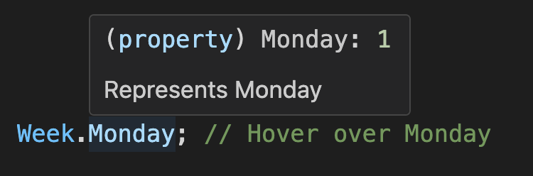
You can see that this hover functionality reveals both documentation and enum values simultaneously, without leaving your current position in the code.
Gets a read-only enum members array
WeekEnum.items; // The output is:
// [
//  { value: 0, label: 'Sunday', key: 'Sunday', raw: { value: 0, label: 'Sunday' } },
//  { value: 1, label: 'Monday', key: 'Monday', raw: { value: 1, label: 'Monday' } },
// ]
Gets the first enum value
WeekEnum.items[0].value; // 0Checks if a value is a valid enum value
WeekEnum.has(1); // true
WeekEnum.items.some((item) => item.value === 1); // true
1 instanceof WeekEnum; // true
instanceof operator
1 instanceof WeekEnum; // true
'1' instanceof WeekEnum; // true
'Monday' instanceof WeekEnum; // true
Supports traversing enum members array
WeekEnum.items.length; // 2
WeekEnum.items.map((item) => item.value); // [0, 1], ✅ Traversable
WeekEnum.items.forEach((item) => {}); // ✅ Traversable
for (const item of WeekEnum.items) {
  // ✅ Traversable
}
WeekEnum.items.push({ value: 2, label: 'Tuesday' }); // ❌ Not allowed, read-only
WeekEnum.items.splice(0, 1); // ❌ Not allowed, read-only
WeekEnum.items[0].label = 'foo'; // ❌ Not allowed, read-only
Gets enum display text by value (or key)
WeekEnum.label(1); // Monday, here is label, not key
WeekEnum.label(WeekEnum.Monday); // Monday, here is label, not key
WeekEnum.label('Monday'); // Monday, get display text by key
Gets enum key by value
WeekEnum.key(1); // 'Monday'
WeekEnum.key(WeekEnum.Monday); // 'Monday'
WeekEnum.key(9); // undefined, because it does not exist
Extends custom fields with unlimited numbers
const WeekEnum = Enum({
  Sunday: { value: 0, label: 'Sunday', active: true, disabled: false },
  Monday: { value: 1, label: 'Monday', active: false, disabled: true },
});

WeekEnum.raw(0).active; // true
WeekEnum.raw(WeekEnum.Sunday).active; // true
WeekEnum.raw('Sunday').active; // true
Converts to UI controls
Enum.itemscan be consumed as control data sources (using Select as an example).React-based UI libraries
Ant Design | Arco Design Select
import { Select } from 'antd';

<Select options={WeekEnum.items} />;
Material-UI Select
import { MenuItem, Select } from '@mui/material';

<Select>
  {WeekEnum.items.map((item) => (
    <MenuItem key={item.value} value={item.value}>
      {item.label}
    </MenuItem>
  ))}
</Select>;
Kendo UI Select
import { DropDownList } from '@progress/kendo-react-dropdowns';

<DropDownList data={WeekEnum.items} textField="label" dataItemKey="value" />;
Vue-based UI libraries
ElementPlus Select
<el-select>
  <el-option v-for="item in WeekEnum.items" v-bind="item" />
</el-select>
Ant Design Vue | Arco Design Select
<a-select :options="WeekEnum.items" />Vuetify Select
<v-select :items="WeekEnum.items" item-title="label" />Angular-based UI libraries
Angular Material Select
<mat-select>
  @for (item of WeekEnum.items; track item.value) {
    <mat-option [value]="item.value">{{ item.label }}</mat-option>
  }
</mat-select>
NG-ZORRO Select
<nz-select>
  @for (item of WeekEnum.items; track item.value) {
    <nz-option [nzValue]="item.value">{{ item.label }}</nz-option>
  }
</nz-select>
Merge two enums (or extend an enum)
const myWeek = Enum({
  ...WeekEnum.raw(),
  Friday: { value: 5, label: 'Friday' },
  Saturday: { value: 6, label: 'Saturday' },
});
Narrowing the number type to enum value sequences [TypeScript ONLY]
By leveraging the valueType type constraint, you can narrow variable types from broad primitives like number or string to precise enum value unions. This type narrowing not only prevents invalid assignments at compile time, but also enhances code readability and self-documentation while providing stronger type safety guarantees.
const weekValue: number = 8; // 👎 Any number can be assigned to the week enum, even if it is wrong
const weekName: string = 'Birthday'; // 👎 Any string can be assigned to the week enum, even if it is wrong

const goodWeekValue: typeof WeekEnum.valueType = 1; // ✅ Type correct, 1 is a valid week enum value
const goodWeekName: typeof WeekEnum.keyType = 'Monday'; // ✅ Type correct, 'Monday' is a valid week enum name

const badWeekValue: typeof WeekEnum.valueType = 8; // ❌ Type error, 8 is not a valid week enum value
const badWeekName: typeof WeekEnum.keyType = 'Birthday'; // ❌ Type error, 'Birthday' is not a valid week enum name

type FooProps = {
  value?: typeof WeekEnum.valueType; // 👍 Component property type constraint, prevent erroneous assignment, and also prompts which values are valid
  names?: (typeof WeekEnum.keyType)[]; // 👍 Component property type constraint, prevent erroneous assignment, and also prompts which values are valid
};
Custom field mapping
In 5. Array Format section, we know that you can build an enum from dynamic data from the backend, but it is very likely that the field names of dynamic data are not value, label, key, but other field names. In this case, you can pass in a custom option to map these to other field names.
import { Enum } from 'enum-plus';

const data = await getPetsData();
// [   { id: 1, code: 'dog', name: 'Dog' },
//     { id: 2, code: 'cat', name: 'Cat' },
//     { id: 3, code: 'rabbit', name: 'Rabbit' }   ];
const PetTypes = Enum(data, {
  getValue: 'id',
  getLabel: 'name',
  getKey: 'code', // getKey is optional
});
PetTypes.items; // The output is:
// [   { value: 1, label: 'Dog', key: 'dog' },
//     { value: 2, label: 'Cat', key: 'cat' },
// { value: 3, label: 'Rabbit', key: 'rabbit' } ]getValue, getLabel, getKey can also be a function to handle more complex business logic, for example:
const PetTypes = Enum(petTypes, {
  getValue: (item) => item.id,
  getLabel: (item) => `${item.name} (${item.code})`,
  getKey: (item) => item.code,
});
Plugin System
enum-plus provides a plugin system that allows you to extend the functionality of all enums. Plugins can add new methods or properties to all enum instances, greatly enhancing their capabilities. You can choose to install only the plugins you need, keeping the core library lightweight and efficient.
import antdPlugin from '@enum-plus/plugin-antd';
import { Enum } from 'enum-plus';

Enum.install(antdPlugin);
After installing a plugin, it will add new methods or properties to all enum instances. For example, after installing the @enum-plus/plugin-antd plugin, you can use the enum.toSelect method to generate a Select component from the enum.
Optionally, you can provide configuration options to customize the behavior of the plugin. For details on the configuration options for each plugin, please refer to the documentation of the respective plugins.
import antdPlugin from '@enum-plus/plugin-antd';
import { Enum } from 'enum-plus';

Enum.install(antdPlugin, {
  toSelect: {
    valueField: 'id', // Sets the field representing the value in the data object generated by the toSelect method
    labelField: 'name', // Sets the field representing the label in the data object generated by the toSelect method
  },
});
Awesome Plugins
The following plugins are available. You can choose to install them based on your needs:
- @enum-plus/plugin-antd: Ant Design oriented features, including
enum.toSelect,enum.toMenu,enum.toFilter, andenum.toValueMap. With these methods, you can directly bind enums to the corresponding Ant Design components, greatly simplifying your code. - @enum-plus/plugin-i18next: i18next localization support.
- @enum-plus/plugin-react: React integration, including support for
Enum.localizeto return React components, and listening for language changes to auto re-render components. - We are working on the following plugins:
- @enum-plus/plugin-vue: Vue integration, including support for
Enum.localizeto return Vue components, and listening for language changes to auto re-render components. - @enum-plus/plugin-angular: Angular integration, including support for
Enum.localizeto return Angular components, and listening for language changes to auto re-render components. We need your help to develop this plugin!
- @enum-plus/plugin-vue: Vue integration, including support for
If the plugin you are searching for is not available, or if you want to develop your own plugin, please refer to the Plugin Development Guide. You can develop new plugins in the official enum-plus repository or publish your developed plugins to npm and share your plugin links here. We sincerely need your help to enrich the plugin ecosystem!
Localization
enum-plus does not include built-in internationalization capabilities by default. Therefore, the label field of enum members is treated as a plain string and returns the original text directly.
To add localization support to enum-plus, the simplest way is to install the corresponding i18n plugin, such as @enum-plus/plugin-i18next, which automatically passes the values of the label and name fields to i18next for translation.
npm install @enum-plus/plugin-i18next i18nextThen install the plugin in the project entry file:
import i18nextPlugin from '@enum-plus/plugin-i18next';
import { Enum } from 'enum-plus';

Enum.install(i18nextPlugin);
After installing the plugin, the label and name fields of the enum will be automatically translated through i18next.
const WeekEnum = Enum(
  {
    Sunday: { value: 0, label: 'week.sunday' },
    Monday: { value: 1, label: 'week.monday' },
  },
  { name: 'weekDays.name' }
);
WeekEnum.label(1); // Monday Or 星期一, depending on the current locale
WeekEnum.named.Monday.label; // Monday Or 星期一, depending on the current locale
WeekEnum.name; // Week Or 周, depending on the current locale
This plugin also supports custom i18next options, and even allows complete control over the localize method. For more details, please refer to the plugin documentation。
If you need to automatically update the UI after switching languages, this requires the capabilities of frameworks like React, Vue, or Angular. Please consider using plugins such as @enum-plus/plugin-react or @enum-plus/plugin-vue.
If you are using other internationalization libraries, such as react-intl, vue-i18next, or ngx-translate, you can integrate these libraries through the Enum.localize method.
index.js
import { Enum } from 'enum-plus';

Enum.localize = (key) => {
  // 这是一段伪代码,请根据你使用的国际化库进行调整
  return intl.formatMessage({ id: key });
};
Once you have completed the setup of
Enum.localize, it is highly recommended to publish it as an npm package and share it in the Awesome Plugins section, so that others can benefit from your work. If you believe that this project is very general, you can also consider submitting it to the official enum-plus plugin repository.
Extensibility
While Enum provides a comprehensive set of built-in methods, you can extend its functionality with custom methods using the Enum.extends API. These extensions are globally applied to all enum instances, including those created before the extension was applied, and take effect immediately without requiring any manual setup.
App.ts
Enum.extends({
  toMySelect(this: ReturnType<typeof Enum>) {
    return this.items.map((item) => ({ value: item.value, title: item.label }));
  },
  reversedItems(this: ReturnType<typeof Enum>) {
    return this.items.reverse();
  },
});

WeekEnum.toMySelect(); // [{ value: 0, title: 'Sunday' }, { value: 1, title: 'Monday' }]
If you are using TypeScript, you probably need to further extend the enum type declaration to get better type hints. Create a declaration file in your project (e.g., enum-extension.d.ts), and extend the global types there.
enum-extension.d.tsfile can be placed in the root directory of the project or any directory. Note, please check theincludeoption in yourtsconfig.jsonconfiguration to ensure that TypeScript can find your declaration file.
enum-extension.d.ts
declare module 'enum-plus/extension' {
  export interface EnumExtension<T, K, V> {
    toMySelect: () => { value: V; title: string }[];
    reversedItems: () => EnumItemClass<EnumItemInit<V>, K, V>[];
  }
}
Then import this declaration file in your project entry file.
index.ts
import './enum-extension';Please note that EnumExtension is a generic interface that accepts three type parameters, which represent:
T: Initialization object of the enum type (e.g., the object passed toEnum())K: Key of the enum member (e.g., Sunday, Monday)V: Value of the enum members
If you want to provide more friendly type hints in the extension methods, you may need to use these type parameters.
However these are all optional, if you don't need them, you can omit them.
Naming Conflicts?
enum-plus is designed with naming conflicts in mind. The namespace of enum members is separate from the methods and properties of the enum instance, minimizing the chances of conflicts. For example, when an enum member's name conflicts with a method name, you can access the overridden methods through the items property.
import { KEYS, VALUES } from 'enum-plus';

const WeekEnum = Enum({
  foo: { value: 1 },
  bar: { value: 2 },
  keys: { value: 3 }, // Naming conflict
  values: { value: 4 }, // Naming conflict
  label: { value: 5 }, // Naming conflict
  named: { value: 6 }, // Naming conflict
  toList: { value: 7 }, // Naming conflict
});

Week.foo; // 1
Week.bar; // 2
// Below are all enum members, which take precedence and override the original methods
WeekEnum.keys; // 3
WeekEnum.values; // 4
WeekEnum.label; // 5
WeekEnum.named; // 6
WeekEnum.toList; // 7

// You can access these overridden methods via .items 🙂
WeekEnum.items[KEYS]; // ['foo', 'bar', 'keys', 'values', 'label', 'named', 'toList']
WeekEnum.items[VALUES]; // [1, 2, 3, 4, 5, 6, 7]
WeekEnum.items.label(1); // 'foo'
WeekEnum.items.named.foo; // { value: 1, label: 'foo', key: 'foo' }
WeekEnum.items.toList(); // [{ value: 1, label: 'foo' }, ...]
Note that
keysandvaluesare special because they are built-in methods of JavaScript arrays. To avoid altering the behavior of theitemsarray, you need to use theKEYSandVALUESsymbols as aliases to access them.
For an even more extreme case, what if items conflicts with an enum member name? Don't worry, you can still access it via the ITEMS alias.
import { ITEMS } from 'enum-plus';

const WeekEnum = Enum({
  foo: { value: 1 },
  bar: { value: 2 },
  items: { value: 3 }, // Naming conflict
  toList: { value: 4 }, // Naming conflict
});

WeekEnum.items; // 3, enum member takes precedence and overrides items
WeekEnum[ITEMS].toList(); // But you can access it via the ITEMS alias
Best Practices
When using enum-plus, following these best practices can help ensure consistency, maintainability, and clarity in your codebase:
- Enum Type Naming: Use
PascalCaseand append with theEnumsuffix (e.g., WeekEnum, ColorEnum). - Enum Member Naming: Use
PascalCasefor enum members(e.g., WeekEnum.Sunday, ColorEnum.Red). This naming style highlights the immutability and static nature of enum members, and ensures they appear at the top in IDE IntelliSense suggestions for easier selection. - Semantic Clarity: Ensure enum and member names have clear semantics. Good semantic naming serves as self-documentation, making code intent explicit and reducing cognitive overhead.
- Single Responsibility Principle: Each enum type should represent a single, cohesive set of related constants. Avoiding overlapping responsibilities between different enum types.
- Provide JSDoc Comments: Provide JSDoc comments for each enum member and the enum type itself, explaining their purpose and usage. Comprehensive documentation enables IDE hover tooltips and improves code readability and maintainability.
- Internationalization Architecture: Plan for internationalization from the outset by leveraging the library’s built-in localization features. A well-designed internationalization architecture minimizes future refactoring and facilitates global scalability.
Compatibility
enum-plus is designed to be compatible with a wide range of environments, including modern browsers, Node.js, and various build tools. Below are the compatibility details for different environments:
Browser Environments
Modern Bundlers: For bundlers supporting the exports configuration (such as webpack 5+, vite, rollup),
esdirectory is imported, which targetsES2020. If you need to support earlier browsers, you can use@babel/preset-envto transpile to earlier syntax during the build process.Legacy Bundlers: For bundlers without exports configuration support (like Webpack 4), this library automatically falls back to the
mainfield entry point, andes-legacydirectory is imported, which targetsES2015.UMD Version: For direct browser usage or static projects without bundlers, enum-plus provides UMD format files in the
umddirectory. These can be included via a<script>tag and accessed throughwindow.EnumPlus. The UMD directory offers two versions:enum-plus.min.js: TargetsES2020, suitable for modern browsers.enum-plus-legacy.min.js: TargetsES2015, suitable for older browsers.
Polyfill Strategy: enum-plus ships no polyfills to minimize bundle size. For legacy browser support, you can include the following tools as needed:
core-js@babel/preset-envwith appropriateuseBuiltInssettings- Alternative polyfill implementations
Node.js Environments
In Node.js environments, the EcmaScript version provided is ES2016.
Additionally, enum-plus supports both CommonJS and ESModule module formats.
- For versions that support the exports configuration (e.g., Node 14+), you can choose to use either
requireorimportsyntax to import the module. - For earlier Node.js versions, the default import is from the
libdirectory, which only supports theCommonJSmodule format, meaning you can only use therequiresyntax. - The minimum compatible version of Node.js is
v7.x.
Q&A
1. How to implement internationalization based on i18next?
Please refer to the code example below:
main.tsx
import { createRoot } from 'react-dom/client';
import { Enum } from 'enum-plus';
import i18next from 'i18next';
import App from './App';
import Locale from './components/Locale';
import LocaleProvider from './components/LocaleProvider';
import enUS from './locales/en-US';
import zhCN from './locales/zh-CN';

i18next.init({
  lng: localStorage.getItem('my_lang'),
  fallbackLng: 'en-US',
  supportedLngs: ['en-US', 'zh-CN'],
  resources: {
    'en-US': { translation: enUS },
    'zh-CN': { translation: zhCN },
  },
});
i18next.on('languageChanged', (lang) => {
  localStorage.setItem('my_lang', lang);
});

// 👀 Here is the key code, set globally through Enum.localize method, use Locale component to output localized text
Enum.localize = (key?: string) => <Locale value={key} />;

const root = createRoot(document.getElementById('root'));
root.render(
  <LocaleProvider>
    <App />
  </LocaleProvider>
);
components/LocaleProvider.tsx
import type { FC, ReactNode } from 'react';
import { createContext, useEffect, useState } from 'react';
import i18next from 'i18next';

export const LocaleContext = createContext<{
  lang: string;
  setLang: (lang: string) => void;
}>({});

const LocaleProvider: FC<{ children: ReactNode }> = ({ children }) => {
  const [lang, setLang] = useState(i18next.language);

  useEffect(() => {
    i18next.changeLanguage(lang);
  }, [lang]);
  return <LocaleContext.Provider value={{ lang, setLang }}>{children}</LocaleContext.Provider>;
};
export default LocaleProvider;
components/Locale.tsx
import { useContext } from 'react';
import i18next from 'i18next';
import { LocaleContext } from './LocaleProvider';

export default function Localize({ value }: { value: string }) {
  const { lang } = useContext(LocaleContext);
  return <>{i18next.t(value, { lng: lang })}</>;
}
2. Why does the search function of the antd dropdown not work after localization?
This occurs because Ant Design's dropdown search functionality performs string matching against the label property. When using React components for labels (after localization), the string matching fails since it's comparing against component objects rather than primitive strings.
The solution is to extend an enum with a filterOption method to help the Select component customize the search function, which will allow it to support the search functionality correctly.
You can refer to the code example below:
import { Select } from 'antd';
import { Enum, type EnumItemClass } from 'enum-plus';

Enum.extends({
  filterOption: (search?: string, option?: EnumItemClass<number | string>) => {
    const label = $t(option?.raw?.label ?? '') ?? option?.value;
    return !search || label?.toUpperCase().includes(search.toUpperCase());
  },
});

// <Select options={WeekEnum.items} filterOption={WeekEnum.filterOption} />;
Contributing
If you would like to contribute to this project, please follow the CONTRIBUTING guidelines outlined in the repository. Feel free to submit issues, pull requests, or suggestions for improvements. Your contributions are greatly appreciated!
If you find a security issue, please follow the Security Policy to report it responsibly.
If you find this project useful, please consider giving it a star ⭐️ on GitHub. It helps others discover the project and encourages further development.