
Package Exports
- form-render
- form-render/lib/antd
- form-render/lib/fusion
This package does not declare an exports field, so the exports above have been automatically detected and optimized by JSPM instead. If any package subpath is missing, it is recommended to post an issue to the original package (form-render) to support the "exports" field. If that is not possible, create a JSPM override to customize the exports field for this package.
Readme

FormRender


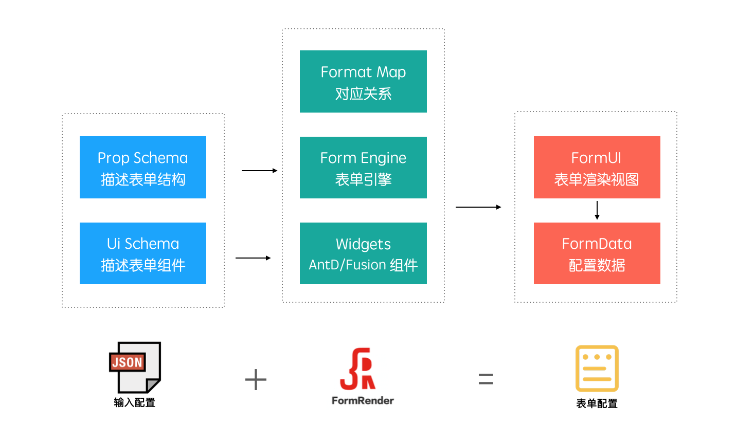
通过 JSON Schema 生成标准 Form,常用于自定义搭建配置界面生成
Topics

Features
- 支持 Ant Design 和 Fusion Design 主流的视觉主题
- 使用 JSON Schema 标准协议描述表单配置,并搭配丰富类型且可扩展的组件
- 支持 1 排 N、横纵排、支持对象无限嵌套、自定义正则校验、自定义样式组件、列表拖拽等特性
- 已在内部不少场景使用,可简单使用同时支持复杂场景使用
- 使用上有详细文档,维护上有专人支持
思路
Form Render 底层引擎用原生 JS 来实现,通过解析 JSON Schema 配置,并支持渲染原生的 HTML 表单,通过 UiSchema 来配置 Widget 组件,在此基础上处理好上层 Antd 或 Fusion 组件 Widget 和 Input Format 的对应关系,最后还可以做到无缝接入其他组件体系的好处
Installation
npm i form-render -SUsage
详细使用可见 开始开始
import React from 'react';

// antd 是这样使用(使用3.x版本)
import 'antd/dist/antd.css';
import FormRender from 'form-render/lib/antd.js';

// fusion 这样使用(使用开源版本)
//import '@alifd/next/dist/next.min.css';
//import FormRender from 'form-render/lib/fusion';

// propsSchema 是配置 Form Render 的必备参数,使用标准的 JSON Schema 来描述表单结构
const propSchema = {
  type: 'object',
  properties: {
    stringDemo: {
      title: '字符串',
      description: '英文或数字组合',
      type: 'string',
      pattern: '^[A-Za-z0-9]+$'
    },
    dateDemo: {
      title: '时间',
      format: 'dateTime',
      type: 'string'
    },
  },
  required: [
    'stringDemo'
  ]
};

//通过uiSchema可以增强 Form Render 展示的丰富性,比如说日历视图
const uiSchema = {
  dateDemo: {
    'ui:widget': 'date'
  }
};

class Playground extends React.Component {
  constructor() {
    super();
    this.state = {
      formData: {}
    };
  }

  // 数据变化回调
  onChange = value => {
    this.setState({
      formData: value
    });
  }

  // 数据格式校验回调
  onValidate = list => {
    console.log(list);
  }

  render() {
    const { formData } = this.state;
    return (
      <FormRender
        name="表单配置"
        propsSchema={propSchema}
        uiSchema={uiSchema}
        formData={formData}
        onChange={this.onChange}
        onValidate={this.onValidate}
      />
    );
  }
}
ReactDOM.render(<Playground />, mountNode);
API
| Prop | Type | Required | Default | Description |
|---|---|---|---|---|
name |
String |
Y |
$form |
表单的名称 |
propsSchema |
Object |
Y |
{} |
表单属性配置 json |
uiSchema |
Object |
N |
{} |
表单 UI 配置 json |
formData |
Object |
N |
{} |
配置数据 |
onChange |
Function |
Y |
()=>{} |
数据更改回调函数 |
onValidate |
Function |
N |
()=>{} |
表单输入校验回调 |
displayType |
String |
N |
column |
设置表单横向排列或者纵向排序column/ row |
*设置表单 displayType 为 row 时候,请设置 showDescIcon 为 true,隐藏说明,效果会更好
Rare API
| Prop | Type | Required | Default | Description |
|---|---|---|---|---|
column |
Number |
1 |
N |
整体布局 1 排 N,局部的 1 排 N 一般使用ui:width |
showValidate |
Boolean |
N |
true |
是否展示校验信息 |
showDescIcon |
Boolean |
N |
false |
是否将文字形式说明显示成描述 tooltip 形式 |
widgets |
Object |
N |
{} |
自定义组件 |
mapping |
Object |
N |
{} |
用于修改默认组件映射表 |
FieldUI |
Component |
N |
内置组件 | 用于自定义整个元素的样式(标签、结构等) |
注:样式覆盖基本能满足简单的样式修改需求,普通用户慎用FieldUI
FieldUI 的 props:
| Prop | Type | Required | Default | Description |
|---|---|---|---|---|
className |
String |
N |
N |
使用ui:options里设置的className |
displayType |
String |
N |
column |
设置表单横向排列或者纵向排序column/ row |
isComplex |
Boolean |
N |
N |
是否是复杂结构:对象和对象数组 |
isRequired |
Boolean |
N |
N |
是否是必填项 |
schema |
Object |
Y |
N |
组件对应的子 schema |
showLabel |
Boolean |
N |
true |
是否展示 label |
showDescIcon |
Boolean |
N |
false |
是否将文字形式说明显示成描述 tooltip 形式 |
showValidate |
Boolean |
N |
true |
是否展示校验 |
validateText |
String |
N |
N |
校验文字 |
协议
- 遵循 MIT 协议
- 请自由地享受和参与开源