
Package Exports
- frog-sass
This package does not declare an exports field, so the exports above have been automatically detected and optimized by JSPM instead. If any package subpath is missing, it is recommended to post an issue to the original package (frog-sass) to support the "exports" field. If that is not possible, create a JSPM override to customize the exports field for this package.
Readme
frog-sass
frog-sass 样式库,让开发更加简洁.

基于 webpack & sass-loader。
Install
frog-sass 使用 npm 管理器,你需要通过 npm 来安装 frog-save
npm install frog-sass --save安装 eyeglass 扩展包 (eyeglass 地址:https://github.com/sass-eyeglass/eyeglass)
npm install eyeglass --save-dev在你的 webpack.config.js 中添加如下代码
const path = require('path');
const webpack = require('webpack');
const eyeglass = require("eyeglass");

const config = {
  ...
  module: {
    rules: [
      {
        test: /(\.css|\.scss)$/,
        use: [
          { loader: 'style-loader' },
          { loader: 'css-loader' },
          {
            loader: 'sass-loader',
            options: eyeglass({
              includePaths: path.resolve(__dirname, 'node_modules')
            })
          }
        ]
      },
    ]
  },
  ...
};

module.exports = config;
在你的 scss 文件首行添加引用
@import "frog-sass";Using
清除浏览器默认样式 _reset
已内置于 frog-sass,引入 frog-sass 的同时已经在使用。变量 _const
Color
// 四种主色
$primary-color: $BLUE_7;
$secondary-color: $GREEN_7;
$warning-color: $RED_7;
$default-color: $GREY_7;

// $[颜色]_[1-10]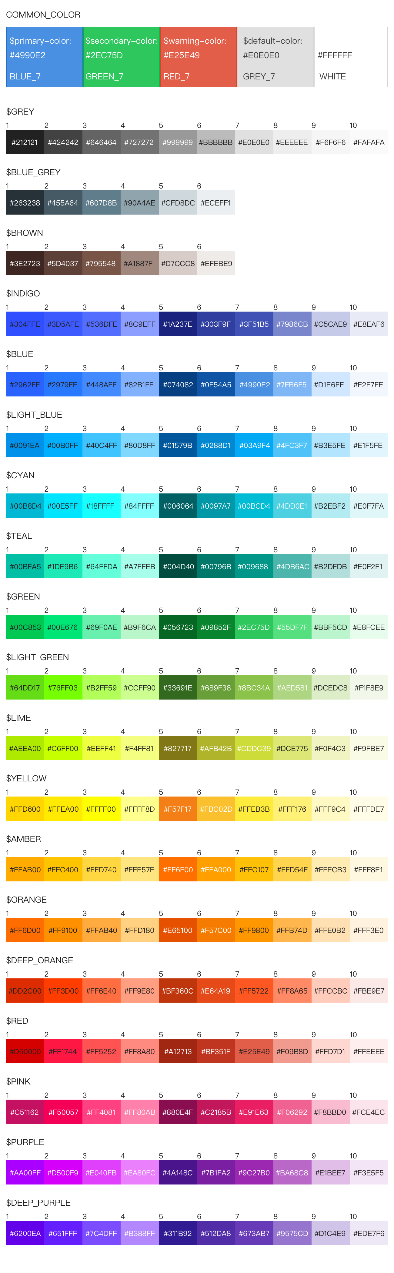
Front
// font-family
// html 标签已默认设置 PC 和 Mobile 两种字体
$PC_FONT_FAMILY: "Noto Sans CJK SC", "Source Han Sans CN", STXihei, SimHei, "Microsoft YaHei";
$MOBILE_FONT_FAMILY: "Noto Sans CJK SC", "Source Han Sans CN", "PingFang SC", STXihei;

// font-size
$FONT_SIZE_10, $FONT_SIZE_12, $FONT_SIZE_14,
$FONT_SIZE_16, $FONT_SIZE_18, $FONT_SIZE_20,
$FONT_SIZE_22, $FONT_SIZE_24

// 针对 Chrmoe 无法展示 10 号字问题,暂时采取缩放方式解决
// 缩放会缩小块级元素,最好直接作用于 span 标签使用
@media screen and (-webkit-min-device-pixel-ratio: 0) {
  span {
    @include font-size-10();
  }
}
Device
// 屏幕尺寸临界值
$SCREEN_XS: 480px;
$SCREEN_SM: 768px;
$SCREEN_MD: 992px;
$SCREEN_LG: 1200px;
统一添加浏览器前缀的方法
// 对于某些属性,浏览器的兼容可以通过添加前缀来处理
@mixin prefix($property, $value) {
  @each $prefix in -webkit-, -moz-, -ms-, -o-, '' {
    #{$prefix}#{$property}: $value;
  }
}

// 使用方法
.test {
  @include prefix(transition, border-left 2s);
}

// 编译之后
.test {
  -webkit-transition: border-left 2s;
  -moz-transition: border-left 2s;
  -ms-transition: border-left 2s;
  -o-transition: border-left 2s;
  transition: border-left 2s;
}
flex布局浏览器兼容
// 设置弹性布局
@mixin flexDisplay {
  display: flex;/* android 4.4 */
  display: -webkit-box;/* Android 2.1-3.0, iOS 3.2-4.3 */
  display: -webkit-flex;/* Chrome 21+ */
  display: -ms-flexbox;/* WP IE 10 */
}

// 水平布局下的子元素
@mixin flexJustify($position) {
  justify-content: $position;/* android 4.4 */
  -webkit-box-pack: $position;/* android 2.1-3.0, ios 3.2-4.3 */
  -webkit-justify-content: $position;/* Chrome 21+ */
  -ms-flex-pack: $position;/* WP IE 10 */
}

// 垂直布局下的子元素
@mixin flexAlign($position) {
  align-items: $position;/* android 4.4 */
  -webkit-box-align: $position;/* android 2.1-3.0, ios 3.2-4.3 */
  -webkit-align-items:$position;/* Chrome 21+ */
  -ms-flex-align: $position;/* WP IE 10 */
}

// 设置弹性布局的方向,子元素按照在源文档中声明的顺序从上到下显示
@mixin flexDirectionColum {
  flex-direction: column;/* android 4.4 */
  -webkit-box-orient: vertical;/* android 2.1-3.0, ios 3.2-4.3 */
  -webkit-flex-direction: column;/* Chrome 21+ */
  -ms-flex-direction: column;/* WP IE 10 */
}

// 子元素自动占据剩余的空间
@mixin flex1 {
  -webkit-box-flex:1;/* android 2.1-3.0, ios 3.2-4.3 */
  -webkit-flex:1;/* Chrome 21+ */
  -ms-flex:1;/* WP IE 10 */
  flex:1;/* android 4.4 */
}

// 水平布局下的子元素 两端对齐
@mixin flexPackJustify {
  -webkit-box-pack: justify;/* android 2.1-3.0, ios 3.2-4.3 */
  -webkit-justify-content: space-between;/* Chrome 21+ */
  -ms-flex-pack: justify;/* WP IE 10 */
  justify-content: space-between;/* android 4.4 */
}

// 使用方法
.test {
  @include flexDisplay();
  @include flexJustify(center);
  @include flexAlign(center);
}

// 编译之后
.test {
  display: flex;
  display: -webkit-box;
  display: -webkit-flex;
  display: -ms-flexbox;
  justify-content: center;
  -webkit-box-pack: center;
  -webkit-justify-content: center;
  -ms-flex-pack: center;
  align-items: center;
  -webkit-box-align: center;
  -webkit-align-items: center;
  -ms-flex-align: center;
}
常用组合的属性
// 省略号,单行文本超出指定宽度,显示省略号
@mixin ellipsis() {
  overflow: hidden;
  text-overflow: ellipsis;
  -ms-text-overflow: ellipsis;
  white-space: nowrap;
}

// 箭头,分为left,right,top,bottom四个方向的箭头,传入三个参数,分别是箭头指向,宽度,颜色
@mixin arrow($direction: right, $width: 10px, $color:#000000) {
  width: 0;
  height: 0;
  @if $direction == top {
    border-left: #{$width} solid transparent;  /* 左边框的宽 */
    border-right: #{$width} solid transparent; /* 右边框的宽 */
    border-bottom: #{$width} solid $color;
  } @else if $direction == bottom {
    border-left: #{$width} solid transparent;  /* 左边框的宽 */
    border-right: #{$width} solid transparent; /* 右边框的宽 */
    border-top: #{$width} solid $color;
  } @else if $direction == left {
    border-top: #{$width} solid transparent; /* 上边框的宽 */
    border-bottom: #{$width} solid transparent; /* 下边框的宽 */
    border-right: #{$width} solid $color;
  } @else if $direction == right {
    border-top: #{$width} solid transparent; /* 上边框的宽 */
    border-bottom: #{$width} solid transparent; /* 下边框的宽 */
    border-left: #{$width} solid $color;
  }
}

// 省略号使用方法
.test {
  @include ellipsis(); // 文本超出指定宽度,显示省略号
}

// 编译之后
.ellipsis {
  overflow: hidden;
  text-overflow: ellipsis;
  -ms-text-overflow: ellipsis;
  white-space: nowrap;
}

// 箭头使用方法
.arrow {
  @include arrow(top, 10px, #e4393c); // 生成一个宽度为10px的向上的红色箭头
}

// 编译之后
.arrow {
  width: 0;
  height: 0;
  border-left: 10px solid transparent;  /* 左边框的宽 */
  border-right: 10px solid transparent; /* 右边框的宽 */
  border-bottom: 10px solid #e4393c;
}
px2vw px2vh方法
// px2vw
@function px2vw($value, $width) {
  @return $value/$width*100vw;
}

// px2vh
@function px2vh($value, $height) {
  @return $value/$height*100vh;
}

// 使用方法,传入两个参数,第一个是元素宽度,第二个是设计稿宽度
.test {
  width: px2vw(37.5px, 375px)
}

// 编译之后
.test {
  width: 10vw;
}