
Package Exports
- glamor
- glamor/lib/CSSPropertyOperations
- glamor/lib/autoprefix
- glamor/lib/hash
- glamor/package.json
- glamor/react
- glamor/reset
This package does not declare an exports field, so the exports above have been automatically detected and optimized by JSPM instead. If any package subpath is missing, it is recommended to post an issue to the original package (glamor) to support the "exports" field. If that is not possible, create a JSPM override to customize the exports field for this package.
Readme
glamor

css for component systems
npm install glamor --save
or if you're interested in a plain script tag -
<script src='https://npmcdn.com/glamor/umd/index.min.js'></script>usage looks like this
<div {...style({ color: 'red' })} {...hover({ color: 'pink' })}>
  zomg
</div>
motivation
This expands on ideas from @vjeux's 2014 css-in-js talk. We introduce an api to annotate arbitrary dom nodes with style definitions ("rules") for, um, the greater good.
features
- really small / fast / efficient, with a fluent api
- framework independent
- adds vendor prefixes
- supports all the pseudo :classes/::elements
- supports
@mediaqueries - supports
@font-faceand@keyframes - escape hatches for global and child selectors
- dev helper to simulate pseudo classes like
:hover, etc - server side rendering
- tests / coverage
- new! - glamor/reset - includes a css reset
- new! - glamor/ous - a port of the skeleton css framework
- new! - glamor/react - react integration, à la jsxstyle
cons
- no real-world usage / adoption yet
- edge cases could consume excess memory (#1)
api
style(props)
defines a rule with the given key-value pairs. returns an object (of shape {'data-css-<id>': ''}),
to be added to an element's attributes. This is not the same as element's style,
and doesn't interfere with the element's className / class
<div {...style({ backgroundColor: '#ccc', borderRadius: 10 })}>
  <a {...style({ label: 'blueText', color: 'blue' })} href='github.com'>
    click me
  </a>
</div>
protip - in dev mode, adding a label string prop will reflect its value in devtools.
useful when debugging, and a good alternative to 'semantic' classnames.
<pseudo>(props)
where <pseudo> is one of :
active      any           checked     _default    disabled    empty
enabled     first         firstChild  firstOfType fullscreen  focus
hover       indeterminate inRange     invalid     lastChild   lastOfType
left        link          onlyChild   onlyOfType  optional    outOfRange
readOnly    readWrite     required    right root  scope       target
valid       visited
defines a rule for the given pseudoclass selector
<div {...hover({ backgroundColor: '#ccc', display: 'block'})}>
  <input
    {...style({ color: 'gray', fontSize: 12 })}
    {...focus({ color: 'black' })}
    {...hover({ fontSize: 16 })} />
</div>
<pseudo>(param, props)
where <pseudo> is one of :
dir lang not nthChild nthLastChild nthLastOfType nthOfTypelike the above, but parameterized with a number / string
dir('ltr', props), dir('rtl', props)
lang('en', props), lang('fr', props), lang('hi', props) /* etc... */
not(/* selector */, props)
nthChild(2, props), nthChild('3n-1', props), nthChild('even', props) /* etc... */
nthLastChild(/* expression */, props)
nthLastOfType(/* expression */, props)
nthOfType(/* expression */, props)
<pseudo>(props)
where <pseudo> is one of
after before firstLetter firstLine selection backdrop placeholdersimilar to the above, but for pseudo elements.
<div {...before({ content: '"hello "' })}>
  world!
</div>
// note the quotes for `content`'s value
multi(pse:udos, props) - DEPRECATED (in favor of select(:ps))
pass a :-separated list of pseudoclasses; for when you need to add
multiple pseudoclasses to a rule.
multi('hover:active', { color: 'red' })
// corresponds to [data-css-1cb101e]:hover:active { color: red; }
select(selector, props)
an escape hatch to define styles for arbitrary css selectors. your selector is appended directly to the css rule, letting you define 'whatever' you want. use sparingly!
<div {...select(':hover ul li:nth-child(even)', { color: 'red' })}>
  <ul>
    <li>one</li>
    <li>two - red!</li>
    <li>three</li>
  </ul>
</div>
(nb: don't forget to add a space for fully child selectors.
eg - select(' .item', {...}). also, simulate() does not work on these yet.)
(experimental!) keyed(key, style)
creates a rule with 'key' as id instead of generating a hash. overwrites said rule when called again with same key.
// let's say you render
<div {...keyed('mykey', { color: 'red' })}/>

//and then later (anywhere, no reassignment required )
keyed('mykey', { color: 'blue' })
keyed('mykey', { color: 'green' })
keyed('mykey', { color: 'yellow' })

// the div is now yellow!
todo - pseudoclasses et al
compose(...rules) / merge(...rules)
combine rules, with latter styles taking precedence over previous ones.
<div {...compose(
    style(props),
    hover(props),
    { color: 'red' },
    hover(props)) }>
    mix it up!
</div>
media(query, ...rules)
media queries!
<div {...media('(min-width: 500px) and (orientation: landscape)',
            { color: 'blue' }, hover({ color: 'red' }))}>
  resize away
</div>
also included are some presets
presets.mobile - (min-width: 400px)
presets.phablet - (min-width: 550px)
presets.tablet - (min-width: 750px)
presets.desktop - (min-width: 1000px)
presets.hd - (min-width: 1200px)
and use as -
media(presets.tablet, {...})simulate(...pseudoclasses)
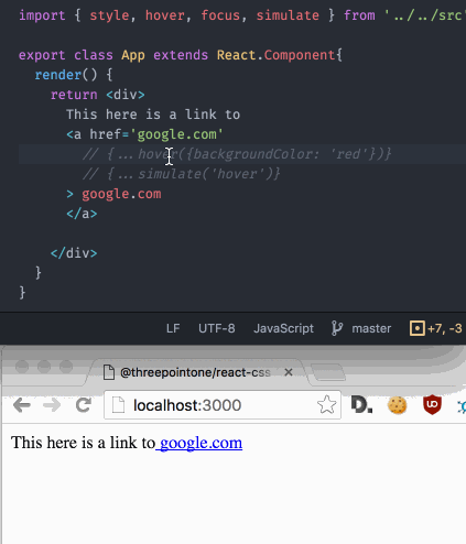
in development, lets you trigger any pseudoclass on an element
fontFace(font)
loads the given font-face at most once into the document, returns the font family name
let family = fontFace({
  fontFamily: 'Open Sans',
  fontStyle: 'normal',
  fontWeight: 400,
  src: "local('Open Sans'), local('OpenSans'), url(https://fonts.gstatic.com/s/...ff2')",
  unicodeRange: "U+0000-00FF, U+0131, ... U+E0FF, U+EFFD, U+F000"
})
// ...
<div {...style({ fontFamily: family })}>
  no serifs!
</div>
for anything more complicated, use something like typography.js
keyframes(timeline)
adds animation keyframes into the document, with an optional name.
let bounce = keyframes('bounce', { // optional name
  '0%': { transform: 'scale(0.1)', opacity: 0 },
  '60%': { transform: 'scale(1.2)', opacity: 1 },
  '100%': { transform: 'scale(1)' }
})
// ...
<div {...style({
  animation: `${bounce} 2s`,
  width: 50, height: 50,
  backgroundColor: 'red'
})}>
  bounce!
</div>
use sparingly! for granular control, use javascript and pencil and paper.
appendSheetRule(css)
append a raw css rule to the stylesheet. the ultimate escape hatch.
appendSheetRule(`body {
  margin: 0;
}`)
glamor/reset
includes and applies a css reset to your page
import 'glamor/reset'glamor/ous
a full port of the skeleton css framework
[TODO docs]
react integration (experimental)
heavily inspired by jsxstyle
import { View } from 'glamor/react'

// ...

<View
  color='red'   // regular style properties
  backgroundColor='#ccc'
  css={{ outline: '1px solid black' }} // or a style object
  hover={{ color: 'blue' }} // pseudo classes
  select={[' li:nth-child(3)', { textDecoration: 'underline' }]} // arbitrary selectors
  media={[ '(min-width: 400px)', {
    width: '85%',
    padding: 0
  } ]} // media queries
  compose={[...]}  // add as many more rules
  component='ul' // use any tag/component
  style={{ border: '1px solid green' }} // 'inline' style
  className='mylist' // combine with aphrodite/css modules/etc
  onClick={() => alert('what what!')} // event handlers
  props={{ disabled: true }} // pass props to the underlying element
>
  <li>one</li>
  <li>two</li>
  <li>three</li>
  <li>four</li>
</View>

// also available - Block, InlineBlock, Flex, Row, Column
cssFor(...rules)
a helper to extract the css for given rules. useful for debugging, and webcomponents
let red = style({ color: 'red' })
let blue = style({ border: 'blue' })
console.log(cssFor(red, blue))

/*
[data-css-16y7vsu]{ color:red; }
[data-css-1el9v42]{ border:blue; }
*/
attribsFor(...rules)
another helper for webcomponents, this generates the attributes to be included when constructing an element's html
// continued from above
console.log(attribsFor(red, blue))
/*
data-css-16y7vsu="" data-css-1el9v42=""
*/
composing / modularity
while it's tempting to add some form of a Stylesheet construct, we'd
rather defer to the developer's preference. In general, we recommed using
simple objects, functions, and components to create abstractions. You can
also lean on compose(...styles) for combining rules. Some examples -
// name your rules with vars/consts/whatevs
let container = style({ color: THEME.primary }),
  item = compose({ backgroundColor: '#ccc' }, hover({ backgroundColor: 'white' })),
  selected = style({ fontWeight: 'bold' })
}
// ...and when rendering
<div {...container}>
  <ul>
    <li {...item}> one </li>
    <li {...item} {...selected}> two </li>
    <li {...item}> three </li>
  </ul>
</div>


// encapsulate custom behavior/attributes with components / functions
let types = {
  'primary': 'blue',
  'secondary': 'gray',
  'disabled': 'transparent'
}

let Button = ({ type, children, onClick = ::console.log }) =>
  <button {...style({ backgroundColor: types[type] })}
    onClick={onClick}>
      {children}
  </button>

// and when rendering ...
  <div>
    are you ready?
    <Button type='primary'>click me!</Button>
  </div>

// or make your own helper function alá aphrodite et al
let sheet = createSheet({
  container: {...},
  item: {
    ...,
    ':hover': {
      ...
    }
  }
})

// and when rendering
<div {...sheet.container}>
  ...etc...
</div>

// any other ideas? share!
server side rendering
renderStatic(fn:html)
renderStaticOptimized(fn:html)
rehydrate(cache)
this api is mostly copied from aphrodite; render your component inside of a callback, and glamor will gather all the calls you used and return an object with html, css, and an object to rehydrate the lib's cache for fast startup
// on the server
import { renderStatic } from 'glamor'
let { html, css, cache } = renderStatic(() =>
  ReactDOMServer.renderToString(<App/>)) // or `renderToStaticMarkup`
<!-- when rendering your html -->
<html>
<head>
<style>${css}</style>
<!-- alternately, you'd save the css to a file
and include it here with
<link rel='stylesheet' href='path/to/css'/>
-->
</head>
<body>
<div id='root'>${html}</div>
<script>
// optional!
window._css = ${JSON.stringify(cache)}
</script>
<script src="bundle.js"></script>
</body>
</html>// optional!
// when starting up your app
import { rehydrate } from 'glamor'
rehydrate(window._css)
ReactDOM.render(<App/>, document.getElementById('root'))caveat: the above will include all the css that's been generated in the app's lifetime.
This should be fine in most cases. If you seem to be including too many unused styles,
use renderStaticOptimized instead of renderStatic. This will parse the generated
html and include only the relevant used css / cache.
characteristics
while glamor shares most common attributes of other inline style / css-in-js systems, here are some key differences -
- as such, it does not generate pretty classnames, but instead generates debug labels in dev mode. (issue #5)
- does not touch
class/styleattributes; instead we usedata-*attributes and jsx attribute spread (some implications). This lets you define styles 'inline', yet globally optimize as one unit. - in dev mode, you can simulate pseudo classes on elements by using the
simulate()helper (or adding a[data-simulate-<pseudo>]attribute manually). very useful, especially when combined when hot-loading and/or editing directly in your browser devtools. - in production, we switch to a much faster method of appending styles to the document, able to add 10s of 1000s of rules in milliseconds. the caveat with this approach is that those styles will not be editable in chrome/firefox devtools (which is fine, for prod?). advanced users may use
speedy(true/false)to toggle this setting manually.
todo
- glamorous documentation
- error checking / typechecks (flow? runtime?)
- ie8 compat for insertRule/deleteRule
- plugins
- other frameworks?
- non-dom? (!)
- flush unused rules?
- compile time optimizations / statically generate css files alá jsxstyle
- benchmarks (#3)
- investigate batching stylesheet changes
- theming et al
- fix autoprefixer order bugs
- bring back coverage
- optimize same styles with different labels
profit, profit
I get it